Wednesday, November 9, 2022

New data platform focuses on Financial Health and Wealth data

If you skim through this blog you'll see that I'm sharing links to tools that communities can use to better understand where youth and families need extra help to share in the opportunities of America.

Below is an image from the Urban Institute's new dashboard which was introduced via a ZOOM event today.  View presentation slides.  A video of the event will be available shortly. 


View the dashboard at this link. One of the features of the platform is the ability to focus on small spaces, as low as the zip code level. 

I shared one of the slides with this Tweet, showing the type of stories that can be created. In doing so, and by writing this article, I'm demonstrating a practice I hope many will adopt. More people need to learn to tell stories using data platforms like this or some of those I point to from this concept map.


Use the data to create change.

In a 2014 Tutor/Mentor blog article I encourage schools and libraries to create programs that teach youth to tell stories using data and maps.


As media report incidents of violence, young people, volunteers and activist could use data platforms like created by the Urban Institute, to show some of the inequalities that contribute to a loss of hope and an embrace of violence.  

If these stories are told creatively, forcefully, and often enough, they can convince policy-makers and philanthropists to create new policies and programs that change these conditions.  

I urge you to take time to view the Urban Institute dashboard, and in a few days, view the video of today's ZOOM call, to see how panelist described how it might be used.

Thanks for reading.  

If you find this information useful, consider a contribution to help Fund Tutor/Mentor Institute, LLC

Thursday, September 22, 2022

Neighborhoods of Concentrated Poverty

Below is a map showing cities in the USA with neighborhoods of concentrated poverty. It's from this Brookings Metro PDF report.  Read the introduction in this article


This map was part of background information showing places where communities need extra help. Solutions were offered and are described in the report, and in this webinar that introduced the report. 

The PDF report included the set of maps below, showing concentrated poverty in Chicago and other cities.  Look at maps I share below, and on this and the Tutor/Mentor blog.  I've been pointing to Chicago's West and South side neighborhoods as places needing help for more than 2 decades! 


While this is a new report and map, the problem is not new.  The map below was from a 2014 Brookings.edu report which I wrote about in this 2015 article.

Maps that show high poverty areas in Chicago and other places have driven the work of the Tutor/Mentor Connection (1993-present) and Tutor/Mentor Institute, LLC (2011-present) for more than 2 decades.  


In the 1994 Chicago SunTimes article, I'm shown with one of the students from a tutor/mentor program I was leading in Chicago. The map in the background was one produced by my organization. The shaded areas are places with concentrated poverty, where I've been trying to help volunteer-based tutor/mentor programs grow since starting the T/MC in 1993. 

So this is not a new problem. 

The student shown with me in the SunTimes article now has a graduate degree and a son in college. That's the potential impact of organized tutor/mentor programs. We need more of them. They need to reach K-12 kids in every high poverty neighborhood.  Each city shown in these maps needs a Tutor/Mentor Connection-type strategy to make this happen. 

The solution.  

The PDF that I shared above included this graphic. Communities that were able to implement all of these steps showed positive gains in reducing poverty and increasing community wealth. 


Getting more people involved in helping the neighborhood, in building and sustaining non-school learning and mentoring organizations, and drawing resources to help improve school performance, high school graduation, college attendance and graduation, are additional needed strategies.

The problems are old. The Brookings.edu/CommonGround report offers new solutions.  Implementing these requires the same strategies that have been needed for decades.

Mobilizing public attention and support that would make long-term solutions available in every one of these high poverty areas is what would be new. This 1995 Chicago Tribune article shows that I had a "master plan".


What I did not have was the ability to communicate this effectively to the millions of people who need to be involved in solutions, for the many years it takes to build involvement, build commitment to solutions, then provide funding and talent to those solutions on a consistent basis for many years.

What's needed is for many to take the YOU role shown in the graphic below.


Share my articles and the reports I point to, such as those from Brookings.edu and those listed in various sections of the Tutor/Mentor Library. 


Educate yourself. Then engage your network. Offer help. Don't wait to be asked. Build a shared understanding and "Give" until it feels good. Build habits of learning by reading these articles weekly, and pass that on to your kids.

This is a long-term problem, requiring long-term solutions. 

Thanks for reading. I'm on Twitter, Facebook, LinkedIn, Instagram, etc. You can find links on this page.

If you want to help fund the Tutor/Mentor Institute, LLC, visit this page and send a small contribution. 


Wednesday, August 3, 2022

ChiVes - new environmental mapping resource

Last night's ChiHackNight presentation introduced ChiVes, a data collaborative and community mapping application that brings data on Chicago’s environment together at the neighborhood level. It’s a partnership of researchers, community organizations, and civic groups.
 

This site is a data collaborative, resource guide and a platform where "code-enthusiasts and developers can fork the ChiVes website, make changes, and submit for review."  

Above is a screen-shot showing a map view from one section in the site. At the right are many menu choices for what you might want to view. You can zoom in to the block level.  

Below is a map view from the 'communities' section on the site. Choose a community from the drop-down menu and you'll see a report like the one shown below for Grand Boulevard.


The beauty of this site is that it is a "work in progress".  If you see something that you think would improve the maps or presentation of information, contact the organizers, like I did on Twitter, or if you're a web developer or GIS professional, use the open source code and create a new page that you can host on your own site or, possibly, offer as an update to the existing site. 

I added a link to ChiVes in this section of the Tutor/Mentor Library where I point to many other examples of GIS mapping. 

In addition I shared this article, showing how I was overlaying information on maps to show poverty levels and the number of kids, age 6-17, in each Chicago community area, and to draw attention and resources to help youth tutor and/or mentor programs grow in each area.  The Tutor/Mentor Program Locator platform built in 2004-2009 is out of date and now only an archive. Thus, I'm hoping a developer (and a university) will be inspired to take ownership and build a new platform with the same features and goals and student involvement similar to what ChiVes is modeling. 

If you're reading this please share information about ChiVes so more people will investigate and help make this a valuable resource for Chicago and a model for other communities.  

Friday, July 29, 2022

30 Year History of Mapping

This blog was created in 2008 by Mike Trakan, a newly hired map maker, to show the work he was doing for the Tutor/Mentor Connection in Chicago.

Today I posted an article on the Tutor/Mentor blog that featured the concept map shown below. 


Please take time to read the article, and dig through the many other articles I point to.   If it makes sense to you, help me find benefactors who will establish a Tutor/Mentor Connection study/action program on one or more college campuses, where student/faculty/alumni manpower will re-build the mapping capacity and apply all of the strategies I've piloted for the past 30 years, to reach more k-12 kids in high poverty areas with support that helps them move safely through school and into adult lives with jobs that enable them to raise their own kids free of the challenges of intense, segregated, poverty.

Connect with me on Twitter, Facebook, Instagram and/or LinkedIn (see links here). 

Help me keep this strategy on-line. Visit my "fund T/MI" page at this link

Thursday, May 19, 2022

Chicago Community Health Index

Below is a screenshot from a Community Health Index created by UIC Great Cities Institute and updated annually since then. The darker red areas are parts of Chicago where the hardship index is highest.  These are areas where people have needed help for many years. 


This blog has been using maps since 2008 to highlight areas of high poverty where youth, families and schools need extra help.  Prior to 2011 the maps shown were created using our own GIS tools. Since then blog articles have continued to show maps using a Program Locator developed in 2008 (but inactive since 2018) and platforms created by others.


The goal is that people from every industry and  profession, as well as from colleges, faith groups and health care institutions, will spend time looking at these maps, then will create their own blog articles, calling more people to look at the information, then do something with their time, talent, dollars and votes to change conditions in one or more of the areas with high needs.

That's not yet happening in nearly enough places.  

See more uses of maps in stories on the Tutor/Mentor blog, which was started in 2005. 

Monday, March 21, 2022

Build Data Dashboard using ESSER funding.

Last week I watched a webinar where the term Social Determinants of Education was used in context of the non-school data schools could be collecting to better understand school performance and propose solutions.  I wrote about it here and included links to the video and website, along with other resources.

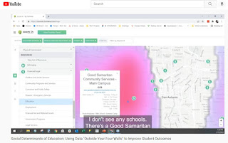
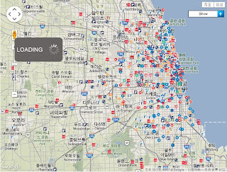
Below is a screenshot from the demonstration shown in the video. This shows how non-school youth development programs are plotted on a map along with indicators such as poverty. 


In my article I showed how the Tutor/Mentor Connection (1993-present) had started building a list of Chicago non-school, volunteer-based tutor/mentor programs in 1993 and began using GIS maps to show where programs were needed and where more were located as part of that strategy. 

Read this article to see growth of our mapping strategy since 1993.  Visit this page to see current status. 

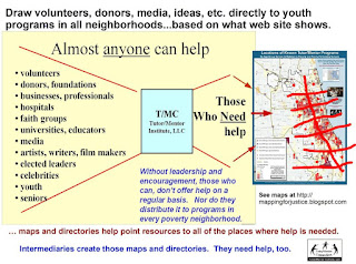
What I did not emphasize enough was that while we pointed to youth serving organizations and indicators of need, we also pointed to businesses, faith groups, colleges, hospitals, banks, etc. who shared geography and could be directly involved in helping fill a neighborhood with a wide range of K-12 tutor and/or mentor programs.


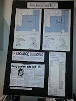
Click on this image and enlarge it, then look at the list posted on the right.  This is how we were sharing information in the 1990s, prior to the Internet.  

It's part of a "Rest of the Story" strategy that we developed to draw additional attention and resources to neighborhoods featured in negative news stories, such as kids getting killed in Chicago.

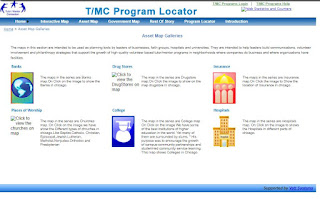
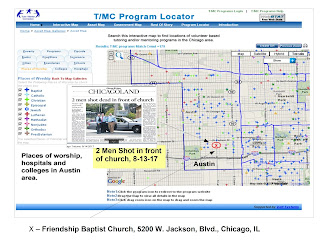
When we launched the interactive Chicago tutor/mentor program locator in 2008 we built a page of asset maps. You can see this in the graphic below. This is only available as an archive now (click here). 

When this was working you could click on any of the categories and open a new page. 

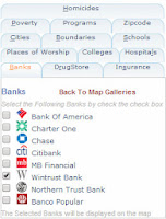
For instance, of you opened the "banks" page you'd find a list of 
Chicago banks. You could build a view showing only one, or several banks. You could also add information from the other categories.  Then you could zoom into a zip code, or Congressional district, or any small area on the map, and see indicators of need, existing programs, which you could sort by age-group served and type of program, and assets.


Below is a map view created using the assets map section:


This shows how I was able to zoom into a section of the city and build a map view, then add an image from a May 2017 newspaper story about "two men shot in front of a church". 


You can find many map-stories on this blog, and the tutor/mentor blog, showing similar map views. 

While this service is no longer available, it remains as a model for people building new dashboards.  Until that happens, I've shown some ways to use other dashboards.

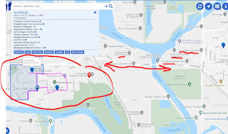
The map view below is shown in this article. I used the Chicago Public Schools Locator platform and zoomed into an area on the far South Side of Chicago with extensive poverty, but too few non-school youth support programs. I highlighted on the map businesses nearby who could be helping.


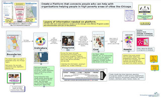
For those who have the funds (perhaps from ESSER) to build new dashboards I created this concept map to show layers of information that could be included.  See it in this article

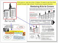
What my maps and articles focus on is funding and sustainability. It takes 12 years for a youth to move from 1st grade to high school graduation and several more years to move into a job.  While a few non-school organizations may succeed in attracting consistent funding, most don't have that type of ability. They struggle. 

If someone can create an interactive dashboard, and someone else can build a list of non-school youth serving organizations, sorted by type of program and age group served, others can integrate this into the dashboard and lead efforts to draw 'people who can help' through the dashboard and into different parts of the city, and the websites of organizations in those areas.


In the graphic above I've drawn a grid over the map of Chicago illustrating the potential for volunteer groups, businesses, faith groups, etc. to adopt specific parts of the city, collecting and maintaining program data for that section of the city and leading on-going communications and outreach efforts intended to draw support to youth programs in that area.  The could also be supporting the operations of programs in that area and/or making specific types of learning more available, such as computer science education. 

Ultimately, every high poverty area should have someone taking this role.  That takes me to another innovative project.   This is the Twitter page of Proven Tutoring. It's a project of the Johns Hopkins University Center for Research and Reform in Education. 
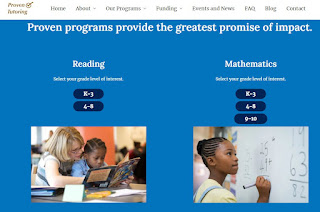

Visit the website, read the blogs, and view the list of reading and mathematics tutoring programs that they point to.  


This is an example of what universities could be doing to collect and share information about non-school tutor, mentor and learning programs in neighborhoods surrounding each university.  I've been reaching out to universities since the late 1990s to enlist one, or more, to take this role in support of the Tutor/Mentor Connection's strategies. Here's one example.

Proven Tutoring is partially funded by the Walton Family Foundation.  Just last week I saw this Tweet, showing a $281 million gift from @MackenzieScott to fund the Boys & Girls Clubs of America.   
Imagine the potential for a major donor to fund the one or more universities adopting the Tutor/Mentor Connection strategy and goals and hiring a team like that at @RS21 to build a data platform that has all of the Social Determinants of Education features that they described in their webinar and in this blog article, along with layers of information showing youth serving organizations, and assets, which was collected and updated by students. 


Imagine the even greater potential if students in business, arts, sports and media departments were leading on-going campaigns to draw policy-makers, volunteers, donors, youth, educators and others to the platform and on to websites of youth organizations, who they then would support with time, talent and dollars.

That's the goal.

If you're still reading, thank you.  Please share this with your network and with people who can take up this call to action. 


Friday, January 14, 2022

Using maps to drive resources to high poverty areas

 I started the Tutor/Mentor blog in 2005 and have posted 255 articles showing uses of maps. If you look at some of these printed newsletters you'll see that I was putting maps in stories back in the 1990s.

This MappingforJustice blog was started in 2008 and until mid 2011 shared maps created by the Tutor/Mentor Connection to draw attention and resources to volunteer-based tutoring and/or mentoring programs in high poverty areas of Chicago.  I took over the blog in mid 2011 when I launched the Tutor/Mentor Institute, LLC and have continued to share maps made using the Chicago Tutor/Mentor Program Locator (now an archive) and maps made using platforms hosted by others.

There are so many stories on these blogs that it's difficult for people to find an overview that they can understand.  Thus, I recently began aggregating a few articles around different topics on my Wakelet account.  Here's one focused on using maps:


While most of my maps created up till 2011 focus on Chicago I point to platforms that can be used to create map-stories focused on any part of the United States.  

With this in mind, use my articles as templates for creating your own stories and try to mobilize public awareness and a flow of resources into all high poverty areas of your own community.  More stories written by more people, built greater public awareness, understanding and motivation.

Share your articles on Twitter and tag me at @tutormentorteam so I can reTweet them.