This album shows some of the map stories created by Tutor/Mentor Connection since 1993 as part of a strategy intended to increase attention on volunteer-based tutoring/mentoring as a strategy for engaging more adults in a wide range of long-term efforts to help kids stay safe in non-school hours, expand their social capital, and keep moving through school toward jobs and careers.
Find more photos like this on Tutor/Mentor Connection
In this blog, the Tutor/Mentor Blog and the Tutor/Mentor Institute,LLC site you'll see numerous examples of maps included in stories.
In this article we describe how youth from many different schools, non school programs, colleges and faith groups could create their own map-stories, focusing on their own school neighborhood or community.
If you are already applying these ideas please share your web address so we can point to you and learn from you. If you'd like our help in developing this strategy, introduce yourself.
Saturday, February 15, 2014
Thursday, February 6, 2014
Map Directory update by Intern

We ran out of money in 2009 and have not been able to update the technology, or the content, in the years since then, except for keeping the information about tutor/mentor programs (the green stars) current.
One section of the Program Locator focuses on Assets, such as banks, insurance companies, faith groups, colleges, hospitals, etc. who could be strategically involved in supporting the on-going operations of tutor/mentor programs in sections of the city where they have facilities.
 When we built the Program Locator in 2008-9 we included locations of eight banks. Since then some have expanded, and some have gone out of business, such as Park National Bank. Since I was not able to update the program locator myself, we've had to live with this outdated information.
I've had interns from Illinois Institute of Technology working with me for six week periods in Jan-Feb and May-June since 2006. On this page you can see work they've done to communicate strategies via various visualizations.

One of our Jan-Feb 2014 interns volunteered to look at the Program Locator, and after three weeks he has updated the Banks section, adding six additional banks and replacing Park National with one more.


If you're doing this work join us at the next Tutor/Mentor Conference to share what you're doing. If you're a business or volunteer who wants to support the Tutor/Mentor Institute, LLC's mapping strategies, introduce yourself on Twitter, Facebook and/or Linked in. Email tutormentor2@earthlink.net to offer your time, talent AND/or financial support to booster this effort.
Thursday, January 23, 2014
Using Maps and Media To Draw Resources to Neighborhoods

I've been doing map stories with the help of volunteers, and occasionally with paid staff, since launching the Tutor/Mentor Connection. Since I don't have advertising dollars, my strategy has been to follow news stories where violence, gangs and/or poorly performing schools have been giving front page, or major emphasis on inside pages of the Chicago Tribune or the Chicago SunTimes, which are the two major papers in Chicago, each reaching several hundred thousand readers a day.
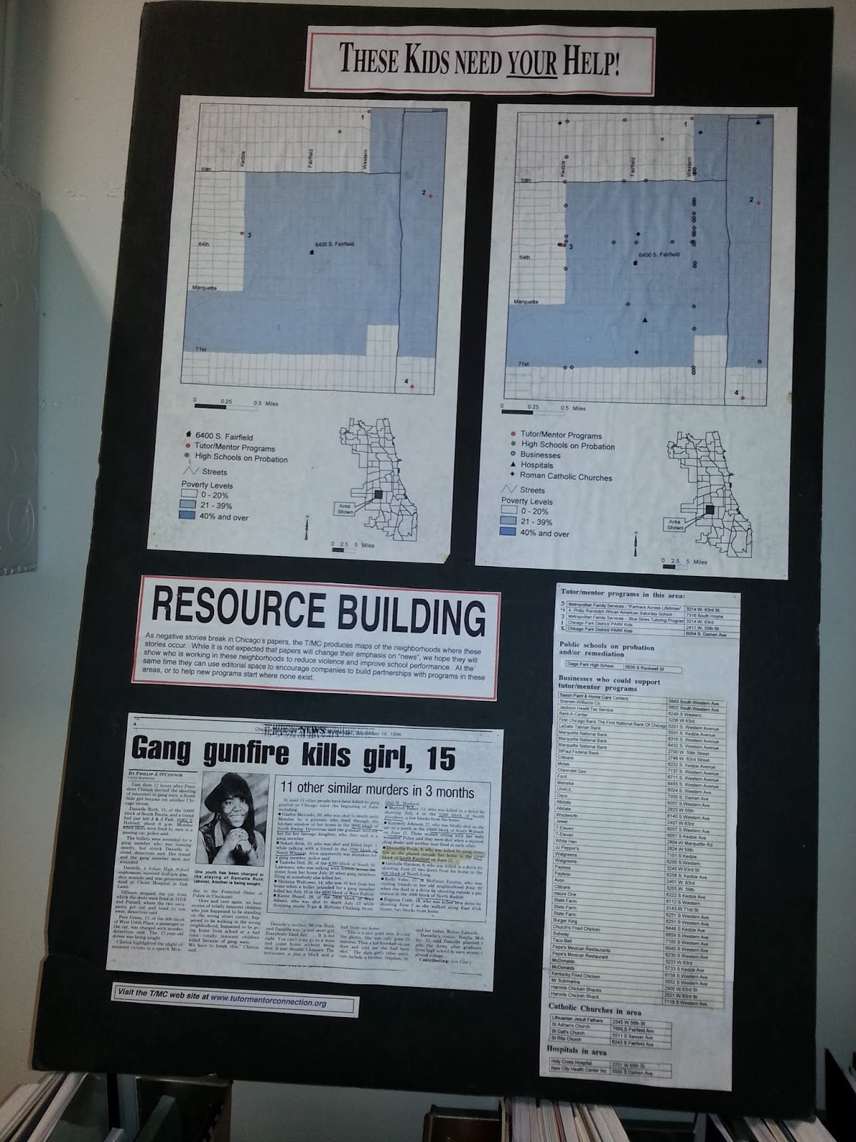
Youth in middle and high schools throughout the Chicago region, and in other cities could be creating these stories, and could be involved in collecting and maintaining information about non-school programs in different neighborhoods. This article and this article offer suggestions for getting young people involved.
See additional map stories here and in the Tutor/Mentor Map Gallery.
If you're implementing this strategy, share a link to your own blog articles and connect with us on Twitter or Facebook.
Friday, December 27, 2013
Mapping the Dropout Crisis

In this article from The Atlantic, you can see a map showing where the drop out crisis is most severe in the USA.
Maps help us understand that social problems are concentrated in many different places, thus, our strategies need to innovate ways to distribute resources consistently to all of the high priority places, not just a few high profile locations.
View the maps on this blog to stimulate your thinking on ways to mobilize and distribute resources to more places where help is needed so more kids go successfully from birth to work without a detour in juvenile justice or out of school.
9-25-2022 update - Maps on the Federal Reserve Bank blog show percentage of disconnected youth in every county in USA. click here to view
Thursday, December 19, 2013
New Maps showing Racial Distribution in Chicago

This is a map showing racial demographics in Chicago, based on the 2013 census data. It's one of a collection of maps that can be found in this Wired.com article.
This map is called a Racial Dot Map, and "provides an accessible visualization of geographic distribution, population density, and racial diversity of the American people in every neighborhood in the entire country." This link provides an overview of the process and purpose of creating the map.
This link points to an article showing the racial dot map used to show Virginia cities.
Use this map, along with maps showing locations of poorly performing schools, incidents of violence, health disparities, etc. and you can form an understanding of what neighborhoods and/or racial groups live in more troubled environments than others.
Use maps that show locations of non-school tutoring and/or mentoring programs and you can begin to build an understanding of which neighborhoods have programs and which don't. Further review and understanding would be needed to determine which of the existing programs are of higher quality or serve more youth than other programs, but using this information leaders should be able to form strategies that help existing programs get the resources to operate and constantly improve, while helping new programs form in areas of need.
This is the type of work Tutor/Mentor Connection has been trying to do since 1993, but with far too few dollars and talent. It's work that now is being attempted by the Tutor/Mentor Institute, LLC, but with the same lack of resources.
Tuesday, November 26, 2013
Hope for the Holidays


Subscribe to:
Posts (Atom)