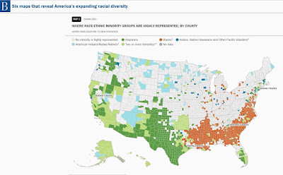
Below is one of six maps shown in a Brookings.edu article titled "Six Maps that Reveal America's Expanding Racial Diversity".
Run your pointer over the maps and you'll get data for every county showing the percent of each racial group in that county.
In theory you would expect a greater percent of minority elected officials, at the local, state and federal level, in those areas showing high concentrations of African American and Latino populations.
Take some time to read the full article.

No comments:
Post a Comment