
This demonstrates a growing ability to use story maps to build a greater understanding of how some places are blessed with great wealth while others are less fortunate due to great poverty.
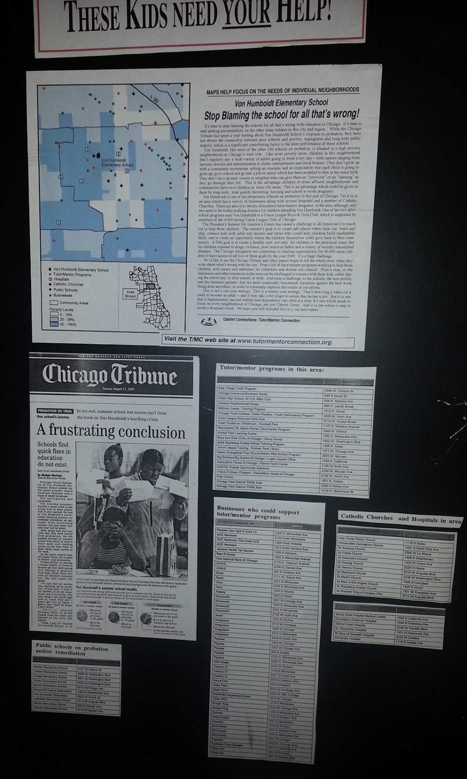
I'll reach out to ESRI, but the next layer of information on maps like this should be borrowed from my own history of building map overlays that show locations of non-school tutor and/or mentoring programs in different neighborhoods, as part of a strategy intended to draw resources to existing programs while helping new programs start where few or none exist.
That could be happening in every part of the world if a few leaders would step forward to make it happen.
11/30/16 update: Here's a New York Times story about immigration, that uses maps and animation to tell the story in a visual way.
12/20/16 update: Here's another ESRI storymap, this time telling the story of the Dakota Access Pipeline (DAPL).
1/11/17 update: Story map showing 10 most segregated cities in the US
6/28/17 update: See how Crain's Chicago Business uses this Wealth Divides map in it's own analysis. click here
2/28/18 update: How Cities are Divided By Income, Mapped - CITYLAB story. click here
View the ESRI Mapping Incomes story-map - click here
4/8/2018 update: Mapping Inequality: Redlining in New Deal America - this collection of Home Owners Loan Corporation (HOLA) maps from the 1920s and 1930s serve as "as critical evidence in countless urban studies in the fields of history, sociology, economics, and law. Indeed, more than a half-century of research has shown housing to be for the twentieth century what slavery was to the antebellum period, namely the broad foundation of both American prosperity and racial inequality."
4/17/2018 update: Public Housing Plays Huge Role in Racial Segregation and Inequality-- but not in the way most people think. Article in Business Insider - click here
4/20/2018 update: US News & World Report article - Segregation's Legacy - click here
4/24/2018 update: Segregation incarnated in brick and mortar. See maps in this April 2018 article on The Hechinger Report.
5/3/2018 update: "Segregation Map: America is More Diverse than Ever, but still Segregated" - Washington Post article - click here
5/10/2018 update: "To Succeed Older Cities Must Overcome Their Stark Color Lines." Brookings edu article - click here
5/16/2018 update: Metropolitan Planning Council site offers plan for addressing costs of segregation in the Chicago region. "Title: Our Equitable Future: A Roadmap for the Chicago Region". click here
5/29/2018 update: Connecticut has more concentrated poverty (and wealth) than most metros. see 2015 article. These are findings from a DataHaven study
6/1/2018 update: The End of the American Dream? Inequality and Segregation in US Cities. Alessandra Fogli, senior economist and assistant director in the research department at the Federal Reserve Bank of Minneapolis leads a discussion about segregation and inequality across U.S. cities and their consequences on educational outcomes of future generations. see video
12/11/2018 update: 2018 County Health Map - Key Findings - click here This report is a resource that can be used by leaders from across the USA.
2/20/2019 update: American segregation, mapped at day and night. This site includes animated maps that show segregation patterns while at work, and while at home. Unique way to view this. click here
2/25/2020 update: Where Democrats and Republicans live in your city. This article includes maps that show political separation in cities across the USA, as well as racial segregation. click here
9/21/2020 update: Redlining and neighborhood health - click here
9/23/2020 update: from Brookings.edu: Six maps that reveal America's expanding racial diversity. - click here
11/23/2021 update: The Ever-Growing Gap: Failing to Address the Status Quo Will Drive the Racial Wealth Divide for Centuries to Come - Institute for Policy Studies report - click here
1 comment:
Here's another set of maps that show income inequality in Chicago and NYC. This one uses three dimensional buildings to illustrate the vast difference in wealth between some blocks in the city and others. http://www.fastcoexist.com/3066008/these-apocalyptic-maps-show-the-holes-income-inequality-has-left-in-cities
Post a Comment