Tuesday, December 21, 2021

Use maps to guide giving


Since 2008 stories on this blog have shown ways to use maps to understand where poverty is concentrated in Chicago and other cities and to draw needed operating dollars, technology, volunteers and ideas to youth serving programs in every high poverty area of Chicago.

As you celebrate the holidays view my lists of youth serving organizations. Visit websites to see what they do. Pick one, or two in different parts of the city to support. 


I depend on contributions to Tutor/Mentor Institute, LLC (not a 501-3-c) to help keep my lists of programs on-line and available to anyone. Visit this page if you'd like to help. 

Friday, November 19, 2021

Africa will have most of worlds largest cities by 2100

 The map below if from a Washington Post article showing how Africa will have most of the World's largest cities by 2100.


Read the article at this link.  https://www.washingtonpost.com/world/interactive/2021/africa-cities/ 

Perhaps universities in Africa will adopt the map-based strategies I've been sharing with Chicago and other US cities since 1994.  

Thursday, November 18, 2021

MapsCorps - another data source

I've used this blog for more than 12 years to show uses of maps in stories that attract attention to important issues and to places where people need extra help from volunteer-based tutor, mentor and learning programs and much more.

Here's a resource to add to your collection.  I've known about MapsCorps for a couple of years but had not seen their community mapping pages.  

If you go to https://mapscorps.org/ and scroll down on the home page you'll see this map of Chicago.


Next click on any of the Chicago community areas shown in red to open a map focused specifically on that area. I clicked on Washington Park, which is just West of Hyde Park on Chicago's South side.


The community area is shown and you can zoom in and out to get a closer look.  On the left side bar are categories of information shown on the map.  I opened the "childcare and schools" category, then clicked on each category to see what would show on the map. When I clicked "other" the Chicago Youth Programs site was shown.  The pop-up provides an address and phone number but not a link to the website.  

Open each of the community areas and you'll find a similar map, but different information will be shown. It's a great resource. I just wish they had a category for "tutor/mentor" program, and that more of the programs operating in the city were showing up on the maps. 

If you use this resource, along with data from other platforms (see this article, and others like it on this blog) you can build an understanding of community needs, available  youth serving organizations, and assets in the area who might provide volunteers, technology, ideas and dollars.

All of this can be included in blog articles, videos, PDF presentations and more, with a goal of supporting existing programs and helping new ones grow where needed.

I learned about this resource in a webinar hosted the the To&Through Project. In the Tweet below you can find a link to the video and learn about this, and the map resources provided by LISC Chicago.
Universities and high schools should be teaching young people to create such map stories and show how they need to be repeated over-and-over for many years in order to build attention and convince leaders to provide the needed resources to the neighborhood. 

A blog like this one, and the Tutor/Mentor blog, which I started in 2005, should be found on various websites in every community area of Chicago, its suburbs, and in other cities. Note that I've written these for more than 12 years and have led the Tutor/Mentor Connection since 1993. Until others build and sustain such a long-term commitment and consistent flow of stories too few will respond to the needs of kids and families in each area where map indicators show there is a need.

It's the only way we will ever cut through all of the noise and attract needed attention and resources to high poverty areas of Chicago and other cities.

I'm on Twitter, LinkedIn, Facebook and Instagram.  Find links here.  Let's connect.


I'll be 75 this December.  You can support my work by making a small contribution. Visit this page

However, what's more important, is that someone from one of Chicago's universities steps forward to take ownership of my archive so it remains available as a teaching tool and inspiration beyond my own lifetime. A wealthy donor could make that happen.  

Tuesday, November 9, 2021

Using data from multiple platforms

 Below I'm showing some data platforms that I've seen recently which show indicators of need for extra support of youth living in high poverty areas.

University of Chicago To&Through Project released a new report showing CPS students' enrollment patterns and high school/college outcomes by the community area in which they live. Click here to view the report.   At the same time a data platform was created to help people use the data.  Below is an image showing one page on this platform.


Follow @UChiToThrough on Twitter and see how they are helping people understand what's available and how to use this tool.


Next, view this report showing schools that include Computer Science Education. Below is a screenshot from a section of the data tool showing the Illinois 7th Congressional District.   


Next, look at the Chicago Public Schools locator platform. Below is a screenshot from that platform that I used in this blog article, to show assets in the neighborhood around different schools who could be helping school and non-school programs help kids. 


After posting this article I attended a ZOOM meeting where the Chicago Community Data Portal was introduced. Below is a screenshot from that.


These are just four data platforms that are available to advocates and planners who want to focus on specific areas within large cities like Chicago. There's a load of data in these portals. Take the time to learn what's available and ways to use it.   

Open this concept map and view other platforms that can be used. 


This data can help people understand where kids and families need extra help but will be of little value if more people don't use the data tools to create stories that attract the attention of policy makers, donors, volunteers, business leaders and others who need to be involved helping programs grow and schools improve.  Those stories need to be launched over and over in order to attract attention and motivate changes in habits.

What this requires are efforts that "influence" what others do.  The graphic at the left is used in several articles on the Tutor/Mentor blog to show that we need to influence resource providers, not just program leaders, youth and parents.  Here's one example.

Get involved!

This blog was started in 2008.  The Tutor/Mentor Blog was started in 2005. The Tutor/Mentor Intern blog was started in 2006.

Review the stories posted over the past 13 to 16 years. They are examples of the type of stories others need to be posting regularly, and for as long, in order to capture attention, mobilize resources and do the work needed to help kids move from poverty to jobs and careers.

If you appreciate these articles, consider a holiday contribution to help me fund this work. Click here. 


Sunday, August 15, 2021

Population growth in US cities

 Below is a screen shot that I created from an article in the Washington  Post, titled "Where America's developed areas are growing".

I'm showing the Sycamore-DeKalb, Illinois cities.  I spent 5th grade through high school in Sycamore, graduating from HS in 1964. I left for college in the fall of 1964 and while my family lived there until 1992, I later made my home in the Chicago region.  Thus, I've watched this population growth with interest over the past 30 years.

I used this example to demonstrate the interactive feature of the Washington Post article. Type in any zip code in the bar at the top of the map and you'll get a map showing that location, with the purple shading showing population growth in that area between 2001 and 2019.

This is just one platform that I point to in this blog, demonstrating ways to visualize data and share it via newspaper and Internet articles.

I've used this blog since 2008 and the Tutor/Mentor blog, since 2006, to share map-stories with the goal of drawing attention to the information, then using the information to develop strategies that draw resources into the areas where the maps show help is needed. 

I've been collecting links to data platforms for many years and while I point to some from articles on this blog, I created this concept map, to point to many more. And while many major media are creating some fantastic map stories, I don't find many bloggers talking about using their data maps for specific purposes, the way I've been doing.

Thus, I'm pleased to point to a new site being  hosted by Adam Hecktman, who has been part of the ChiHackNight group for many years, in his role with Microsoft.  Look at the Tweet below and visit Adam's new site. I'm please that this MappingforJustice blog is the first on the site. I hope there will be many more in the coming months.

The Washington Post article enables you to look at population growth in every part of the country.  People in every city need to be looking at the maps and asking "what does this mean for us?" and "What can we do to fix any problems this shows?" and finally, "Who wants to help?"

Since most of us don't have dedicated advertising budgets to reach out and gather people to work together to solve specific problems, using our blogs and social media to share our ideas is one of the few resources we can use.

 Creating libraries, or hubs, is one way to shine the light on the work many are doing. 

8-20-2021 update - Here's 8-20-2021 WBEZ story titled,  "Takeaways From 2020 Census Data For Chicago And Illinois In 6 Graphics".  White population in Illinois declined while POC grew. 

Monday, August 2, 2021

How Many Youth Programs are Needed?

Last week I posted two articles on the Tutor/Mentor blog that included the maps I'm showing below.  These show 15 Chicago community areas with high levels of shootings and homicides, considered 'high priority' by the Chicago SunTimes

I've combined the community area maps created by the SunTimes, with maps from the Tutor/Mentor directory to show the same  neighborhoods, locations of existing non-school, volunteer-based, tutor and/or mentor programs, and the number of high-poverty youth, age 6-17, in the area.

Here's an example: North Lawndale is on the far West side of Chicago and 4178 low income youth, which is 61% of the total youth population in that area.  

The green icons of the Tutor/Mentor map are youth programs in the Tutor/Mentor Institute, LLC's directory. (see map here). While there are seven programs, they are on the edges of the community area, except for the Better Boys Foundation (BBF Family Services).   We don't know how many youth each existing program serves, nor the age groups they serve, but if each served 100 kids weekly, it would mean 700 out of 4178 had access to a non-school tutor and/or mentor program.

Here's another example:  This shows Englewood, on the South side of Chicago, West of the Dan Ryan Expressway.  Click to enlarge the map.

The goal of creating these maps is to stimulate planning teams that help existing programs each get the operating resources needed to continue to serve youth and (hopefully) constantly improve, based on what they can learn from each other. At the same time, planning teams should identify where more programs are needed, and work to fill those voids.  


This should be happening in every community area of Chicago, as well as in Chicago suburbs and other cities.

Take a look at the two articles on the Tutor/Mentor blog. July 29 and August 1.

Since the mid 1980s I've seen stories of violence in Chicago, followed by editorials saying "demand something" or with quotes by parents saying "we need more youth programs for these kids".  Yet, there's never been an on-going, map-based planning process, intended to fill high poverty areas with a wide range of youth tutor, mentor, learning and jobs programs.


Unless that changes, it's likely the violence will continue.

If  you're using maps for this type of analysis or interested in learning more you can find me on Twitter, Facebook, LinkedIN and Instagram (see links here).   Let's connect.  

Thursday, June 17, 2021

Thoughts about Maps

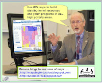
Since 1993 I've been trying using maps to help people form "partnerships and connections" that lead to a greater and more consistent flow of resources into every high poverty area of Chicago. One result would be a broader range of K-12, non-school, tutor, mentor and learning programs.  

Maps can be used to focus attention on places where people in Chicago need extra help. They provide answers to questions like “What neighborhoods are affected?” And, “What indicators show these areas need this government and philanthropic support?”

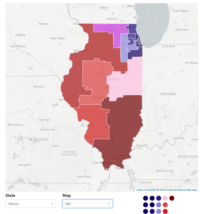
Below are some examples of how maps can be used. In this case I'm focusing on the Opportunity Zones announced in January 2019. 

The Opportunity Zone map is shown at the right in the following graphics. In the first map I've used a demographics mapping site  to show Chicago. The green color shows areas with a high density of African Americans. By comparing the O-Zone map with the one on the right, you can see that the Opportunity Zones are targeted to help this sector more than others.


This next map shows the Chicago Tribuneshootings tracker” site, which shows locations of Chicago shootings for past 365 days. There's a definite overlap with O-zones but there are other areas which also need investment.


The next map comes from the Casey Foundation's Community Opportunity Map which shows poverty levels in Chicago (and other parts of the country). Using the interactive map you can focus in on specific parts of the city, and generate tables of information. For instance, I created a view focused on the North Lawndale area.


This next set of maps shows non-school youth tutor and/or mentor programs in Chicago, based on a list I've been maintaining since 1994. While most of these are not-profit centers that would attract Opportunity Zone investment, they are part of the mix of youth and family support organizations needed to help bring a neighborhood out of deep poverty.

View Tutor/Mentor Programs map here

A closer inspection of my map would show the wide range of programs on the map, and the lack of these programs in many of the O-Zone areas.

So who are some of the potential stakeholders and resources already in these neighborhoods?

On the graphic below I've zoomed into the O-Zone map to focus on the North Lawndale area of Chicago's West side. Then, I used the Chicago Health Atlas Map to focus on North Lawndale, and show hospitals serving this area.


Hospitals can be employers, can be customers for products and services produced locally, can provide needed health services, and can be conveners who bring stakeholders together. They can also be leaders who help comprehensive youth tutor/mentor programs grow in the area. Using the Chicago Health Atlas you can also create maps showing health disparities, which are indicators of investments needed in different areas of Chicago.

In the concept map below I point to the platforms I used to create the maps I've shown. These are just a few of the growing number of data mapping resources becoming available over the past few years.

Open map at this link

Creating, maintaining, and motivating others to use these platforms offer many challenges. Among these are:

a) Motivating and teaching people to use the various platforms to create maps that focus a story on specific places. That's what I did in the above maps.

b) Locating the different platforms with needed information can also be a challenge, at least from a time perspective. In many cases the data-maps are no longer on-line, so when I open a link it is a dead end. Unless people are really motivated, most won't do the digging needed to put together an effective map story.

c) Building public awareness so more people look at the maps, use them in planning and action steps that bring people together and drive needed resources to non profits and growing businesses in specific areas is also a challenge. People creating the map platforms usually don't have advertising dollars to do the communications needed to attract people to the maps, or to teach others to use the platforms to create on-gong map stories.

These data resources are not profit centers. Thus, they don't qualify for investment zone capital. One role of philanthropy, or other government resources, could be to support the development, constant maintenance and updating, and long-term use of platforms like this.

There are already a variety of community planning resources. Why not use them to guide investment? LISC Chicago as an example of this.


Below is a screenshot is from one of 27 quality of life community plans developed under the lead of LISC Chicago. It shows the Austin Community area. All 27 can be downloaded at this link.

Download at this link.

I don't include it on my data map because it's in a PDF, and not an interactive, on-line map (according to LISC Chicago). Thus while it's a great map, it's only useful to those who have access to it. You can't add layers, or zoom in, to focus on specific areas, or turn it into stories. There may be other map platforms like this in Chicago, or in other cities. I'm always adding to my library and this concept map. Send me links if you have them.

Another resource that can be used is the Chicago Public Schools Locator map. Below is a screenshot that I created using the CPS Locator platform. I shared it and others in this blog article.


In my own efforts between 1994 and 2011 I tried to build one platform that would provide many layers of information that could be used to support neighborhood based planning intended to make more and better youth serving programs available in high poverty neighborhoods.


The map of the left was created using  the Interactive Tutor/Mentor Program Locator's Asset Map section. (It's no longer functioning properly, although still can be seen on-line archive at this location.)

While I've been collecting and mapping data since 1994, for most of those years I was dependent on volunteers and donated software. In 2007 a $50k anonymous gift, combined with a grant from HSBC North America, enabled me to re-build our in house mapping platform, and to build the on-line interactive platform.

Using ARC GIS software we could create maps showing layers of information and using the interactive platform, we enabled others to create similar maps. Below are two examples. You can see more like this in the MapGallery created in late 2010.


Unfortunately, the recession, starting in 2008, dried up funding for this by mid 2010.  I've not had funds to update this or create these maps since 2011, and it would take a significant investment to rebuild my capacity.

Yet, I feel it is needed because I don't find any other mapping platforms combining all the layers I was trying to combine, and building it into blogs and on-going communications, so community planners could show the need, show existing service providers (and/or businesses) and show assets in, and around, the community who should be involved in any planning process.

I wrote an article last year showing the layers of information needed on a platform like the Tutor/Mentor Program Locator - read it here

I also added an interesting article about building relationship networks to support philanthropy. You can read it here.  Such networks could be using the mapping ideas I've been sharing.

Last year MacKenzie Scott made a massive contribution to help fund 116 organizations (see here list). This week she did it again, and one of the recipients was MENTOR, The National Mentoring Partnership.

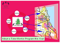
Following last year's announcement I created this graphic, with the goal that she and others would make a long-term commitment to support the growth and operations of well-organized, long-term, tutor, mentor and learning programs helping kids in poverty from birth to work.  Maybe the MENTOR gift is a partial response. 


Thus far I've not seen MENTOR or any other youth development organization use maps the way I've been, in an effort to draw funding and volunteers into every high poverty neighborhood.  Thus, if you're  researching places where you can make a difference, perhaps you can read some of the articles on my blogs then share them with others who might want to become the investor, partner or benefactor who rebuilds the Tutor/Mentor Connection and its on-line mapping, and makes it freely available for others to use in Chicago and cities around the world.  

Or, you might be a creative social entrepreneur who can figure out how to generate revenue and profit from this, so we could seek capital investors from programs like the Opportunity Zones program.

I'm on Twitter, Facebook and LinkedIN. I'll look forward to connecting with you.

Thursday, June 3, 2021

MyChiMyFuture Chicago Youth Programs Map

 Below is a screenshot of the MyChiMyFuture Chicago youth programs map. This is Mayor Lightfoot's initiative aimed at reaching more Chicago youth with non-school programs. 

The map is interactive, with multiple categories of service providers. You can create map views showing single, or multiple categories. You can zoom into smaller sections of the city. And you can click on each icon to find program name, address, and website.  This is all good.

However, there is no sub category for "tutor, or tutor/mentor".  If programs from the list I maintain are on this map, they would be included in the "academic support category".  

I've participated in MyChiMyFuture meetings since 2019 and have posted a series of articles on the Tutor/Mentor blog. I'm happy to see this map finally made public and hope that the Mayor and other public leaders will draw attention to it regularly in an effort to attract volunteers and donors to programs in every neighborhood.  

So far it seems that the effort is aimed at youth and families, along with networking and training among programs.  Without driving operating resources to EVERY program, on a continuous, multi-year, basis, the initiative is unlikely to fulfill it's goals.


Hopefully the initiative will evolve to one with a purpose of drawing needed resources to every high poverty area of the city, brining ideas, volunteers, operating dollars, technology and youth participants to every program.  


Wednesday, May 19, 2021

Use CPS School Locator to Find Support

The Tutor/Mentor Connection created a map-based Chicago Tutor/Mentor Program Locator in 2008 to help programs connect with resources near where programs operate. That's no longer active, but maps are still available for this purpose.  

Below is a screenshot of the Chicago Public Schools Locator. I used this today in a series of Tweets about the Riverdale Community area on Chicago's Far South Side. 


I've circled the South part of Riverdale.  The Northern part of the area is mostly filled by the Metropolitan Water Reclamation District facility.  On this map I've  highlighted 130th Street. To the East, there are many big companies, like Ford Motor Co., who could be recruiting employee volunteers to fill the Riverdale area with mentor-rich non-school programs like some that operate in other parts of Chicago, and like the one I led at the Montgomery Ward headquarters on Chicago Avenue, from 1975 to 1992.  

Below is one of several Tweets I posted with this information.

On the Tutor/Mentor Institute, LLC website there's one section about starting a program and another about roles business can take.  Leaders from the Riverdale area can use these resources to gain ideas for reaching out to these businesses, while volunteers from these companies can find ideas to support a long-term involvement with k-12 kids in the area.

I'd be happy to walk people through this process.  Connect with me on Twitter, Facebook and/or LinkedIN.  See links on this page

Monday, April 26, 2021

Chicago a divided city - WBEZ maps

Today the US Census announced that Illinois will lose one Congressional seat as a result of declining population in Illinois and growth in a few other states.  As I  thought about this I saw an article on the WBEZ website, showing maps created by the Center for Neighborhood and Community Improvement at the University of Illinois at Chicago.


 Whereas in 1970 there were large middle class neighborhoods in the North, SW and South sides of Chicago, not the city seems starkly divided between wealth and very low income.  

While the low income area grew dramatically this does not mean the population of poor people grew. African American population within Chicago has been declining for decades. This 2019 UIC Great Cities Institute report states that "Since a peak measured in 1980, Chicago’s Black population has declined steadily from 1,187,905 in 1980 to 797,253 in 2017, a decrease of 390,652 or 32.9%."  

This 2018 article provides more information about the migration of Blacks out of Chicago, to the suburbs, other cities in Illinois, and out of state, perhaps to some of those states gaining Congressional seats. It includes a quote saying, "Experts from the Urban Institute predict that by 2030, Chicago’s African-American population will shrink to 665,000 from a post-war high of roughly 1.2 million."  

That leaves behind those who are very poor and those who are very affluent.  


Saturday, April 24, 2021

Chicago Philanthropic Initiative Using Maps

If you skim through articles on this blog you'll see that I've piloted uses of maps to guide the distribution of resources to youth programs in high poverty areas of Chicago  since 1993.

The Tweet posted below points to a WBEZ article pointing to The Mapping COVID-19 Recovery Project, a collaborative effort of 25 major Chicago foundations, nonprofit organizations, and public and private groups.


WBEZ is doing some outstanding mapping. It's an example of what's possible if you have the talent and dollars needed to create the maps and share them via various media channels.  I encourage you to read the report, visit the Recovery Project website, then help draw attention to the places where the maps show people need extra help.

Monday, March 1, 2021

Map resource for redistricting in 2021

 Every 10  years state political district maps are re drawn, based on the new Census information. Across the country Democratic and Republican party leaders try to "gerrymander" the maps to favor one party or another.

This platform provides maps for every state, showing maps favoring one party or the other, plus an recommended "fair map". 

Use the search bar under the map to find your state, then to see the three versions of the map. Which will your state choose? 

Friday, February 12, 2021

TIF Districts in Chicago

 I use this blog to show ways GIS maps can be used to share information and to provide resources that people can use to tell stories showing where people need help.  Below is a screen shot from Chicago's Interactive TIF Data Map.


The website shows that "Tax Increment Financing (TIF) is a special funding tool used by the City of Chicago to promote public and private investment across the city. Funds are used to build and repair roads and infrastructure, clean polluted land and put vacant properties back to productive use, usually in conjunction with private development projects."

The red and yellow dots on the map show infrastructure projects (yellow) and redevelopment projects (red).  You can turn on or off layers showing community area boundaries, planning regions and wards. You can click on any of the red or yellow dots to find information about that project.   You can zoom into the map down to the neighborhood level.  

Note: one of the most vocal critics of the TIF program is Tom Tresser, who I met via the Tutor/Mentor Leadership and Networking Conferences in the 1990s.  Here's a site where you can learn about Tom's concerns.   Frankly, I'd love to see a TIF map where there was a third set of dots, representing non-school youth tutor, mentor and learning programs funded with TIF dollars.  That would support the campaign I've led through the Tutor/Mentor Connection (1993-present) and Tutor/Mentor Institute, LLC (2011-present)  for the past 28 years.

 
At the left is a screen shot of the Chicago Tutor/Mentor Program Locator which my organization built in 2008 to share information about Chicago youth tutor, mentor and learning programs.  The site has not been updated since 2011 but remains a model for what needs to be created to help mentor-rich youth programs grow and thrive in every high poverty area of the city.

The TIF map is an example of the type of platform that could be developed in a new version of the Program Locator.  Something like this could be developed in any city of the world and shared via open source to every other city.  If you recognize the need for this in your city, or want to  help rebuild the Program Locator, and Tutor/Mentor Connection 4-part strategy, for Chicago, please reach out to me.

You can connect with me on any of these social media platforms

Monday, February 8, 2021

Census Map Shows Home Town of Superbowl Players

 I've pointed to the US Census Bureau in past articles to show how their maps can be used to create map-stories. I was reminded of this capacity when a friend emailed me this map showing home towns of players in the 2021 Super Bowl.


You can find this map here

Are you using the Census Bureau platform to create map stories that draw attention to the needs of youth and families in high poverty areas of the USA?  Share links to your stories in the comments.