Thursday, October 26, 2017

Mapping Opioid/Overdose crisis and service providers

Brookings Institute map
Yesterday I posted an article asking that someone map locations of the Digital Divide and showed a concept map outlining problems schools are facing.

 Today I found this article, with a title of "A Nation in Overdose Peril:  Pinpointing the Most Impacted Communities and the local gaps in care".

 The article shows where this crisis is most severe, where it is growing and also talks about lack of prevention and treatment non-profits in many of the areas that have the greatest need. If I had ever had a research institute to help me do the work I've been doing to identify where youth tutor/mentor programs are most needed, and where existing programs exist, my stories might have looked very much like this one.

Thus, I posted a comment on Facebook with the goal that some folks working with public health issues might be interested in what I've been doing for the past 23 years.

I decided to post that comment here, with more detail. 

Based on this article I have two comments/requests. First, have you produced a concept map/visualization showing the different treatments and prevention services that are available in some communities but not in others?

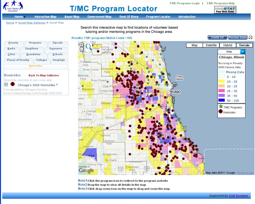
This link points to the cMap below,  showing supports kids in poverty need to move from first grade to a job. http://tinyurl.com/TMI-K-CareerMentoring


My map starts at the left, pointing to pre-school, then moves from elementary school, to middle school, high school, college/vocational school, then jobs and careers. That's a 20-30 year journey for every youth. Those living in high poverty have less support, thus non-school volunteer-based tutoring, mentoring and learning programs are a valuable resource.

Middle School
At each age level I show a range of supports that all kids need, but which are missing in many areas of high poverty.

I feel that a similar map could show a time line of first exposure to potential drug abuse and the causes of addiction, to a later stage where a person is heavily addicted and needed specialized treatments. At the right end of the time like could be the post addition recovery stages, showing supports still needed.

At each stage having the appropriate supports and treatment could make a huge difference.

The information the Brookings Institute is collecting to produce this article could be organized into a web library sorted by the categories on the concept map, making these resources available to every community in the country/world.

The second question asked if the Brookings Institute has plotted its data about service providers on a map, as an overlay to the maps showing distribution of the problem? I have been plotting locations of non-school tutor/mentor programs on maps since 1994. The map at the right is created using a Chicago Tutor/Mentor Program Locator pilot which was built in 2008.

The maps force leaders to think of all the places where help is needed. Without mapping resource providers you could fill a stadium with people doing this work and still not be reaching most places where help is needed.

With this information people concerned with the problem could begin a marketing campaign intended to help existing providers continue to provide services while helping others build new service distribution points, borrowing from what is working in other places. If someone is doing this please share the links.

Using the information you collect in a campaign intended to draw resources to the areas where extra help is needed is the 4-part strategy the Tutor/Mentor Connection developed in 1994 and has been using since then (since 2011 as part of Tutor/Mentor Institute, LLC).  Just showing where the program is located, and talking about some causes is only part of what needs to be happening.

If some is interested in talking more about what I've just suggested,I'll post this on my blog and look forward to connecting.

Update: 10-27-17- Here's a link to a Jan 2016 New York Times story with maps showing drug overdose deaths each year since 1999.

Update: 10-12-18 - Here's useful article in USNews about the challenges of solving the opioid epidemic.

Update: 10-25-18- America's 150 Year Opioid Epidemic - NY Times article  click here

Wednesday, October 25, 2017

Mapping Digital Learning Access - invitation

Earlier this week I watched a one hour documentary showing the Digital Divide in America, and identifying three key challenges that must be overcome.

I created this concept map to visualize that discussion and add some other issues that were not included in the video.

I'm looking for information that can make this cMap more useful.

First, if you know of articles that provide more information related to hardware, connectivity, or teacher training, I'd like to add links to such articles in the three nodes on the map that focus on those issues.   If you know of anyone writing about the challenges of keeping this stuff updated as kids go through school - 12  years - I'd like to point to such articles.

Second, I am looking for maps that show every school in the US, and provide some sort of indicator that shows what level of digital access that school offers.  Ideally such maps would have overlays showing poverty demographics and legislative districts, such as I've tried to provide in the Chicago Tutor/Mentor Program Locator platform.

A few weeks ago I pointed to the OpenStreet Map Project, in which people from around the world can help upgrade the quality of information for places throughout the world.  It seems to me that a group of students and/or volunteers could create a base map, and that schools from around the country could add their own information with pre-set icons that would show levels of readiness (yellow, red, blue, green, etc?) based on the information in the Digital Divide video.

Maybe someone is already doing all of this?  If so, just share a link and I can point to it.

This information needs to be available on a school by school level or in districts with multiple schools crossing income and wealth divides, the need of poor schools might be overlooked.  Including legislative overlays would build in direct accountability to the people who represent those districts.

We can't help kids get through school and into jobs and adult lives free of poverty if we can't give them a more equal playing field.

11-10-17 update - Here's an article titled "From good intentions to real outcomes: Equity by design in Learning Technologies", which relates to this topic.  It has been set up on Hypothes.is so readers can annotate and share ideas in the margins.

5-28-18 update - Here's an article about a 2018 Google Report revealing the state of CS education in the US

7-16-2018 update - Article titled "The Last Mile" talks about broadband access in rural areas of US.

9-11-2018 update - The Stark Geography of America's Digital Divide, article by Bryan Alexander, summarizes this Pew Research Center Report on the Digital Divide.

11-23-2018 update - Equity, Access and the Distributed Web - relevant blog article from #clmooc network.

4-24-2020 update - map showing broadband accessibility in Chicago census tracks - click here

Thursday, October 19, 2017

Unique Geography Teaching & Learning Resource

I've been following a Twitter chat using the hashtag #worldgeochat and this week I saw this graphic introducing a web site titled The Human Imprint.

I took a look at the site and found it to be a treasure of information and ideas.  It was created by a geography teacher and one section is an Illustrated Textbook for teaching geography and spatial-based history, current events, environmental topics and more.

However, another section is a web library, organized in nine categories, with topics such as population and migration, urbanization, industry and economic geography, political configurations, etc.  In each section are sub-sections, which you can find using the drop-down menu. 

I've been building a web library for more than 20 years and I have two categories with links to geography and mapping resources.  The graphic at the right can be found in this presentation, describing the information library I've been building and showing my goal of finding others who are experts in specific topics. It looks like The Human Imprint is providing some of this expertise.

I encourage you to book mark the site as I did, and visit regularly.

Monday, October 16, 2017

Updating CPS Tiers Map - How It Was Done

Many well-intentioned civic tech volunteers are creating apps and web sites, but seldom do the work to update them regularly.  Thus, it was great to find a set of Tweets and web links posted by Derek Elder, of ChiHackNight, showing how he updated a map platform showing Chicago Public School Tiers. You can read Derek's article here.

The CPS School Tiers map can be found here.

The same tier info is also used on the CPS School Locator.

I think the information Derek is sharing could be applied by civic tech volunteers in other cities and working on other projects.

I'd love to find some volunteers who would help update, and/or rebuild, the Tutor/Mentor Program Locator, which was built for me by a team from India in 2008. I've not been able to update the site since 2010 and have not been able to update the tutor/mentor program information on the site since 2013.

The Program Locator is part of a project started in 1993, intended to identify all non-school, volunteer-based tutor and mentor programs in the Chicago region and share that information in on-going public awareness activities intended to draw resources and ideas to existing programs,  help parents, volunteers and donors find programs, and help people see where more programs are needed.

Initially the list of programs was published in a printed directory that was mailed to libraries, businesses, foundations, and existing programs each year and shared at a May and November Tutor/Mentor Leadership and Networking Conference.

In 1998 we began putting the list of programs on line, pointing to program web sites, which we felt would have much more updated information than what we could provide in a directory. It could also be found by more people.

In 2004 we launched a ProgramLocator search portal, which you can see at the right, which enabled people to search for programs by age group, type of program and zip code or community area. The results would show on a Google map.  A special feature made it easier for Tutor/Mentor Connection staff to update program data, and allowed programs to enter and  update their own data.

Unfortunately, this feature has not worked since 2013 and even in the late 2000s we had too few dollars to train programs to use this effectively.

This is one of many graphics created over the past 20 years to emphasize our intent of connecting donors and volunteers directly to individual tutor/mentor programs, using the Program Locator, and eliminating us or anyone else as the gate-keeper or middle-man.

Our goal was to create PDF essays, like this Shoppers Guide, to educate programs and resource providers, so they could make informed decisions on which programs to support.  In some cases, there are almost no choices in some zip codes, so you need to help which ever programs are there become great at what they do. That take time and perseverance.

This page contains articles that show ways to use the Program Locator.

I've not found many using maps this way, to draw needed support to organizations who are already doing needed work in different parts of a city.  Yet, I believe what I'm piloting can, and should, be applied in cities throughout the world.

Read more stories about my use of maps, on this blog, and on the Tutor/Mentor blog. See history of my use of maps, and current status, on this wiki page.

So, as I look at what Derek and others are doing with GIS technology, I hope to find people with similar talent, or some dollars, who will help me upgrade what I've been doing for almost 24 years.


Wednesday, October 11, 2017

Help More CPS Youth Move To&Through College - See the Data


I attended an event in Chicago yesterday hosted by the To&Through Project of the University of Chicago's Urban Education Institute. The Project's mission is:

The To&Through Project’s mission is to close the gap between the 76% of CPS freshmen who aspire to attend college and the actual results of only 18% obtaining a 4-year college degree within 10 years, with research, data, and resources designed to give every student who aspires to earn a college degree the opportunity and support to do so.

The Project web site has a data portal that anyone can use to understand how each CPS high school performs, with a multi-year history and with comparisons to other schools, CPS in total, and national results. The site also has reports produced by experts in Chicago and beyond that provide additional ideas that can be used to build a stronger support system for Chicago youth.

This is a rich resource. You'll need to spend time on site to learn what's there.

One of the features of the site is a collection of stories, submitted by anyone in the community, showing how they are using To&Through data to help CPS students through school and through college.

I attended this event in September 2016 and posted this story on the Tutor/Mentor blog.   In that story I encouraged Project leaders to review the ways I'm using maps and showing how others use maps, via articles on this blog. 

Birth to Work Support

I included this graphic in that story, emphasizing the need for support that starts as early as first grade and points to jobs as the result of post high school college and/or vocational school programs, along with an expanded network of mentors who help open doors to those jobs.

In the breakout group that I attended yesterday I asked if any of the data was plotted on GIS maps. The best answer I received was that you could find such maps on CPS web site, and perhaps on other sites, such as that of WBEZ radio. 

data platforms
This blog is full of articles showing uses of maps. The concept map at the left shows many data portals that are models that can be reviewed.

On other concept maps, like the one below, I show how maps should be used in planning and community building efforts that focus on specific neighborhoods, such as the area surrounding each CPS school. 

Use maps in planning

I'd like to see stories on the To&Through site that show how people in different map-areas are using some of the ideas I'm sharing and are coming together to help students be more successful in moving through school and into jobs and careers.

One goal expressed by the To&Through Project director at this year's event was data that show income and earnings of CPS alumni, as a result of having obtained a college degree. That would align with my own goals and perhaps build greater support for the broader system of supports needed by youth in many school neighborhoods.

Last year's article did not result in an invitation to connect and share ideas with any of the organizations working toward the To&Through Project goals. Hopefully, this year's article will lead to some conversations.

Thursday, October 5, 2017

KUMU adds GEO layer to Community-Based Concept Maps

Map from Kumu blog
I was delighted to scroll my LinkedIn feed today and see a post announcing that Kumu.io is introducing Geographic Mapping Underlays.  Here's the blog article that introduces this feature. 

I've been interested in mapping event participation for about a dozen years. In this article on the Tutor/Mentor blog I describe my interest. In this page on the Tutor/Mentor Conference site I show conference participation maps.

In this 2014 article I talk about systems mapping and introduce Kumu and a few other companies I'd connected with. I also bemoan my lack of resources to apply their technology, or my ability to influence others in Chicago to apply these tools.

The map at the right shows participation in one of the MOOCs I've taken part in since 2013. I first saw this type of mapping in an Education Technology and Learning MOOC (#ETMOOC) which was I joined in Jan 2013. As I participated in later MOOCs, such as Deeper Learning (DLMOOC), then Connected Learning (CLMOOC), I shared a link to the ETMOOC and encouraged adoption. I was pleased to see this happen.

In this Twitter chat the #clmooc group is talking about using maps to understand "who's here and who's not".

Now if only the foundations and event organizers in Chicago would take the same steps.

The Kumu GIS Mapping Underlay looks like a really sophisticated, but simple, way to map participation. I'll be following their progress and user groups to see (and share) how this is used by people throughout the world.

If you're trying to bring people with different talents and representing different networks in order to solve a problem, you might use maps like the one at the left to show what talents or networks you seek.  Using tools like KUMU is developing you might find a way to map participation in your meetings and events and do the analysis needed to know if you are getting the range of participation you need, and where you might still have some missing pieces.

If you're using these tools, for this purpose, I look forward to hearing from you.  If you'd like me to sit in on your brainstorming and share my ideas, I'm available.


Sunday, October 1, 2017

Learn about Open Street Mapping

The video below is from last week's ChiHackNight session. Steve Vance describes Open Street Mapping and efforts to create better maps for areas of the world, like Puerto Rico, where there are not enough good maps to support disaster recovery efforts.


Here are some relevant links:

Open Street Map site - click here

Humanitarian Open Street Map team - click here

Many areas prone to disaster have not yet been mapped. View the video, visit the web sites and find ways you can help.