Monday, February 26, 2018

Understand Graduation Rate in Every State

The America's Promise Alliance hosts a map on its web site showing graduation rate data for every US state. Take a look.

Earlier today I posted an ESRI storymap showing places around the world where each of the 17 United Nations Sustainable Development Goals needs to be addressed.

With that map, and this map, I said "Great work. Useful data." Then said "We need to look at this information at the block level, or at the zip code level" (not sure how this works in other countries).

The state and national level are too large. Within such boundaries are many places where there is much greater need than what the average shows, and other places doing far better.

The Education Trust Data Tool
Here's another map. This is shows inequality and funding gaps (2018) in school funding from state to state. States shaded green provide greater funding to schools serving high numbers of low income kids. States shaded pink  and red (Illinois) provide less funding to these students than to other schools in the state.  View article here and data tool here.

If you compare the different maps shown on this map you begin to see that areas with high poverty show up as places needing extra help.

Building the public will to provide that help is something the Tutor/Mentor Connection (T/MC) and Tutor/Mentor Institute, LLC (T/MI) have focused on since 1993.

Mapping UN's Sustainable Development Goals - ESRI Story map

At left is a screen shot from an ESRI story map that shows areas of concentration for each of the 17 UN Sustainable Development Goals. Take a look.

These goals target the year 2030 for an achievement date and for the past year a growing effort has attempted to get more people involved.  I wrote about this on the Tutor/Mentor blog, here, and here.

I've been following the #SDGs on Twitter.


Last August I created this graphic, combining my Race-Poverty in US concept map with the SDGs graphic. My goal was to show that places in the US face some of the same issues, and that all the issues are interconnected and have poverty as a root cause, or as a primary result.

While I think the ESRI map is great, I feel that individual story maps need to be created for each of the 17 goals, and that these  maps need to focus on areas as small as a few blocks, in every country.  This would show areas in the US and Europe where people live in pockets of poverty, isolated from the wealth that surrounds them.

While we need a global mobilization, problems will only be solved at the local level and without maps it's hard to focus on all of these places, or know if resources are being provided to help people overcome their challenges.

I've been aggregating links to data-mapping platforms, and share that information via this blog, a concept map, and links in my web library.

I hope that in the near future I can find a site that if building a similar collection of links, focusing on the Sustainable Development Goals.


Thursday, February 22, 2018

South Side Weekly (Chicago) - Event Map

Here's another example of effective  use of maps.  This is the South Side Weekly's Event Map

I encourage you to take a look at the Chicago tutor/mentor programs map that I created in 2016 (and the Program Locator, created in 2008 and the Program Locator search screen, created in 2004).  My maps are not showing programs as clearly as the South Side Weekly map shows event locations. 

Due to technical difficulties (and lack of money) the Program Locator has not been updated since 2013.

I keep searching for tech volunteers/partners (or donor/investors) to help me upgrade the map platforms the Tutor/Mentor Connection launched on line starting in 2004. 

Want to help? Contact me on Twitter @tutormentorteam or on Linkedin.

Thursday, February 15, 2018

Building Political Power to Enact Gun Laws in America

Another school shooting tragedy has hit America and my social media feed is full of anger at elected representatives who have done nothing over the past 20 years to make America safe again. Below is a map I found today showing school shootings since 2013.

Associated Press map - find it here
I looked through my files and I've several maps showing shootings and gun violence in America. Below is a map from 2013, showing "Gun Deaths Since Sandy Hook"


Since the second map shows outlines of all 50 states you could do a count and see that 10 to 12 states have far fewer gun deaths and school shootings than other states.  If you did the political math this would mean 20 to 24 Senators (less than 25%) might firmly oppose gun legislation because it's not a big issue in their states.  If you added up the number of Representatives in the House from those states the percent would be far below 25% since these are low population states  (and it's likely that some of the gun violence is in the big cities in these states, which means their representatives should be pro gun law voters).

So what's the problem?  Why aren't elected representatives in these other states where there is a clear problem of gun violence, doing something to change this?

A few years ago I created a pdf presentation that showed how maps could be used in a campaign to get the needed votes in the state legislature to enact effective high-school drop-out prevention strategies.  You don't  need 100% of the votes. You need 51% (or maybe 61% to over-ride a veto).

That's true at the national level too.

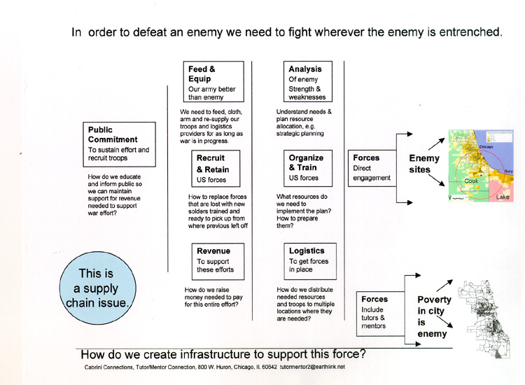
I've posted dozens of article on the Tutor/Mentor blog that focus on planning and leadership and many include the graphic at the right, which is from a presentation titled "War on Poverty".

A similar process needs to grow in America, where the maps above are used and are filled in with information showing that the elected local and national representatives are voting to enact radical changes in American gun laws, for the welfare and safety of the American people.

When we have the needed votes, we'll get the laws we need.

Update 2/19/18 - NPR article shows gun legislation voting records for every House and Senate rep from all 50 states.  click here

Update 2/19/18 NY Times article - Thoughts and Prayers and N.R.A. Funding - click here

Update 2/19/18 - GunControlNow - this site is collecting information on state-by-state basis. Looking for volunteers to help. See info they have for Texas.

Update 12/11/18 - Victims of Gun Violence - Philadelphia - this web site and map show shooting victims in Philadelphia

Update 5/2/2022 - Mapping Gun Violence, Brookings Metro article. click here

I'm on Twitter @tutormentorteam. I look forward to talking with you about the way I see maps being  used.

If you like what I write about and value the web library I host, please go to this link and send a small contribution. I'm paying all of my expenses from what I can raise.

Thursday, February 8, 2018

Understanding DACA, Immigration and Importance to America

This is one of many interactive maps that can be found on the web site of the USC Center for Study of Immigrant Integration (CSII).

Browse this section of the Tutor/Mentor web library to find many articles related to law, poverty, racial justice, etc.