Showing posts with label media. Show all posts

Sunday, June 28, 2026

I started using maps in 1993.

This blog was created in 2008 by Mike Trakan, a newly hired map maker, to show the work he was doing for the Tutor/Mentor Connection in Chicago.  I've been the one posting here since mid 2011.

A few years ago I posted an article on the Tutor/Mentor blog that featured the concept map shown below. 


Please take time to read the article, and dig through the many other articles I point to.   


If it makes sense to you, help me find benefactors who will establish a Tutor/Mentor Connection study/action program on one or more college campuses, where student/faculty/alumni manpower will re-build the mapping capacity and apply all of the strategies I've piloted for the past 30 years, to reach more k-12 kids in high poverty areas with support that helps them move safely through school and into adult lives with jobs that enable them to raise their own kids free of the challenges of intense, segregated, poverty.

Connect with me on Twitter, Facebook, Instagram and/or LinkedIn (see links here). 

Help me keep this strategy on-line. Visit my "fund T/MI" page at this link. 

Wednesday, March 25, 2026

Have you visited the ESRI GIS site?

I was able to obtain donated ESRI GIS software each year from 1995 to 2011.  Many of the maps that I show on this blog from 2008-2011 and earlier were created using that donation. 

ESRI maintains a huge on-line library of resources.  In this blog article ESRI introduces the most recent U.S. Census American Community Survey (ACS) which is available in the ArcGIS Living Atlas.


The direct link to the ACS Atlas Collection is here. 

I started using ESRI software in 1995 (When I say "I", I really mean volunteers and part-time staff made the maps under my direction.) Below is an example of how I shared these at every Tutor/Mentor Leadership and Networking Conference.


Below is a visual essay showing how I've been using maps and why.  Click here to open.


Is someone in your community creating maps like these and sharing them in their blog articles, newsletters and social media?  If yes, send me the link.

Thanks for reading.  Please connect with me on LinkedIn, BlueSky, Facebook, Instagram, Mastodon and/or Twitter.  Find links on this page. 

I depend on a small group of supporters for contributions that help me cover expenses.  If you'd like to help, click here.

Wednesday, November 9, 2022

New data platform focuses on Financial Health and Wealth data

If you skim through this blog you'll see that I'm sharing links to tools that communities can use to better understand where youth and families need extra help to share in the opportunities of America.

Below is an image from the Urban Institute's new dashboard which was introduced via a ZOOM event today.  View presentation slides.  A video of the event will be available shortly. 


View the dashboard at this link. One of the features of the platform is the ability to focus on small spaces, as low as the zip code level. 

I shared one of the slides with this Tweet, showing the type of stories that can be created. In doing so, and by writing this article, I'm demonstrating a practice I hope many will adopt. More people need to learn to tell stories using data platforms like this or some of those I point to from this concept map.


Use the data to create change.

In a 2014 Tutor/Mentor blog article I encourage schools and libraries to create programs that teach youth to tell stories using data and maps.


As media report incidents of violence, young people, volunteers and activist could use data platforms like created by the Urban Institute, to show some of the inequalities that contribute to a loss of hope and an embrace of violence.  

If these stories are told creatively, forcefully, and often enough, they can convince policy-makers and philanthropists to create new policies and programs that change these conditions.  

I urge you to take time to view the Urban Institute dashboard, and in a few days, view the video of today's ZOOM call, to see how panelist described how it might be used.

Thanks for reading.  

If you find this information useful, consider a contribution to help Fund Tutor/Mentor Institute, LLC. 

Friday, January 14, 2022

Using maps to drive resources to high poverty areas

 I started the Tutor/Mentor blog in 2005 and have posted 255 articles showing uses of maps. If you look at some of these printed newsletters you'll see that I was putting maps in stories back in the 1990s.

This MappingforJustice blog was started in 2008 and until mid 2011 shared maps created by the Tutor/Mentor Connection to draw attention and resources to volunteer-based tutoring and/or mentoring programs in high poverty areas of Chicago.  I took over the blog in mid 2011 when I launched the Tutor/Mentor Institute, LLC and have continued to share maps made using the Chicago Tutor/Mentor Program Locator (now an archive) and maps made using platforms hosted by others.

There are so many stories on these blogs that it's difficult for people to find an overview that they can understand.  Thus, I recently began aggregating a few articles around different topics on my Wakelet account.  Here's one focused on using maps:


While most of my maps created up till 2011 focus on Chicago I point to platforms that can be used to create map-stories focused on any part of the United States.  

With this in mind, use my articles as templates for creating your own stories and try to mobilize public awareness and a flow of resources into all high poverty areas of your own community.  More stories written by more people, built greater public awareness, understanding and motivation.

Share your articles on Twitter and tag me at @tutormentorteam so I can reTweet them.

Thursday, November 18, 2021

MapsCorps - another data source

I've used this blog for more than 12 years to show uses of maps in stories that attract attention to important issues and to places where people need extra help from volunteer-based tutor, mentor and learning programs and much more.

Here's a resource to add to your collection.  I've known about MapsCorps for a couple of years but had not seen their community mapping pages.  

If you go to https://mapscorps.org/ and scroll down on the home page you'll see this map of Chicago.


Next click on any of the Chicago community areas shown in red to open a map focused specifically on that area. I clicked on Washington Park, which is just West of Hyde Park on Chicago's South side.


The community area is shown and you can zoom in and out to get a closer look.  On the left side bar are categories of information shown on the map.  I opened the "childcare and schools" category, then clicked on each category to see what would show on the map. When I clicked "other" the Chicago Youth Programs site was shown.  The pop-up provides an address and phone number but not a link to the website.  

Open each of the community areas and you'll find a similar map, but different information will be shown. It's a great resource. I just wish they had a category for "tutor/mentor" program, and that more of the programs operating in the city were showing up on the maps. 

If you use this resource, along with data from other platforms (see this article, and others like it on this blog) you can build an understanding of community needs, available  youth serving organizations, and assets in the area who might provide volunteers, technology, ideas and dollars.

All of this can be included in blog articles, videos, PDF presentations and more, with a goal of supporting existing programs and helping new ones grow where needed.

I learned about this resource in a webinar hosted the the To&Through Project. In the Tweet below you can find a link to the video and learn about this, and the map resources provided by LISC Chicago.
Universities and high schools should be teaching young people to create such map stories and show how they need to be repeated over-and-over for many years in order to build attention and convince leaders to provide the needed resources to the neighborhood. 

A blog like this one, and the Tutor/Mentor blog, which I started in 2005, should be found on various websites in every community area of Chicago, its suburbs, and in other cities. Note that I've written these for more than 12 years and have led the Tutor/Mentor Connection since 1993. Until others build and sustain such a long-term commitment and consistent flow of stories too few will respond to the needs of kids and families in each area where map indicators show there is a need.

It's the only way we will ever cut through all of the noise and attract needed attention and resources to high poverty areas of Chicago and other cities.

I'm on Twitter, LinkedIn, Facebook and Instagram.  Find links here.  Let's connect.


I'll be 75 this December.  You can support my work by making a small contribution. Visit this page. 

However, what's more important, is that someone from one of Chicago's universities steps forward to take ownership of my archive so it remains available as a teaching tool and inspiration beyond my own lifetime. A wealthy donor could make that happen.  

Tuesday, November 9, 2021

Using data from multiple platforms

 Below I'm showing some data platforms that I've seen recently which show indicators of need for extra support of youth living in high poverty areas.

University of Chicago To&Through Project released a new report showing CPS students' enrollment patterns and high school/college outcomes by the community area in which they live. Click here to view the report.   At the same time a data platform was created to help people use the data.  Below is an image showing one page on this platform.


Follow @UChiToThrough on Twitter and see how they are helping people understand what's available and how to use this tool.


Next, view this report showing schools that include Computer Science Education. Below is a screenshot from a section of the data tool showing the Illinois 7th Congressional District.   


Next, look at the Chicago Public Schools locator platform. Below is a screenshot from that platform that I used in this blog article, to show assets in the neighborhood around different schools who could be helping school and non-school programs help kids. 


After posting this article I attended a ZOOM meeting where the Chicago Community Data Portal was introduced. Below is a screenshot from that.


These are just four data platforms that are available to advocates and planners who want to focus on specific areas within large cities like Chicago. There's a load of data in these portals. Take the time to learn what's available and ways to use it.   

Open this concept map and view other platforms that can be used. 


This data can help people understand where kids and families need extra help but will be of little value if more people don't use the data tools to create stories that attract the attention of policy makers, donors, volunteers, business leaders and others who need to be involved helping programs grow and schools improve.  Those stories need to be launched over and over in order to attract attention and motivate changes in habits.

What this requires are efforts that "influence" what others do.  The graphic at the left is used in several articles on the Tutor/Mentor blog to show that we need to influence resource providers, not just program leaders, youth and parents.  Here's one example.

Get involved!

This blog was started in 2008.  The Tutor/Mentor Blog was started in 2005. The Tutor/Mentor Intern blog was started in 2006.

Review the stories posted over the past 13 to 16 years. They are examples of the type of stories others need to be posting regularly, and for as long, in order to capture attention, mobilize resources and do the work needed to help kids move from poverty to jobs and careers.

If you appreciate these articles, consider a holiday contribution to help me fund this work. Click here. 


Saturday, April 24, 2021

Chicago Philanthropic Initiative Using Maps

If you skim through articles on this blog you'll see that I've piloted uses of maps to guide the distribution of resources to youth programs in high poverty areas of Chicago  since 1993.

The Tweet posted below points to a WBEZ article pointing to The Mapping COVID-19 Recovery Project, a collaborative effort of 25 major Chicago foundations, nonprofit organizations, and public and private groups.


WBEZ is doing some outstanding mapping. It's an example of what's possible if you have the talent and dollars needed to create the maps and share them via various media channels.  I encourage you to read the report, visit the Recovery Project website, then help draw attention to the places where the maps show people need extra help.

Friday, July 20, 2018

Elections coming - Vote for People Using Maps in their Leadership

Il 4th Congressional District
The Tutor/Mentor Connection started using maps in 1994 to help leaders understand where non-school, volunteer-based tutor, mentor and learning programs were most needed, and where existing programs were located.

This blog was created in 2008 to share maps that we were able to created between then and 2011.

 I've encouraged politicians to use maps since we launched this strategy.  Sadly, I've never seen this happen consistently.

Yesterday I had another opportunity, when I had a brief discussion with a leading candidate for the Illinois 4th Congressional District election in November.  Above is a map of the district. Below is one of many presentations I've created showing uses of maps:


See more articles and ideas for using maps on this page of Tutor/Mentor Institute, LLC web site. 

Browse past articles on this blog and the Tutor/Mentor blog to see ways maps can be embedded into stories.

Help me keep the Tutor/Mentor Institute, LLC resources and stories like this on line. Make contribution using PayPal form on this page. 

Interested in helping me rebuild and update this resource? Introduce yourself with comment or connect with me on Twitter @tutormentorteam or on Linkedin.

Thursday, May 3, 2018

America: More Diverse. Still Segregated

Map from Washington
Post,
5/2/18
This map shows segregation in the Chicago region and is part of an extensive article titled: Segregation Map: America is more diverse than ever, but still segregated",  in the May 2, 2018 Washington Post. click here

This is not a new issue. I've been adding stories about racism and segregation to this article and this section of my web library for many years.

The Washington Post article draws it's data from a new book titled Cycle of Segregation, written by Kyle Crowder and Maria Krysan . Here's an interview on WGN Radio with one of the authors.

The challenge continues to plague Chicago and other parts of the country. It's a complex problem and as Maria Krysan said in the Washington Post article:
We don't have the integrated social networks. We don't have integrated experiences through the city. It's baked-in segregation,” Krysan said. “Every time [a person] makes a move [they’re] not making a move that breaks out of that cycle and making a move that regenerates it.”
 I've supported well-organized, volunteer-based tutor/mentor programs for more than 30 years because these programs are integrated social networks connecting youth and families from inner city neighborhoods with a mix of volunteers from many different parts of Chicago, many different business backgrounds, and many faith, age and racial backgrounds.


While I've led the Tutor/Mentor Connection since creating it in 1993, few leaders have adopted the strategies I've shared and/or made consistent, long-term commitments to helping this type of program start and grow in all high poverty areas of the city and suburbs. Furthermore, of the nearly 200 youth serving organizations I point to on this list, very few show a strategy and theory of change that describes their program as a social network connecting youth in poverty to people, experiences and opportunities beyond.

Next week The Chicago Community Trust will host it's annual On The Table event, where people from throughout the region gather in small groups to discuss issues important to them, and to Chicago. 

My hope is that many of these groups will use maps like I share and point to on this site, and discuss ways they and people they know can build a better understanding of the places and problems of racial segregation in the Chicago region, then map out strategies and action steps that people can take daily to try to close the gaps.


Thursday, February 22, 2018

South Side Weekly (Chicago) - Event Map

Here's another example of effective  use of maps.  This is the South Side Weekly's Event Map. 

I encourage you to take a look at the Chicago tutor/mentor programs map that I created in 2016 (and the Program Locator, created in 2008 and the Program Locator search screen, created in 2004).  My maps are not showing programs as clearly as the South Side Weekly map shows event locations. 

Due to technical difficulties (and lack of money) the Program Locator has not been updated since 2013.

I keep searching for tech volunteers/partners (or donor/investors) to help me upgrade the map platforms the Tutor/Mentor Connection launched on line starting in 2004. 

Want to help? Contact me on Twitter @tutormentorteam or on Linkedin.

Sunday, January 14, 2018

Police Shootings in Cook County, IL - Interactive Map

BetterGov.org web site
The Better Government Association and WBEZ have been following police shootings in Cook County suburbs and reporting this in a TakingCover series of articles. Their focus is on "How Cops Escape Discipline For Shootings in Suburban Illinois."

One data resource is an interactive map that shows locations of shootings and provides details. The screen shot at the left was created by zooming into one part of the map then clicking on one of the yellow dots. In this case, I'm looking at the South Suburban area around Harvey, IL.

While I'm interested in this topic, I'm more interested in helping people in communities with high poverty, poorly performing schools, too few jobs, and too much violence and police shootings, have a system of youth and family support services that help shrink the negatives by creating more paths to high school graduation, jobs and careers.

More specifically, I've been trying to help well organized, mentor-rich, non-school tutor, mentor and learning programs grow in high poverty areas. Site based programs could be operating in faith based buildings, colleges, business sites and/or free standing locations. They could be hosted at public or private schools. I led one of these from 1975 to 2011, serving youth in the Cabrini-Green area of Chicago.

For this to happen, someone needs to take the lead, then begin mobilizing others, who will help start and sustain needed programs.  Using maps in stories that are presented via social media, YouTube, face-to-face presentations, etc. is one strategy to help do this. I've been piloting this for 24 years and keep trying to motivate others to adopt the same tactics.

I created the Tutor/Mentor Connection in 1993 to help non-school, tutor, mentor and learning programs grow in the Chicago region and started a survey in 1994 to locate existing non-school tutor/mentor programs in the Chicago region. I've been plotting this information on maps and sharing it via an Interactive Program Locator, a web list, and the map shown at this link. 

Since 1994 I've been using the database and maps to tell stories and generate public interest and involvement aimed at drawing needed resources to existing programs, or helping new programs form where more are needed.

At the left is a map view created by zooming into my map platform, to show the same area as the BetterGov.org map.  In this case, I don't find any organized volunteer-based tutor or mentor programs in the area.  That means people in this area are going to need to step forward and create programs,  hopefully borrowing from the ideas on my web sites. Here's a section focused on "how to start a program".

Lack of programs in the South Suburbs is not new information to me. In 2007 I hosted a Tutor/Mentor Conference in this area and this article show our goal of mobilizing people to help programs grow.

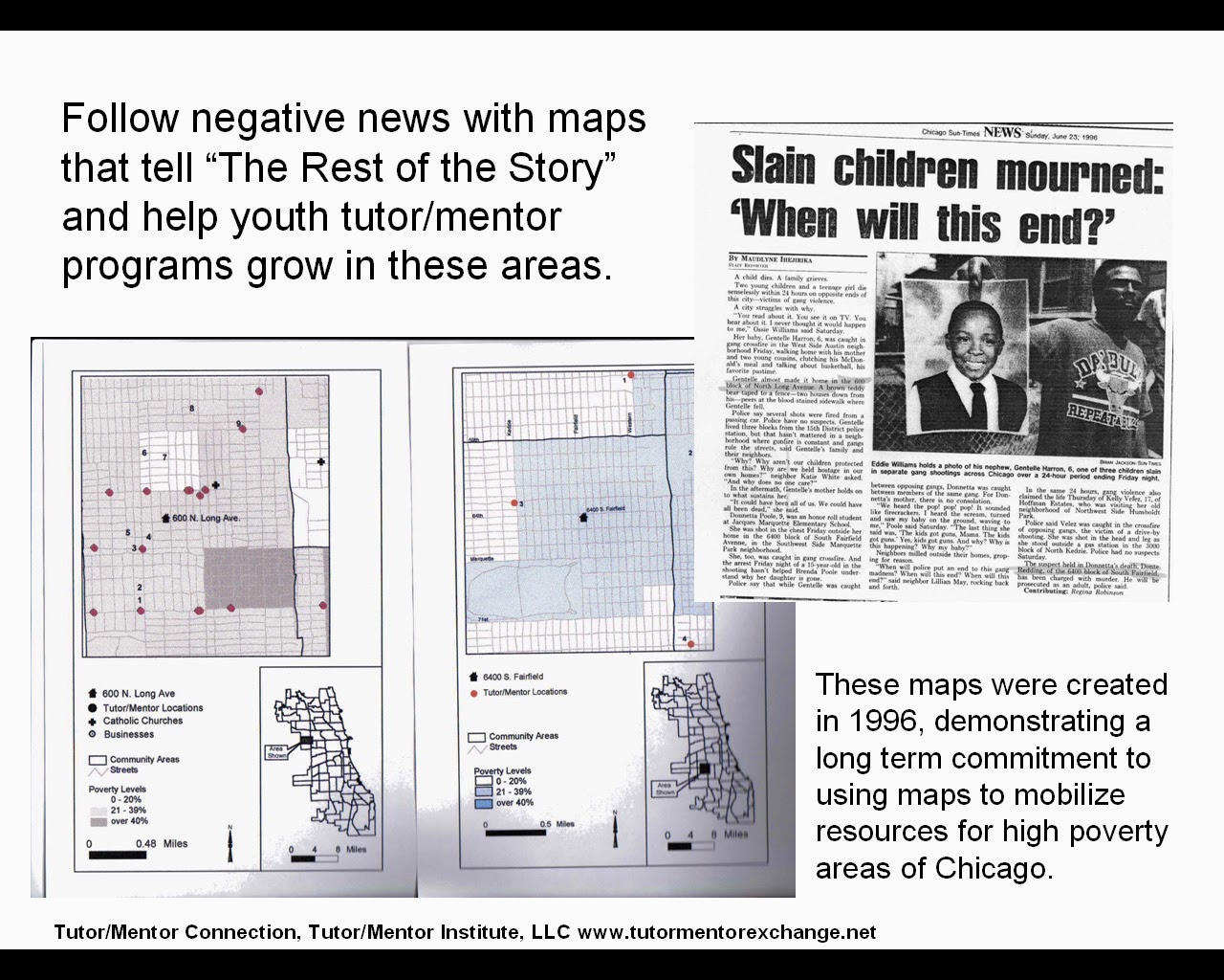
At the right is a map-story created in the 1990s before I had access to the Internet for sharing these stories.  Click on the image to enlarge. Then  you can see a Chicago SunTimes story of a shooting in Chicago and a map that shows where the shooting took place. You can also see a table showing existing tutor/mentor programs in the area, with additional tables showing some businesses in the same area. Finally there's a narrative that ends up calling on assets, political leaders, media and others to help support existing programs in the map area, or help new programs form.

I've been repeating this type of map-story for many years, but my voice is too small, and I'm an outsider in these neighborhoods. If youth, volunteers, parents and community leaders learn to create these stories, and share them weekly, they can begin to draw together a coalition of people who will take the lead on building and sustaining needed programs.

view presentation

In 2008 the T/MC began building an interactive Tutor/Mentor Program Locator, with layers of information that could be used to create a story showing why help was needed, what tutor/mentor programs were in the area, if any, and what banks, hospitals, colleges, faith groups, etc were also in the area and should be taking a role to help build and sustain great programs.

This link points to a presentation showing "how to  use" the program locator to create map stories. 

Since mid 2011 the T/MC has been operated by the Tutor/Mentor Institute, LLC and I've not had the resources to continue updating the Program Locator platform. Thus, it's out of date.  However, it's a model for what could be created in Chicago or other cities, and how it could be used to create map stories that draw attention and resources to neighborhoods where bad things happen too often.

Furthermore, I've demonstrated on this blog, and many others on this site, that you can use data platforms created by others, such as the BGA and WBEZ to create map views which you then edit using Power Point or other tools to add additional information that shows why people should be helping tutor/mentor programs grow in this map-area.

While there are many examples of map-stories on this blog, here's a Nov. 2017 article that shows how one person is creating map stories and sharing them regularly on Twitter. 

Others can, and should, do the same. If I begin to see more map-stories in Tweets and Facebook posts that focus on helping build needed youth and family support programs in different parts of Chicago, the US or the world, I'll know that some people have read this story, or forwarded it to others.

Thank you to Joel Inwood of the ChiHackNight group for bringing the BetterGov.org map to my attention.


Thursday, June 8, 2017

U.S. Census Bureau - Learn to Use Its Data

This is a screen shot from a page on the ChicagoReporter.org web site, which makes U.S. Census Bureau data easily available.

This was just one of many resources that I learned about during last night's Chicago City Data User Group (#CCDUG) meeting at the Microsoft headquarters in Chicago.

Other resources were shared by participants in the MeetUP, using the #CCDUG  hashtag. Browse this thread and you can find more links.

I posted to Twitter my own long-term vision of sharing map-based data with this type of sophistication.

A couple of other links that were shared are:

The Space Informatics Lab (SIL) at the University of Cincinnati - click here

Census Explorer - click here

Census Business Builder - Regional Analysis Version - click here

Census Business Builder - Small Business Addition - click here

Below is a pdf created in 2009 to show how to use the Tutor/Mentor Program Locator to create map stories. The program locator is now out of date and needs updating. Imagine what I could do if I had the talent and resources to apply some of the mapping tools shown above to the work I've been trying to do since 1993.


If you can imagine this, and you understand the need and opportunity, and you have either the talent or the dollars, why don't you reach out and offer your help?  This can apply to any city in the world, so you can be located in any city and work with me via Skype or other on-line tools.  Let's connect.

Tuesday, May 2, 2017

South Shore Neighborhood Focus of Today's Tribune

Today's Chicago Tribune devoted two full pages to the changes taking place in the South Shore neighborhood of Chicago, and of how the violence is causing many young African American families to move out of the city, and often out of Illinois.

I've been using maps to focus attention and draw resources to high poverty neighborhoods since launching the Tutor/Mentor Connection in Chicago in 1994.  This map was created in 2009, following a shooting in the South Shore area and was included in this article, I hope you'll read it. I hope local leaders will also read it, and other articles I've shared in this and the Tutor/Mentor blog.

The ideas still apply.

At the right is a page from a 1990s edition of the Tutor/Mentor Connection printed newsletter. (see it and others here). I've been sharing ideas like this for more than 20 years, yet with too little support from business, political leaders, faith leaders and peers.

The appeal for financial support of the T/MC that was included in our 2009 article was not answered and since 2011 I've not had anyone on staff to create maps like this, or to update the interactive tutor/mentor program locator, which can also be used to create story maps.

As the Chicago media remind us daily, the problems that prompted me to create the Tutor/Mentor Connection in 1993 (and launching in January 1994) are still with us in 2017.  I'm just a lot older, and a lot poorer, and am now leading this effort via the Tutor/Mentor Institute, LLC, which is also not generating nearly the revenue needed to support this work in all the ways I describe in my past articles.

Thus, a month ago I posted an article about a "do-over",  inviting others to adopt and share ownership of the T/MC, using their own talents to lead it for the next 20 years...hopefully with greater impact and success than I've been able to provide.

I hope you'll take a look and share this with others who might respond to the invitation.

Monday, March 13, 2017

Follow up to negative news about violence, poverty

From Chicago Tribune, 3-12-17
In the 4-part strategy created by the Tutor/Mentor Connection in 1993 to support the growth of mentor-rich non-school programs in Chicago's high poverty neighborhoods, step 2 focuses on building public awareness and drawing needed resources to the youth organizations already operating in these areas.

Since T/MC had no money for advertising, other ways needed to be created to build on-going public awareness. The "Rest of the Story" strategy was invented for this purpose.  You can find examples of this in many past articles on this blog, and the Tutor/Mentor blog.

Following is an example.  The graphic above shows an article on the front page of the March 12 Chicago Tribune, telling the story of one young man living in the North Lawndale neighborhood of Chicago. The second part of the graphic is a set of statistics that was included with the article. The Tribune devoted 2 full inside pages to this story, and a commentary on page 2 of today's (March 13) paper.

Only briefly were non-school programs mentioned on Sunday.  No discussion was in the paper about what programs are available, are there enough, how to help them grow, etc. Thus, in a "Rest of the Story" article that would be the focus.

Here's a page from a 2011 presentation that shows the number of kids, age 6-17, below poverty line, in different community areas of Chicago. North Lawndale is at the bottom of the map, and has 4717 kids.  This map was created using the Tutor/Mentor Program Locator, created in 2008, but not updated since 2010, due to my lacking the funds or talent. Yet, it's still a usable tool. Click on green stars to see contact information and web sites of youth orgs in the directory.

T/MC surveys used in the 1990s to collect program information intended to create a more sophisticated understanding of program availability. Thus, on this search page, you're able to sort by type of program (pure mentoring, pure tutoring, or combination tutor/mentor) and by age group served (elementary, middle school and high school).  Using the map layers feature on the Interactive map, leaders could quickly see that there are too few programs serving older youth (and all youth, really) and a poor distribution of existing programs in many of the high poverty areas of the city.  I don't find this type of analysis anywhere on the Internet (If you know of others doing this, please share the link in the comments below).


Here's a more updated map and list of Chicago programs showing the North Lawndale area. Click on each icon to find the name of the organization.

My goal since 1993 has been to create a map platform that could be used to better understand the location and availability of non-school tutor/mentor programs in Chicago so leaders could help existing programs grow, and create new programs where needed, using the same strategies that corporate offices of large retail organizations use to make high performing stores available near potential customers.  I've never had the resources or partners to do this as well as it needed to be done. The service is still needed, in 2017, in Chicago, and in other cities.

In the asset map section of the Program Locator you can create map overlays showing banks, colleges, faith groups, etc. in different areas, such as North Lawndale.  At the right I'm pointing to another web site that enables users to see businesses in different parts of the city. In this case it is showing banks.

Since there are more than 4500 youth in the area who could benefit from non-school programs, and the map shows that many blocks have no programs, helping existing programs stay in business while helping new programs grow and reach more kids should be the focus of leaders in this area.  At the same time, helping programs learn from each other, and from programs around the world, so each is constantly improving it's ability to attract and retain youth and volunteer participation is also a goal. Several sections of the Tutor/Mentor library point to different types of youth serving programs that could be models for Chicago programs.


This information is intended to be used by groups of people in business, faith groups, media, colleges, non-profit networks, etc. to build strategies that fill the neighborhood with a wide range of birth-to-work youth support programs, supported by the different "assets" who are already located in the neighborhood.

There's a lot of information. Thus a learning process needs to be included as part of any support organization's strategy.

This is another map from the Program Locator, showing the North Lawndale community area, and showing faith groups and other assets. In this case, I've highlighted Ogden Ave, Roosevelt Road and the Eisenhower Expressway, which are three main roads bringing commuters from the suburbs through this neighborhood every day on their way to work.

Part of the effort to support the growth of youth programs in the area would be an on-going effort to motivate some of these people who "drive by poverty" to visit web sites and read blog articles like this, then join in efforts to help programs attract the ideas, talent and dollars each program needs to sustain it's efforts and constantly improve its impact.

I put these graphics in this SlideShare presentation so anyone could use this in an effort to mobilize and educate others. I've also drawn from a collection of strategy presentations in the Tutor/Mentor Institute, LLC library for this article.

On the Tutor/Mentor blog I've written a couple of articles recently inviting others to a "do over", using the ideas and strategies I've created since 1993 in a new organizational structure and effort that aims to have a much greater impact in the next 20 years than what I've had in the past 24 years.

I think many others could communicate ideas like this article better than I do. I invite you to "do it over", creating your own version, using your own talent, and reaching your own network of followers. Visit this page to see how interns working with me in Chicago have been doing this for many years.

It's not enough for the media to make us feel bad about young people living in poverty. They need to point us to information and strategies that motivate people who have the ability and resources to provide time, talent and dollars on an on-going basis to support the growth and long-term operations of needed birth-to-work support programs in every high poverty neighborhood of Chicago and other cities.

If the media don't do this regularly, it's up to us.

That's the goal of telling "The Rest of the Story" every time the media uses its space to attract reader attention to the problem.

Wednesday, June 22, 2016

Chicago. A Divided City


These maps can be seen in this article written by Greg Hinz, in the 6/13/2016 issue of Crain's Chicago Business.  

I wrote about this today in this article on the Tutor/Mentor Blog.

Saturday, June 4, 2016

Want To Reduce Violence, Inequality?

One of the challenges to solving complex problems is building and sustaining public interest and involvement. Most non profits, particularly smaller ones, don't have advertising dollars to use to attract attention the way most for-profit businesses do. Thus, one strategy piloted by the Tutor/Mentor Connection in Chicago, in the mid 1990s, is to create map-stories, that follow negative news, and point to places where volunteers and donors are needed to support tutoring, mentoring and learning strategies. I've modeled this by dozens of articles on this blog and the Tutor/Mentor blog. However, unless many others create their own map stories, and point links to me and others, we won't have the reach and frequency needed to build attention and motivate actions. Thus, this graphic is a reminder that you and anyone else can create and share similar map stories.
Here's a PDF essay that s hows how you can create your own maps.  If you're doing this, share your blog address in the comment section so that other readers can be inspired by the work you are doing. Below you can see another map created by the Tutor/Mentor Connection in the mid 1990s with text that shows how we have been trying to use maps to draw support to tutor/mentor programs in high poverty areas of Chicago.  It's a strategy that can be duplicated in any city.


Here's another PDF essay, showing how you can create map stories following stories in local media that are drawing reader attention to problems caused by high poverty and too much inattention from people who don't live in poverty.

If you're a writer, artist, or YouTube creator, I encourage you to hack my articles and create your own interpretations, sharing them with me, and with your own network. 

Note: Since 2011 the Tutor/Mentor Connection has been operated as a program of the Tutor/Mentor Institute, LLC.  


Wednesday, December 23, 2015

Chicago Most Segregated City in US - Brooking.edu

I included this map from a Brookings.edu article in a story I posted here in May 2015. 

Today I received another article from Brookings,edu, under the headline "The Most American City: Chicago, race and inequality". 

I have started using an annotation tool to highlight and comment on articles like this. Here's the link to the annotated version.  

The writer finises with a comment saying, "The broader tragedy of Baltimore, of Ferguson, of Chicago, is that black and Hispanic Americans in the poorest areas of our cities have such bleak prospects. The danger is that once the media bandwagon has moved on, these structural inequalities will remain."  

The strategies I've launched since 1993, through the Tutor/Mentor Connection, have aimed to keep attention focused on issues like this, even when the media are not paying attention.  Read stories on this blog and the Tutor/Mentor Institute, LLC blog, to see how I've been doing that for the past 10 years. 

Wednesday, July 15, 2015

Mapping Philanthropy - Combining data

For the past few years I've been using this blog to highlight mapping platforms hosted by others, in addition to showing how GIS maps and concept maps can be used to communicate ideas and mobilize resources.

Today I read an article in the Chronicle of Philanthropy that used two different data sources to create a map showing different levels of philanthropic giving in every county in the USA. One set of data came from a How America Gives map, created by The Chronicle. The second map, was created by the Opportunity Index. By combining data from both maps, a more comprehensive picture of giving was created. Visit the site and read the full story. Share with your friends on social media so more people take a look at this.

As you look at these maps, look for ways to recruit teams of students, volunteers and professionals who will create map stories that focus attention on specific neighborhoods of where the need for philanthropic support is greatest. In the Tutor/Mentor Connection Map Gallery, we've posted some map-stories created in past years, as examples of the type of stories that need to be written over, and over, by many different people, but for the common purpose of generating more consistent, on-going and flexible support for volunteer-based tutoring, mentoring and learning programs operating in different neighborhoods of Chicago and other cities around the country (world).

Thursday, February 19, 2015

Teens using maps --- in 1997 Presidents' Summit Publication

This is the back page of an 8 page newsletter that I picked up while attending the 1997 Presidents' Summit for America's Future event in Philadelphia. I was a Chicago delegate, and my organization, the Tutor/Mentor Connection (T/MC), was one of 50 Teaching Examples with booths at the Summit. I was hoping this event would launch a wave of reinforcements (talent, dollars, ideas, etc.) to support site based tutor/mentor programs in Chicago and other cities, as well as intermediaries like the T/MC who were collecting and sharing information, and organizing events, intended to draw these resources directly to tutor/mentor programs.

I tried to find this organization on the web site, but it no longer exists, at least under this web address. The organization supporting this effort is TeenInk.com, which you can find here.

As you can see from this graphic I've been collecting information about Chicago tutor/mentor programs since before 1995, and have been using maps to show where existing programs are located as well as where more are needed, for just as long.

I've yet to see the President, Mayor, national leadership groups like America's Promise, etc. use maps consistently and for the purpose of drawing resources to places already operating, so each could constantly improve. Below is one of several illustrated essays I've created to show how leaders can, and should, be using maps. I sat next to General Colin Powel in a small Chicago meeting in 1997 or 1998 and tried to put some ideas about mapping in his hands at that time. Unfortunately, another leader (and former General) snatched the info from him. I doubt that he ever saw it.

No General Goes to War Without a Map by Daniel F. Bassill

If you're a leader, I encourage you to use maps in this way. If you lead a youth serving organization, or youth publication, encourage your teens and volunteers to create stories using maps, and calling on resource providers to fill high poverty areas with needed volunteer-based tutoring, mentoring and learning programs, as well as the talent, dollars and technology each program needs to operate, and constantly improve.

I'm looking for partners, sponsors, volunteers and a wide range of help to update my own mapping platform since I'm no longer operating as a 501-c-3 and have yet to figure out a business plan to generate revenue to support this work.

Here's the front cover of the publication that I point to above.

Five Presidents were featured and pledged to help the most at risk kids in America get mentors and find safe places to learn, play and connect during non school hours. Too bad none of them, or Presidents elected since then, have done this consistently, nor used maps in their own efforts to mobilize resources to support youth serving organizations.

Monday, May 26, 2014

Create Map Stories following Negative News

Throughout this blog and the Tutor/Mentor Blog I show how maps can be created to focus attention and resources on places in Chicago where bad things are happening to good people.

Maps can be created using the Tutor/Mentor Program Locator, or by using other map resources, such as this homicide map hosted by the Chicago SunTimes.

If you browse this blog you'll see other mapping platforms that can be used to create images for blogs and social media articles. These are tools that youth and adult volunteers could use in creating map stories that leverage the attention created by traditional media coverage of negative news. 

Such stories, if repeated over and over, could begin to motivate adults in different parts of the Chicago region (or in other cities) to provide the on-going flow of resources that are needed to create mentor-rich programs and learning opportunities for K-12 youth in neighborhoods where lack of opportunity contributes to lack of hope, which contributes to many of the negatives that are reported too often in the media.

See this album for map stories from the 1990s and this Map Gallery for stories from between 2008 and 2011.

If you're already creating map stories for the purpose of drawing resources to neighborhoods, point to this list of Chicago tutoring and/or mentoring programs as you call on leaders to provide resources so your stories are helping existing programs grow.

Share your stories with me on Twitter @tutormentorteam or on Facebook in this group.