This map is one of a series of maps that I found in an article titled "The Storefront Index, on the CityCommentary web site. The maps were also described in this Washington Post article,
In articles written between 2008-2011 on this blog, such as this, you can see the Tutor/Mentor Connection's efforts to show business locations in different parts of Chicago, who are assets who could be helping tutor/mentor programs grow in areas around each location. I've not found a web site mapping business sites, so this one is possibly a valuable tool for those creating map stories like I do.
Update: 4/28/2016: The Washington Post hosts an article showing winners and losers in the US Housing market, using maps to help build an understanding on a city-by-city basis and emphasizing the unequal impact on minorities vs Whites. See story.
All of the articles on this and the Tutor/Mentor blog aim to support the growth of non-school programs that connect urban youth with workplace volunteers.
I encourage you to spend time browsing past articles. See how concept maps are used to show strategy, and emphasize the need for long-term, on-going, flexible funding of youth serving programs. See how GIS maps focus attention and resources on all high poverty areas of the Chicago region, not just a few high profile places.
I've been building a database of Chicago non-school tutor, mentor and learning programs since 1993 and use maps to show where these programs are located. Below is an example from a map platform, showing how you can zoom into the map and look at a specific part of the neighborhood.
While I've been hosting an interactive Chicago Program Locator that can be used to create map views, I've also been pointing to platforms hosted by others. Below I'll point to the Community Commons platform and compare it to the Program Locator.
Faith groups in entire Chicago region.
These two map views show faith groups who could be leading strategies that engage the resources of a faith group in support of tutor/mentor and learning programs in different high poverty neighborhoods. This PDF outlines a strategy I've been sharing with faith leaders since the late 1990s.
Faith groups on Chicago's West Side
This shows how you can zoom into maps on interactive platforms, to get a closer view. The Program Locator includes features that show zip code, community area and legislative districts. The Community Commons platform has a feature for adding legislative district boundaries.
Others who could be helping - Program Locator feature
These two map views show the West side of Chicago. One shows poverty overlays. Both include green stars indicating locations of tutor/mentor programs in my database. Put the mouse over an icon and get the name of the organization. Double click and go to their web site.
The map on the left also adds information showing businesses, colleges and hospitals in the area, who should be serving as anchor organizations and leaders in on-going efforts to help the neighborhoods have a full range of world-class quality tutor/mentor programs.
On both of these maps you can see additional information that has been added by pasting the map image into Power Point, then adding additional information, such as additional locations of tutor/mentor programs, or data showing the number of high poverty youth living in each community area.
Birth to Work Tutor/Mentor Programs needed in every poverty neighborhood
This concept map is part of a series that I've summarized on this article. It shows that at each stage of life young people need a full range of supports in order to move more successfully, and safely, to the next stage, GIS maps should show if such supports are available....and in every high poverty zip code.
This concept map is a model. Each node should point to a directory of web sites, like this, showing organizations that provide that service in one, or many, neighborhoods. If that information were plotted on poverty maps, leaders could begin to better understand what supports exist, and which are missing. Leaders could begin to lead year-round marketing campaigns intended to draw visibility, volunteers and dollars to programs in each map area.
With the help of researchers and information collectors, and funders, such information could be made available, and kept updated on an on-going basis. In this article you can see how I've been reaching out to universities to encourage adoption of this strategy.
Here's one PDF essay focusing on information collection.
Getting the information, organizing it and making it available is just one part of a 4 part strategy that needs to be embraced by many leaders in every city. The concept map below illustrates these four strategies.
See this concept map described in this PDF essay. 1) Better information, 2) seen by more people, 3) understood by more people, 4) leads to more consistent support of organizations serving youth and families in high poverty areas, so each can grow to be great at what they do to help people climb out of poverty and into the American Dream.
Accountability Maps needed
Just mapping indicators showing places of need, mapping places where service is available is not enough. We also need to create maps showing who is coming together to find ways to solve these problems, and/or who is taking actions that make resources available in different neighborhoods. The map shown here shows participation in a past Tutor/Mentor Leadership and Networking Conference. You can clearly see that business, media, government, and philanthropy are not represented. Maybe they are meeting elsewhere. We won't know that unless organizers create participation maps like this. Read this article about mapping events and this article about mapping philanthropy to learn more about this part of the strategy.
I don't find many other web sites where leaders are outlining their strategies, using maps and visualizations, the way I have been doing for nearly 20 years. If you know of such places, please share the link and make an introduction. If you see the value of the ideas I'm sharing then adopt them, and lead them, or offer your time, talent and dollars to help me keep this available to Chicago and other cities.
Today Congresswoman Robin Kelly hosted a press conference, announcing an #Urban Progress initiative. Here's one of many tweets from that event, which includes photos of the high profile people who spoke.
I hope some of those leaders will view this and other articles I've written and duplicate what I've been doing for the past 20 years, to achieve a problem that still persist because too few have a deep commitment and a day-to-day map-based strategy, to draw people from the entire village together, and to mobilize needed resources for each high poverty neighborhood of Chicago and other big cities throughout the country.
If you look at the mission for the Tutor/Mentor Connection (T/MC), formed in 1993, and Tutor/Mentor Institute, LLC, formed in 2011, it says "gather and organize
all that is known about successful non-school tutoring/mentoring
programs and apply that knowledge to expand the availability and enhance
the effectiveness of these services to children throughout the Chicago
region."
That's what I've been focusing on for the past 23 years. In doing so, I've gathered information that focuses on the resources needed to enable high-impact tutor/mentor programs to be available in more places. I've also built a library of links pointing to ideas about process improvement, collaboration, innovation, creativity, knowledge management and visualization. These represent skills that need to be learned, if we're going to do all we need to do so that great programs are not only available today, but are still available 10 or 15 years from now...with a growing network of students and adult alumni who are living lives free of poverty because of the long-term support they have received.
Understanding the flow of philanthropic dollars is essential. Below are three map images, pointing to three web sites where maps are being used in creative ways.
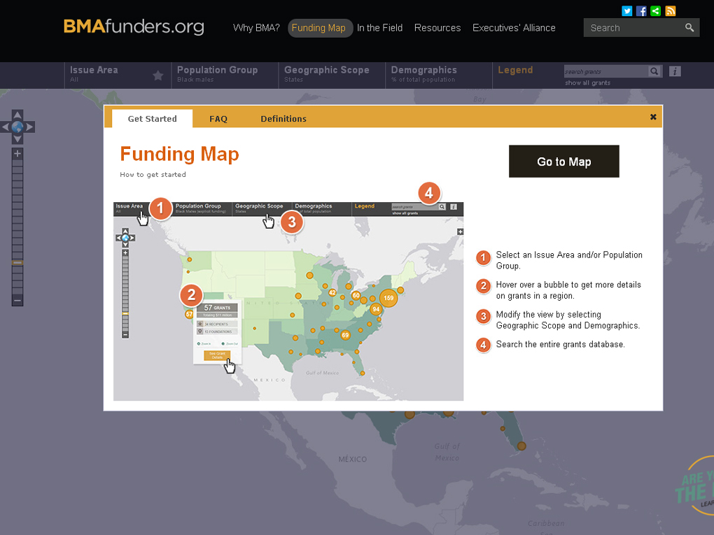
BMA Funders Map - Shows philanthropic support for organizations serving Black Male Youth and Adults. Sort by category, and zoom in to focus on different cities. Click on the yellow bubble and get detailed information.
Learning by Giving Foundation grants map.Since 2003 this foundation has partnered with colleges and universities around the country to teach philanthropic habits to students, who then raise money to support different non-profits. In the drop down menu you can sort by cause, college, year of donation, etc. Using the map you can zoom into different cities to see who was funded, and by what university.

Chronicle of Philanthropy map of on-line giving. I wrote about this last November. The image below was created by zooming into the Chicago region, then clicking on the 60623 zip code. The pop-up menu shows donations for an entire year (in this case March 2015-March 2016) and donations by category. This does not show the individual organizations receiving donations, but aggregates on regional levels. It enables a comparison of giving in different parts of the city, which quickly shows that high poverty neighborhoods receive less than more affluent areas. Note: this is not inclusive of all on-line donations, but only those made through Network for Good.

The last map is a map view created using the Chicago Tutor/Mentor Program Locator, which was launched by the T/MC in 2008, and which I've tried to keep available since 2015, via the Tutor/Mentor Institute, LLC. This first view shows the entire Chicago region, with overlays showing poverty areas, homicides in 2010, and locations of non-school tutor/mentor programs (green stars).
This second map is also from the Program Locator, but shows how you can zoom into the map to look at a smaller section of the city, as small as a few square blocks. On this map an overlay shows poorly performing public schools, with different color flags for elementary, middle and high school (from 2008).
Browse through maps shown on this blog and on the Tutor/Mentor blog, or the map gallery, and you can see dozens of maps created between 1994 and 2011, using the Program Locator or our desk top GIS work station.
These maps illustrate the T/MC goal of collecting information that shows where non-school tutor/mentor programs are most needed, based on indicators such as poverty, violence, poor schools, etc. They also show what programs exist (based on surveys done since 1994) so that a) parents, volunteers and social workers can find programs; and b) so that leaders at the neighborhood and city level, including the business community, can build strategies that help existing programs get the resources they need to grow, while helping new programs form where more are needed.
There's more I've wanted to do. I'd like to be able to gather information on donations, as an overlay on this map, so leaders could see where more funds need to be distributed. In addition, I'd like to create an overlay that enables crowdfunding for the individual organizations shown on the map, and that collect information showing funds raised. This also would be used to try to influence greater giving in underfunded areas.
So far I've not found others who are creating map-directories for this purpose, although there are a growing number of organizations creating maps showing organizations in their networks (see list). In addition, I've not found platforms that map philanthropy, including maps showing a) indicators of need; b) existing providers; c) areas where more programs are needed.
I've never had consistent funding, or more than a few dollars to build the database, build and update the maps, create map stories, and use them to build public awareness, or to train others to use the program locator to create their own maps.
Yet I continue to share this with the goal that volunteers and investors/benefactors will come forward to help me upgrade my own platforms and share it with others so this strategy is applied in every city, not just in Chicago.
If you'd like to learn more about this use of maps, click here, or email me at tutormentor 2 at earthlink dot net.