Showing posts with label violence. Show all posts

Friday, June 6, 2025

Chicago's Violence Reduction Dashboard

 A few days ago I watched an introduction to Chicago's Violence Reduction Dashboard which was created by the University of Chicago's Urban Crime Lab.  Below I'm showing a few images I made from the video. Click on the images to enlarge them.


If you scroll back through articles posted on this blog since 2008 you'll see my interest in maps, and how my organization created an interactive tutor/mentor program locator that plotted locations of Chicago volunteer-based tutor/mentor programs as overlays to demographic and crime data such as shown in these graphics.

The two images below show the data plotted on a Tableau GIS platform.  The first show the entire city and the second illustrates how you can zoom in to look at a smaller section.  The data sorts by zip code, aldermanic ward, community area, etc.


View the video below and you'll see how the above images are from the dashboard.


While this Mapping For Justice blog is fully focused on maps and visualizations, the Tutor/Mentor blog shows uses of maps as part of the larger strategy of helping kids in high poverty areas that I launched in 1993, and have supported through the Tutor/Mentor Institute, LLC since 2011.  Here's one example.

I wish I had this type of functionality in the 1990s and 2000s!   Over a period of 16 years I mixed together volunteer and paid talent to create maps and map-stories intended to show where volunteer-based tutor/mentor programs were most needed in the Chicago region and why.  By 2009 when the interactive Chicago program locator was built the financial crisis had hit and we lost our funding and ultimately the capacity to continue to update the program locator and create map stories.

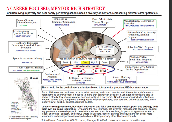
The concept map below shows my 30 year history of using data maps. You can find the link to it in this article.


This graphic visualizes my goal in using maps and it's one I hope others who now have this capacity will adopt.


Creating data dashboards that help people understand the distribution of problems within a big city like Chicago and keeping those updated is a huge challenge.  However, unless layers of information are added that show organizations working in different places who are constantly looking for volunteers, donors, talent, technology and ideas to do good work, the maps are not connecting "people who can help" with "places where help is needed".

They are missing a big opportunity to be part of the solution.

And if this role is not taken by many leaders there will always be a few great organizations in a few places, but too few great organizations in all the places they are needed, because of the competition for scarce resources.

Below is a concept map that I created to show layers of information that I'd love to see on these data maps, along with strategies that get more people to view and use the information. See it in this article


In mid 2011 when I created the Tutor/Mentor Institute, LLC in order to keep the Tutor/Mentor Connection available in Chicago. As I wrote above, I lost the funding and capacity to continue building and maintaining my own program locator.  However, in the 14 years since then I've pointed to data platforms built by others that could be used to create map stories that draw volunteers and donors to tutor/mentor programs in high poverty/high violence areas of Chicago and other places.

I hope you'll take a look.  I hope donors will provide you with the funding to build and maintain this capacity.  


There's too much information on my blog and website for a quick review. Unless someone keeps referring to the information, they way college students review course material, or faith group review religious texts, too few people will build the understanding needed apply the ideas I'm sharing. 

That's why I keep encouraging wealthy donors to fund the creation of Tutor/Mentor Connection-type programs on college campuses, where my archives can serve as study material, intended to build the new leaders needed to build the technology and apply these ideas.

Thanks for reading.  Please share this with your network and connect with me on LinkedIn, Facebook, BlueSky, Instagram, Mastodon and Threads (see links here). 

If you value what I'm sharing and are able, please visit this page and make a contribution to help fund my work. 

Monday, August 2, 2021

How Many Youth Programs are Needed?

Last week I posted two articles on the Tutor/Mentor blog that included the maps I'm showing below.  These show 15 Chicago community areas with high levels of shootings and homicides, considered 'high priority' by the Chicago SunTimes

I've combined the community area maps created by the SunTimes, with maps from the Tutor/Mentor directory to show the same  neighborhoods, locations of existing non-school, volunteer-based, tutor and/or mentor programs, and the number of high-poverty youth, age 6-17, in the area.

Here's an example: North Lawndale is on the far West side of Chicago and 4178 low income youth, which is 61% of the total youth population in that area.  

The green icons of the Tutor/Mentor map are youth programs in the Tutor/Mentor Institute, LLC's directory. (see map here). While there are seven programs, they are on the edges of the community area, except for the Better Boys Foundation (BBF Family Services).   We don't know how many youth each existing program serves, nor the age groups they serve, but if each served 100 kids weekly, it would mean 700 out of 4178 had access to a non-school tutor and/or mentor program.

Here's another example:  This shows Englewood, on the South side of Chicago, West of the Dan Ryan Expressway.  Click to enlarge the map.

The goal of creating these maps is to stimulate planning teams that help existing programs each get the operating resources needed to continue to serve youth and (hopefully) constantly improve, based on what they can learn from each other. At the same time, planning teams should identify where more programs are needed, and work to fill those voids.  


This should be happening in every community area of Chicago, as well as in Chicago suburbs and other cities.

Take a look at the two articles on the Tutor/Mentor blog. July 29 and August 1.

Since the mid 1980s I've seen stories of violence in Chicago, followed by editorials saying "demand something" or with quotes by parents saying "we need more youth programs for these kids".  Yet, there's never been an on-going, map-based planning process, intended to fill high poverty areas with a wide range of youth tutor, mentor, learning and jobs programs.


Unless that changes, it's likely the violence will continue.

If  you're using maps for this type of analysis or interested in learning more you can find me on Twitter, Facebook, LinkedIN and Instagram (see links here).   Let's connect.  

Tuesday, February 26, 2019

The Politics of Englewood

This is a  map of the greater Englewood area of Chicago, taken from a Southsideweekly.com article titled Without Representation: How Englewood got mapped into pieces.

I drew the line down the middle to show how the Englewood and West Englewood community areas are dividied.

I've posted a number of articles featuring Englewood, on the tutor/mentor blog.

Here's one from 2009, under  headline of:

Chicago Kids Victims of Neighborhood Violence


I encourage you to read the feature article of Sunday's Chicago Tribune, titled Innocence in Peril, which shows the tragic impact of violence and drugs on kids living in the Englewood neighborhood of Chicago.

 Then I encourage you to use the interactive tutor/mentor program locator to zoom in on the Englewood neighborhood (zip code 60621) and learn about existing volunteer-based tutoring /mentoring programs, or other youth organizations that provide some form of tutoring for kids in these areas.

This is map of Englewood from Tutor/Mentor Program Locator

 When you look at this, don't think of tutoring or mentoring as a simplistic strategy that cannot overcome the complex, deeply rooted poverty, segregation and racism in Chicago. Think of this as a strategy that connects adults, businesses, faith groups and other resources beyond poverty, in long-term personal connections which transform the volunteers and what they are willing to do to help kids and families.

 If we don't increase the number of people beyond poverty, who get involved with as much commitment as they would to help their own kids, we'll never have the dollars and political will-power to change the systems of support for kids living in poverty.

 As you use the interactive map, you can create overlays showing faith groups, businesses, universities in the area who could be helping tutor/mentor programs grow. You can also look at the highways that bring working people from the suburbs, through these neighborhoods every day. Look at the faith groups on the suburban end of these highways, and think of them as partners who could be educating their members to use this information, and their resources, to help tutor/mentor programs grow in poverty neighborhoods.

Visit the Tutor/Mentor Institute to learn more about strategies that readers of this Tribune story might learn so that they are more of the solution, than a drive by reader.
-----------------------------------------

In November 2015 I wrote another article, titled "Using Maps in Long Term Planning" and showed how an area where two shootings took place had multiple layers of political representation. 

The ChicagoSouthsideweekly.com article shows how this dilutes accountability, and may be contributing to the lack of progress on some of these issues.

I've been using maps to tell stories and draw resources to high poverty neighborhoods since 1994. Browse through sections of this blog, and the Tutor/Mentor blog, to see many of these.

If you value this work, I could use some help, with contributions, to keep on doing it. Click here if interested.

Friday, June 22, 2018

Maps for Planning - Use Multiple Sources

Since 2008 articles on this blog have shown my uses of maps to help fill high poverty areas with youth serving organizations that include volunteer based tutor and/or mentor components. I started using maps for this purpose in 1993.

In many of the articles posted since 2011 I've shown map platforms hosted by other organizations in Chicago and in other cities.  Some contain different information, or present the information in different formats, than what I've done. 

I encourage people to learn to use these multiple platforms in their own map-stories and planning strategies. Here's an example.  The image below contains three maps showing the West side of Chicago and the Austin neighborhood.


The  infographic on the left, with a map showing the Austin neighborhood, and its location in Chicago, can be found on the Strengthening Chicago Youth web site. 

If you open the link above you will find a page listing all 77 Chicago area community areas, with an infographic like these for each area.  Shown are Austin and North Lawndale. Click on the graphic to get an enlarged version.

Open the Projects & Resources page of the SCY site and you'll see that the infographics are part of a set of actions intended to bring people together and try to develop strategies that reduce violence in Chicago.  I attend the quarterly meetings and get their monthly newsletter.

The other two maps shown above are from my collection. This map is from a pdf presentation showing the number of high poverty youth, age 6-17, in each community area on Chicago's West side. Austin and North Lawndale are at the far left.

This map was created using the Interactive Chicago Tutor/Mentor Program Locator, so it includes green stars indicating the location of non-school, volunteer-based tutor/mentor programs. On the interactive map you can zoom into an area as small as a few blocks and click on the green star to go directly to that organization's web site.*

The third map is also from the Program Locator, but I've added on a photo from an August 2017 Chicago Tribune article, reporting on a shooting that took place on the West side of Chicago. I put that map in an article on this blog. 

For this map story I used the asset map section of  the Program Locator, which enables me to show faith groups, banks, hospitals, universities and drug stores in the map area. These are people who need to be strategically involved in helping youth programs and anti-violence solutions grow. 

I share my blog articles in a monthly email newsletter which I send to people at SCYChicago and many other groups, with the goal that they will borrow some of my ideas to help draw attention to the same issues that they focus on.  I also show links to SCY and many other Chicago organizations in my newsletters and the Tutor/Mentor web library.

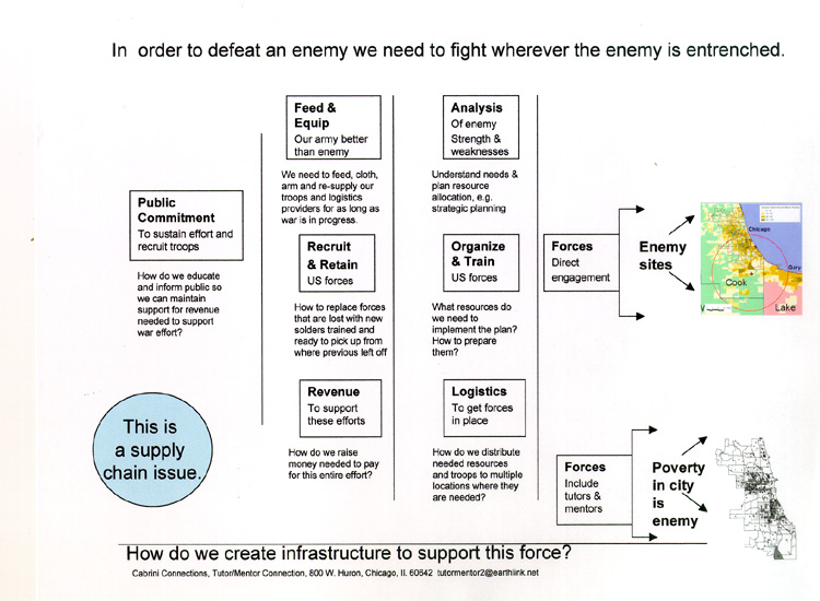
The goal is shown by this planning graphic:


If someone is collecting information showing existing service providers as well as assets in an area, then anyone can use that information to invite people to connect in face-to-face and/or on-line gatherings.

If we can encourage growing numbers of people to use maps in bringing people together and drawing attention and resources to solutions needed to reduce violence and poverty by helping more kids go safely through school and into adult lives and jobs, we can make Chicago and other cities a better place for everyone to live and raise their families.

While I've posted stories on this blog since 2008 I have also posted related stories on the Tutor/Mentor blog since 2005.  Spend time browsing through the archives. You'll find  many ideas that you can apply to change the future.

Let me know if you'd like to know more about these resources.  I'm on Twitter @tutormentorteam

* Due to a lack of funds and talent the Tutor/Mentor Program Locator has not been upgraded since 2011 and program data has not been updated since 2013.  

Thursday, February 15, 2018

Building Political Power to Enact Gun Laws in America

Another school shooting tragedy has hit America and my social media feed is full of anger at elected representatives who have done nothing over the past 20 years to make America safe again. Below is a map I found today showing school shootings since 2013.

Associated Press map - find it here
I looked through my files and I've several maps showing shootings and gun violence in America. Below is a map from 2013, showing "Gun Deaths Since Sandy Hook"


Since the second map shows outlines of all 50 states you could do a count and see that 10 to 12 states have far fewer gun deaths and school shootings than other states.  If you did the political math this would mean 20 to 24 Senators (less than 25%) might firmly oppose gun legislation because it's not a big issue in their states.  If you added up the number of Representatives in the House from those states the percent would be far below 25% since these are low population states  (and it's likely that some of the gun violence is in the big cities in these states, which means their representatives should be pro gun law voters).

So what's the problem?  Why aren't elected representatives in these other states where there is a clear problem of gun violence, doing something to change this?

A few years ago I created a pdf presentation that showed how maps could be used in a campaign to get the needed votes in the state legislature to enact effective high-school drop-out prevention strategies.  You don't  need 100% of the votes. You need 51% (or maybe 61% to over-ride a veto).

That's true at the national level too.

I've posted dozens of article on the Tutor/Mentor blog that focus on planning and leadership and many include the graphic at the right, which is from a presentation titled "War on Poverty".

A similar process needs to grow in America, where the maps above are used and are filled in with information showing that the elected local and national representatives are voting to enact radical changes in American gun laws, for the welfare and safety of the American people.

When we have the needed votes, we'll get the laws we need.

Update 2/19/18 - NPR article shows gun legislation voting records for every House and Senate rep from all 50 states.  click here

Update 2/19/18 NY Times article - Thoughts and Prayers and N.R.A. Funding - click here

Update 2/19/18 - GunControlNow - this site is collecting information on state-by-state basis. Looking for volunteers to help. See info they have for Texas.

Update 12/11/18 - Victims of Gun Violence - Philadelphia - this web site and map show shooting victims in Philadelphia

Update 5/2/2022 - Mapping Gun Violence, Brookings Metro article. click here

I'm on Twitter @tutormentorteam. I look forward to talking with you about the way I see maps being  used.

If you like what I write about and value the web library I host, please go to this link and send a small contribution. I'm paying all of my expenses from what I can raise.

Monday, September 18, 2017

Mapping Terrorist Attacks Around World

This is another ESRI story map, showing terrorist attacks around the world in 2018.

Teams of students, volunteers and researchers in US cities could create similar maps to show neighborhood violence and the availability (or lack) of  youth jobs, tutoring and mentoring support services.

Monday, August 14, 2017

Violence on doorstep of Church in Austin neighborhood

While social media rages against the violence in Virginia, my Monday Chicago Tribune reminded me of another act of violence that took place yesterday in Chicago, when two men were gunned down right in front of the Friendship Baptist Church in Chicago.

I have written often on this and the Tutor/Mentor blog about violence in the Austin neighborhood, using maps to encourage businesses, universities, faith groups and others to work collectively to build a first-grade to careers support system that provide hope and opportunity and competes against gangs and their influence

The daily newspapers provide just one more reminder of problems that won't go away unless many more people give time, talent, dollars and votes over many years to address the root-causes of these problems.

That's true for racism, fanaticism, fascism and other problems we face in America and the world.

Friday, September 30, 2016

Rising Crime and Declining Population - an analysis

Today I found two articles on the Metropolitan Planning Council web site that focus on crime rates in Chicago and declining population.

Sept 14 - Data Points: Are crime and population loss connected in Chicago? - click here

Sept 29 -  Data Points: How Chicago's crime rate and population change stack up against other cities - click here

Sunday, June 5, 2016

Most Dangerous Cities in America. Look at the maps

This May 2015 story shows the 20 most dangerous cities in America, and includes a map of each city showing the highest crime areas in each city.  While Chicago gets a huge mount of media attention for it's violence, it is not on the list of top 20.

I've shared information about the Tutor/Mentor Connection with people in cities on this list, starting in the mid 1990s, with the goal that other cities adopt the T/MC strategy.  These include Rockford, Milwaukee, Detroit and Indianapolis.

Between 2000 and 2004 I developed a relationship with leaders at IUPUI in Indianapolis, that aimed to fully duplicate the T/MC in that city.  IUPUI never found the money to do that, but a show of their commitment was the hosting of an on-line conference (2004 or 2005) to parallel a Tutor/Mentor Leadership and Networking Conference in Chicago, and the rebuilding of the http://www.tutormentorconnection.org web site in 2005 by members of their technology department.

This strategy is still available to these and other cities. You can browse through my web sites and borrow the ideas. You can assign student research teams to dig into the sites and report what I'm doing that could be duplicated. You could hire me as a consultant.

You can do all three.


Tuesday, March 1, 2016

Chicago Shootings - Use Map to Mobilize Resources

In the articles on this blog and the Tutor/Mentor blog I repeatedly show how maps can be embedded in stories that show what happened, where it happened, and what people can do to help prevent it from happening again in the future. Below is an interactive map, hosted on the DNAinfo web site, showing shootings in Chicago since January 2010. 


Use this and other interactive mapping platforms to show areas of Chicago where high concentrations of poverty lead to a multitude of problems and where volunteer, donor and public support are needed to help residents overcome those problems.

Using the Tutor/Mentor Program Locator, created in 2008, people have been able to zoom into neighborhoods, build overlays showing poverty, tutor/mentor programs (if any) and assets who could be helping programs grow in the area. 

While the Program Locator is not updated due to financial challenges, this "how to create a map story" guide, can still be useful, showing how map stories can be created using any of the data platforms that are now available. 

If you're creating stories using maps, post a link to your stories in the comment section below. 


Saturday, November 21, 2015

Using Systems Thinking to understand & respond to Terror Attacks

I've pointed out  uses of concept maps on this blog and written a few articles about Systems Thinking on the Tutor/Mentor blog.  Today I was introduced to a page on the Know-Why-Net web site that is mapping a " Systemic view on terror threats after the 2015 Paris attacks."  Click the link .  

Know-Why-Net before. This visualization of the terror threat and response is just one of many visualizations on the site. I encourage you to visit and build your own  understanding of these tools.

Friday, October 2, 2015

Mass Shootings vs Urban Violence

Yesterday's mass shooting in Oregon has led to a wave of new stories showing mass shootings in the US, prompting front page headlines. At the same time, constant violence is generating front page headlines in Chicago. Are these the same? Should they be discussed in one big conversation? Or are there different root causes, which need to have in-depth conversations? What information is available?


My Facebook and Twitter feed are full of stories about the mass shooting in Oregon, pointing out how this has become an epidemic across the USA. A few sites are using maps to show where these incidents have taken place. This Mass Shootings in US since 1966 report is one. Here's an analysis of data on this map, from the MotherJones site.

Here's another site with a good analysis of mass killings. Note that both of these map analysis reports do not focus on gang involved shootings/killings. I looked for maps showing gang involved shootings in the US. Here is a WBEZ map analysis showing gun violence in Chicago from 2002-2012. Here's another site that seems to include both mass killings and gang related gun violence across the country.

If you are motivated to get more involved, visiting these sites, then inviting friends, family, etc. to also visit the sites, would be a good start.

While mass shootings hit randomly in different towns/cities, they do not occur daily in the same town/city the way shootings do in Chicago and other cities., While access to guns is a common factor, root causes and possible solutions may differ.

Can you point to web sites where these similarities and/or differences are being discussed?

I collect and archive information like this on blogs and in the Tutor/Mentor Connection web library so that others can read and begin discussion causes and solutions without needing to do the searching for articles.

I support volunteer-based tutor/mentor programs that engage adults who don't live in poverty because those adults are a form of bridging social capital that can open doors to aspirations and opportunities beyond what urban youth see modeled every day in their own neighborhoods. However, I also view these programs as a strategy for engaging adults who don't live with the same daily challenges, such as daily shootings that terrorize even those who are not the targets. Unless we find ways to engage more people on a personal, self-interested level, I don't think we'll ever generated to public will to build sustained, long-term solutions to urban poverty, and urban violence.

I think the mass shootings plaguing the country have a different root cause, and possibly, a different set of solutions. What they have in common is an easy access to guns and ammunition. Take that away and the conversation is different.

Sunday, September 20, 2015

Chicago Shooting Victims - Map

View this map on the Chicago Tribune web site to see where shooting victims are concentrated in Chicago. Use other maps on this blog to see where poverty is most concentrated, and to create map stories showing the link between high poverty and high violence. Then use the ideas shared on the Tutor/Mentor Institute, LLC site to build strategies that make hope and opportunity more available in each of these neighborhoods.

Monday, May 26, 2014

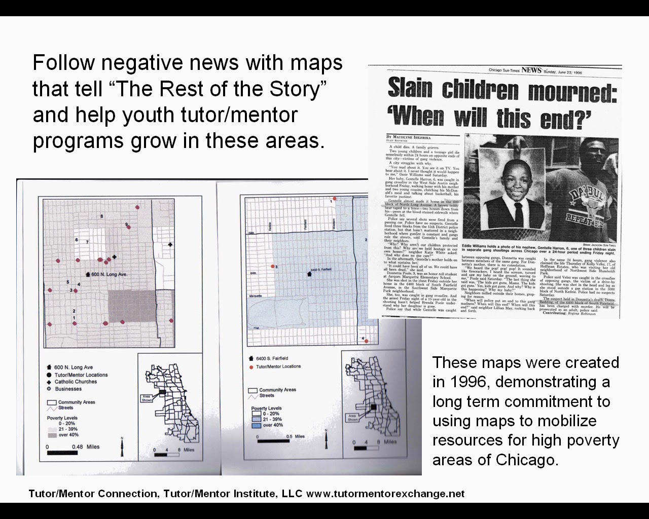
Create Map Stories following Negative News

Throughout this blog and the Tutor/Mentor Blog I show how maps can be created to focus attention and resources on places in Chicago where bad things are happening to good people.

Maps can be created using the Tutor/Mentor Program Locator, or by using other map resources, such as this homicide map hosted by the Chicago SunTimes.

If you browse this blog you'll see other mapping platforms that can be used to create images for blogs and social media articles. These are tools that youth and adult volunteers could use in creating map stories that leverage the attention created by traditional media coverage of negative news. 

Such stories, if repeated over and over, could begin to motivate adults in different parts of the Chicago region (or in other cities) to provide the on-going flow of resources that are needed to create mentor-rich programs and learning opportunities for K-12 youth in neighborhoods where lack of opportunity contributes to lack of hope, which contributes to many of the negatives that are reported too often in the media.

See this album for map stories from the 1990s and this Map Gallery for stories from between 2008 and 2011.

If you're already creating map stories for the purpose of drawing resources to neighborhoods, point to this list of Chicago tutoring and/or mentoring programs as you call on leaders to provide resources so your stories are helping existing programs grow.

Share your stories with me on Twitter @tutormentorteam or on Facebook in this group.

Saturday, February 15, 2014

Creating Map Stories Following Negative News

This album shows some of the map stories created by Tutor/Mentor Connection since 1993 as part of a strategy intended to increase attention on volunteer-based tutoring/mentoring as a strategy for engaging more adults in a wide range of long-term efforts to help kids stay safe in non-school hours, expand their social capital, and keep moving through school toward jobs and careers.


Find more photos like this on Tutor/Mentor Connection
In this blog, the Tutor/Mentor Blog and the Tutor/Mentor Institute,LLC site you'll see numerous examples of maps included in stories.

In this article we describe how youth from many different schools, non school programs, colleges and faith groups could create their own map-stories, focusing on their own school neighborhood or community.

If you are already applying these ideas please share your web address so we can point to you and learn from you. If you'd like our help in developing this strategy, introduce yourself.

Thursday, February 6, 2014

Map Directory update by Intern

In 2008-2009 I was able to build an interactive Chicago Tutor/Mentor Program Locator Map/Directory that could be used by leaders in Chicago to help build and sustain mentor-rich, non-school tutor/mentor programs in high poverty neighborhoods. This image was created by combining layers of information showing poverty, poorly performing schools, existing programs and community assets, like banks then zooming in to show a specific part of Chicago.

We ran out of money in 2009 and have not been able to update the technology, or the content, in the years since then, except for keeping the information about tutor/mentor programs (the green stars) current.

One section of the Program Locator focuses on Assets, such as banks, insurance companies, faith groups, colleges, hospitals, etc. who could be strategically involved in supporting the on-going operations of tutor/mentor programs in sections of the city where they have facilities.

When we built the Program Locator in 2008-9 we included locations of eight banks. Since then some have expanded, and some have gone out of business, such as Park National Bank. Since I was not able to update the program locator myself, we've had to live with this outdated information.
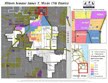
I've had interns from Illinois Institute of Technology working with me for six week periods in Jan-Feb and May-June since 2006. On this page you can see work they've done to communicate strategies via various visualizations.


One of our Jan-Feb 2014 interns volunteered to look at the Program Locator, and after three weeks he has updated the Banks section, adding six additional banks and replacing Park National with one more.

Now when you look at the Banks section of the asset maps you'll see a much richer range of banks. I hope that neighborhood groups and volunteer teams from the banks will use this information to bring together networks of business, non profit, educator, faith groups and other community assets and leaders to develop an understanding of the current level of tutor/mentor programs available in different neighborhoods, and to build on-going strategies to help existing and new programs constantly learn from each other and from effective practices around the world, so each program in every neighborhood of the Chicago region can be considered "world class" in helping kids through school and into 21st century jobs and careers.

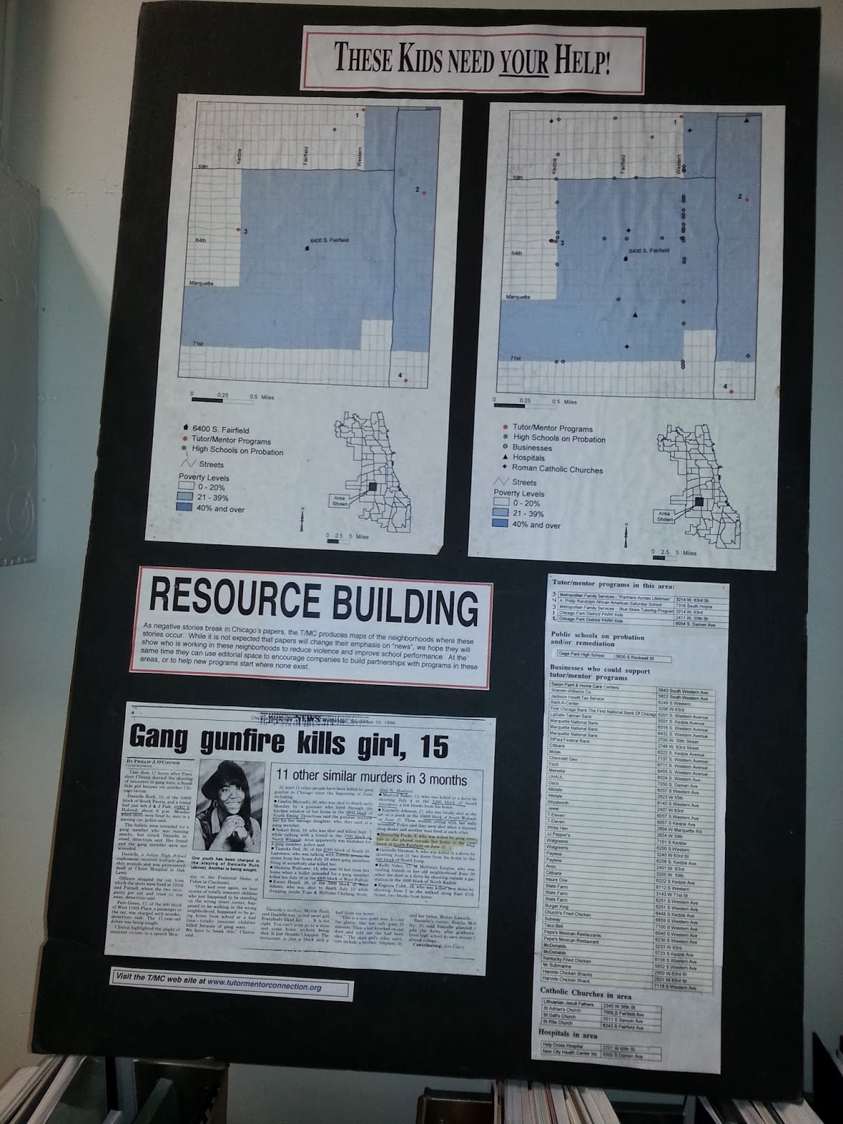
The purpose of the Interactive Program Locator is that when bad things happen in a city neighborhood, and get feature and editorial attention in the major newspapers, a map can be created showing where the incident happened, and showing businesses, hospitals, faith groups, etc. in the neighborhood who should be working together to make mentor-rich non-school tutoring, mentoring and learning programs more available in the neighborhood where the incident occurred, and in other neighborhoods with similar history. Until the interactive Program Locator was created in 2008-09 we were making map stories and displaying them like you see in this graphic.

If you're doing this work join us at the next Tutor/Mentor Conference to share what you're doing. If you're a business or volunteer who wants to support the Tutor/Mentor Institute, LLC's mapping strategies, introduce yourself on Twitter, Facebook and/or Linked in. Email tutormentor2@earthlink.net to offer your time, talent AND/or financial support to booster this effort.

Thursday, January 23, 2014

Using Maps and Media To Draw Resources to Neighborhoods

Today I posted a story on the Tutor/Mentor Blog showing how I've been creating map stories like this one since 1993, in an effort to build greater attention for tutor/mentor programs in neighborhoods where incidents of violence are highlighted in the media.

I've been doing map stories with the help of volunteers, and occasionally with paid staff, since launching the Tutor/Mentor Connection. Since I don't have advertising dollars, my strategy has been to follow news stories where violence, gangs and/or poorly performing schools have been giving front page, or major emphasis on inside pages of the Chicago Tribune or the Chicago SunTimes, which are the two major papers in Chicago, each reaching several hundred thousand readers a day.

If the media story builds public interest and a desire for readers to get involved, map-stories like these can tell "The Rest of The Story", which is what the media do not do consistently include in their stories. We can show indicators of why shootings are taking place, or why students perform poorly in public schools, and we can show if there are any non-school, volunteer-based tutoring and/or mentoring programs in the area around where the story took place. We can also show some of the businesses, faith groups, hospitals and/or universities that share the same geography, and who should be strategically involved in making high quality, constantly improving tutor/mentor programs available in these areas.

Youth in middle and high schools throughout the Chicago region, and in other cities could be creating these stories, and could be involved in collecting and maintaining information about non-school programs in different neighborhoods. This article and this article offer suggestions for getting young people involved.

See additional map stories here and in the Tutor/Mentor Map Gallery.

If you're implementing this strategy, share a link to your own blog articles and connect with us on Twitter or Facebook.

Wednesday, July 17, 2013

Mapping Chicago's Shooting Problem

This map is from an animated map story on the WBEZ web site. The maps show the distribution of gun violence in Chicago from 2002 through 2011 and changes in intensity in different parts of the city from year to year. I'd like to see stories that focus on gun violence include links to other stories and research that focus on poverty as a root cause. Using the interactive Tutor/Mentor Program Locator I created this image. If you compare the areas of high poverty to the areas of high numbers of shootings you see a correlation.
My goal is that leaders use these maps as a planning tool to build and sustain high quality, mentor-rich, non-school mentoring, tutoring, arts, technology and learning programs in high poverty neighborhoods. Reach young people young and provide supports and alternatives to gangs and dropping out of school and perhaps there would be fewer people willing to pick up guns and do harm to others as a result.

Sunday, March 24, 2013

Violence Hits Cities Hardest

These maps illustrate that the heaviest concentrations of gun violence are in big cities. The top map is from a March 22, 2013 Huffington Post article and the bottom is from the Maps of the World web site.

To me the maps illustrate the challenge we face in obtaining national political consensus on any type of gun control, or effective education policy. People in some parts of the country don't live with the same problems that people in other parts live with. Big city problems are far different than problems of smaller communities and rural areas. In a system where votes are tied to geography, getting enough votes to support policies important to one or another geographic regions requires compromise, or tremendous empathy, or both.

While we look for national compromise, I look to connect with people in big cities who have youth populations of 75,000 or larger, with concentrations of poverty isolated geographically and politically from the rest of the resources in their regions. If we can connect on-line and in face-to-face events we can talk in a common language, about common problems, and perhaps innovate ways to resolve these problems without dependence on national consensus.

Join me on Facebook, Linked in, the Tutor/Mentor Connection on Ning.com, or in the Tutor/Mentor Leadership and Networking Conference held in the spring and fall.

Or, invite me to places where you're bringing people from big cities together to innovate solutions to these problems.

Thursday, January 3, 2013

NYTimes maps murder sites in Chicago!

This graphic was part of a January 2, 2013 New York Times story about murder in Chicago. Does that make you feel good, fellow Chicagoans? I encourage you to browse past articles on this blog to see maps created by the Tutor/Mentor Connection over the past few years. If you compare the maps showing murders with the maps showing poverty and poorly performing schools, there is a correlation.
The maps I've created are part of a strategy. They are intended to show how community leaders, businesses, political leaders and others can support the growth of non-school tutoring, mentoring, arts, technology and jobs programs in high poverty neighborhoods. Such programs can combat offer alternative choices and support systems to youth in neighborhoods where often gangs are the only network available to youth. Maybe in a few years the NY Times and other metropolitan papers will be showing different maps, indicating the rich network of youth supports available in high poverty areas.