Showing posts with label datamaps. Show all posts

Friday, July 10, 2026

Check out this 3-D map of the USA

In this post on LinkedIn I was introduced to a 3-D map showing poverty/risks by county throughout the USA.  A view of the map is shown below. click here to open


One of the ways I've used this blog since 2011 is to show data mapping platforms created by other people and organizations.  Anyone can zoom into their own city/county and create a view that they use in a story intended to mobilize attention and resources to support problem-solving in the area shown on the map.

Below is a concept map that I created to share some of these platforms.  It has links to sections of my library that show even more uses of GIS maps, concept maps and visualization. 


Do you host a platform like one of these? Do you create blog articles using these data maps?  Please share links with me on LinkedIn or in the comment section of this blog.

Thanks for reading. Go forth and multiply.

Wednesday, March 18, 2026

Population & Households Data - Cook County, IL

My friend Layton Olson shared a link to the Cook County Community Data Snapshots on the Chicago Metropolitan Agency for Planning website.  Open the Dashboard and you can view the data at the county, municipality and Chicago Community Area levels.  

I open the Municipality page at this link.  You can use the drop down menu to pick a community in Cook County that you want to view.  You can also select for different types of data. I chose "Population & Households".   I'm showing three examples.

Alsip


Aurora


North Chicago


For each area selected you get a view like those I've shown.  It has a map of the community showing its location in Cook County.  And it has five visualizations of the data, showing Race & Ethnicity, Language spoken at home, if not English, Household size, Age cohorts, and Household Income.

Planners who are concerned about income inequality and the negative affects of high poverty can easily see what percent of people in each area have household income below $25,000 or ranging from $25,000 to 49,000.

These would indicate how many people in the community need extra support from public and private sector support.  I'd love to find a version of these maps, with overlays showing youth serving programs in the area, sorted by type of program, age group served, etc.

Ideally someone would create a tool to collect and sort information about non-school and school-based tutor, mentor and learning programs and show where these are located, using demographic overlays to show where they are most needed.

Oh. We did that. 

View this PDF essay to see features we built into the Chicago Tutor/Mentor Program Locator when we first put it on-line in 2004, then when we updated it in 2008. 


Then view this "everyone's a map-maker" essay to see how maps could be created and integrated into public education campaigns. 

Unfortunately, I was not able to keep the Program Locator updated after 2011 and on-line after 2018.  It's now only available as and archive that anyone can use in building their own version.

In one section of the Tutor/Mentor library I point to on-line directories that I've learned about.  One project any university might adopt would be to build a program locator for their city, then have students keep it updated and leading public awareness campaigns that draw parents, volunteers, donors, media, policy-makers, and other users, with the goal of helping existing programs support long-term involvement of youth and volunteers, while helping new programs form were more are needed.

Another project would be to build a library with links to Program Locator type directories in every city in the USA and the world. That would be an extensive resource!

I'd be happy to help any university that wants to take this role.

Thanks for reading. Please connect with me on LinkedIn, Facebook, Instagram, BlueSky, Mastodon and/or Twitter - see links on this page.

 And, if you want to help me keep hosting and sharing this information, visit this page and make a contribution. 

Thursday, August 28, 2025

Explore the maps. Create your own stories.

I've been using maps since 1994 to show where Chicago area kids need extra help based on the level of poverty and inequality in the areas where they live. This blog was created in 2008 to show maps my organization was creating. Since 2011 the blog has shared maps created using our interactive map-based Chicago Tutor/Mentor Program Locator. 

The Program Locator has only been available as an archive since around 2017, so the blog has been used to show data platforms hosted by others.  Below is a concept map showing some of the platforms found in this section of the Tutor/Mentor library.


On this concept map I've circled one node, titled "Education data".  Click on the small box at the bottom of the node and you see three links.  I opened the one titled "Education Opportunity Map".

This is the "Education Opportunity Project at Stanford University".  This page shows three projects. I chose the "Segregation Tracking Project" and opened the map shown below.


In the lower right is a legend. The green shading shows the level of White-Black Segregation between schools in each state, with the dark green being the most segregated.   The orange shading shows the percent of White Students in individual schools, with the darker Orange being the highest.

I zoomed in to the Chicago region, to the map-view shown below.  This map shows the level of segregation in individual schools.  Just click on any of the dots and a pop-up will show the name of the school and level of segregation.


I zoomed in as far as the site would allow.  The map below shows the South Side of Chicago.


The dark green background shows that this is a highly segregated area and the white dots showing individual schools, confirms that.

I've written about segregation several times in past years.  Open this link to find articles on this site, and open this link to find articles on the Tutor/Mentor blog. 

Now create your own map stories. 

Explore the data platforms shown on the concept map at the top of this article. Zoom into your own city, state and/or neighborhood.  Learn about needs and opportunities. 

Then brows my blog and use my articles as templates, to see how you might embed maps in articles and/or videos intended to draw more people to information about race, segregation and inequality, and to draw more people to organizations working with youth and families living in areas of persistent poverty.


Students in middle school, high school and college can learn to do this. At some point in the future every city should have at least one blog like this one, sharing datamaps and stories created by others, and drawing attention to places where people need extra help.

I've created many visual essays that show how maps and map-stories, created by many people, can have a huge impact on changing public policy and influencing the flow of needed resources into high poverty, highly segregated neighborhoods.  Here' one example

Find more like that in this collection

Thanks for reading. I hope you'll share this, and your own work.  Connect with me on LinkedIn, Twitter, Facebook, Instagram, BlueSky and Mastodon (see links here). 

I depend on help from a small group of donors to fund the work I'm doing.  Please visit this page and add your own support. 

Friday, June 6, 2025

Chicago's Violence Reduction Dashboard

 A few days ago I watched an introduction to Chicago's Violence Reduction Dashboard which was created by the University of Chicago's Urban Crime Lab.  Below I'm showing a few images I made from the video. Click on the images to enlarge them.


If you scroll back through articles posted on this blog since 2008 you'll see my interest in maps, and how my organization created an interactive tutor/mentor program locator that plotted locations of Chicago volunteer-based tutor/mentor programs as overlays to demographic and crime data such as shown in these graphics.

The two images below show the data plotted on a Tableau GIS platform.  The first show the entire city and the second illustrates how you can zoom in to look at a smaller section.  The data sorts by zip code, aldermanic ward, community area, etc.


View the video below and you'll see how the above images are from the dashboard.


While this Mapping For Justice blog is fully focused on maps and visualizations, the Tutor/Mentor blog shows uses of maps as part of the larger strategy of helping kids in high poverty areas that I launched in 1993, and have supported through the Tutor/Mentor Institute, LLC since 2011.  Here's one example.

I wish I had this type of functionality in the 1990s and 2000s!   Over a period of 16 years I mixed together volunteer and paid talent to create maps and map-stories intended to show where volunteer-based tutor/mentor programs were most needed in the Chicago region and why.  By 2009 when the interactive Chicago program locator was built the financial crisis had hit and we lost our funding and ultimately the capacity to continue to update the program locator and create map stories.

The concept map below shows my 30 year history of using data maps. You can find the link to it in this article.


This graphic visualizes my goal in using maps and it's one I hope others who now have this capacity will adopt.


Creating data dashboards that help people understand the distribution of problems within a big city like Chicago and keeping those updated is a huge challenge.  However, unless layers of information are added that show organizations working in different places who are constantly looking for volunteers, donors, talent, technology and ideas to do good work, the maps are not connecting "people who can help" with "places where help is needed".

They are missing a big opportunity to be part of the solution.

And if this role is not taken by many leaders there will always be a few great organizations in a few places, but too few great organizations in all the places they are needed, because of the competition for scarce resources.

Below is a concept map that I created to show layers of information that I'd love to see on these data maps, along with strategies that get more people to view and use the information. See it in this article


In mid 2011 when I created the Tutor/Mentor Institute, LLC in order to keep the Tutor/Mentor Connection available in Chicago. As I wrote above, I lost the funding and capacity to continue building and maintaining my own program locator.  However, in the 14 years since then I've pointed to data platforms built by others that could be used to create map stories that draw volunteers and donors to tutor/mentor programs in high poverty/high violence areas of Chicago and other places.

I hope you'll take a look.  I hope donors will provide you with the funding to build and maintain this capacity.  


There's too much information on my blog and website for a quick review. Unless someone keeps referring to the information, they way college students review course material, or faith group review religious texts, too few people will build the understanding needed apply the ideas I'm sharing. 

That's why I keep encouraging wealthy donors to fund the creation of Tutor/Mentor Connection-type programs on college campuses, where my archives can serve as study material, intended to build the new leaders needed to build the technology and apply these ideas.

Thanks for reading.  Please share this with your network and connect with me on LinkedIn, Facebook, BlueSky, Instagram, Mastodon and Threads (see links here). 

If you value what I'm sharing and are able, please visit this page and make a contribution to help fund my work. 

Tuesday, April 2, 2024

University of Michigan Poverty Solutions Data Maps

I've followed the University of Michigan Poverty Solutions account on Twitter (X) for a few years and have a viewed some of their live presentations. Below are screenshots from two resources I found on their site today.

Michigan  Poverty and Well-Being Map - open link


Multidimensional Index of Deep Disadvantage - open link


Both maps are interactive, meaning you can zoom in to small sections of the country, or the state. And you can click on an area and get data showing the level of poverty and/or disadvantage in that area. I encourage you to spend time learning to use these in your own advocacy.

I've added links to the University of Michigan Poverty Solutions site in this section of the Tutor/Mentor library. Take time to get to know these resources. Share them with your community. 

As I prepared to write this post I scrolled through this blog, looking at articles I had tagged "datamaps".

I encourage you to do the same.  You'll see many other interactive data platforms and maps. 

In many articles you'll see how I've used maps to call attention to areas where kids and families need extra help. Here's one example


There are a lot of resources mapping poverty but I don't find enough people using the maps the way I have been since 1994, to draw volunteers, donors and business investment into these areas and keep it there for many years.   

That's the only solution I know of.  It comes down to building and sustaining public attention and public will.  

I took this photo many years ago, as a reminder of what I needed to do daily, and what others also need to be doing.


I'm on many social media platforms. See links on this page. I hope you'll connect and post links to map-stories you are creating.

I also hope you'll visit my "Support Tutor/Mentor Institute, LLC" page and make a contribution to help me continue to maintain this library and share it daily with the rest of the world. 


Wednesday, February 14, 2024

Persistent Poverty in America

My Twitter feed brought a new report to my attention this week. It's titled "Persistently poor, left-behind and chronically disconnected" and was written by Kenan Fikri who I've been following for a while.  (I'll use Persistent Poverty to refer to this report in the rest of this article.)

The map below was what caught my attention.  It shows areas of concentrated poverty in six Ohio cities.

For the past 30 years I've used maps to focus attention on areas of concentrated poverty in Chicago. In this set of MappingforJustice blog articles, I show other cities with the same challenges.  In the 1990s a book titled American Apartheid: Segregation and the Making of the Underclass written by Douglas S. Massey,  addressed this same issue.

Below are a few passages from the Persistent Poverty article that I highlighted. (click to enlarge). Go to the report to read this in context.


The abstract shows a focus on social networks and social capital and says "these problems tend not to resolve themselves naturally".    The second shows that hidden in affluent Cook County are several clusters of persistent poverty census tracts.  Two with over 200,000 residents."

This is not a new problem. This 1994 Chicago Tribune front page pointed to some of the same high poverty areas as are shown in the Persistent Poverty report. 

I formed the Tutor/Mentor Connection in Chicago in 1993 (and Tutor/Mentor Institute, LLC in 2011)  to try to help volunteer-based tutor, mentor and learning programs grow in these areas as a strategy for expanding the networks of adults from beyond poverty areas who were helping kids through school.  I point volunteers and donors to these programs, through lists that I host on this page

In the Persistent Poverty report, one strategy was to expand networks of support and bridging social capital. 


This paragraph highlights the difference between "bonding" social capital which consists of strong ties between family, neighborhoods and/or church groups.  These are present in many high poverty communities.  What's not present are large doses of "bridging" social capital, which connect youth and families to people and opportunities and solutions beyond the place where they live.  

I've been writing about social capital on the Tutor/Mentor blog for many years. Add these articles to your research. 

The graphic below was created in the 1990s to show the design of the tutor/mentor program I led. It's a strategy designed to expand "bridging" social capital for K-12 youth and families in every high poverty area of Chicago and other cities with areas of concentrated poverty. 

The hub on this graphic represents a youth, a family, a school or a neighborhood. It shows a volunteer-based tutor/mentor program as a place that draws workplace volunteers from many different backgrounds to serve as one-on-one and group tutors/mentors to youth living in high poverty places of Chicago.  The timeline in the middle of the hub emphasizes the 20-plus years it takes to help each youth through school and into jobs where they can earn enough to raise their own kids free from poverty's challenges.  

The strategy I've emphasized has been to enlist leaders from every industry to use their own media, visibility and resources to draw volunteers and donors to tutor/mentor programs in all parts of a city, not just to one, or two, high profile programs. 

These two PDFs show this goal - Total Quality Mentoring  click here

Role of Leaders - click here

I've focused on cities because the geographic size makes it difficult for workplace volunteers to meet with kids during the school day, or right after school, because of the distance between work and program locations.  The after work and weekend hours are times when that volunteers is more able to stop at a neighborhood program and make an on-going commitment.

However, there are not enough long-term programs and there is inconsistent funding to build and sustain such programs.  Here's one of many articles where I focus on funding.  No solution will come without addressing the flow of dollars to these places!

However, as the map from the Persistent Poverty report shows, the problem of long-term poverty is not limited to cities and urban areas.


These two paragraphs emphasize the different history of places across the US and the lack of simple solutions.


Below is another graphic from my collection.  


It emphasizes the role each person can take to be part of a solution. If you've read this far, that means YOU!

Read the report. Here's the link again.

Update: I asked if there is an interactive map showing the Persistent Poverty data. There is. Follow the link in this post from Twitter (x): Using the interactive map you can zoom into the Chicago area, or any other place with high concentrations of poverty.  Look at it. Create your own map stories.

Then, share it with people in your network, so they read it and begin to think about roles they might take in helping more people become involved in efforts that make mentor-rich programs available in all of the high poverty areas shown on these maps.

3-7-2024 update - Here's another article using the EIG dashboards to understand t his data:  https://cityobservatory.org/a-yawning-chasm-patterns-of-neighborhood-distress-in-us-metros/

Then visit this section of the Tutor/Mentor library and read additional reports about poverty, race and inequality in America, that I've been collecting for more than 20 years. 


In last Sunday's Super Bowl a group spent millions of dollars to purchase ads talking about Jesus.   I wish someone were spending the same money talking about the research I've been pointing to and mobilizing people to be volunteers, leaders and donors supporting youth tutor, mentor and learning programs in all high poverty areas of big cities across the country. 

And building a similar research library showing the different challenges of rural areas, reservations, and other places where solutions may be different than for big cities. Then, drawing readers and planners to that resource so they develop solutions.

And that they do it consistently for the next two decades.

What do you think?  Connect with me on social media. (see links here)

Help me pay the bills. Make a contribution to Fund the Tutor/Mentor Institute, LLC. click here

Thursday, November 30, 2023

Explore STEM Visualizations for Stakeholder Conversations

Today I explored a robust data visualization site created by Argonne Labs in partnership with Northwestern University’s Digital Youth Network. The project is described on this page.   


Click on any of the green circles and you'll open data tables for nine communities on Chicago’s south side, cataloguing STEM assets from Kindergarten to career.  

2026 update - the links on the Argonne page no longer open, possibly due to restrictions by the Trump administration.  However, you can still view the interactive map, using the link below.

The nine focus communities are shown in the map on the home page.  Open this link and you'll find an interactive version.  Below are some map views that I created in just a few minutes.


Click on the "layers" tab and you will see a menu of choices for what you want to show on your map.  For instance.

This view shows community organizations in the area who offer various forms of STEM learning opportunities.  The orange circles show census data for each census tract in the nine community areas.


In the map view above I've clicked on an icon for the Chicago Youth Programs site at 5350 S. Prairie Ave.  You can see program information in the text box to the left of the map.  This is an organization I've know for many years and is also included in my list of Chicago area volunteer-based tutor, mentor and learning programs.

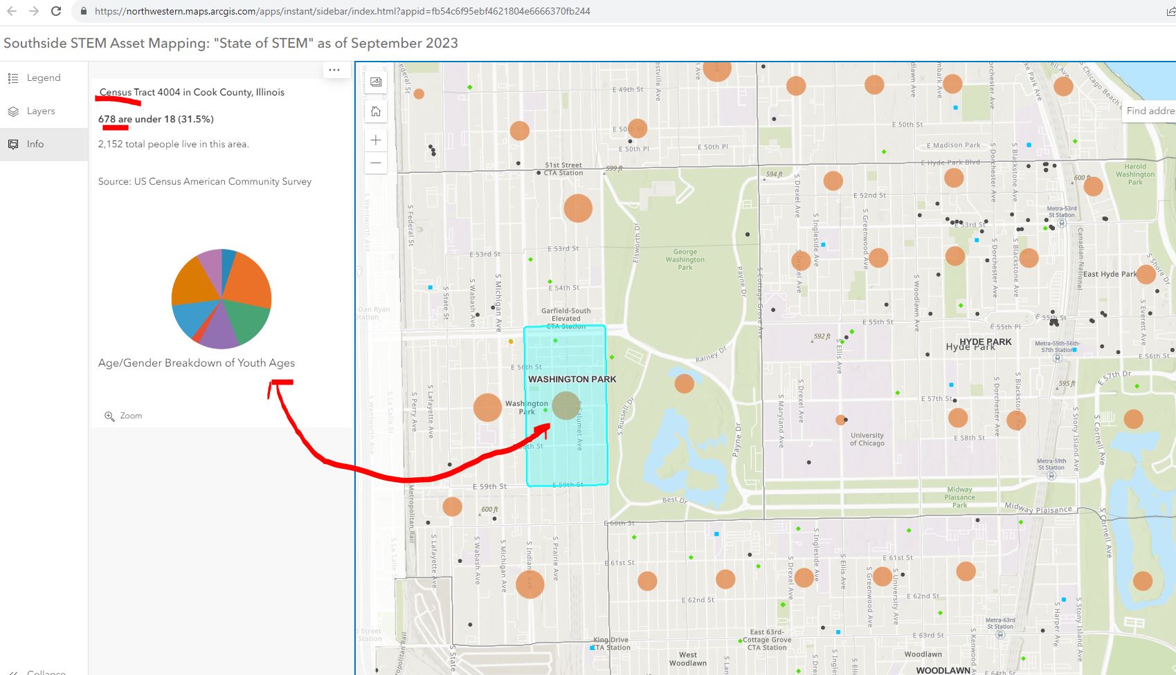
Below is a map view where I've clicked on the orange circle for the census tract with the Chicago Youth Programs location.  I asked for information showing the number of youth under age 18 in the area. The map shows 678 kids out of a population of 2152 in that census tract.


The next map view shows businesses, or potential employers, in the nine community areas.  Put your curser over any black dot and find information showing who that business is. Zoom in to see what businesses are in different census tracts. 


There is a lot to explore.  Here's an article about the platform, posted in the Block Club Chicago publication.

My question is, "How will it be used to make STEM learning and career opportunities available to youth through out the area?"  

I've met in the past two years with the people who created this platform and encouraged them to dig into the history of the Tutor/Mentor Connection and the tools and strategies we piloted from 1993 to 2011 to help volunteer-based tutor/mentor programs grow in the Chicago region.  This Mapping for Justice blog is a textbook for anyone who wants to use it that way. Just read some of the "strategy" articles. 

I started building a list of Chicago tutor/mentor programs in 1993 and at the same time began learning ways to use GIS mapping to show where the programs were located and where more were needed. We published our first Directory in May 1994 at the same time as we hosted our first networking conference.  We used the directory to launch citywide volunteer recruitment campaigns in August 1995.


In 2004 an intern from India built the first on-line Tutor/Mentor Program Locator, which was a searchable database shown below.  We had organized our annual survey in 1994 to learn who offers volunteer-based tutor/mentor programs, where they were located, what age group they served, and what type of tutoring and/or mentoring did they offer, as well as what time of day did they offer services.


The search fields on the Program Locator enabled people to search for specific programs based on the categories of our survey.  This worked like most search engines. If you had an idea of what you were looking for, and where, the platform helped you narrow your search and find tutor/mentor program information in that area.

In 2008 a team from India built a new version of the Program Locator. The home page is shown below. This works differently from Google. It starts with a map of a specific area, then shows layers of information, including our data on Chicago tutor, mentor programs.


At the left you can see layers of information that can be displayed on the map.  These layers included our data about Chicago tutor/mentor programs, but also included poverty data, poorly performing schools, and assets (businesses, faith groups, colleges, hospitals) etc.

Thus, you could create a map showing the entire city.


Or you could zoom in and create a map view showing a portion of the city.  

You could add text to the map to focus on specific organizations in various community areas.


You could follow news stories with map stories. On your map you could not only show existing tutor/mentor programs, but you could add layers showing businesses, hospitals, faith groups, universities who share the same geography and who should be innovative and strategic in helping mentor-rich non-school programs grow in the area. For each part of the city the mix of programs and assets is different.


The Program Locator is now only available as an archive.  However, you can see some of the features in this PDF essay.

How to Use Chicago Tutor/Me... by Daniel F. Bassill

One of the challenges of the STEM project is building public awareness and drawing people to the platform, then teaching them to create stories on a regular basis that draw even more people to the platform and motivate them to take actions that help kids in the area have access to mentor-rich STEM learning programs that provide on-going support as kids move from 1st grade through high school, college/tech school and into jobs and careers.

Since my organization did not have advertising dollars we developed a "Rest of the Story" strategy that followed media stories with maps that showed the neighborhood and pointed to tutor/mentor programs in the area (if any) and described the need for more programs.  Below is a mid 1990s example.


The STEM project leaders could duplicate this and other strategies that I've piloted over the past 30 years.  They are all on-line and available to anyone motivated to look.  They might even add some features and functionality to their platform based on what I have done, or tried to do. 

The Tutor/Mentor Blog is an even broader text book than the Mapping For Justice blog.  Think of the sections below as chapters, or courses in a learning curriculum.  

Public awareness - click here

Using maps - click here

Media strategies - click here

Follow up to violence - click here

Mentor role in larger strategy - click here

Tutor/Mentor Institute, LLC website - click here

The challenge: Too much information.  

View this graphic in this article.  The ideas I share and websites I point to are a vast information ecosystem. It's like a university library or the library of different religious groups.  It can't be learned in a day. It needs to be part of on-going learning.


For that to happen major donors, perhaps MacKenzie Scott, need to provide money to fund programs within high schools and college that provide advance degrees for people who spend 10-20 years learning and applying these ideas.


Thanks for reading. Please share these ideas with leaders in Chicago and other cities.  Maybe you know one of these donors, or are one yourself.

Connect with me on social media platforms and share your own strategies and maps. Help build the network. Help the STEM network grow and reach more people. 

Finally, consider a year-end contribution to help me continue this work in 2024. Visit this page to use the PayPal.  

Wednesday, November 15, 2023

Maptitude tools using GIS for regional economic planning

Below is a map view showing three cities in Oregon, using a mapping product from Maptitude.

This map is part of an article on LinkedIn titled "How to use GIS to look at changes in employment patterns".   

In the introduction the writer says "This article explores how to use GIS (geographic information software) in local or regional economics. Many times, local or regional governments, economic geographers or regional economists are asked to look at changes in employment patterns over a specific period within a particular geography (e.g., a city, township, or county) or between several geographies where a comparative analysis is required."

This is a detailed article with step-by-step instructions for building a map-view like shown above.  You may not feel comfortable doing this work yourself, but if you understand the potential, you can share the article with others who might be able to fund this type of work in your community. 


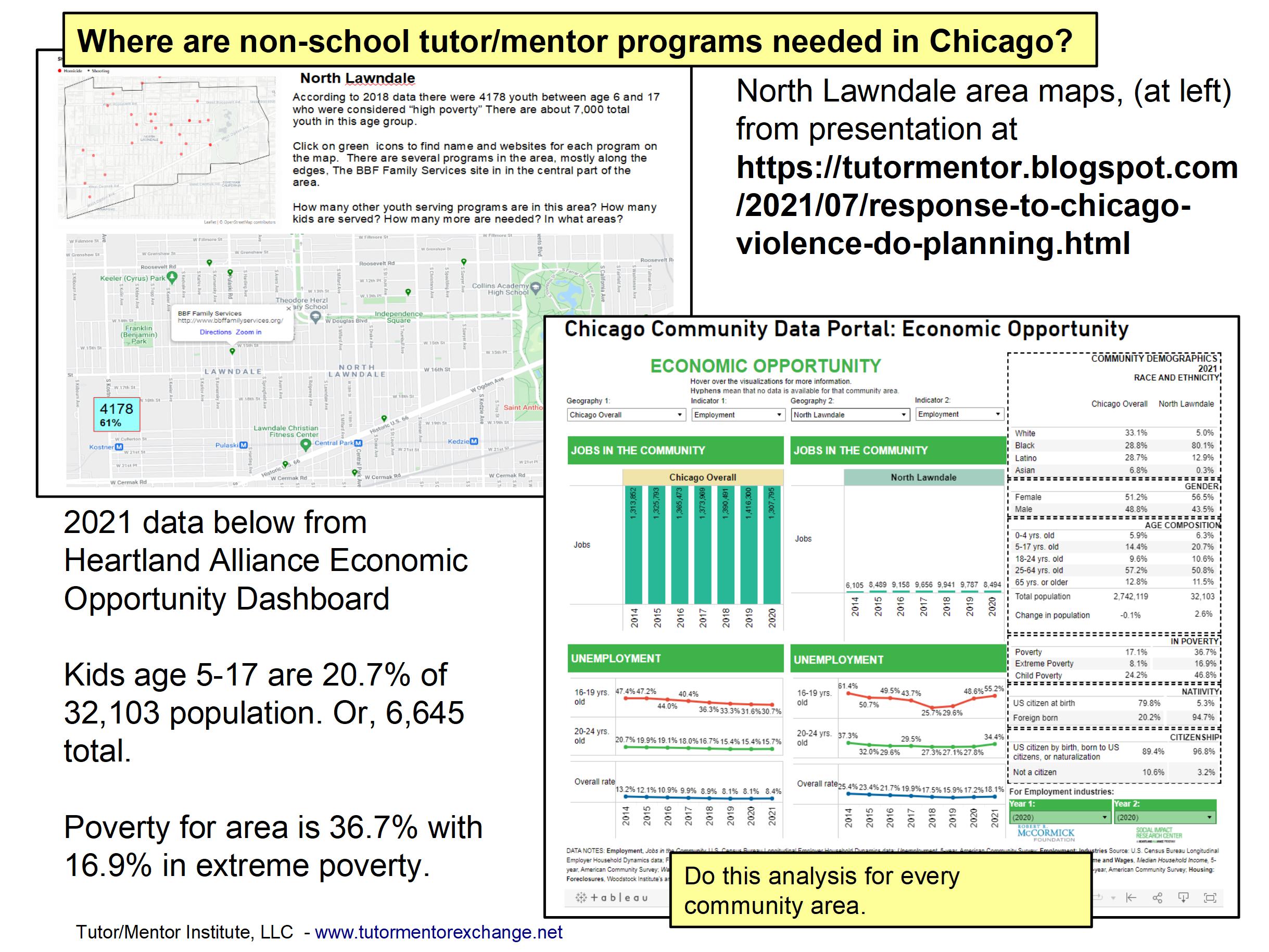
In my June 25, 2023 article titled "Where are non-school youth development programs most needed?" and in many other articles on this blog, I've encouraged the use of GIS software to do an analysis of community areas, similar to what is described in the Maptitude article, but different in purpose. 

Here are just a few articles I encourage you to read. 
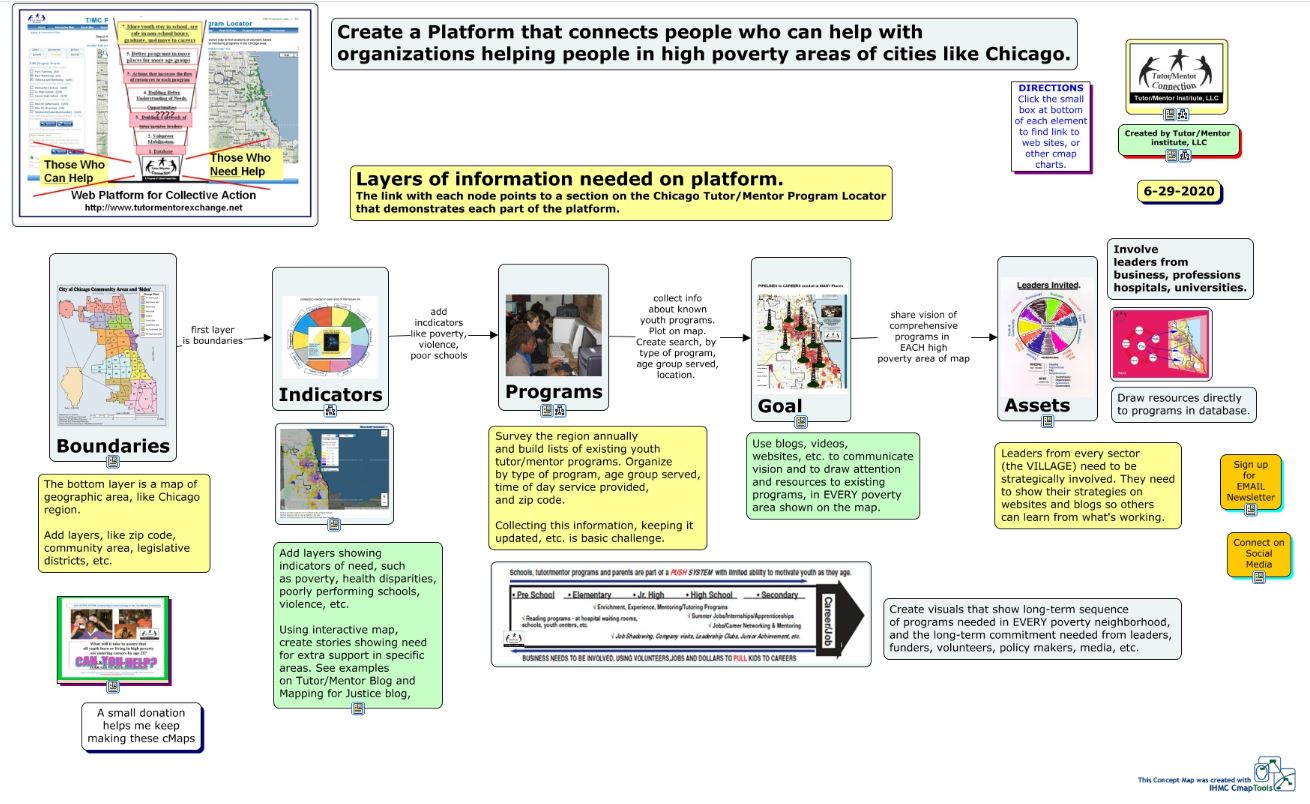
In this article I show the concept map below. 

This concept map shows layers of data that need to be collected and mapped to not only show where tutor/mentor programs are most needed, based on indicators like poverty concentrations, poorly performing schools, violence, etc., but also to show assets (businesses, colleges, hospitals, faith groups, etc) who share the same geography and who should be leading efforts to make mentor-rich youth programs available to more K-12 kids.


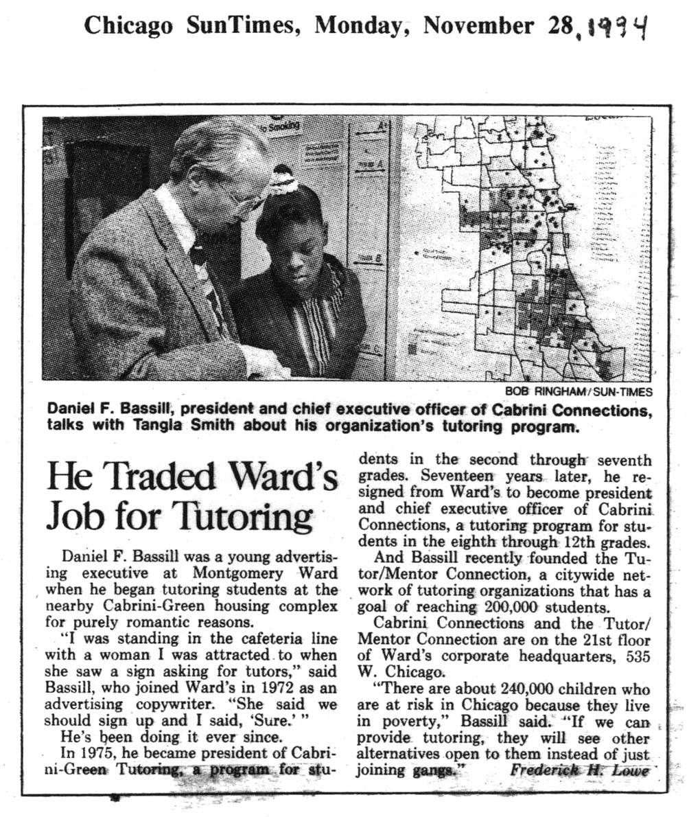
This 1994 Chicago SunTimes article shows me with a student from the tutor/mentor program I led at that time. In the background is a map of Chicago, with high poverty areas highlighted.  I've been trying to harness this technology for nearly 30 years!

I've never been a GIS expert myself, thus always depended on volunteers or paid staff to make maps, and map stories for me.  Since these resources were inconsistently available, I never have been able to do the type of analysis described on the Maptitude site.  

Yet, I keep pointing to maps as tools that leaders in Chicago and other cities should be using.

Youth in non-school tutor/mentor programs, high schools and/or colleges could be learning to do this type of analysis and then sharing map stories to mobilize more people to become strategically involved in helping reach K-12 youth with on-going programs that expand their networks of "who they know" while helping them through school and into adult lives.

In these articles I outline a "Rest of the Story" strategy that young people, supported by professional mentors, could be leading. 

Please share my articles and help recruit people to do this work.  If you know groups who already do this, share their website and blog addresses in the comment section and introduce them to me on social media.


Thank you for reading.  Visit this page to find my social media platforms.

Visit this page to make a contribution to help me continue to share these ideas.