Showing posts with label public health. Show all posts

Saturday, April 24, 2021

Chicago Philanthropic Initiative Using Maps

If you skim through articles on this blog you'll see that I've piloted uses of maps to guide the distribution of resources to youth programs in high poverty areas of Chicago  since 1993.

The Tweet posted below points to a WBEZ article pointing to The Mapping COVID-19 Recovery Project, a collaborative effort of 25 major Chicago foundations, nonprofit organizations, and public and private groups.


WBEZ is doing some outstanding mapping. It's an example of what's possible if you have the talent and dollars needed to create the maps and share them via various media channels.  I encourage you to read the report, visit the Recovery Project website, then help draw attention to the places where the maps show people need extra help.

Wednesday, March 13, 2019

Chicago Health Atlas - updated

In 2014 I wrote this article about the Chicago Health Atlas. Last night at the weekly ChiHackNight event, the updated version was shown.

Below are some screenshots I've created, with links to a couple of articles where I've used these.

This is map showing hospitals in the North Lawndale area of Chicago - from this article


This map shows youth serving organizations in the North Lawndale area - from this article


Here's another screenshot that I just created today, showing the Auburn Gresham neighborhood.


I've been creating map stories, using mapping resources that I've had available, and those created by others, for more than 25 years. My goal is to teach others to do the same.

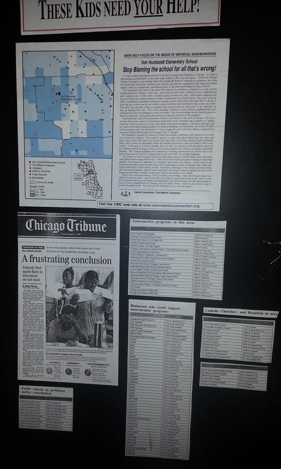
Here's one from many years ago.


This was created in the 1990s, before I had access to the Internet, and well before I had the ability to create map views with layers of information.  However, you can see poverty areas highlighted, indicating a need for youth tutor/mentor programs, among other supports. You can see an Excel list, of programs in the area, based on the Tutor/Mentor Connection survey, and you can see a list of assets (business, faith groups, university, hospital) who could be helping build mentor-rich programs (visualized by the chart). 

For this map area to be filled with such programs, someone needs to be creating an on-going invitation that reaches out to all the assets on the map, the political leaders, media, and community members, including leaders of existing tutor/mentor programs, to bring them together in an on-going conversation that builds a better understanding of need, and leads to the growth of more, constantly improving youth programs in the area. 

This concept map visualizes that process.

Map-based planning - view here
If some, like Chicago Health Atlas, are building and maintaining platforms like this, with a list of resources in each community area, then it will be easier for others to use this list in an invitation process, getting people together on an on-going basis, and innovating solutions that build public will, and a distribution of needed resources, to all parts of the map-area shown.

Here's a second concept map, visualizing planning needed.

Planning needed to influence resource providers - click here

I hope those who are creating data maps will devote space on their web sites to coach others to use their platform for creating map stories that bring people together to solve problems shown by the maps. One group that does that pretty well is the Community Commons site.  It's one of many that I point to on this data map.

There's a lot of information in my blog articles and on my web site and web library. Use it for on-going learning. Make it a resource for college programs that help grow future leaders.

If you appreciate what I'm sharing, I could use your help to pay the bills. Click here to contribute to my FUND TMI page.


Monday, July 16, 2018

GEOFRED blog and map - Health Disparities

The Federal Reserve Banks have a wealth of resources on their web sites. This map is from the GEOFRED site of the Federal Reserve Bank of St. Louis. Read the blog article and follow the links.

This introduction is provided:

GeoFRED maps can help us understand a lot of things, including trends in regional socioeconomic data, which could ultimately provide insights for policy recommendations. In this post, we look at two important indicators of health throughout the United States: premature deaths and preventable hospital admissions. High levels of premature deaths indicate issues with public health.


I've been posting links to mapping and data platforms on this blog since 2011. Original articles, posted between 2008 and 2011, show map stories created using ESRI GIS software and an interactive Chicago Tutor/Mentor Program Locator (created in 2008).

My goal is to provide tools, and examples, that encourage many others to create map stories that show indicators of need in different places and draw attention and resources to organizations working in those areas to help kids and families.

In this article I've been aggregating links to additional articles that include data maps.

If you're creating maps stories using some of the platforms I point to please share links to your blogs and tell of the successes (or challenges) you are having.

Wednesday, June 28, 2017

ESRI solution templates for local government

ESRI has created a set of map templates that local governments can use to tackle the Opioid Epidemic and other public health issues. They are shown on this page.

This same set of tools, or ones similar to it, could be used to identify existing non-school tutor/mentor programs in a geographic region and draw support to each of them. That's what Tutor/Mentor Connection has been trying to do with GIS maps since 1994. I've never had the talent and resources that companies like ESRI have to do this work.

Thursday, March 2, 2017

500 Cities: Local Data for Better Health

From 500 Cities web site
This map shows 500 cities across the United States which are included in a new data hub created by the Center for Disease Control (CDC) and the Robert Wood Johnson Foundation.

You can use the interactive map to create your own map view, or look at PDF reports for each of the 500 cities. This link points to Chicago maps.

Looking at the maps you quickly see a correlation between poverty and poor health.

Monday, November 28, 2016

Income Inequality in Cities - Using ESRI StoryMap

This image is from an ESRI Storymap titled "Wealth Divides" that you can find at this link.

This demonstrates a growing ability to use story maps to build a greater understanding of how some places are blessed with great wealth while others are less fortunate due to great poverty.

I'll reach out to ESRI, but the next layer of information on maps like this should be borrowed from my own  history of building map overlays that show locations of non-school tutor and/or mentoring programs in different neighborhoods, as part of a strategy intended to draw resources to existing programs while helping new programs start where few or none exist.

Here's a blog article that illustrates how I've been trying to use maps. Imagine what might result if teams of students, volunteers and map-makers were duplicating the Tutor/Mentor Connection's 4-part strategy, and were producing map stories using current StoryMap tools, to draw attention to inequality, violence and other indicators of need, and were drawing resources to organizations working to reduce those inequalities.

That could be happening in every part of the world if a few leaders would step forward to make it happen.

11/30/16 update: Here's a New York Times story about immigration, that uses maps and animation to tell the story in a visual way.

12/20/16 update: Here's another ESRI storymap, this time telling the story of the Dakota Access Pipeline (DAPL).

1/11/17 update: Story map showing 10 most segregated cities in the US

6/28/17 update:  See how Crain's Chicago Business uses this Wealth Divides map in it's own analysis. click here

2/28/18 update:  How Cities are Divided By Income, Mapped - CITYLAB story. click here
View the ESRI Mapping Incomes story-map - click here

4/8/2018 update: Mapping Inequality: Redlining in New Deal America - this collection of Home Owners Loan Corporation (HOLA) maps from the 1920s and 1930s serve as "as critical evidence in countless urban studies in the fields of history, sociology, economics, and law. Indeed, more than a half-century of research has shown housing to be for the twentieth century what slavery was to the antebellum period, namely the broad foundation of both American prosperity and racial inequality."

4/17/2018 update:  Public Housing Plays Huge Role in Racial Segregation and Inequality-- but not in the way most people think.  Article in Business Insider - click here

4/20/2018 update: US News & World Report article - Segregation's Legacy - click here

4/24/2018 update: Segregation incarnated in brick and mortar. See maps in this April 2018 article on The Hechinger Report. 

5/3/2018 update: "Segregation Map: America is More Diverse than Ever, but still Segregated" - Washington Post article - click here

5/10/2018 update: "To Succeed Older Cities Must Overcome Their Stark Color Lines." Brookings edu article - click here

5/16/2018  update:  Metropolitan Planning Council site offers plan for addressing costs of segregation in the Chicago region. "Title: Our Equitable Future: A Roadmap for the Chicago Region". click here

5/29/2018 update:  Connecticut has more concentrated poverty (and wealth) than most metros. see 2015 article. These are findings from a DataHaven study

6/1/2018  update: The End of the American Dream? Inequality and Segregation in US Cities. Alessandra Fogli, senior economist and assistant director in the research department at the Federal Reserve Bank of Minneapolis leads a discussion about segregation and inequality across U.S. cities and their consequences on educational outcomes of future generations. see video

12/11/2018 update2018 County Health Map - Key Findings - click here  This report is a resource that can be used by leaders from across the USA.

2/20/2019 updateAmerican segregation, mapped at day and night. This site includes animated maps that show segregation patterns while at work, and while at home. Unique way to view this. click here

2/25/2020 update:  Where Democrats and Republicans live in your city.  This article includes maps that show political separation in cities across the USA, as well as racial segregation.  click here

9/21/2020 update:  Redlining and neighborhood health - click here

9/23/2020 update:  from Brookings.edu: Six maps that reveal America's expanding racial diversity. - click here

11/23/2021  update: The Ever-Growing Gap: Failing to Address the Status Quo Will Drive the Racial Wealth Divide for Centuries to Come - Institute for  Policy Studies report - click here   

Thursday, October 6, 2016

Chicago Life Expectancy Maps

This map is one of many that you can find on a Chicago Life Expectancy web site, compiled by a team from DePaul University in Chicago.

These were introduced to myself and a group of others at the monthly ChicagoCityData user group meet-up, held at the Microsoft headquarters in Chicago.

Spend some time browsing these maps, then scroll through articles posted on this site, showing other mapping platforms and ways people are turning  maps into stories intended to build public awareness, mobilize resources and fill map areas with needed solutions.  Also visit the links, and you'll find an extensive library of links to other GIS platforms being used in the US and the world to focus attention on areas with high poverty, health disparities, inequality, etc.

I was one of nearly 100 people at the meet up, so there's not much opportunity to engage in a deep and on-going conversation with presenters, or other participants.  In the Tutor/Mentor blog I've been pointing to cMOOCs, such as the Connected Learning #clmooc, where the format encourages the type of on-going conversation and idea sharing that I feel would be valuable in many sectors.

If any readers want to help set up, or sponsor, this type of conversation focused on uses of spatial thinking and tools, or the broader conversations that I focus on, please introduce yourself.

Wednesday, September 28, 2016

Understanding growing drug crisis in America

If you browse articles on this blog, going back to 2008, you'll see that my focus has been on urban poverty and its causes, and on volunteer-based tutor/mentor programs as part of the solutions.

Today my Twitter feed included this post.
The maps in this post are from a Wall Street Journal article (see link in Tweet) which shows the growth of the drug crisis in America since 1990.

In articles on this blog and the Tutor/Mentor blog I have pointed to this concept map, showing four actions that need to be taking place to help people solve complex problems that they are concerned with.  You can find this map here, and it's described in this presentation.

While my web library has many articles about poverty, and showing how to use GIS maps, it does not focus on the drug crisis, solution providers, and places where people are interacting and trying to figure out ways to reduce this plague.

This concept map shows the research sub sections in the Tutor/Mentor web library. Why are tutor/mentor programs needed? Where are they most needed?

If someone has a good web library focused on the drug crisis, with links to other resources beyond their own, share a link with me in the comment section and I'll add another node to this map, pointing to your site(s).

I'm sure that as we look at the maps, we'll see that some of the places I've been focusing on will be the same places where drugs are a problem.  However, we'll also see many places in smaller cities and towns where this is a huge problem.


This graphic shows a process that we need to be going through, in places all over the country. I describe it in this blog article and this presentation.  


As more communities and organizations begin to organize this process, we can connect with each other in online communities, enabling a sharing of ideas, identification of common problems, and innovation of solutions to solve these problems.

Perhaps that common bond will bring more of us together in efforts that find solutions.

NOTE: view the comments sections for new articles on this topic that have been discovered since this original post was written.

Jan 2017 update: This interactive map shows locations where people died of drug overdoses, and tells stories of who those people were.

Feb 27, 2017 update: The Poynter Institute is offering a free one-day workshop in New York on March 3, 2017 (and in other cities after that) to help journalists cover the unfolding story of the Opiod Crisis. Visit the web site for more information and updates.

Dec 3, 2017 update - This ESRI map shows mortality rates for every county in the USA. This article talks about the data in the map.

Friday, September 26, 2014

Chicago Health Atlas a valuable resource

This map view was created using the Chicago Health Atlas, one of the projects of the Smart Chicago Collaborative.

While a majority of the maps in the Mapping for Justice blog were created by Tutor/Mentor Connection, I've also used articles to point to other map platforms that provide indicators showing a need for extra investment and support of youth and families in neighborhoods highlighted on these maps. In this section of the Tutor/Mentor web library are more links to poverty and crime maps.

Our aim is to encourage, and inspire, a growing number of people to create videos, blog articles, books, slide presentations, etc. that use these indicators to show people beyond poverty where they need to be investing time, talent and dollars to help communities overcome challenges they cannot overcome by themselves. If youth learn to create map stories, and how to communicate these regularly as part of a call to action, they learn skills they can apply in adult lives, and provide talent that helps draw needed resources to various places shown on the map. If you're creating map stories with a goal of drawing resources to volunteer based tutor/mentor programs in different parts of Chicago, or in another city, please share your link.