Showing posts with label universities. Show all posts

Thursday, January 29, 2026

Mapping Conference Participation - IVMOOC Project

On this page I've shared the Network Mapping tool created by a team of Indiana University students in the Fall 2025 Information Visualization (IVMOOC) class. 

This week I received the final report from a second IVMOOC team, who used the same Tutor/Mentor Conference history, to visualize participation.  Below is the interactive map-based visualization that they created.


Open the interactive map at this link.  Across the top of the map are dates of the 1994-2015 Tutor/Mentor Leadership and Networking Conferences, held in Chicago.  For each conference the IVMOOC team created a zip code map, with shaded areas showing where conference participants came from.

You won't find the text that I show with the map on the actual interactive version.  I had to read the Final Report to see their description of the information on the map, how to view the four classifications which you can view, using the drop down menu at the top left.  

I'm sharing some of that below.

---  beginning of text from the report ----

Dashboard Walkthrough
 
In addition to static figures, an interactive dashboard was developed using Plotly to provide a more flexible view of participation trends. The dashboard displays ZIP codes shaded by intensity, where darker colors represent higher levels of activity. Users can explore the data dynamically through a dropdown menu that switches between four key metrics:

Total Participation: Shows the overall number of participants from each ZIP code. This view highlights the most active regions and provides a baseline for geographic engagement.

Change in Participation: Displays year‐to‐year changes in participation by ZIP code. Areas shaded in stronger colors indicate growth, while lighter or negative values highlight declines. This view is useful for spotting emerging regions or places where engagement has tapered off.

New Members: Focuses on participants attending for the first time. This metric helps identify ZIP codes that are contributing fresh engagement and expanding the community base.

Recurring Members: Highlights ZIP codes with participants who attended multiple times.

Then they provided this Data Analysis.

The data included thousands of individual entries. Most participants came from Illinois, with a strong cluster centered in Chicago and nearby cities such as Evanston, Oak Park, and Cicero. Outside Illinois, several states, including Indiana, Michigan, and Wisconsin, showed consistent participation across multiple years.

The total participant count increased gradually from the 1990s through the early 2010s, suggesting a steady growth in engagement. However, the participation rate dropped slightly in the final years, likely due to changes in outreach or available data coverage. (Note - this was largely due to less funding available to host and market the conferences following the 2011 decision of the Board of Directors to discontinue support of the Tutor/Mentor Connection part of the Cabrini Connections nonprofit, that was launched in late 1992. While I formed the Tutor/Mentor Institute, LLC to keep this strategy available to Chicago, I never found significant funding due to no longer operating as a 501-c-3 non profit.)

Geographic concentration: Participation spanned 616 ZIP codes across 45 states, but Illinois dominated with about 66% of all participants. Chicago alone accounted for over 5,500 entries, underscoring its role as the central hub. After 2005, participation gradually expanded into nearby states such as Indiana, Michigan, and Wisconsin, reflecting regional growth. (This also reflected the growing use of the Internet since the early 2000s).

Organizational diversity: More than 1,532 unique organizations were represented. Nonprofit and education-related groups contributed the majority of attendees, while donor and policy-focused organizations made up a smaller share, highlighting a sector imbalance.

Temporal trends: Yearly participation fluctuated, peaking in the late 1990s and early 2000s, followed by a gradual decline after 2010. This suggests that outreach strategies or conference accessibility may have shifted in later years. (As noted above, there were less funds available after 2011.  However, there also was growing competition as others hosted their own networking events.  And with the Internet, there were fewer reasons for people to attend face-to-face events.)

The report concluded with this INTERPRETATION OF RESULTS

Our analysis has shown strong participation from nonprofits and educators, but limited involvement from donors and policymakers. This imbalance suggests that the conferences primarily served as spaces for practitioners and community‐based organizations rather than funding institutions. While this helped strengthen grassroots connections, it also limited opportunities for broader institutional influence and resource mobilization. 

The interactive dashboard provides a clearer picture of how participation evolved across ZIP codes and years. By toggling between metrics such as total participation, change in participation, new members, and recurring members, several patterns emerge:

● Community clusters: The dashboard shows that nonprofit and education‐related ZIP codes consistently appear with high intensity, especially in Illinois. Many of these areas also show strong recurring member counts, reinforcing the persistence of local and regional communities over time. (Note. if you view many of the maps on this blog you'll see where poverty is concentrated in the Chicago region. If there were a demographic overlay to the IVMOOC map it would show most of the participating organizations came from these high poverty areas. That was our goal.)

● Peripheral actors: When switching to the “new members” view, donor and policy‐related ZIP codes appear less frequently and with weaker intensity. Their limited presence suggests missed opportunities to expand engagement beyond practitioner and educator communities.

● Regional hubs: Chicago and surrounding Illinois ZIP codes dominate across all dashboard views, acting as central hubs of participation. After 2005, the dashboard highlights new activity in Indiana, Michigan, and Wisconsin, showing geographic expansion and gradual integration of neighboring states into the conference network.

● Retention vs. outreach: The dropdown comparison between recurring members and new members reveals a balance between retention and outreach. Some ZIP codes show strong recurring participation, indicating long‐term commitment, while others contribute more new members, highlighting successful outreach into fresh regions. Together, these dashboard insights suggest that while the conferences were highly effective at sustaining nonprofit and education networks, future outreach could focus on strengthening donor and policy participation and leveraging regional growth beyond Illinois.

--- end of text from the report ----

The report reinforces what I recognized since launching the conferences in 1994.  We were attracting many of the volunteer-based tutor/mentor programs in the Chicago region, along with some of the university programs and researchers involved in doing this work.  Occasionally we had participation from foundations, business, universities and local media.  However, we never were able to attract a large and consistent following of business, philanthropy and policy representatives.

This concept map visualizes the long-term goal of bringing people from every sector together in an on-going effort to learn where youth need extra help, how volunteer-based tutor/mentor programs can expand networks and learning opportunities, and ways business, philanthropy and public policy need to support programs in every high poverty neighborhood, not just a few.

Open this page and view a second concept map that visualizes the different networks who we were trying to connect via the conferences, our website library and on-going social media efforts. 

As long as donors, business and policy makers live in silos, disconnected from organizations doing the work and people being served, there will be too few resources distributed consistently and in too few places.

The 2025 IVMOOC team report shows that we were not very successful at this. Had I had the report in the mid 2000s I might have been able to recruit leaders to help.  However, part of the reason I never was able to accomplish all that we were trying to do was the loss of major donors in 2000 when Montgomery Ward went out of business, and the dot-com bubble burst, then 2001 to 2003 following the 9/11 attack.  We were just recovering in 2007 and 2008 and had earned several grants of $50,000 or more, when the financial crisis began, causing us to lose major supporters like HSBC North America, and ultimately in mid 2011 causing the Board of Directors to decide to focus only on the direct service part of the organization.

As you look at this report, visit this page and look at the Network Mapping tool created by a second 2025 IVMOOC team.   These show two ways of looking at participation in an event, or network, and of understanding "who's participating" and "who's missing".   Until those who are missing are involved, the network will continue to struggle to achieve significant impact.

Thank you to the students who created both of the 2025 IVMOOC visualizations and reports. I look forward to being part of the Spring 2026 project cycle.  I also look forward to hearing from readers how they are using this information.  Just share in the comments, or reach out to me on LinkedIn. 

Saturday, December 6, 2025

Using Concept Maps to Understand Systems

 While most of the articles on this blog focus on the use of GIS maps, which I started doing in 1993 as I formed the Tutor/Mentor Connection,  I've used a few articles to show my use of concept maps.  Visit this section and this section of the Tutor/Mentor blog and you'll find many more.

Today I found another example of concept maps being used to help understand complex systems.  I'll show a few screen shots below, then I encourage you to go to the site and do your own exploring.

Open this link and you'll be introduced to a Child Care Systems map that "explores the current reality of the childcare system in low to middle income communities in India, Bangladesh, Viet Nam, South Africa and Kenya.  


On most KUMU maps the explanation of each node is shown on a left hand sidebar.  That's true on this map, too.  In this case, there's an in-depth explanation of what the map is trying to show.  All of the nodes on the map are shown in the above graphic.

At the top of the map are labels, such as "deep structure", "family and community", "gender equity", #policies and resources, and "social and economic development".

At the lower left is a legend that shows what category of information each color represents. You can click on any of these and get a view that only shows nodes of that category. 

Click on "deep structure" and you'll get this view. 


What I really like about this map is that while information can be seen on the left, this map includes clarifying information directly on the map.  Click any node and a "pop up" text box appears. Even the "orange arrows" surrounding some nodes have text boxes.

Click on "gender equity" and you'll see this view.

Click on "policies and resources" and see this view.


Click on "social and economic development" and see this view.


In this article on the Tutor/Mentor blog I showed slides from a Global Futures Society Network Map.


This map shows "who" is involved and how they are connected to each other.  If used in combination with a map like the Child Care Systems map, it seems that there could be a robust, on-going conversation that might lead to fixing some of the problems addressed on the Child Care Systems map.

In this article, titled "Mapping Event Participation" I show my own efforts since the late 2000s to map participation in conferences that I hosted, with a goal of connecting those who attended with each other, and building an analysis of "who's there" and "who's missing".  

These are powerful tools, if used in on-going planning, network building and capacity building.  

In this article I wrote about mapping assets within universities and of creating an on-campus Tutor/Mentor Connection, where students, faculty and alumni would do the work I've done for the past 30 years, and the work that I'm now showing about the use of concept maps.


If you've read this article, please share it with people in your network who have the wealth that could lead to funding a university-based Tutor/Mentor Connection, based on the ideas I've shared.  Share it with students who might want to do this work as independent study, or for information visualization courses, like the IVMOOC course offered at Indiana University.

Maybe someone in your network will be the 'tipping point' that make this a reality.

Thanks for reading. Please connect with me on one or more of the social media platforms that I show on this page.

If you're able please contribute to my December 19th 79th birthday campaign, or my Fund T/MI campaign.  

Monday, April 15, 2024

Maps and Map-Stories from past 30 years


This is a story that appeared in the Chicago SunTimes in November 1994. It talks about my leaving my corporate advertising job to lead a volunteer-based tutor/mentor program in Chicago.

The two photos show me with a 7th grade student, who is now a college graduate with two kids in college. We're still connected on Facebook.

The second is a map of Chicago, with high poverty areas highlighted, and known volunteer-based tutor/mentor programs shown.

While we launched the site-based Cabrini Connections program in January 1993, we spent all of 1993 planning a second program, aimed at building greater attention and a better flow of volunteers and dollars to EVERY volunteer-based tutor/mentor program in Chicago, including our own. 

We named that Tutor/Mentor Connection and launched our first survey to learn about existing programs in January 1994.  

Why maps?

In late 1992 as I was forming the new program I told a librarian at the United Way/Crusade of Mercy about our intent to learn about every tutor/mentor program in Chicago. She asked, "How will you share that information?"

I told her I had not yet figured that out and she went into the library and came back with a magazine that describe Geographic Information Systems (GIS) and how that could be used to plot locations of programs on a map of Chicago.  

I was immediately sold on the ideas and have spent the last 30 years trying to do that.

The first challenge was learning about GIS technology and building the capacity to create maps. That was solved in 1993 when Metro Chicago Information Systems offered to produce maps for us (for a fee).  They produced maps for us through 1995. We launched our own capacity in 1996 (see below). 

How were maps used?  

One strategy was to publish our list of programs in a directory, which we began to do in May 1994.  We updated that annually and continued publishing it until 2002.  Then we moved the data to an online Program Locator, which was used until 2018 when the site went off line.  View 1995 Directory.

A second strategy was to create map-stories following negative news in the Chicago SunTimes or Chicago Tribune.  Below is one example.

Our aim was to show where something "bad" happened, and was given significant attention in local media. Our goal was to tell "The Rest of the Story", showing the level of poverty and number of poorly performing schools in that area, which were contributing factors to what happened.  

We added locations of tutor/mentor programs in the area, if there were any.  Then we also added layers showing assets, such as churches, business, colleges and/or hospitals, who shared the geography, thus should be strategically involved in helping tutor/mentor programs grow, and helping those programs constantly improve what they were doing to help kids through school and into jobs and careers.

At the same time we created maps like these, showing businesses, faith groups, universities, etc. who had locations in many parts of the Chicago area, thus could be supporting volunteer-based tutor/mentor programs in many places, not just a few favored, high-profile, programs.

The goal has been to have good and constantly improving programs in EVERY high poverty area, not just in a few places.

Over the past few months I've been creating archives in my Google drive folder and now you can look at all of the maps and map stories we've created, as well as the media stories our strategies generated.

Map stories created since 1993 - open this link


From 2008 to early 2011 we were able to hire a part time GIS expert to create maps using donated ESRI ArcView GIS software. View his collection.


The collections below show maps used in blog articles, visual presentations, social media, etc.  Many of these maps were NOT created by the Tutor/Mentor Connection or Tutor/Mentor Institute, LLC.  Some were created using the interactive map-based program locator that was created in 2008 - open this link


As we found ways to create maps and map-stories we created an on-going event strategy that generated media stories.  Below is a folder that shows several hundred articles.


Finding talent to do the annual survey, create and maintain a database, and then create our maps was always a challenge. Drawing attention to the maps was an equally large challenge.  That's why I began to reach out to universities in 1993 to try to form partnerships that would lead to students, faculty and alumni duplicating the work my small organization was piloting.

Last Friday I posted an article on the Tutor/Mentor Blog, featuring a PDF presentation showing my "30-year history of reaching out to universities".  Below are three pages from that presentation

Students from Northern Illinois University set up a GIS map-making capacity at our Cabrini Connections office in 1995.  One student worked for us part time in 1996 and 1997 to create maps for us, then continued as a volunteer.


Vamshee Bhupathiraju, a graduate student at IIT, came to Cabrini Connections, Tutor/Mentor Connection in 2003 through a technology grant.  He created the on-line program locator, which was launched in 2004.  This was the source of data used in the interactive Chicago Program Locator built in 2008 by a team from India. 


Students from Indiana University created a map in 2016, showing participation in every Tutor/Mentor Leadership and Networking Conference from May 1994 to May 2014.


These were significant contributions.  These are just 3 pages out of 50 that I share in this presentation. They show what's possible. I hope you'll take a look. 

I'm sharing my archives because I believe other people could do what I've been trying to do, and do it better.  And because I'm now 77 and need others to continue this work.

My maps show that non-school, volunteer-based, tutor, mentor and learning programs are needed in many parts of the Chicago region, but in many cities around the country (and probably the world). 

Too few people ever saw the maps I'm sharing because I never had millions of dollars for advertising and was not a Taylor Swift type of celebrity who could draw people to complex ideas on a regular basis. 


Universities have the talent, and responsibility, to do this work.  However, unless major donors step forward to provide on-going, decades-long, funding, none will do this for as long as I have and none will ever be able to publish an archive like I've shared here, showing 30 years of maps and map stories.

Ten or fifteen years from now archives like mine could be available on university websites in many cities.  It only takes "two or three people on a campus to launch a Tutor/Mentor Connection", and a major donor!

I'll be sharing more of my archives in coming weeks, primarily in articles on the Tutor/Mentor blog.  My goal is that a few people will be motivated to dig deeply into this information. I'm sure there's a book that could be written, showing strategies leaders can use to help end poverty by helping more kids through school and into jobs and careers.


Thanks for reading this. Please share it.

I'm on Twitter (x), Facebook, LinkedIn, Instagram and other platforms. You can find links on this page.

If you are able to make a small contribution to help me keep doing this work, visit this page.  


Wednesday, November 15, 2023

Maptitude tools using GIS for regional economic planning

Below is a map view showing three cities in Oregon, using a mapping product from Maptitude.


This map is part of an article on LinkedIn titled "How to use GIS to look at changes in employment patterns".   

In the introduction the writer says "This article explores how to use GIS (geographic information software) in local or regional economics. Many times, local or regional governments, economic geographers or regional economists are asked to look at changes in employment patterns over a specific period within a particular geography (e.g., a city, township, or county) or between several geographies where a comparative analysis is required."

This is a detailed article with step-by-step instructions for building a map-view like shown above.  You may not feel comfortable doing this work yourself, but if you understand the potential, you can share the article with others who might be able to fund this type of work in your community. 


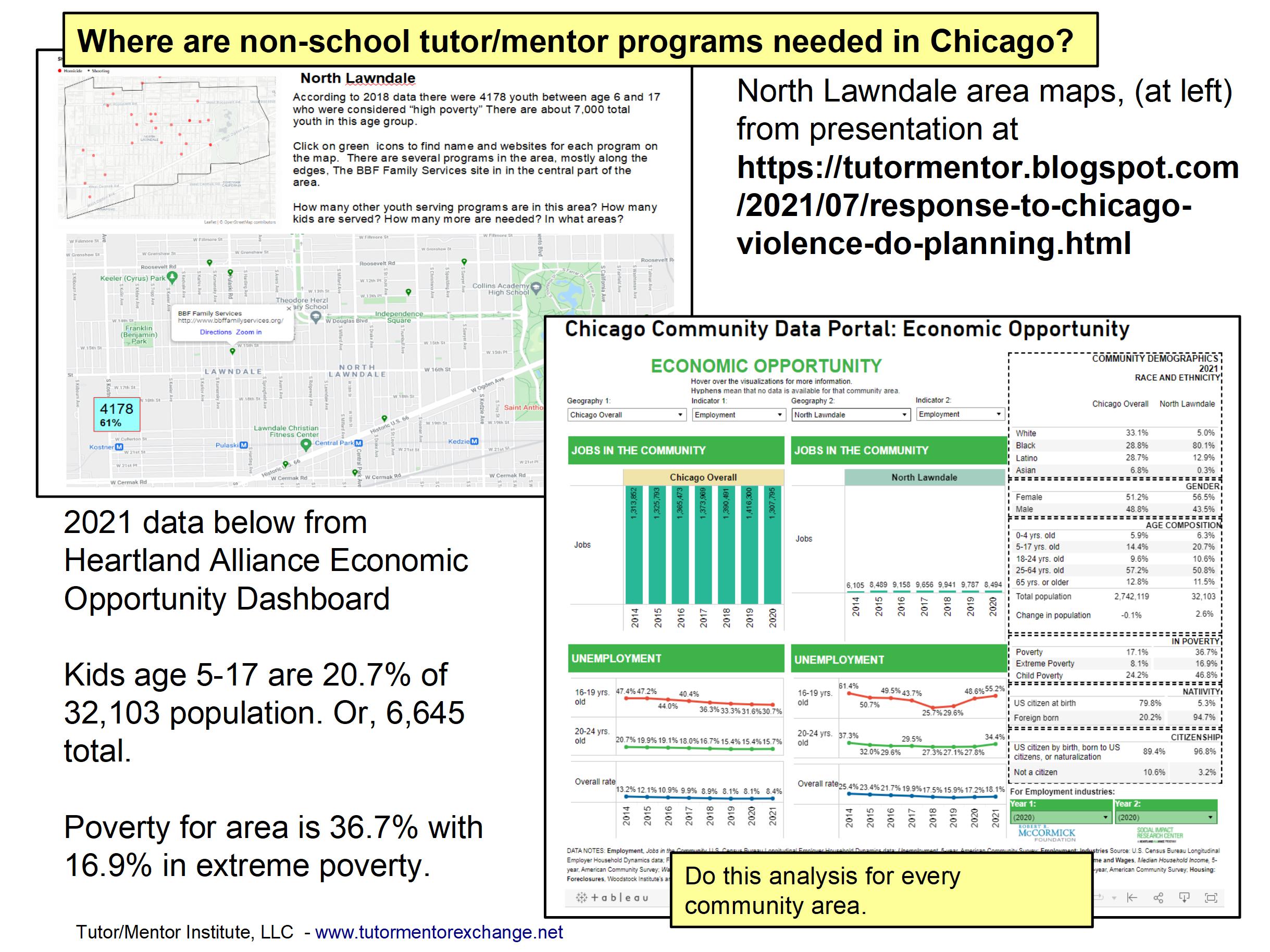
In my June 25, 2023 article titled "Where are non-school youth development programs most needed?" and in many other articles on this blog, I've encouraged the use of GIS software to do an analysis of community areas, similar to what is described in the Maptitude article, but different in purpose. 

Here are just a few articles I encourage you to read. 
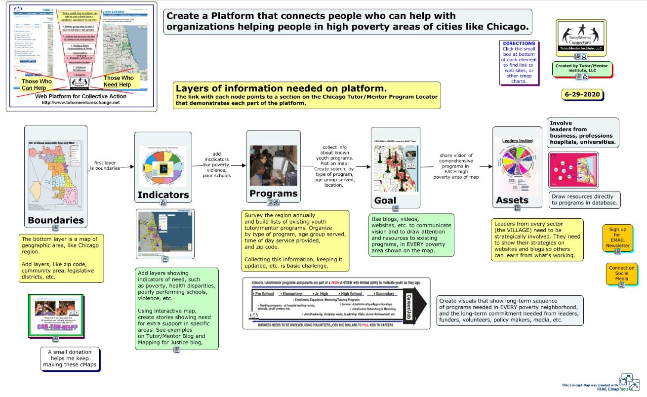
In this article I show the concept map below. 

This concept map shows layers of data that need to be collected and mapped to not only show where tutor/mentor programs are most needed, based on indicators like poverty concentrations, poorly performing schools, violence, etc., but also to show assets (businesses, colleges, hospitals, faith groups, etc) who share the same geography and who should be leading efforts to make mentor-rich youth programs available to more K-12 kids.


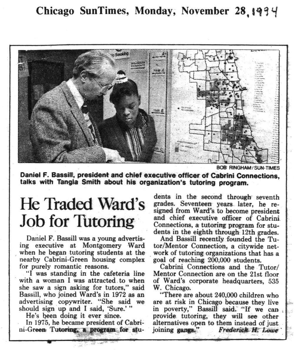
This 1994 Chicago SunTimes article shows me with a student from the tutor/mentor program I led at that time. In the background is a map of Chicago, with high poverty areas highlighted.  I've been trying to harness this technology for nearly 30 years!

I've never been a GIS expert myself, thus always depended on volunteers or paid staff to make maps, and map stories for me.  Since these resources were inconsistently available, I never have been able to do the type of analysis described on the Maptitude site.  

Yet, I keep pointing to maps as tools that leaders in Chicago and other cities should be using.

Youth in non-school tutor/mentor programs, high schools and/or colleges could be learning to do this type of analysis and then sharing map stories to mobilize more people to become strategically involved in helping reach K-12 youth with on-going programs that expand their networks of "who they know" while helping them through school and into adult lives.

In these articles I outline a "Rest of the Story" strategy that young people, supported by professional mentors, could be leading. 

Please share my articles and help recruit people to do this work.  If you know groups who already do this, share their website and blog addresses in the comment section and introduce them to me on social media.


Thank you for reading.  Visit this page to find my social media platforms.

Visit this page to make a contribution to help me continue to share these ideas. 


Monday, August 31, 2015

Mapping the Opportunity Gap - GatewatytoCollege

Just found this Gateway To College map.

I'll reach out with an introduction. Hopefully some of the ideas I share here and on the Tutor/Mentor Blog will be used in their own efforts.

Wednesday, March 4, 2015

Mapping college locations in relation to poverty

This map is one of a series of maps showing poverty in Illinois, and showing locations of colleges. You can see the map in this article, titled "Location, location, location: Are top universities too far away from low-income high school graduates?" The maps for the article were drawn from this report, titled "Optimal Spatial Distribution of Colleges" which includes similar maps for all 50 US states. Illinois is on page 42.

In this 2008 Mapping for Justice article you can see that the Tutor/Mentor Connection has consistently used maps to encourage colleges and hospitals to build strategies that support the growth of mentor-rich non-school programs in the neighborhoods where they are locate. This article on the Tutor/Mentor Institute blog has the same goal.

Thursday, February 6, 2014

Map Directory update by Intern

In 2008-2009 I was able to build an interactive Chicago Tutor/Mentor Program Locator Map/Directory that could be used by leaders in Chicago to help build and sustain mentor-rich, non-school tutor/mentor programs in high poverty neighborhoods. This image was created by combining layers of information showing poverty, poorly performing schools, existing programs and community assets, like banks then zooming in to show a specific part of Chicago.

We ran out of money in 2009 and have not been able to update the technology, or the content, in the years since then, except for keeping the information about tutor/mentor programs (the green stars) current.

One section of the Program Locator focuses on Assets, such as banks, insurance companies, faith groups, colleges, hospitals, etc. who could be strategically involved in supporting the on-going operations of tutor/mentor programs in sections of the city where they have facilities.

When we built the Program Locator in 2008-9 we included locations of eight banks. Since then some have expanded, and some have gone out of business, such as Park National Bank. Since I was not able to update the program locator myself, we've had to live with this outdated information.

I've had interns from Illinois Institute of Technology working with me for six week periods in Jan-Feb and May-June since 2006. On this page you can see work they've done to communicate strategies via various visualizations.


One of our Jan-Feb 2014 interns volunteered to look at the Program Locator, and after three weeks he has updated the Banks section, adding six additional banks and replacing Park National with one more.

Now when you look at the Banks section of the asset maps you'll see a much richer range of banks. I hope that neighborhood groups and volunteer teams from the banks will use this information to bring together networks of business, non profit, educator, faith groups and other community assets and leaders to develop an understanding of the current level of tutor/mentor programs available in different neighborhoods, and to build on-going strategies to help existing and new programs constantly learn from each other and from effective practices around the world, so each program in every neighborhood of the Chicago region can be considered "world class" in helping kids through school and into 21st century jobs and careers.

The purpose of the Interactive Program Locator is that when bad things happen in a city neighborhood, and get feature and editorial attention in the major newspapers, a map can be created showing where the incident happened, and showing businesses, hospitals, faith groups, etc. in the neighborhood who should be working together to make mentor-rich non-school tutoring, mentoring and learning programs more available in the neighborhood where the incident occurred, and in other neighborhoods with similar history. Until the interactive Program Locator was created in 2008-09 we were making map stories and displaying them like you see in this graphic.

If you're doing this work join us at the next Tutor/Mentor Conference to share what you're doing. If you're a business or volunteer who wants to support the Tutor/Mentor Institute, LLC's mapping strategies, introduce yourself on Twitter, Facebook and/or Linked in. Email tutormentor2@earthlink.net to offer your time, talent AND/or financial support to booster this effort.

Monday, February 28, 2011

As "Offshoring" Loses Popularity and "Onshoring" Trends, Am I Crazy to Propose "Urbansourcing"?

It seems corporations have started to recognize over the past decade that outsourcing American jobs to foreign labor pools is not the money-saving no-brainer it originally seemed to be.

A few years back, Stephanie Overby at CIO.com went to great detail to show how businesses, in their rush to save money, probably overlooked or didn’t anticipate many “hidden costs” of outsourcing (aka "offshoring").

Specifically, she details the costs and challenges that pop up when working with colleagues half a world away. For instance, there are hassles related to managing foreign workers; never-ending travel expenses in all directions; the costs of transitioning technology, architecture, and knowledge while operations continue at home; the emotional and financial costs of layoffs and retention bonuses; the time it takes to adjust to different cultures (laws, business practices, ethics, and communication challenges); delays and problems that need to be addressed from many time-zones away; new quality assurance and testing needs… on and on. In the end, not many companies succeeded in saving gobs of money, and many have refocused on the home front in their ongoing search for new ways to save on labor costs.

This all reminded me of a question I've had from time to time while working on this Mapping For Justice project; a question that I’ve posed before to different community leaders, mentoring leaders… friends and family who dabble with economics… and even complete strangers on a couple occasions:

Why couldn’t some corporate mastermind find a way to cut labor costs by grooming “cheap” labor available right down the street, right here in our city?

Last I looked there were a lot of people who could probably use a minimum-wage gig, and if the “hidden costs” of offshoring the labor make it somewhat of a wash, are companies currently looking to develop our students right here in our backyard, to take on some menial jobs like customer service? I know as a Chicagoan, I’d rather talk with someone who knew my city, my culture, and the nuances of my problems, while feeling good that companies were putting money into the pockets of local consumers, which in turn helps our struggling local economy instead of, say, India’s.

Or Arkansas’s.

Now that companies are coming back to the United States to replenish their staffs, CNN reports that “some companies are starting to eye job-hungry areas of the country as prime candidates for the kind of outsourced work that once would have gone overseas.”

“Ruralsourcing” or “onshoring,” the story tells us, “recruits workers from minimum-wage jobs and gives them intensive training in IT specialties.” Mentoring in rural America!

If this is any indication, it seems companies aren't thinking solely about "menial" jobs when looking at places in the United States to develop workers from "minimum-wage" skill sets.

And really, why should they set their sights low? I have worked with some CPS high school students like Sean at Cabrini Connections tutor/mentor program’s Tech Club (a club where students from Chicago’s notorious Cabrini Green neighborhood meet each week to learn marketable tech skills), who are perfectly capable of rising to any challenge I have faced in the corporate sector.

Socially-responsible and forward-thinking companies would be foolish to look thousands of miles beyond the Seans living right down their road.

In 2005, Russ Finney wrote an article in which he observed that “companies must keep a talent base close to home to remain innovative. Educational institutions still need to meet the emerging requirements for skilled entry-level IT talent.”

He continued, “already companies are preparing to refill their downturn diminished entry labor pool with a new wave of IT recruits. These companies need to get the word out to ensure an adequate supply of graduates.”

Some companies aren't focusing their recruiting efforts on Ivy League schools either. Indeed, The Bill & Melinda Gates Foundation has been frequenting community and 4-year colleges because they want “to encourage more 20-somethings to get a post-high school degree or certificate before starting a family … The foundation's overall higher education goal is to double the number of low-income adults who get a degree or certificate beyond high school by age 26.”

Why is this important to Mr. and Mrs. Gates' philanthropy?

While the press releases and reports focus on social and charitable benefits, I can’t imagine that Microsoft hasn’t recognized the potential shared value that would come from increasing the number of students who move from every walk of life into college and onto career, and in turn increase the number of Seans who have a need for (and a way to pay for) new computers and occasional MS operating system upgrades.

In the end, of course, business has a choice in how they want to invest in their human resources. By no means, as an IT professional do I love the fact corporations have looked into solutions like outsourcing to save costs, and in turn crippling the purchasing power of and confidence of many qualified American workers, even as the cost of living in a city like Chicago shows no signs of slowing down.

The more I read and the more I think about it, though, I can’t help but believe there are creative solutions out there, rooted in simultaneously solving our economic, workforce development, and education crises, all while creating long-term shared value for some brilliant business mind.

Maybe I'm crazy to pitch “urbansourcing” and a support-system that includes a closer look at tutoring/mentoring?

Or maybe it's the next big trend.

Saturday, September 20, 2008

Get Your College Involved (Time Magazine)

I had just finished this past week's blog about how politicians such as Congressman Danny Davis, who share the T/MC and Barack Obama's interest in "Service," can use the Tutor/Mentor Connection's (T/MC) maps as tools to help build additional support for tutor/mentor programs...

When on my way home, I saw the week's issue of Time Magazine, featuring McCain and Obama on the cover. The headline read, "Second annual National Service Issue." How perfect. Another exploration of this word "service" that both candidates keep throwing around. So I'll be looking at some of this issue's articles in the near future, highlighting instances where our maps and Time's stories on "service" might collide in the name of tutoring and mentoring.

One section of this issue offers "21 Ways To Serve America" - a list of quick and easy ways you can serve America, each written by important leaders in different sectors of society.

For instance, Lawrence S. Bacow, president of the prestigious Tufts University in Boston, contributed an essay titled "Get Your College Involved." He writes that "Colleges and universities have a special responsibility to educate the next generation of active, engaged citizens... If we are to address this nation's major challenges, we need people across the political spectrum to serve in government, to run for office and to work to build stronger, more vibrant communities... Helping young people pursue their passion for service is one of the best investments our society can make." I immediately thought of all the alumni and college-aged volunteers working with the "next generation of active, engaged citizens" at Tutor/Mentor programs throughout the city.

(click on the map above to see "full-sized" version)

President Bacow also references the fact that many "colleges have set up programs to facilitate community service."

This is great news! Since they are in such close proximity to high-poverty neighborhoods where students have a dire need for more tutoring and mentoring. In fact there is a document in the Tutor/Mentor Institute's library called "University Connection," wherein the T/MC demonstrates how beneficial the T/M programs are for universities themselves, in an effort to secure an even greater investment by academia in T/M programs.

(click on the map above to see "full-sized" version)

But the "University Connection" document does not only show how tutoring and mentoring benefits universities. It also discusses goals and strategies universities can use in implementing new initiatives. If not doing so already for instance, university leaders might consider "operating mentoring-to-career programs" themselves. Or perhaps, a university's faculty or student body can "lead mobilizations that recruit students, faculty and workplace volunteers who support the growth of tutor/mentor programs near the university and throughout the city"...

Both of these are important (and needed) roles academia can play in their own best interest, and in the fight against poverty.

Monday, September 15, 2008

Working with Maps and Politicians To Promote the Development of T/M Programs

Barack Obama told an audience in Mt. Vernon, Iowa last year that:

“Your own story and the American story are not separate — they are shared. And they will both be enriched if we stand up together, and answer a new call to service to meet the challenges of our new century … I will ask for your service and your active citizenship when I am president of the United States.”

His platform's focus on "Service" has been brought up a lot in recent weeks, and promises to be a focus of future political strategy.

While Obama is busy campaigning for the Presidency at the moment, many Democratic U.S. Representatives are already serving as elected leaders, and are entrenched in positions where they can be unifying figures in his/her districts, serving to organize and promote service-oriented programs such as Tutor/Mentor Programs.

I would like to focus on the Illinois 7th Congressional District today - currently represented by Congressman Danny Davis - as another example of how the Tutor/Mentor Connection's (T/MC) maps can be used as tools to help politicians and their constituants work to create strategies that promote the development of tutor/mentor programs.

(click on the map above to see "full-sized" version)

Similar to Illinois Sentor Emil Jones, Congressman Davis works with a constituency that is split between city and suburban voters. This Chicago border marks a clear division between the highly impoverished West side, and the relatively affluent near west suburbs.

Notice how commuters use the Eisenhower (I290) expressway, daily, to get downtown, bypassing the heavy poverty areas along the way. Commuter trains such as the CTA's green and blue lines also provide east-west access through the heart of the 7th District.

There is a noticible tie between "failing" schools and poverty visible on this map. Pockets of failing schools represent areas where students need more tutoring/mentoring than they are receiving. This has been looked at in detail in a recent blog. Fortunately, highways provide access for commuters interested in "service" to volunteer or make donations, in support of tutor/mentor programs in these areas of high poverty.

Descriptions of these individual tutor/mentor programs (green stars on the map) can be found using the Tutor/Mentor Program Locator Database.


(click on the map above to see "full-sized" version)

In this map, we show Universities and Hospitals that may (or may not) already be working with the district's tutor/mentor programs. As we've discussed in earlier blogs, Universities and Hospitals have important and intimate relationships with their communities, and can work to support the growth of Tutor/Mentor programs in their district.

Imagine that each hospital or university on this map is hosting learning circles, with the organizations' leaders actively developing engagement strategies to reach youth throughout the entire district. For more information, please review the presentation for the Tutor/Mentor Hospital Connection.


(click on the map above to see "full-sized" version)

As discussed in the blog on Chicago's Places of Worship, the Tutor/Mentor Institute has a document called "How Faith Communities Can Lead Volunteer Mobilization For Tutor/Mentor Programs, detailing how "churches in affluent suburban areas, as well as in inner city areas, can be delivering sermons on a regular basis, that tie scripture and service, and point members to tutor/mentor programs that already exist, or to neighborhoods, where new programs need to be created."

Here we look at Baptist churches, Catholic churches, and other "general" Christian congregations in the 7th.

(click on the map above to see "full-sized" version)

And here are the Episcopal, Lutheran, Methodist, and Presbyterian churches in the district. Again, each of these locations represent sites where congregations can meet to learn about tutoring and mentoring, and where church leaders can evangelize to get donors to contribute to the growth of programs.

Please also take a look at Tutor/Mentor Institute's suggested communications strategy for Faith Communities.

In general, I am hopeful that these maps can be used as important tools by leaders throughout Chicago who share the T/MC and Barack Obama's interest in "Service," and that hopefully a high powered political figure like Danny Davis can take a look at them, help mobilize other public and private leaders in his district, and build additional support needed for tutor/mentor programs.

I should mention, if it's not clear, that these maps are not intended to show where service work is, or is not occurring. They are also not meant to endorse, or criticize elected leaders. The voters should make those decisions.

Tuesday, July 15, 2008

Colleges and Universities and Poverty

Last week, students and professors from Madison, Wisconsin's Edgewood College took a yearly summer trip down to Chicago to spend a few days with the kids at Cabrini Connections. Edgewood College's mission statement says that they are "committed to building a just and compassionate world" and that their identity revolves around "open, caring, thoughtful engagement with one another and an enduring commitment to service, all in an educational community that seeks truth, compassion, justice and partnership." From the Cabrini Blog, we see that these teachers set up "several large and small group activities at [Cabrini Connections] that focused on positive self esteem, building confidence, and positive communication. The group also had the opportunity to take part in activities around Chicagoland."

The Edgewood-Cabrini collaboration provides a perfect example of how a typical university's philosophy tends to fit hand-in-glove with the goals of tutor/mentor (T/M) programs - each reaching out to work for social justice, aspiring to close the learning and poverty gaps, and (importantly) educating tutors/teachers as well as students.

In fact, a quick look at mission statements from most universities and colleges in Chicagoland seem to suggest that this sort of partnership should be natural and regularly-occuring. I notice that every university I look at espouses the belief that institutions of higher education need to support the community and build partnerships. They also seem to unanimously believe, on some level, that a fundamental purpose for education is to work for social justice and equal educational opportunity.

DePaul University, for instance, (point # 6 on my newest map below) "emphasizes social engagement and service to others," and has "formed lasting partnerships with community organizations." Sitting just north and east of many struggling communities, I imagine that DePaul would be interested in supporting programs like Cabrini Connections (located a quick 7 to 10 minute bus ride south, down Halsted) .


(click on the map above to see "full-sized" version)


Looking south of DePaul, the prestigious University of Chicago (#51) and six other institutions of higher learning sit on a virtual island in Hyde Park, surrounded on all sides by poverty and failing schools. U. of Chicago recognizes that they are indeed "uniquely positioned to contribute to, and draw from, the strength and diversity of this world-class metropolis." Almost begging to work with T/Ms, they write that, "At Chicago, campus and community are interconnected in partnerships that serve both to support the community and train future policymakers, social workers, artists, and social and political leaders."


Northwestern University's president reports that "the second year of the Chicago initiative, an effort to reach out to the African-American and Hispanic communities in the Chicago area ... has been going very well" and states that he wants to"offer our students the opportunity to learn in a diverse community, thereby preparing them better for their careers. This is particularly true in the 21st century, when the United States is becoming increasingly diverse and the working world increasingly globalized." As we see on the map, opportunities exist for Northwestern (#35) to reach out to T/M programs in impoverished areas of Evanston itself, as well as to the south in the Rogers Park community of Chicago, where Loyola University (#21) lists among its 5 characteristics of Jesuit Education, "learning and leadership in openhanded and generous ways to ensure freedom of inquiry, the pursuit of truth and care for others."


The University of Illinois - Chicago (UIC), is located just west of downtown (#27 in the expanded downtown map below), and sits almost like a gateway on I290 to West Side poverty. Like the others, UIC promotes a goal of providing "a wide range of students with the educational opportunity ... to address the challenges and opportunities facing not only Chicago but all Great Cities of the 21st century."

(click on the map above to see "full-sized" version)

Dan Bassill writes in his blog this week that, "if you're at Northwestern, or Loyola, you could have a great impact on the growth of programs in the North part of Chicago and in Evanston. While if you're at the University of Chicago, you could have an impact in helping tutor/mentor programs grow throughout the South Side where our maps show so much poverty and too few tutor/mentor programs."

One only has to look at this map, and combine the universities' existing philosophies and proximity to impoverished areas, to see how easily this can happen.