Showing posts with label inequality. Show all posts

Wednesday, May 24, 2023

American Inequality site shows problems and solutions

I've used this blog for the past 12 years to share links to data-mapping platforms that identify areas of high poverty and inequality.  I host these links in this section of the Tutor/Mentor library. 

This week I learned of a new resource, called American Inequality.  Below is a screenshot from one article on the site.


Visit this page for a collection of data visualizations and articles showing "a path forward". 

One feature that I like on this site is that it not only provides an interactive map that enables you to zoom into specific parts of the country to learn more, but in the article it shares solutions that could be implemented if more people mobilized public will to solve these problems.

I've been sharing some of the data-maps I find in the concept map shown below.  


In addition to sharing these resources on this blog I've been showing ways to incorporate maps into blog articles on the Tutor/Mentor Institute, LLC blog.  

I learned about the American Inequality resource by participating in a ZOOM webinar hosted last night by the PBS News Hour Classroom.  During the webinar I asked "Who was teaching this?" and was told about a New American History site. I asked them to post the link on Twitter, which they did, as you can see below.
I visited the site and found this Mapping Inequality lesson plan. 


If you're an educator or an activist I encourage you to browse this site an see ways to teach others to tell these stories in creative, interesting and informative ways.

I keep looking for sections on each data-mapping site that show ways students and adults can create similar, on-going, map-stories, since that's the only way we'll build the public attention, and motivation, to do the work of solving the problems shown on the maps.  It seems to me that any of these platforms could be hosting a "teach this" resource list and including the New American History site. 

Share links in the comment section to sites where you feel this is being taught. 

Unfortunately, access to all of the articles and resources on the American Inequality site is not free. There is a subscription fee.  If you can afford to pay please do. If not, use the articles that are shared at no cost and share them with others. 


Thanks for reading. I hope you'll connect with me on Twitter, Instagram, LinkedIn, Mastodon and/or Facebook. (see links here).

I don't charge a fee for anyone to use the resources on any of the blogs or websites I host, but there is a cost to me. If you can help with a small contribution, please visit this page

Saturday, June 20, 2020

Understanding history of redlining - Louisville, Oakland, CA, Chicago, more

See map here
The murder of George Floyd in Minneapolis in late May unleashed pent up anger in cities across the world, which continued through the Juneteenth celebrations and protest marches of June 19, 2020.

Hopefully this leads people of all backgrounds to dig deeper into the history of slavery and continued oppression of Black and Brown people that continues today.

One part of this history is 'redlining' where maps were drawn using red lines to show neighborhoods where banks and insurance companies would not invest. Those were poor neighborhoods with concentrations of Black and Brown people.

The map I'm showing here is from an article on the Bloomberg City Lab website, titled "Louisville Confronts Its Redlining Past and Present".   Visit this page to see the full presentation.

Oakland, San Francisco - redlining
These graphics are from ESRI story map presentations about 'redlining'.   While the map above focuses on Louisville, Kentucky, the maps in this story focus on Oakland and San Francisco, CA.

The ESRI story maps make great presentation platforms for this information. Scroll down the map and new images and text appear. It makes it easier to understand the stories being told.

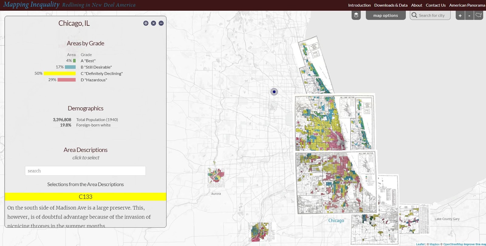
Below is a map showing the Chicago region. It's from a Mapping Inequality project of the Digital Scholarship Lab at the University of Richmond.

Redlining in the Chicago region - see map
The Digital Scholarship Lab has maps for almost every city in America, thus, this is something that can be part of student and adult learning throughout the country.  Understanding how we got to the situation we're facing is a first step toward figuring out how to un-do the evils of past history and create a more just and equitable future.

Visit the American Panorama section on the DSL site and find story maps focusing on other issues in American history.

I found these maps on my @tutormentorteam Twitter feed then did a Google search for "Esri story maps - redlining"  and "redlining maps".  There are many other resources to learn from.

Return to this article often and read updates where I've added links to new, related, articles.


11/30/16 update: Here's a New York Times story about immigration, that uses maps and animation to tell the story in a visual way.

12/20/16 update: Here's another ESRI storymap, this time telling the story of the Dakota Access Pipeline (DAPL).

1/11/17 update: Story map showing 10 most segregated cities in the US.
 
6/28/17 update:  See how Crain's Chicago Business uses this Wealth Divides map in it's own analysis. click here

2/28/18 update:  How Cities are Divided By Income, Mapped - CITYLAB story. click here
View the ESRI Mapping Incomes story-map - click here

4/8/2018 update: Mapping Inequality: Redlining in New Deal America - this collection of Home Owners Loan Corporation (HOLA) maps from the 1920s and 1930s serve as "as critical evidence in countless urban studies in the fields of history, sociology, economics, and law. Indeed, more than a half-century of research has shown housing to be for the twentieth century what slavery was to the antebellum period, namely the broad foundation of both American prosperity and racial inequality."

4/17/2018 update:  Public Housing Plays Huge Role in Racial Segregation and Inequality-- but not in the way most people think.  Article in Business Insider - click here

4/20/2018 update: US News & World Report article - Segregation's Legacy - click here

4/24/2018 update: Segregation incarnated in brick and mortar. See maps in this April 2018 article on The Hechinger Report. 

5/3/2018 update: "Segregation Map: America is More Diverse than Ever, but still Segregated" - Washington Post article - click here

5/10/2018 update: "To Succeed Older Cities Must Overcome Their Stark Color Lines." Brookings edu article - click here

5/16/2018  update:  Metropolitan Planning Council site offers plan for addressing costs of segregation in the Chicago region. "Title: Our Equitable Future: A Roadmap for the Chicago Region". click here

5/29/2018 update:  Connecticut has more concentrated poverty (and wealth) than most metros. see 2015 article. These are findings from a DataHaven study

6/1/2018  update: The End of the American Dream? Inequality and Segregation in US Cities. Alessandra Fogli, senior economist and assistant director in the research department at the Federal Reserve Bank of Minneapolis leads a discussion about segregation and inequality across U.S. cities and their consequences on educational outcomes of future generations. see video

12/11/2018 update2018 County Health Map - Key Findings - click here  This report is a resource that can be used by leaders from across the USA.

2/20/2019 updateAmerican segregation, mapped at day and night. This site includes animated maps that show segregation patterns while at work, and while at home. Unique way to view this. click here

2/25/2020 update:  Where Democrats and Republicans live in your city.  This article includes maps that show political separation in cities across the USA, as well as racial segregation.  click here

9/21/2020 update:  Redlining and neighborhood health - click here

9/23/2020 update:  from Brookings.edu: Six maps that reveal America's expanding racial diversity. - click here

2/19/2021 update
- The Case for Reparations - Story by Ta-Nehisi Coates. Review history of slavery, Jim Crow, separate but not equal, housing discrimination, etc. in America. 

2/24/2021  update - How Black cartographers put racism on the map of America  This article shows how maps have been used in the past to fight racism and inequality.

3/5/2021 update - Race & Policing in America - storymap - click here

3/5/2021  update -
- Exploring impacts of structural racism in Chicago - click here
- Lessons from the Harvard/Brown Opportunity Atlas - click here
- Fatal Force - report on police shootings in USA - Washington Post - click here

3-6-2021 update - Mapping Project Explores Links Between Historic Redlining And Future Climate Vulnerability - click here

3-17-2021 update - NY Times article shows patterns of segregation dividing Democrats and Republicans - using maps of many cities - click here

4-2-2021 update - Redlining and Neighborhood Health - National Community Reinvestment Coalition article. click here 

9-21-2021 update - New research puts a different light on how we've traditionally understood "Redlining. Read Redlining Didn’t Happen Quite the Way We Thought It Did" - click here

11-10-21 update - "Before redlining and beyond: How data driven neighborhood classification masks spatial racism". click here

3-9-2022 update - "Redlining means 45 million Americans are breathing dirtier air, 50 years after it ended". Washington Post article. click here

4-29-2022 update - "Mapping Chicago's Racial Segregation" part 1 of 6 series in South Side Weekly - click here

5-14-2022 update - "How a Minneapolis public  history project is building political will to redress racial housing disparities" -  Brookings.edu article highlights role of the University of Minnesota Libraries in this research.  click here

5-17-2022 - School Segregation dashboard by The Century Foundation shows how segregated the schools within every metro area in the US are, including breakdowns by different types of segregation. click here

6-1-2022 - Segregation and School Funding - How Housing Discrimination Reproduces  Unequal Opportunity. New research from Albert Shanker Institute  click here

2-15-2023 - 2020 WBEZ article "Where Banks Don't Lend (in Chicago)  click  here

2-24-2023 - Follow these Tweets from David Schonholzer to see how segregation has changed (or not) in urban areas over the past 30 years. click here

This article does a great job of showing the data in the segregation dashboard. 

6-21-2023 - "School segregation thrives in America’s most liberal cities" - American Inequality article with maps. click here

12-12-2023 - Upgraded version of "Mapping Inequality," the award-winning, foremost digital resource on New Deal redlining, posted here

5-31-2024 - NCRC (National Community Reinvestment Corporation ) article titled "Decades of Disinvestment: Historic Redlining and Mortgage Lending Since 1981" - https://ncrc.org/decades-of-disinvestment/  This report introduces a new HMDA Longitudinal Dataset (HLD).  

Wednesday, October 17, 2018

Opportunity Index article in Chicago Tribune

Below is a Tweet that points to article in today's Chicago Tribune, describing the different opportunities available to youth in different parts of Chicago.


In the concept map shown below I point to several different data platforms that you can use to understand where people need extra help.

Click here to open cMap. Then click on box under each node to open links.
The number of data maps has grown tremendously over the past 10 years. However, the number of people using these as tools to guide needed resource, jobs, health, education and youth support programs into each of these areas has not yet grown to the same extent.

Tuesday, October 9, 2018

World Wide Inequality Index - Interactive Map

Inequality Index
I created the Tutor/Mentor Connection in 1993 with the goal of collecting and sharing information showing work being done in some parts of the world that could be borrowed and duplicate in other places.  Instead of constant reinvention, we need constant learning and innovation.

With that in mind, here's a web site/data map showing a World Wide Inequality Index, which is an annual "global ranking of governments based on what they are doing to tackle the gap between rich and poor".

Reclaim American Dream
Here's another example. This is from the Reclaim the American Dream web site. On a map showing US states you can find information showing legislative work being done in some states that can be inspiration and models for similar work to be done in other states.

Click here to see map
I've been adding links to sites like this to various sections of the Tutor/Mentor web library, and to the concept map shown at the right, as well as posting stories that point to some of them. (see links on right side of this blog)

I learned about the Inequality Index from an article on the From Poverty to Power blog, which is one of the blogs I point to in the web library.

I don't have any money for advertising (never had much) so use my blogs and social media to try to draw attention to the information I'm putting in my library. As others share this in their own networks, my goal is that more people will learn to use these platforms to learn what's working in some places that might also work where they are located, if they can find resources to implement the ideas.

Thus, getting people involved from every sector is really important if we want to try to reduce some of the complex problems facing us in Chicago, the US, and around the world.

You can help by following this blog, or the Tutor/Mentor blog, and sharing posts on social media sites.

If you value the work I'm doing, and the web library I host, please visit my FUND ME page and send a contribution. 


Wednesday, March 14, 2018

Mapping Income Levels and Population Changes

Last week I found a City Lab article titled How Cities Are Divided By Income, Mapped , which uses ESRI story maps to show the income inequality in cities across the USA.

At the right is a screen shot of the ESRI story map.

For those who are concerned about these gaps, and the well-being of people living on the poverty and low-income side, these articles will add ammunition to your efforts.


Here's another map, that I learned about from my ChiHackNight network.  This shows population changes in US cities from 1990 to 2010. The graphic at the left is a screen shot showing the Chicago region. Green dots are cities with population gains and red and pink are cities that lost population.  Click on any dot and see the gain or loss.

For those studying poverty and income equality, as well as racism, education, violence, etc. the population changes  may add some additional information to your analysis.

For any activist, these articles will demonstrate ways to embed maps into stories, with the goal of helping you draw attention, resources and solutions to places where the maps show a need for extra support.

Monday, November 28, 2016

Income Inequality in Cities - Using ESRI StoryMap

This image is from an ESRI Storymap titled "Wealth Divides" that you can find at this link.

This demonstrates a growing ability to use story maps to build a greater understanding of how some places are blessed with great wealth while others are less fortunate due to great poverty.

I'll reach out to ESRI, but the next layer of information on maps like this should be borrowed from my own  history of building map overlays that show locations of non-school tutor and/or mentoring programs in different neighborhoods, as part of a strategy intended to draw resources to existing programs while helping new programs start where few or none exist.

Here's a blog article that illustrates how I've been trying to use maps. Imagine what might result if teams of students, volunteers and map-makers were duplicating the Tutor/Mentor Connection's 4-part strategy, and were producing map stories using current StoryMap tools, to draw attention to inequality, violence and other indicators of need, and were drawing resources to organizations working to reduce those inequalities.

That could be happening in every part of the world if a few leaders would step forward to make it happen.

11/30/16 update: Here's a New York Times story about immigration, that uses maps and animation to tell the story in a visual way.

12/20/16 update: Here's another ESRI storymap, this time telling the story of the Dakota Access Pipeline (DAPL).

1/11/17 update: Story map showing 10 most segregated cities in the US

6/28/17 update:  See how Crain's Chicago Business uses this Wealth Divides map in it's own analysis. click here

2/28/18 update:  How Cities are Divided By Income, Mapped - CITYLAB story. click here
View the ESRI Mapping Incomes story-map - click here

4/8/2018 update: Mapping Inequality: Redlining in New Deal America - this collection of Home Owners Loan Corporation (HOLA) maps from the 1920s and 1930s serve as "as critical evidence in countless urban studies in the fields of history, sociology, economics, and law. Indeed, more than a half-century of research has shown housing to be for the twentieth century what slavery was to the antebellum period, namely the broad foundation of both American prosperity and racial inequality."

4/17/2018 update:  Public Housing Plays Huge Role in Racial Segregation and Inequality-- but not in the way most people think.  Article in Business Insider - click here

4/20/2018 update: US News & World Report article - Segregation's Legacy - click here

4/24/2018 update: Segregation incarnated in brick and mortar. See maps in this April 2018 article on The Hechinger Report. 

5/3/2018 update: "Segregation Map: America is More Diverse than Ever, but still Segregated" - Washington Post article - click here

5/10/2018 update: "To Succeed Older Cities Must Overcome Their Stark Color Lines." Brookings edu article - click here

5/16/2018  update:  Metropolitan Planning Council site offers plan for addressing costs of segregation in the Chicago region. "Title: Our Equitable Future: A Roadmap for the Chicago Region". click here

5/29/2018 update:  Connecticut has more concentrated poverty (and wealth) than most metros. see 2015 article. These are findings from a DataHaven study

6/1/2018  update: The End of the American Dream? Inequality and Segregation in US Cities. Alessandra Fogli, senior economist and assistant director in the research department at the Federal Reserve Bank of Minneapolis leads a discussion about segregation and inequality across U.S. cities and their consequences on educational outcomes of future generations. see video

12/11/2018 update2018 County Health Map - Key Findings - click here  This report is a resource that can be used by leaders from across the USA.

2/20/2019 updateAmerican segregation, mapped at day and night. This site includes animated maps that show segregation patterns while at work, and while at home. Unique way to view this. click here

2/25/2020 update:  Where Democrats and Republicans live in your city.  This article includes maps that show political separation in cities across the USA, as well as racial segregation.  click here

9/21/2020 update:  Redlining and neighborhood health - click here

9/23/2020 update:  from Brookings.edu: Six maps that reveal America's expanding racial diversity. - click here

11/23/2021  update: The Ever-Growing Gap: Failing to Address the Status Quo Will Drive the Racial Wealth Divide for Centuries to Come - Institute for  Policy Studies report - click here