2026 update - the links on the Argonne page no longer open, possibly due to restrictions by the Trump administration. However, you can still view the interactive map, using the link below.

This view shows community organizations in the area who offer various forms of STEM learning opportunities. The orange circles show census data for each census tract in the nine community areas.

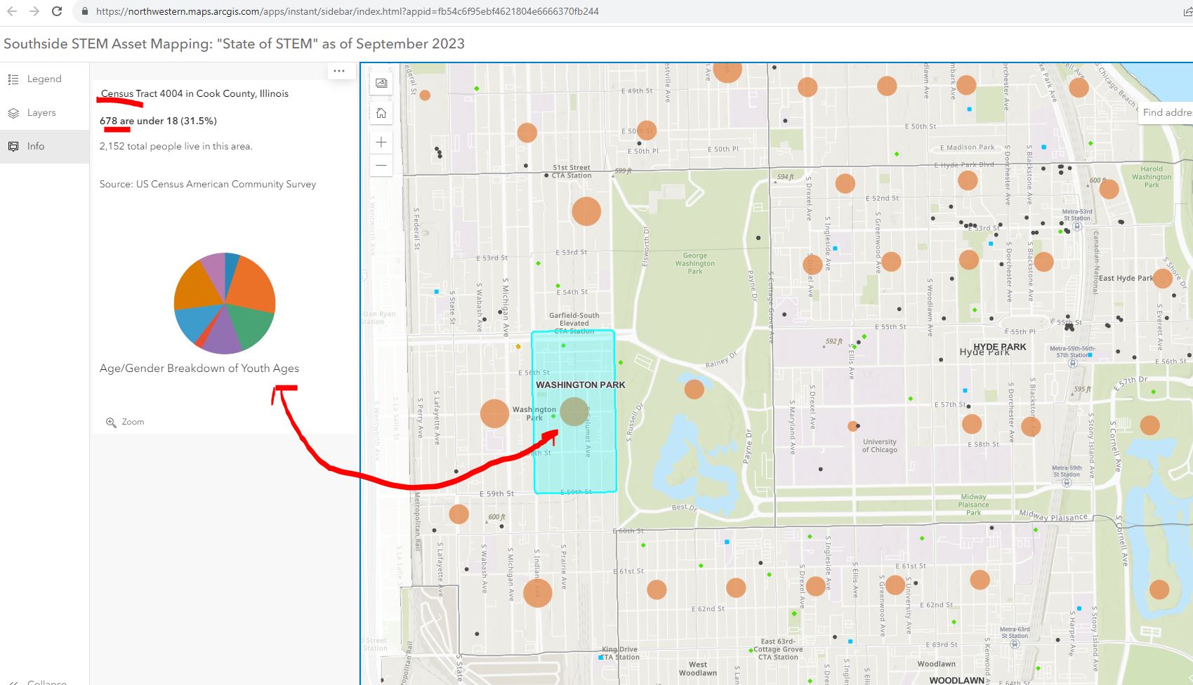

My question is, "How will it be used to make STEM learning and career opportunities available to youth through out the area?"

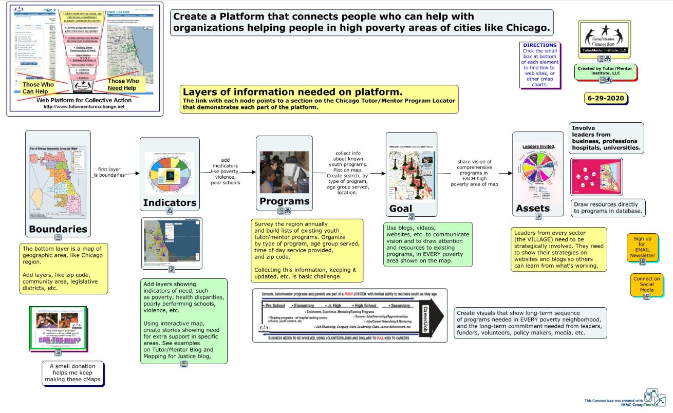
In 2004 an intern from India built the first on-line Tutor/Mentor Program Locator, which was a searchable database shown below. We had organized our annual survey in 1994 to learn who offers volunteer-based tutor/mentor programs, where they were located, what age group they served, and what type of tutoring and/or mentoring did they offer, as well as what time of day did they offer services.


You could follow news stories with map stories. On your map you could not only show existing tutor/mentor programs, but you could add layers showing businesses, hospitals, faith groups, universities who share the same geography and who should be innovative and strategic in helping mentor-rich non-school programs grow in the area. For each part of the city the mix of programs and assets is different.

How to Use Chicago Tutor/Me... by Daniel F. Bassill
One of the challenges of the STEM project is building public awareness and drawing people to the platform, then teaching them to create stories on a regular basis that draw even more people to the platform and motivate them to take actions that help kids in the area have access to mentor-rich STEM learning programs that provide on-going support as kids move from 1st grade through high school, college/tech school and into jobs and careers.
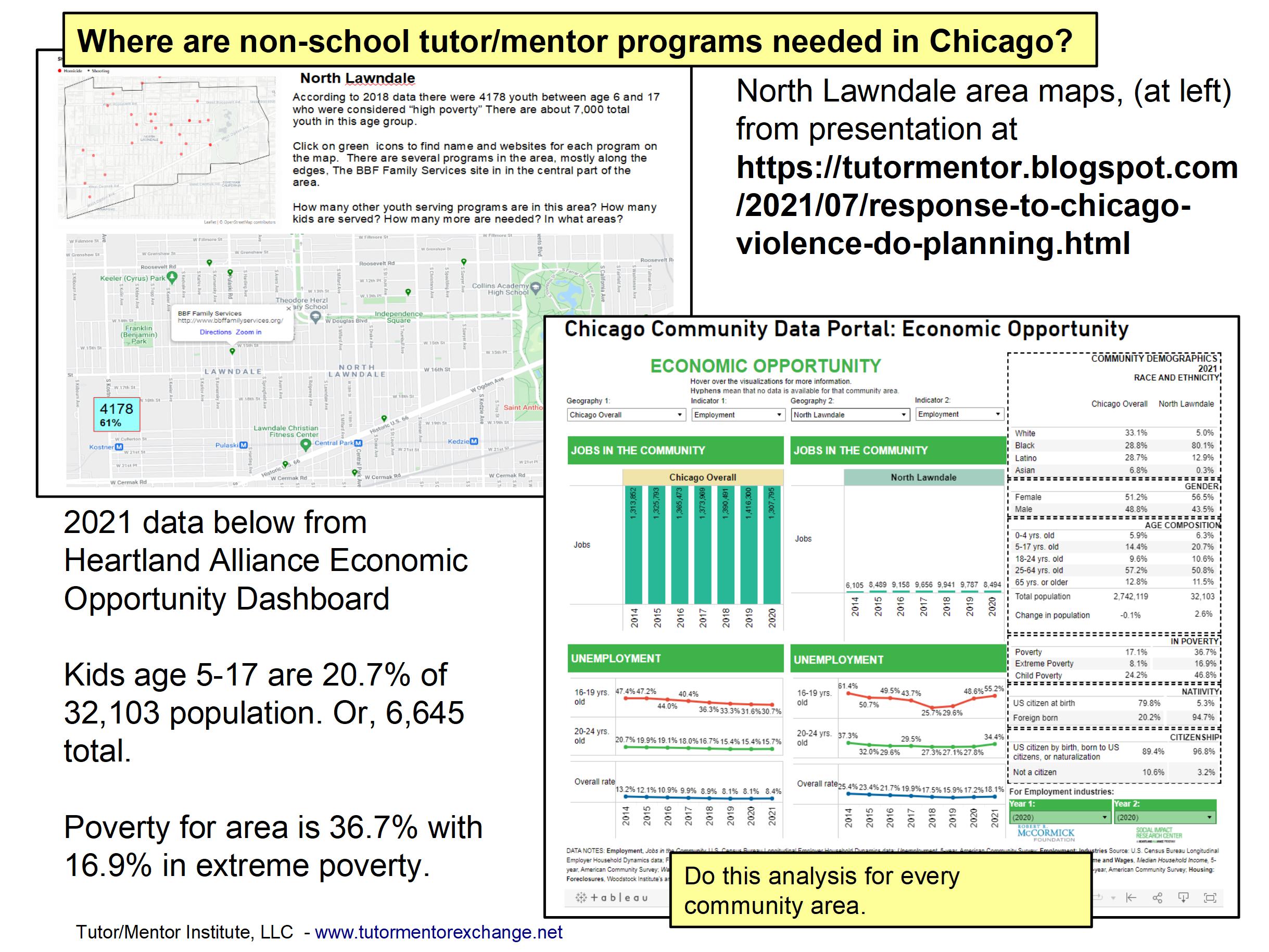
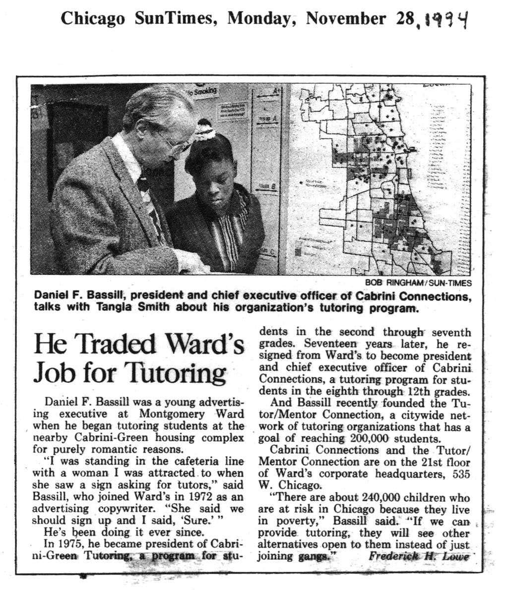
Since my organization did not have advertising dollars we developed a "Rest of the Story" strategy that followed media stories with maps that showed the neighborhood and pointed to tutor/mentor programs in the area (if any) and described the need for more programs. Below is a mid 1990s example.

The STEM project leaders could duplicate this and other strategies that I've piloted over the past 30 years. They are all on-line and available to anyone motivated to look. They might even add some features and functionality to their platform based on what I have done, or tried to do.
The Tutor/Mentor Blog is an even broader text book than the Mapping For Justice blog. Think of the sections below as chapters, or courses in a learning curriculum.
Public awareness - click here
Using maps - click here
Media strategies - click here
Follow up to violence - click here
Mentor role in larger strategy - click here
Tutor/Mentor Institute, LLC website - click here
The challenge: Too much information.
View this graphic in this article. The ideas I share and websites I point to are a vast information ecosystem. It's like a university library or the library of different religious groups. It can't be learned in a day. It needs to be part of on-going learning.

For that to happen major donors, perhaps MacKenzie Scott, need to provide money to fund programs within high schools and college that provide advance degrees for people who spend 10-20 years learning and applying these ideas.

Thanks for reading. Please share these ideas with leaders in Chicago and other cities. Maybe you know one of these donors, or are one yourself.
Connect with me on social media platforms and share your own strategies and maps. Help build the network. Help the STEM network grow and reach more people.
Finally, consider a year-end contribution to help me continue this work in 2024. Visit this page to use the PayPal.