Showing posts with label race. Show all posts

Wednesday, February 14, 2024

Persistent Poverty in America

My Twitter feed brought a new report to my attention this week. It's titled "Persistently poor, left-behind and chronically disconnected" and was written by Kenan Fikri who I've been following for a while.  (I'll use Persistent Poverty to refer to this report in the rest of this article.)

The map below was what caught my attention.  It shows areas of concentrated poverty in six Ohio cities.

For the past 30 years I've used maps to focus attention on areas of concentrated poverty in Chicago. In this set of MappingforJustice blog articles, I show other cities with the same challenges.  In the 1990s a book titled American Apartheid: Segregation and the Making of the Underclass,  written by Douglas S. Massey,  addressed this same issue.

Below are a few passages from the Persistent Poverty article that I highlighted. (click to enlarge). Go to the report to read this in context.


The abstract shows a focus on social networks and social capital and says "these problems tend not to resolve themselves naturally".    The second shows that hidden in affluent Cook County are several clusters of persistent poverty census tracts.  Two with over 200,000 residents."

This is not a new problem. This 1994 Chicago Tribune front page pointed to some of the same high poverty areas as are shown in the Persistent Poverty report. 

I formed the Tutor/Mentor Connection in Chicago in 1993 (and Tutor/Mentor Institute, LLC in 2011)  to try to help volunteer-based tutor, mentor and learning programs grow in these areas as a strategy for expanding the networks of adults from beyond poverty areas who were helping kids through school.  I point volunteers and donors to these programs, through lists that I host on this page. 

In the Persistent Poverty report, one strategy was to expand networks of support and bridging social capital. 


This paragraph highlights the difference between "bonding" social capital which consists of strong ties between family, neighborhoods and/or church groups.  These are present in many high poverty communities.  What's not present are large doses of "bridging" social capital, which connect youth and families to people and opportunities and solutions beyond the place where they live.  

I've been writing about social capital on the Tutor/Mentor blog for many years. Add these articles to your research. 

The graphic below was created in the 1990s to show the design of the tutor/mentor program I led. It's a strategy designed to expand "bridging" social capital for K-12 youth and families in every high poverty area of Chicago and other cities with areas of concentrated poverty. 

The hub on this graphic represents a youth, a family, a school or a neighborhood. It shows a volunteer-based tutor/mentor program as a place that draws workplace volunteers from many different backgrounds to serve as one-on-one and group tutors/mentors to youth living in high poverty places of Chicago.  The timeline in the middle of the hub emphasizes the 20-plus years it takes to help each youth through school and into jobs where they can earn enough to raise their own kids free from poverty's challenges.  

The strategy I've emphasized has been to enlist leaders from every industry to use their own media, visibility and resources to draw volunteers and donors to tutor/mentor programs in all parts of a city, not just to one, or two, high profile programs. 

These two PDFs show this goal - Total Quality Mentoring  click here

Role of Leaders - click here

I've focused on cities because the geographic size makes it difficult for workplace volunteers to meet with kids during the school day, or right after school, because of the distance between work and program locations.  The after work and weekend hours are times when that volunteers is more able to stop at a neighborhood program and make an on-going commitment.

However, there are not enough long-term programs and there is inconsistent funding to build and sustain such programs.  Here's one of many articles where I focus on funding.  No solution will come without addressing the flow of dollars to these places!

However, as the map from the Persistent Poverty report shows, the problem of long-term poverty is not limited to cities and urban areas.


These two paragraphs emphasize the different history of places across the US and the lack of simple solutions.


Below is another graphic from my collection.  


It emphasizes the role each person can take to be part of a solution. If you've read this far, that means YOU!

Read the report. Here's the link again.

Update: I asked if there is an interactive map showing the Persistent Poverty data. There is. Follow the link in this post from Twitter (x): Using the interactive map you can zoom into the Chicago area, or any other place with high concentrations of poverty.  Look at it. Create your own map stories.

Then, share it with people in your network, so they read it and begin to think about roles they might take in helping more people become involved in efforts that make mentor-rich programs available in all of the high poverty areas shown on these maps.

3-7-2024 update - Here's another article using the EIG dashboards to understand t his data:  https://cityobservatory.org/a-yawning-chasm-patterns-of-neighborhood-distress-in-us-metros/

Then visit this section of the Tutor/Mentor library and read additional reports about poverty, race and inequality in America, that I've been collecting for more than 20 years. 


In last Sunday's Super Bowl a group spent millions of dollars to purchase ads talking about Jesus.   I wish someone were spending the same money talking about the research I've been pointing to and mobilizing people to be volunteers, leaders and donors supporting youth tutor, mentor and learning programs in all high poverty areas of big cities across the country. 

And building a similar research library showing the different challenges of rural areas, reservations, and other places where solutions may be different than for big cities. Then, drawing readers and planners to that resource so they develop solutions.

And that they do it consistently for the next two decades.

What do you think?  Connect with me on social media. (see links here)

Help me pay the bills. Make a contribution to Fund the Tutor/Mentor Institute, LLC. click here

Thursday, June 8, 2023

Who is doing research about youth program availability?

 If you've read articles on this blog, going back to 2008, you'll see that the Tutor/Mentor Connection (1993-present) and Tutor/Mentor Institute, LLC (2011-present) have been trying to build a comprehensive, map-based, understanding of what non-school, volunteer-based tutor/mentor and learning programs exist in Chicago and where more are needed.  Over the past several years my capacity to do this work has been greatly reduced so I'm pleased to be able to point to others who seem to be filling this space.

Below is one slide from today's STEM Pathways Coop meeting, where Deanna Howlett of Northwestern University spoke to attendees about the Citywide State of STEM Landscape Survey.  


View the slides at this link.  Below is another slide from the presentation, showing the process intended to create understanding, and change, where change is needed.


I've shared ideas and strategies with those doing this research and participated in the meetings when they were on-line.  I look forward to more.

Today I did participate in an on-line webinar, hosted by Brookings.edu, focused on Racial Equity.  Here's one Tweet that I shared during the event. 
Visit #BrookingsRacialEquity on Twitter and see my contributions and posts by others.   As I write this post and share my ideas on Twitter and other platforms I'm trying to model a practice that I wish thousands had been duplicating for the past 10 years.  

The Internet is a huge depository of information. But unless people are aggregating it in libraries like mine, or sites like https://www.brookings.edu/blog/how-we-rise/, it will be difficult to organize learning communities that are needed to build understanding and public will necessary to impact public policy in America.   In addition to its blog and huge library of research articles you can find video archives of past webinars if you search in this section on the Brookings site. 

Share this information. Build learning circles.


You can be the YOU in this graphic by sharing my post and forwarding my Tweets, along with those of other people and organizations that I point to in my library and blog articles. 

Among many problems we face one big barrier is that there is "too much information".  We need people collecting the information, but we also need people evangelizing and trying to get growing number of people to look at the information that's been collected. Then we need even more people who are facilitating understanding and helping people connect and work together to implement solutions, in places where data maps show more people need extra help.  Colleges, public schools and faith based organizations have been doing this for centuries.  We need to duplicate that process and that requires some major benefactors who make long-term investments.

I've written several hundred articles on the Tutor/Mentor blog, that just focus on this "learning" process. Here's one.  

The Step 3 graphic above is part of this concept map, showing 4 strategies that I've followed since starting the Tutor/Mentor Connection in 1993.  I invite others to build their own version and apply this in their own work.


Thanks for reading. I hope you'll borrow from what I share here, on the Tutor/Mentor Blog and on the Tutor/Mentor Institute, LLC website.  Create your own versions. Share your own maps and blog articles. Teach others to do the same.


You can connect with me on Twitter, Facebook, LinkedIn, Instagram and Mastodon.  

If you want to help fund my work, visit this page and send a small contribution.

If you want to adopt this work and embed it in your university, I'd love to hear from you. 

Saturday, June 20, 2020

Understanding history of redlining - Louisville, Oakland, CA, Chicago, more

See map here
The murder of George Floyd in Minneapolis in late May unleashed pent up anger in cities across the world, which continued through the Juneteenth celebrations and protest marches of June 19, 2020.

Hopefully this leads people of all backgrounds to dig deeper into the history of slavery and continued oppression of Black and Brown people that continues today.

One part of this history is 'redlining' where maps were drawn using red lines to show neighborhoods where banks and insurance companies would not invest. Those were poor neighborhoods with concentrations of Black and Brown people.

The map I'm showing here is from an article on the Bloomberg City Lab website, titled "Louisville Confronts Its Redlining Past and Present".   Visit this page to see the full presentation.

Oakland, San Francisco - redlining
These graphics are from ESRI story map presentations about 'redlining'.   While the map above focuses on Louisville, Kentucky, the maps in this story focus on Oakland and San Francisco, CA.

The ESRI story maps make great presentation platforms for this information. Scroll down the map and new images and text appear. It makes it easier to understand the stories being told.

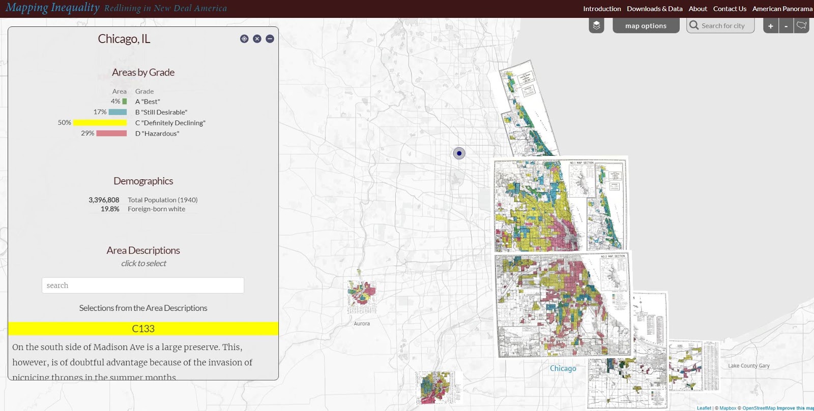
Below is a map showing the Chicago region. It's from a Mapping Inequality project of the Digital Scholarship Lab at the University of Richmond.

Redlining in the Chicago region - see map
The Digital Scholarship Lab has maps for almost every city in America, thus, this is something that can be part of student and adult learning throughout the country.  Understanding how we got to the situation we're facing is a first step toward figuring out how to un-do the evils of past history and create a more just and equitable future.

Visit the American Panorama section on the DSL site and find story maps focusing on other issues in American history.

I found these maps on my @tutormentorteam Twitter feed then did a Google search for "Esri story maps - redlining"  and "redlining maps".  There are many other resources to learn from.

Return to this article often and read updates where I've added links to new, related, articles.


11/30/16 update: Here's a New York Times story about immigration, that uses maps and animation to tell the story in a visual way.

12/20/16 update: Here's another ESRI storymap, this time telling the story of the Dakota Access Pipeline (DAPL).

1/11/17 update: Story map showing 10 most segregated cities in the US.
 
6/28/17 update:  See how Crain's Chicago Business uses this Wealth Divides map in it's own analysis. click here

2/28/18 update:  How Cities are Divided By Income, Mapped - CITYLAB story. click here
View the ESRI Mapping Incomes story-map - click here

4/8/2018 update: Mapping Inequality: Redlining in New Deal America - this collection of Home Owners Loan Corporation (HOLA) maps from the 1920s and 1930s serve as "as critical evidence in countless urban studies in the fields of history, sociology, economics, and law. Indeed, more than a half-century of research has shown housing to be for the twentieth century what slavery was to the antebellum period, namely the broad foundation of both American prosperity and racial inequality."

4/17/2018 update:  Public Housing Plays Huge Role in Racial Segregation and Inequality-- but not in the way most people think.  Article in Business Insider - click here

4/20/2018 update: US News & World Report article - Segregation's Legacy - click here

4/24/2018 update: Segregation incarnated in brick and mortar. See maps in this April 2018 article on The Hechinger Report. 

5/3/2018 update: "Segregation Map: America is More Diverse than Ever, but still Segregated" - Washington Post article - click here

5/10/2018 update: "To Succeed Older Cities Must Overcome Their Stark Color Lines." Brookings edu article - click here

5/16/2018  update:  Metropolitan Planning Council site offers plan for addressing costs of segregation in the Chicago region. "Title: Our Equitable Future: A Roadmap for the Chicago Region". click here

5/29/2018 update:  Connecticut has more concentrated poverty (and wealth) than most metros. see 2015 article. These are findings from a DataHaven study

6/1/2018  update: The End of the American Dream? Inequality and Segregation in US Cities. Alessandra Fogli, senior economist and assistant director in the research department at the Federal Reserve Bank of Minneapolis leads a discussion about segregation and inequality across U.S. cities and their consequences on educational outcomes of future generations. see video

12/11/2018 update:  2018 County Health Map - Key Findings - click here  This report is a resource that can be used by leaders from across the USA.

2/20/2019 update: American segregation, mapped at day and night. This site includes animated maps that show segregation patterns while at work, and while at home. Unique way to view this. click here

2/25/2020 update:  Where Democrats and Republicans live in your city.  This article includes maps that show political separation in cities across the USA, as well as racial segregation.  click here

9/21/2020 update:  Redlining and neighborhood health - click here

9/23/2020 update:  from Brookings.edu: Six maps that reveal America's expanding racial diversity. - click here

2/19/2021 update
- The Case for Reparations - Story by Ta-Nehisi Coates. Review history of slavery, Jim Crow, separate but not equal, housing discrimination, etc. in America. 

2/24/2021  update - How Black cartographers put racism on the map of America  This article shows how maps have been used in the past to fight racism and inequality.

3/5/2021 update - Race & Policing in America - storymap - click here

3/5/2021  update -
- Exploring impacts of structural racism in Chicago - click here
- Lessons from the Harvard/Brown Opportunity Atlas - click here
- Fatal Force - report on police shootings in USA - Washington Post - click here

3-6-2021 update - Mapping Project Explores Links Between Historic Redlining And Future Climate Vulnerability - click here

3-17-2021 update - NY Times article shows patterns of segregation dividing Democrats and Republicans - using maps of many cities - click here

4-2-2021 update - Redlining and Neighborhood Health - National Community Reinvestment Coalition article. click here 

9-21-2021 update - New research puts a different light on how we've traditionally understood "Redlining. Read Redlining Didn’t Happen Quite the Way We Thought It Did" - click here

11-10-21 update - "Before redlining and beyond: How data driven neighborhood classification masks spatial racism". click here

3-9-2022 update - "Redlining means 45 million Americans are breathing dirtier air, 50 years after it ended". Washington Post article. click here

4-29-2022 update - "Mapping Chicago's Racial Segregation" part 1 of 6 series in South Side Weekly - click here

5-14-2022 update - "How a Minneapolis public  history project is building political will to redress racial housing disparities" -  Brookings.edu article highlights role of the University of Minnesota Libraries in this research.  click here

5-17-2022 - School Segregation dashboard by The Century Foundation shows how segregated the schools within every metro area in the US are, including breakdowns by different types of segregation. click here

6-1-2022 - Segregation and School Funding - How Housing Discrimination Reproduces  Unequal Opportunity. New research from Albert Shanker Institute  click here

2-15-2023 - 2020 WBEZ article "Where Banks Don't Lend (in Chicago)  click  here

2-24-2023 - Follow these Tweets from David Schonholzer to see how segregation has changed (or not) in urban areas over the past 30 years. click here

This article does a great job of showing the data in the segregation dashboard. 

6-21-2023 - "School segregation thrives in America’s most liberal cities" - American Inequality article with maps. click here

12-12-2023 - Upgraded version of "Mapping Inequality," the award-winning, foremost digital resource on New Deal redlining, posted here

5-31-2024 - NCRC (National Community Reinvestment Corporation ) article titled "Decades of Disinvestment: Historic Redlining and Mortgage Lending Since 1981" - https://ncrc.org/decades-of-disinvestment/  This report introduces a new HMDA Longitudinal Dataset (HLD).  

Saturday, March 2, 2019

How to Increase Focus on Black Issues, when Share of US population is less than 14%

Here's a Tweet from BrookingsMetro that I saw this week:

This points to a Brookings article titled The Rise of Black-Majority Cities

Within the article is this statement: "The black share of the U.S. population rose only slightly since 1970. From 11.1 percent in 1970 to 12.6 percent in 2010." 

The map shows a heavy concentration of African Americans in the South East and along the East Coast from New York City South to Florida and in many large cities spread across the country.

I'm in Chicago, and started leading a tutor/mentor program serving African American kids living in the Cabrini Green public housing area in 1975. In 1993 I created the Tutor/Mentor Connection (T/MC) to help mentor-rich non-school programs, like the one I was leading, grow in all high poverty areas of Chicago, which were mostly African American and Hispanic neighborhoods.

I've been using maps since 1994 to show high poverty areas, in an effort to build public attention and motivate more people to provide time, talent and dollars to help youth tutor/mentor programs grow in all of these areas.

I use tags to help sort the articles in my blog, so if you click the #poverty tag, you can find a series of articles with various maps that show the demographics of Chicago the concentrations of poverty in the USA. 

Over the past 30 years the population of Black kids in the city has been decreasing.  It's still a huge number, but the Hispanic population is almost the same, and many African Americans who lived in the city are now living in the Chicago suburbs, or have moved out of state.

The work I've been doing since early 1990s is building a web library with information anyone can use to better understand issues, know more possible solutions, and then use these ideas in efforts to build and sustain youth tutor/mentor and learning programs that reach more k-12 kids in high poverty areas with support systems that help them move through school and into adult lives free of poverty.  In the concept map below I point to sections of the Tutor/Mentor Connection web library, with links to articles about poverty, race issues, inequality, Black History, etc.

In looking at the Brookings article and map I have some questions.

a) How do we attract and maintain attention and support for those kids still living in high poverty neighborhoods of Chicago as the population changes?

b) How do we attract and maintain attention on social justice, inequality and other issues that focus on the lives of people whose ancestors came to America as slaves many years ago, when most parts of the country don't have a significant population of people with this background....and when the overall percent of African Americans in the total US population is  under 14%

Do solutions need to come from cities rather than from national initiatives? Do solutions need to be regional, focusing on parts of the country with high concentrations of African Americans?

Would it be helpful to show similar maps with Hispanic and immigrant populations, showing what percent live in poverty, and where they live? Are there shared experiences that are similar, and that could create political bonds that focus on solutions at the national level?

I really don't know.

Thursday, February 8, 2018

Understanding DACA, Immigration and Importance to America

This is one of many interactive maps that can be found on the web site of the USC Center for Study of Immigrant Integration (CSII).

Browse this section of the Tutor/Mentor web library to find many articles related to law, poverty, racial justice, etc.

Wednesday, January 31, 2018

Chicago United for Equity - CPS equity maps

I attended an event last night titled "65/54 Brown v. Chicago: Race and Access in Education" which was held at the Hull House Museum near UIC in Chicago. The map below was shared by one of the speakers, Niketa Brar, a co-founder and executive director of Chicago United for Equity (CUE). 

Link to interactive map - click here
The event description says "Sixty-four years after Brown v. Board of Education (1954) declared that separate was unequal, Chicago’s public schools remain segregated, and access to education continues to be out of reach." Panel members were passionate and full of data to support this claim and urged that anyone who cares, should take an active role.

The map on the CUE web site helps support this. It is one of the few maps I've found that show CPS school boundaries. You can zoom in to enlarge the maps. You can also run your mouse over the map and find data for each school, showing segregation rates, student gains and/or loss over past few years, and school utilization by community members.

Other speakers were Amanda Lewis, Director of the Institute for Research on Race and Public Policy and Professor of African American Studies and Sociology at UIC and  David Stovall, a Professor of Education Policy Studies and African American Studies at UIC. I met Dave last year and continue to encourage him to put his research on a blog or web site.  The moderator was Cassandra McKay-Jackson, an associate professor, and the new director of the Master of Social Work program at Erikson Institute. 

Last night's session was recorded and once the video is available I will add it as a link to this article. Listening to the speakers is much more effective than me trying to paraphrase what they were saying.

As you look at the CUE map, look at map stories on this blog and on the Tutor/Mentor blog.  I feel that students, parents, volunteers and others could be using map platforms like the CUE site to tell stories, specific to areas as small as a city block or a CPS school neighborhood. Every time something happens that shows the inequity in the city, a story needs to be created. Every time something good happens, stories can be created.

This needs to be happening daily if we're going to get more people involved and build the political power needed to address the deeply implanted root causes of these problems. 

Do you value what I write about and the information I share. Visit this page and use the PayPal to send me a small contribution to help me continue this work. 

Thursday, December 14, 2017

Racial Segregation in Metro Areas - Brookings report

Map from Brookings.edu report
This is one of four sets of maps included in this article describing continuing racial segregation in 24 large metro areas of the United States.  Take a look.

Read other articles that focus on race and segregation that I've posted on this blog.

Monday, December 11, 2017

Racial Imbalance in U.S. Public Schools - Interactive map

See this map here
I've posted several articles over the past few years that point to the Brookings.edu site and their use of data maps to show poverty and race issues in the U.S.

This link points to an article and interactive map showing the racial imbalance in U.S. public schools. 

You can zoom into the map and look at the school and neighborhood demographics for every public school (traditional and charter) in the U.S. 

Saturday, December 2, 2017

Mapping Decline: St. Louis and the American City

This map is from a web site that tells the story of racial segregation in St. Louis as a result of deliberate policies enacted from the 1900 through the 1970s.  Click on the interactive maps to understand the impact of different policies and to see changes by decade.

In this blog I've included maps of Milwaukee, St. Louis, Cincinnati, Chicago and other cities to show that racism led to concentrated poverty and inequality that is present in every city. Maps can be used to not only show where the problem is, and why it occurred, but also to support leadership efforts that help put programs in place that help overcome these challenges.

Monday, September 18, 2017

Mapping Segregation in Washington, DC

This image is from an ESRI story-map, showing the growth of racial segregation in Washington, DC.

Take a look at this, and other articles on this blog, where I've shared maps focusing on race, poverty and segregation.

Wednesday, August 2, 2017

New report details Chicago’s racial, ethnic disparities

Browsing Linkedin feed today and saw link to UIC press release titled "New report details Chicago’s racial, ethnic disparities".  Opened link to full report, which is in an eBook format.

 “A Tale of Three Cities: The State of Racial Justice in Chicago,”
I've pointed to articles like this for many years and supported the growth of volunteer-based tutor, mentor and learning programs as a strategy to engage people from different parts of the Chicago region with people living in high poverty, segregated neighborhoods.  Read more articles on this blog, or visit the Tutor/Mentor blog or the Tutor/Mentor Institute, LLC web site.  Use this concept map to guild you to different research sections of the Tutor/Mentor web library. 


Nothing will change unless people form learning circles in business, faith groups, colleges, high schools and other places and begin reading these articles and looking for ways you can get involved with youth and families who are different from your own.

Visit this link to browse my list of Chicago area tutor/mentor programs where you might get involved. 

Thursday, February 16, 2017

Race, Place and Jobs.

From PolicyLink.org
This image is from a PolicyLink report that I read today, that results from an analysis of 150 metro areas of the US.  The study shows a connection between where you live, race, and unemployment.  Chicago is not listed among the top 25 cities with the greatest unemployment.  See the PDF.

Read article.

Monday, October 17, 2016

Divided Nation - Rural vs Urban America

On Saturday, Ann Medlock, of the Giraffe Heroes Project, shared a story on Facebook that prompted me to write this.  The article is titled "How Half Of America Lost Its F**king Mind" and was talking about how so many American's are supporting Donald Trump for President.

I read the article and encourage you to read it too.  If you live in a city, some of the ideas may turn you off, or challenge your thinking. If you live in rural America, or grew up there, you might say, as the author did, "That could be me."

Included in the article was a map showing the 2012 Presidential Election voting, on a county-by county basis.

The red counties on this map represent rural, mostly White, America. The blue counties represent urban America, with much larger populations of people of color. Reading the article I began to look at "TWO Americas" from a "rural-urban" perspective, not just from a "White-Minority" or "Rich-Poor" perspective.

Of course, they are all related.

What's driving the motivation of rural America is a changing economy that has caused factories and jobs to leave smaller cities and rural areas, leaving poverty and a lack of hope in its wake. The article talks about how popular culture (movies, TV, radio, music), coming out of urban Ameria, have helped prepare rural America to accept Trump. One line in the article was, "He's our "asxhxxle"

I did a little more digging today, and visited the web site of Mark Newman  There are several more maps on the site, like the one below. This shows that not all of the Red counties are 100% Republican and not all of the Blue counties are 100% Democratic.


What this map does not show is the racial mix across America.  The article about rural America voting for Trump does not focus on the race and inequality issues that Black American's have been focusing on, yet it's there.

I recalled another web site that I saw a couple of years ago, with what's called a "Racial Dot Map". I've included a screen shot below, showing the full country.  The map has color coded dots showing where different racial groups are most concentrated.
You will need to open the site and zoom in to get better information from this map, but just by comparing this to the map above, you see two patterns. A large part of the Republican counties East of the Mississippi are high majority White. Cities and urban areas across the country have high minority populations.  However, the areas West of the Mississippi, mostly Republican, have very low population density. This is lack of population density is a different rural America than Appalachia and the US South.   I encourage you to read Newman's article and see how he describes how population density affects the general election vote, as well as the Electoral College vote.

My take-away?

First, the issues of race and poverty in America are complex, and getting consistent attention of people in Red and Blue states will be difficult.  For the past 40 years I have focused on helping urban areas build and sustain non-school support systems for youth living in poverty.  However, I've recognized that there needs to be a parallel group duplicating my efforts, with a focus on rural areas. I recently found an organization called Rural Assembly, who is doing some of this.

Second, the problems facing rural American and its loss of jobs, rising poverty, growing drug abuse and suicide rates is also a wicked problem, that won't be solved by more tutor/mentor programs. It's not a problem I've spent much time thinking about, since the problems I do focus on are far beyond my own area of influence.

However, graphics like this illustrate a path toward possible solutions. It shows how a few of us can reach out to others, and build a network of learners, which grows over time. 


In articles on the Tutor/Mentor blog I focus on learning, complex problems, network building, etc. These do apply to both of the issues this article focuses on.  Getting more people personally engaged in learning about the problems we face, and using their own time, talent and dollars to build solutions, is the one strategy that I keep sharing that can lead to a more connected America focusing on problems, not personalities, and focusing on well-thought-out solutions, not vague promises. 

I hope you'll take a look.


Jan 27, 2017 update.  The election is over and Trump won. People on the left are in panic mode fearing the destruction of our democracy by a Hitler-like Trump. Poor people who voted for Trump are likely to suffer as much, or more, from program cuts he is proposing. So why did they vote for him?  This MotherJones article offers a look into that voter and his motivations.   For people on the left to create an alternative to Trump, they need to understand and find ways to connect with people who voted for Trump.

Jan 31, 2017  update - this Gallup.com site show the most conservative and most liberal states in the US, emphasizing how difficult it will be to build a middle ground consensus in America.

Feb 18, 2017 update - This link points to a set of articles, starting with "America's long (unaddressed) history of class.  http://www.wnyc.org/story/americas-long-unaddressed-history-class/

June 19, 2017 update - blogger writes about hopelessness in rural America. click here

Aug. 11, 2017  update - Rural Poverty in Illinois growing faster than urban poverty. - article

Jan. 2, 2018 update - The 100 year capitalist experiment that keeps Appalachia poor, sick and stuck on coal. - article 

Jan 8, 2018 update - The Divide Between America's Prosperous Cities and and Struggling Small Towns - in 20 charts - WSJ article

Jan. 8, 2018  update - Native Americans and Path to Voting Rights - NY Times article

July 20, 2018 update - review of community organizing around racial justice issues in rural America - pdf - click here

April 13, 2020 update
- two useful resources are The Center on Rural Innovation and The Rural Opportunity Map

December 1, 2020 update
- why Democrats keep losing Rural American voters - with recommended fixes. click here

 Jan 26, 2021 update - Five Ways Joe Biden Can Help Rural America - click here

Nov 22, 2021  update - St. Louis Federal Reserve Bank released collection of essays focused on "Investing in Rural Prosperity". Find full collection at this link.   

Then read the essay titled "Geographic Equity belongs in Federal Policy Making" - click here 

On page 4 of the introduction is this statement "If you are working to alleviate poverty or generate prosperity, map the location of program beneficiaries & layer it w a #map of persistent poverty counties. If program benefits do not reach the poorest places, you may be inadvertently contributing to our inequitable system."    This describes a use of geographic mapping that I've proposed for over 25 years. 

December 27, 2022 update - "Redefining Rural: Towards a Better Understanding of Geography, Demography, and Economy in America's Rural Places".  March 2021 article.  click here

March 4, 2026 update - "No 'Silver Bullet' For Economic Resurgence in Hard-Hit Rural Areas".  From Spotlight on Poverty and Opportunity - click here

Tuesday, June 7, 2016

Understanding Neighborhood Diversity

Here's a map platform that enables you to look at diversity patterns, at the city level. In the "about" section on this site it says "This application is in support of the article in Urban Studies, “Locating neighborhood diversity in the American Metropolis.” The article analyzes geographic variations in neighborhood racial and ethnic diversity over time in large metropolitan areas in the United States."

Combined with other map platforms,  readers and activist can build an understanding of where poverty and segregation are most concentrated in Chicago and other cities.

Monday, May 16, 2016

Map shows population changes in Chicago since 2000, by racial category

I saw the Tweet below today, and encourage you to view the interactive map on the DNAInfo web site, to see how population has changed in Chicago over the past 30 years. 

If you compare areas of White population growth and decline in Chicago since 2000 with Black and Hispanic growth you'll see that in many cases White flight from neighborhoods with growing minority populations continues while gentrification of neighborhoods by upper income Whites is causing lower income people to move out. 


When I created the Tutor/Mentor Connection in 1993 there were far more school-age youth living in the South part of Chicago.  This set of maps was created from a 1997 study of non-school youth serving programs in Chicago.  It shows the number of youth in each of six Chicago Public School Regions and plotted locations of existing non-school tutor/mentor programs.  

If you compare this map to the DNAInfo maps, you can see the change.  I've been trying to map data like this and share it with the public for 20 years, with the goal of mobilizing more people to support youth and families.  While I've  had inconsistent success in doing that, other factors, such as changing demographics and continued race and segregation issues, have also made it difficult to build strategies that reach youth where they live with a wide range of programs that help youth move through school and into jobs and careers.

Map info like this just has not been consistently available. And now that it's more available, there  still are too few people using the data to mobilize attention and resources to fill map areas with needed services.

That's just my conclusion from a quick look at the map. What does it tell you?

Tuesday, January 19, 2016

Where Tutor/Mentor Orgs Needed-based on indicators

This map is a screen shot from the Community Commons resource center. The map shows census tracts where a high number of Hispanic residents have not received a high school diploma.  The areas with the darkest red are tracts with 200 or more people without a diploma.

If you click this link,  you'll find another map, this one showing 'racial/ethnic diversity. 

On this map I've also turned on Illinois state senate district boundaries, which can be used to hold elected people accountable for what they do to help the people in their district. I've a feature like this built into the Tutor/Mentor Program Locator, but the technology on this site is much more sophisticated than on my site. 

I encourage you to browse around the Community Commons map. You can look at other cities. You can zoom in. You can turn on different layers of information. It's a really good data site.

Using maps like this, and maps that show services, like tutor/mentor programs, that might help young people stay in school and get their diplomas, or adult literacy/career education programs that help adults get a GED, or vocational skills training, could show where existing services are located and where more are needed.

Browse articles on this blog, and here and here on the Tutor/Mentor blog that show how I've used maps in stories that are intended to motivate leaders to provide time and resources to support existing programs and/or help new ones grow where they are needed.  Youth, volunteers, business and/or political leaders in any of these areas could be creating similar maps, for the same purpose that I do.

Wednesday, December 23, 2015

Chicago Most Segregated City in US - Brooking.edu

I included this map from a Brookings.edu article in a story I posted here in May 2015. 

Today I received another article from Brookings,edu, under the headline "The Most American City: Chicago, race and inequality". 

I have started using an annotation tool to highlight and comment on articles like this. Here's the link to the annotated version.  

The writer finises with a comment saying, "The broader tragedy of Baltimore, of Ferguson, of Chicago, is that black and Hispanic Americans in the poorest areas of our cities have such bleak prospects. The danger is that once the media bandwagon has moved on, these structural inequalities will remain."  

The strategies I've launched since 1993, through the Tutor/Mentor Connection, have aimed to keep attention focused on issues like this, even when the media are not paying attention.  Read stories on this blog and the Tutor/Mentor Institute, LLC blog, to see how I've been doing that for the past 10 years. 

Thursday, August 27, 2015

2010 Census data on interactive map

This just came across my Twitter feed. Open the link and you'll find a map of the USA, with the 2010 census data plotted, and color coded for different racial groups. It clearly shows how big cities around the country have the greatest concentrations of minorities, and the greatest challenges of race and inequality issues.

Thursday, July 9, 2015

Mapping Segregation in Cities

The New York Times has created an interactive map that maps segregation patterns in major cities, such as Chicago. Local activists should learn to use these and other data maps, in stories that draw more people into engagements that solve the problems shown on the maps.

Concentrations of White poverty in Chicago - almost none!
This WBEZ article focuses on White poverty in Chicago. It's map shows only two census tracts, in the Rogers Park area on the North side, as being "high poverty".  Read the article.

Update: 11/21/2017 - Here's 2017 Brookings.edu article about segregation, titled "60 years after Brown vs Board of Education, how racially balanced are America's public schools?"  Look at the interactive map  to see racial mix for more than 86,000 public schools.

Update: 1/9/2018 -Here's article about school segregation in US cities. Title is We can draw school zones to make classrooms less segregated. This is how well your district does. Is your district drawing borders to reduce or perpetuate racial segregation?