Showing posts with label T/MC. Show all posts

Monday, November 28, 2016

Income Inequality in Cities - Using ESRI StoryMap

This image is from an ESRI Storymap titled "Wealth Divides" that you can find at this link.

This demonstrates a growing ability to use story maps to build a greater understanding of how some places are blessed with great wealth while others are less fortunate due to great poverty.

I'll reach out to ESRI, but the next layer of information on maps like this should be borrowed from my own  history of building map overlays that show locations of non-school tutor and/or mentoring programs in different neighborhoods, as part of a strategy intended to draw resources to existing programs while helping new programs start where few or none exist.
Here's a blog article that illustrates how I've been trying to use maps. Imagine what might result if teams of students, volunteers and map-makers were duplicating the Tutor/Mentor Connection's 4-part strategy, and were producing map stories using current StoryMap tools, to draw attention to inequality, violence and other indicators of need, and were drawing resources to organizations working to reduce those inequalities.

That could be happening in every part of the world if a few leaders would step forward to make it happen.

11/30/16 update: Here's a New York Times story about immigration, that uses maps and animation to tell the story in a visual way.

12/20/16 update: Here's another ESRI storymap, this time telling the story of the Dakota Access Pipeline (DAPL).

1/11/17 update: Story map showing 10 most segregated cities in the US

6/28/17 update:  See how Crain's Chicago Business uses this Wealth Divides map in it's own analysis. click here

2/28/18 update:  How Cities are Divided By Income, Mapped - CITYLAB story. click here
View the ESRI Mapping Incomes story-map - click here

4/8/2018 update: Mapping Inequality: Redlining in New Deal America - this collection of Home Owners Loan Corporation (HOLA) maps from the 1920s and 1930s serve as "as critical evidence in countless urban studies in the fields of history, sociology, economics, and law. Indeed, more than a half-century of research has shown housing to be for the twentieth century what slavery was to the antebellum period, namely the broad foundation of both American prosperity and racial inequality."

4/17/2018 update:  Public Housing Plays Huge Role in Racial Segregation and Inequality-- but not in the way most people think.  Article in Business Insider - click here

4/20/2018 update: US News & World Report article - Segregation's Legacy - click here

4/24/2018 update: Segregation incarnated in brick and mortar. See maps in this April 2018 article on The Hechinger Report. 

5/3/2018 update: "Segregation Map: America is More Diverse than Ever, but still Segregated" - Washington Post article - click here

5/10/2018 update: "To Succeed Older Cities Must Overcome Their Stark Color Lines." Brookings edu article - click here

5/16/2018  update:  Metropolitan Planning Council site offers plan for addressing costs of segregation in the Chicago region. "Title: Our Equitable Future: A Roadmap for the Chicago Region". click here

5/29/2018 update:  Connecticut has more concentrated poverty (and wealth) than most metros. see 2015 article. These are findings from a DataHaven study

6/1/2018  update: The End of the American Dream? Inequality and Segregation in US Cities. Alessandra Fogli, senior economist and assistant director in the research department at the Federal Reserve Bank of Minneapolis leads a discussion about segregation and inequality across U.S. cities and their consequences on educational outcomes of future generations. see video

12/11/2018 update2018 County Health Map - Key Findings - click here  This report is a resource that can be used by leaders from across the USA.

2/20/2019 updateAmerican segregation, mapped at day and night. This site includes animated maps that show segregation patterns while at work, and while at home. Unique way to view this. click here

2/25/2020 update:  Where Democrats and Republicans live in your city.  This article includes maps that show political separation in cities across the USA, as well as racial segregation.  click here

9/21/2020 update:  Redlining and neighborhood health - click here

9/23/2020 update:  from Brookings.edu: Six maps that reveal America's expanding racial diversity. - click here

11/23/2021  update: The Ever-Growing Gap: Failing to Address the Status Quo Will Drive the Racial Wealth Divide for Centuries to Come - Institute for  Policy Studies report - click here   

Tuesday, May 17, 2016

Goal of Maps Created by T/MC; A Bridge Too Far

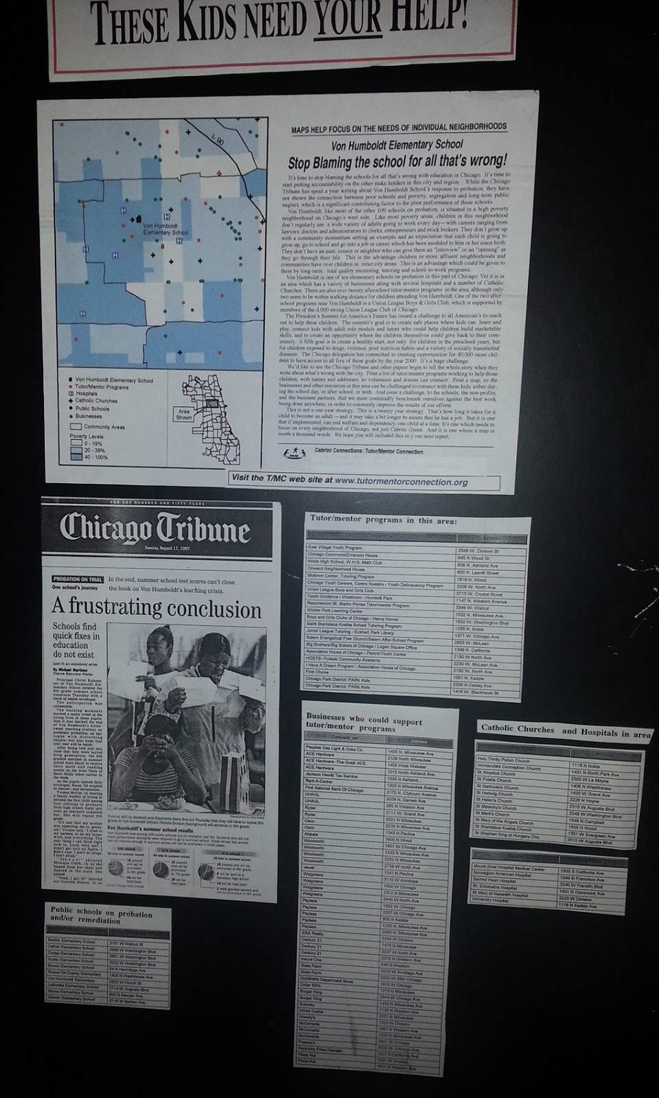
I created the Tutor/Mentor Connection (T/MC) in 1993 to help volunteer-based tutor/mentor programs grow in all high poverty neighborhoods of Chicago. One strategy to accomplish this goal was to create map-stories that would show locations where news media had focused full or half-page attention to a negative news story. Below is an example from the 1990s.

We were using donated ESRI software at that time.  As you know, maps are layers of information, drawn from spreadsheet data.  In the graphic above, you can see the newspaper story we were focusing on, and you can see a map, color coded to show high poverty areas. You can also see what section of the city this was in.  

If you click on the image and enlarge it you can see that on the map we have icons showing known non school tutoring and/or mentoring programs in the map area, plus locations of poorly performing schools in the area, and assets (businesses, faith groups, hospitals).

Below is another example, showing how map stories can be created following news stories that focus on the tragedy, but seldom on strategies to prevent future occurrences of the same bad news.


On an interactive map you'd be able to look at these tables, but with maps created on a desk top set up, we needed to print the tables and post them with the maps, as shown here. View this slide show to see several other map-stories from 1990s, with data tables included.

To create these map required people with special GIS map making talent. I depended on volunteers to do this work between 1994-2008, except for a few intern hours I was able to fund in 1994-1995.  I could never find foundations who'd provide the funds to do this work.

It was not until 2008 that we found funds, via an anonymous donor who gave a one time gift of $50,000,  to re-create our desk top mapping as an interactive program locator that went live in 2009.  This map has the same layers of information as the one above.  You can zoom into different sections of the city and add layers of data to create map views, like shown below. You can mouse over icons and see who the organization is. You can double click on green stars and go directly to the web site of organizations on the map.


Unfortunately we ran out of money to finish developing this in 2009 and the financial crisis that started in 2007 ultimately caused the non profit that created the T/MC to discontinue support for this strategy. Not only was I not able to finish developing the platform, I've not been able to update it since 2011 and since 2013 several parts are no longer working.

Thus, I was never able to build in the features that would enable users to pull up data tables for the map areas shown, which is a common feature for sophisticated GIS map platforms. I was also not able to build layers showing Chicago political wards, or, police, library and fire stations.

Nor was I able to market this extensively and teach youth organizations, media, donors and policy-makers to use it.

At the peak of our service between 2008 and 2011 we were creating map stories using our desk-top ARC GIS software, donated by ESRI, and also creating map stories using the interactive map.  Visit this map gallery to see maps and stories created using the desk top. View this section of the Tutor/Mentor blog to see map stories created using the Interactive Program Locator.

However, this was still not the final goal. The graphic below shows what had been created, but also points to functions that are still on the drawing board.  The goal of the T/MC was to help programs grow, which meant helping them get the dollars needed to grow.


If you look at this page on the Tutor/Mentor Planning wiki, you can see a vision for using a map platform to attract donors to programs shown on the map, using map-stories and quarterly events to attract donor attention and point it to different neighborhoods.  Our goal was to have donations made via a special overlay, so that we could capture donation amounts per year, for each organization, and aggregate that data for each zip code or community area.  

Thus, we'd be able to show what neighborhoods were less funded than other neighborhoods and attempt to motivate additional funding by sharing this information.  In doing so, we could increase the flow of needed operating dollars to tutor/mentor and learning programs in all high poverty neighborhoods of Chicago, meaning more kids would get the extra help they need to move through school and into jobs.

Furthermore, by not being able to get this model fully functioning in Chicago, we've not been able to share it, or lease it, to other cities, and we've not been able to create version that would focus on other supports needed in each high poverty neighborhood.

All of this is still possible. It just takes the commitment of one or two benefactors/investors/partners and the talent of one or two web developers.  When working, the model could apply to any city.


Sunday, June 19, 2011

Mapping Actions


This graphic represents the vision of Dan Bassill and the Tutor/Mentor Connection (T/MC) which began to pilot a use of maps in 1993.

This shows a cycle of collecting information about non-school, volunteer-based tutor/mentor programs operating in the Chicago region, and using maps to show where these programs are most needed, based on poverty, poorly performing schools, violence, etc. The strategy is based on what big companies like Sears, WalMart, Bank of America, etc do to support thousands of branch locations with central organizing, planning and advertising strategies.

The T/MC wants to help high-quality, constantly improving tutor/mentor programs reach kids in high poverty neighborhoods of Chicago and other urban areas in the USA and the world.

We have never had enough resources to do this so the graphic on the chart shows some actions that we do, but not with enough impact, and some actions that we will do when we find investors and partners to help us. We outline the GIS strategy on this WIKI along with other complementary strategies that make our use of maps unique.

If you want to help implement this strategy in Chicago, or in your own city, please email tutormentor2@earthlink.net and offer your time, talent and/or dollars. We cannot do as much working alone as we can with the help of others who might benefit from what we're trying to do.