Showing posts with label story-map. Show all posts

Friday, April 17, 2026

Mapping Justice - Teaches teens to use maps to raise awareness

Today I saw a LinkedIn post from the Afterschool Alliance that announced an "EcoGIS: Mapping Environmental Justice and Beyond" program.  I followed the links and the first took me to an article with the map shown below.


The article started, by saying it is part of the Afterschool Alliance's Collective For  Youth Empowerment in STEM and Society (CYESS) Initiative. It shows work done by youth through a program of CYESS.  

Before I followed that link I read the article and saw that the EcoGIS project was part of a flagship program Mapping Justice.  That really caught my attention since the name of this blog, started in 2008, is MappingForJustice

I followed that link and learned that it's a program based in Florida and supported by a group called "Trubel &Co" that provides "civic tech education to turn local data into community action" through "specialized workshops that explore the intersections of justice, data storytelling, and technology, giving students, nonprofits, and advocates an opportunity to learn technical skills and engage with critical issues pertaining to their communities".  

I have links to the CYESS program on this page in the Tutor/Mentor library. 

So today I took a new look at the "Collective for Youth Empowerment in STEM and Society" program.  This is their home page.


Click on the "Projects" link in the top menu and you'll find the page shown below.


Then click on the "toolkit" button under the "Civic Engagement Resources" paragraph.  This is a huge resource. As I looked through this section I was hoping to see how the initial maps and information collected by students was part of on-going efforts to share the information and get more people involved in solving the problems highlighted by the maps.  

I found a lot more than that.  

But I'm not sure if I found maps showing organizations working to solve these problems, with an analysis of "are there enough?" "or are different types of programs also needed?"  More important, were there blog articles and public awareness campaigns trying to draw volunteers and donors directly to the programs doing the work?

I don't know if anyone on their team has ever visited this blog or my website, but that's what my maps have been used for.  Below are links to three visual essays that I hope some of the leaders of these programs will study.

- "Getting Attention for a Cause"  - click here

- "Rest of the Story" - role youth can take to draw attention to causes - click here

- "Rest of the Story - example focused on one Chicago community area" - click here

This entire blog is a resource that anyone learning to create maps might use to find ideas for how the maps can be used in on-going campaigns.  On the Tutor/Mentor blog you can find nearly 300 articles showing uses of maps in one set of articles on the blog.

Then, look at this concept map which shows the 4-part information-based problem solving strategy that I've piloted since 1993. 

Step 1 involved collecting and organizing information. Creating the maps and blog articles would be included in this step.  Step 2 focuses on increasing the number of people who look at the information.  Step 3 is where people learn to use the information collected in Step 1, to provide time, talent, dollars, votes and other resources in specific places shown by the maps (Step 4). 

Most of the problems that GIS maps highlight are complex and will take many people, and many years, to solve. Without people focusing on all four of these steps, from year-to-year, most of these problems will still be with us many years from now.

Thank you to the Afterschool Alliance for launching the CYESS program and for sharing it on LinkedIn. I hope anyone reading this will take time to dig through all the articles on their site. It's a great resource. 

Furthermore, I hope you'll add a link from your resource page to my blogs, concept maps and visual essays.  

On these sites I show a 30 year history of collecting and sharing information. In 20 or 30 years I hope that some of the projects created through CYESS in 2026 will have websites and blogs showing their own long-term efforts at bringing people together to try to solve some of these complex problems.

Thanks for reading. Please connect with me on LinkedIn, BlueSky, Facebook, Instagram and other platforms. Find links on this page.

I depend on contributions from a small group of people to continue this work. Visit this page if you'd like to help.


Tuesday, September 4, 2018

Citizens Police Data Project - Use As Resource

Below is the home page image from the Chicago Police Data Project, created by the Invisible Institute to collect and publish information about police misconduct in Chicago.

Visit this page and view the video that shows how this information can be used.

Over the past few weeks I've posted a few stories on the Tutor/Mentor blog showing other data platforms, such as Healthy Chicago 2.0 and DuPage Impact.

Click here, here, here and here to see three recent articles.

The common theme of all of these is that poverty concentrations on the West and South parts of Chicago show many indicators that people need extra help from public and private services.

I've posted more than 150 stories since 2005 on the Tutor/Mentor blog where I point to violence in Chicago in an effort to motivate more people to help mentor-rich, non-school youth programs grow in these areas.

I can't do this alone. I invite others to use my stories as a template, and these platforms that I point to, and create your own map stories. If enough of us do this daily or weekly perhaps we'll be able to influence what power brokers do in Chicago to help fill these map-areas with a wide range of needed supports for youth and families.

Sunday, May 27, 2018

Teaching Nineteenth-Century Slave Narratives using Digital Story Maps

Image from The Slave Trail site
I follow a #WorldGEOchat Twitter group that meets every Tuesday evening and am constantly finding new ideas for teaching and for engaging people with social issues that have roots in the past, but are cause for great concern in the present and the future.

Last week I saw a mention of using ESRI story maps to teach the history of the nineteenth-century US slave trade.  I clicked the link and started reading an article titled "Teaching Nineteenth-Century Slave Narratives: Engaging Student Scholars in the Production of Digital Story Maps" written by Amy Lewis, Assistant Professor of Humanities and Liberal Arts, St. Norbert College.

The article is an important read because it encourages student study of the American slave trade, which I feel is and important journey for many to take. It also shows how the students used ESRI story maps to plot escape routes and show movement of individual slaves while in captivity. The author says "the digital story maps engage their interest in ways that few other assignments can match and that they create an awareness of how digital media impacts the ongoing conversation about nineteenth-century slavery that continues to unfold in the United States."

I wanted to share this article, but it did not have usable images so I did a Google search for "slave trade ESRI story maps" then looked at the images.  The one I used in this article is from a site titled "The Slave Trail" which is an extensive resource.

This link opens the ESRI story map on that site.

Thus, by opening one link, reading the article, then doing a search for more information, I'm expanding my own learning. By writing this article, I'm hoping to spark the curiosity of others.  I go one step further. I put links to some of these articles in the Tutor/Mentor web library, to help people find some of the articles I've found valuable.

view examples of maps in stories
It looks like many colleges are using story maps and teaching digital literacy. If you're an educator, or someone interested in history, or in reversing the centuries of injustice caused by slavery, these resources will be useful to you.

However, I'm hoping that some of the students and faculty who learn to use GIS mapping to tell stories will look at what I've been trying to do for 25 years to use stories and maps to support the growth of volunteer-based tutor, mentor and learning programs in areas of high poverty, frequent violence, poorly performing schools and many other indicators that can be viewed on a map.

I don't just want to build a deeper, more empathetic understanding. I want to influence more people to take the YOU role in this graphic. Become someone who helps mobilize time, talent and dollars from people YOU know, to support the growth and continued operations of mentor-rich programs in more places.

I maintain a list of nearly 200 organizations in the Chicago region that offer various forms of tutoring and/or mentoring and plot locations on maps to help build an understanding of where programs are located and where more are needed...and to help parents, volunteers and donors connect with individual programs.

This could be duplicated in other cities, with students from high schools and/or colleges building and maintaining the list of programs, and duplicating work I've been doing to use maps to draw attention to the data resources.

If this interests you, introduce yourself in the comment sections, or connect with me on Twitter @tutormentorteam or on Facebook, or LinkedIN

Wednesday, May 16, 2018

Understand Issues of the Two Koreas - ESRI story map

I follow a weekly #WorldGEOchat on Twitter and this week one Tweet pointed to an ESRI storymap showing history of the conflict between North and South Korea.


It's a demonstration of the use of ESRI story maps, and a valuable resource for understanding current events in the Far East.

Wednesday, April 4, 2018

Justice Map - Visualize Race & Income Data

My Twitter feed today included a Tweet that introduced me to the JusticeMap project. The screen shot at the left shows African American population in the US as a percent of total population.

This site  enables you to "Visualize race and income data for your community, county, and country. It includes tools for data journalists, bloggers and community activists."

It's easy to use. You can click one of the categories on the horizontal bar at the top of the map to create new map views, showing different demographic groups.

You can also zoom in to focus on different regions of the country. This map shows the Chicago region. You can zoom in even closer and add street maps, getting you down to the  neighborhood level.

My goal is that people learn to use maps like these to tell map-stories that point to places where people need extra  help, and repeat often enough that people are actually motivated to provide the talent, dollars, ideas and other resources needed to create change where it may be needed.

Here's a Tweet showing how someone created a map showing Hispanic population density.


If you skim through past articles on this blog you'll find other data mapping platforms and you'll see many ways I've used maps to tell stories intended to help volunteer-based tutor/mentor programs grow in high poverty areas of Chicago.

Here's another Tweet showing how you can focus in on a small area:


Browse feed of Tweets by benjancewicz and see how many are interacting with this platform and with each other on Twitter.

Create your own map stories and share them on social media. Help build the conversation.

Wednesday, March 14, 2018

Mapping Income Levels and Population Changes

Last week I found a City Lab article titled How Cities Are Divided By Income, Mapped , which uses ESRI story maps to show the income inequality in cities across the USA.

At the right is a screen shot of the ESRI story map.

For those who are concerned about these gaps, and the well-being of people living on the poverty and low-income side, these articles will add ammunition to your efforts.


Here's another map, that I learned about from my ChiHackNight network.  This shows population changes in US cities from 1990 to 2010. The graphic at the left is a screen shot showing the Chicago region. Green dots are cities with population gains and red and pink are cities that lost population.  Click on any dot and see the gain or loss.

For those studying poverty and income equality, as well as racism, education, violence, etc. the population changes  may add some additional information to your analysis.

For any activist, these articles will demonstrate ways to embed maps into stories, with the goal of helping you draw attention, resources and solutions to places where the maps show a need for extra support.

Sunday, January 14, 2018

Police Shootings in Cook County, IL - Interactive Map

BetterGov.org web site
The Better Government Association and WBEZ have been following police shootings in Cook County suburbs and reporting this in a TakingCover series of articles. Their focus is on "How Cops Escape Discipline For Shootings in Suburban Illinois."

One data resource is an interactive map that shows locations of shootings and provides details. The screen shot at the left was created by zooming into one part of the map then clicking on one of the yellow dots. In this case, I'm looking at the South Suburban area around Harvey, IL.

While I'm interested in this topic, I'm more interested in helping people in communities with high poverty, poorly performing schools, too few jobs, and too much violence and police shootings, have a system of youth and family support services that help shrink the negatives by creating more paths to high school graduation, jobs and careers.

More specifically, I've been trying to help well organized, mentor-rich, non-school tutor, mentor and learning programs grow in high poverty areas. Site based programs could be operating in faith based buildings, colleges, business sites and/or free standing locations. They could be hosted at public or private schools. I led one of these from 1975 to 2011, serving youth in the Cabrini-Green area of Chicago.

For this to happen, someone needs to take the lead, then begin mobilizing others, who will help start and sustain needed programs.  Using maps in stories that are presented via social media, YouTube, face-to-face presentations, etc. is one strategy to help do this. I've been piloting this for 24 years and keep trying to motivate others to adopt the same tactics.

I created the Tutor/Mentor Connection in 1993 to help non-school, tutor, mentor and learning programs grow in the Chicago region and started a survey in 1994 to locate existing non-school tutor/mentor programs in the Chicago region. I've been plotting this information on maps and sharing it via an Interactive Program Locator, a web list, and the map shown at this link

Since 1994 I've been using the database and maps to tell stories and generate public interest and involvement aimed at drawing needed resources to existing programs, or helping new programs form where more are needed.

At the left is a map view created by zooming into my map platform, to show the same area as the BetterGov.org map.  In this case, I don't find any organized volunteer-based tutor or mentor programs in the area.  That means people in this area are going to need to step forward and create programs,  hopefully borrowing from the ideas on my web sites. Here's a section focused on "how to start a program".

Lack of programs in the South Suburbs is not new information to me. In 2007 I hosted a Tutor/Mentor Conference in this area and this article show our goal of mobilizing people to help programs grow.

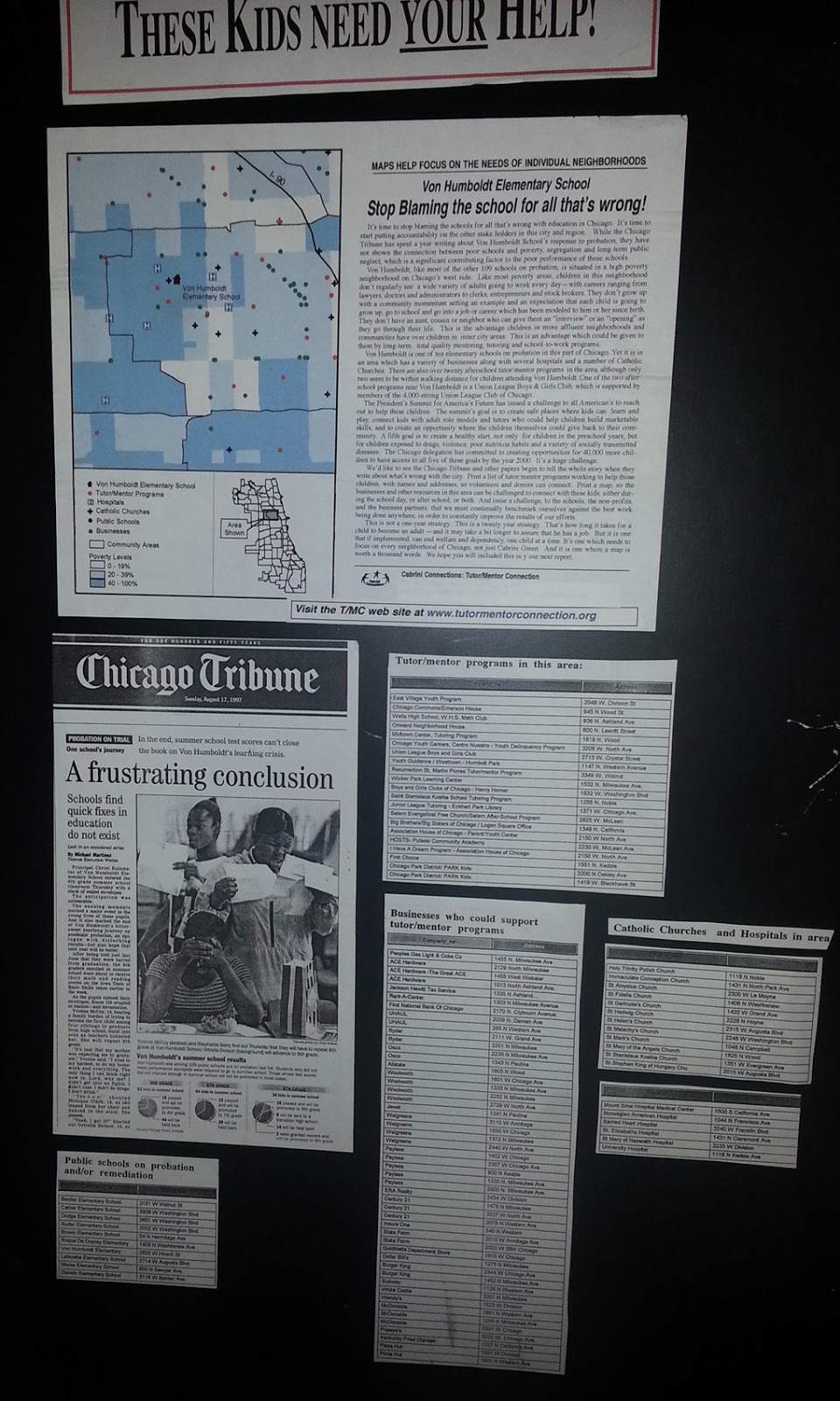
At the right is a map-story created in the 1990s before I had access to the Internet for sharing these stories.  Click on the image to enlarge. Then  you can see a Chicago SunTimes story of a shooting in Chicago and a map that shows where the shooting took place. You can also see a table showing existing tutor/mentor programs in the area, with additional tables showing some businesses in the same area. Finally there's a narrative that ends up calling on assets, political leaders, media and others to help support existing programs in the map area, or help new programs form.

I've been repeating this type of map-story for many years, but my voice is too small, and I'm an outsider in these neighborhoods. If youth, volunteers, parents and community leaders learn to create these stories, and share them weekly, they can begin to draw together a coalition of people who will take the lead on building and sustaining needed programs.

view presentation

In 2008 the T/MC began building an interactive Tutor/Mentor Program Locator, with layers of information that could be used to create a story showing why help was needed, what tutor/mentor programs were in the area, if any, and what banks, hospitals, colleges, faith groups, etc were also in the area and should be taking a role to help build and sustain great programs.

This link points to a presentation showing "how to  use" the program locator to create map stories. 

Since mid 2011 the T/MC has been operated by the Tutor/Mentor Institute, LLC and I've not had the resources to continue updating the Program Locator platform. Thus, it's out of date.  However, it's a model for what could be created in Chicago or other cities, and how it could be used to create map stories that draw attention and resources to neighborhoods where bad things happen too often.

Furthermore, I've demonstrated on this blog, and many others on this site, that you can use data platforms created by others, such as the BGA and WBEZ to create map views which you then edit using Power Point or other tools to add additional information that shows why people should be helping tutor/mentor programs grow in this map-area.

While there are many examples of map-stories on this blog, here's a Nov. 2017 article that shows how one person is creating map stories and sharing them regularly on Twitter. 

Others can, and should, do the same. If I begin to see more map-stories in Tweets and Facebook posts that focus on helping build needed youth and family support programs in different parts of Chicago, the US or the world, I'll know that some people have read this story, or forwarded it to others.

Thank you to Joel Inwood of the ChiHackNight group for bringing the BetterGov.org map to my attention.


Saturday, December 23, 2017

Be a story-map-maker. Draw needed resources to neighborhoods.

This map shows the Austin neighborhood on the West side of Chicago. It also shows the Eisenhower Expressway that draws commuters through the West side as they travel to and through work.

I've used this and similar maps in several stories on this blog in past years. Please look at them and use them as examples for ways you and others can use maps in stories that draw attention, volunteers, dollars, ideas and other needed resources to youth serving organizations in every poverty neighborhood in the Chicago area,  the USA, and the world.

Here's another article, showing ways to make your own maps to influence public policy and willpower.

This blog was started in 2008. There are nearly 10 years of articles showing ways to use maps and visualizations in stories, which also point you to many other resources that help you understand poverty, inequality and racism in America.

The purpose of my map stories is to help well-organized, volunteer-based, tutor, mentor and learning programs grow in all high poverty neighborhoods of the Chicago region. Ideally, such programs connect with youth in elementary and middle school, then stay connected as they help youth move through high school and into adult lives.

With social media, such programs can be a hub connecting youth, volunteers, ideas and opportunities for a lifetime.

I know of very few programs who actually do this. One reason is that the system that funds non profit  youth serving organizations is inconsistent and short-term in who it funds, and how long it funds, as well as what it funds.  Another might be that there is no university or apprentice program training leaders to come into this field, drawing upon the multi-year experience of current and past program leaders, such as myself. 

While I provide these map stories, I host a library of articles and web sites that you can use to expand your understanding of problems and solutions. For instance:

List of Chicago youth programs - visit this link and see the way I share links to Chicago youth programs. You can use this list to find programs. You can also use it to learn ideas from well organized programs that you can apply to help other programs.  Or you can use this to frame a vision for new programs that need to be created in areas where no programs now exist.

Learn  more about challenges of funding these programs - click this link and read articles I've been collecting for the past 20 years.  Unless we find better ways to fund programs, making talent, technology and operating resources consistently available to EVERY program, little will change in the availability of programs or the number of kids being helped through school and into adult lives.

Browse sections of Tutor/Mentor Institute, LLC web site and use it as an on-going resource to support your own efforts. 
* Use this "getting started" page to help you navigate the site. 
* Visit this page to view the library of "strategy presentations" that I've created since the mid 1990s.

If you value this information and these resources, click here and use the PayPal button to provide financial support to help me keep it available to you and others.

Sunday, November 12, 2017

Who else doing map stories like this?

Through my participation in the weekly ChiHackNight meetings that take place at Chicago's Merchandise Mart every Tuesday evening I've met a lot of people doing interesting things with technology.  One is Steven Vance who heads the ChicagoCityscape site which focuses on making Chicago neighborhood property, construction and development data accessible to everyone.

Steve posted a series of Tweets today, using maps to focus on four Chicago schools.
here's another
here's another
and here's the fourth
This interests me because I've been using maps of Chicago neighborhoods since 1994 to focus attention on places where non-school tutor/mentor programs are most needed, based on poverty, poorly performing schools, etc.. My goal is to draw support to any non-school tutor and/or mentor programs that may be in the neighborhoods I point to, or to inspire local leaders, business, philanthropy, etc.  to create new programs where more are needed.

Below is one of the map stories the Tutor/Mentor Connection created in the 1990s.


Browse articles on this blog written between 2008 and 2011 and you'll find many more stories like this, created when we had funds to hire a part time GIS specialist.  Browse stories on the Tutor/Mentor blog, written since 2008, and you'll see maps made using an interactive program locator created in 2008-09.  

Steve focuses on a different issue than I do, and uses more updated mapping technologies, and demonstrates how maps can be used to focus on neighborhoods and draw attention to information people can use to better understand problems and opportunities in Chicago. I encourage you to browse his web site to see the many map views he has created.

I've not had help updating my maps, or telling map stories, since 2011, so I write articles like this with the goal of locating others already doing map stories, so I can point to their examples, encourage more people to use maps in planning support for social sector organizations, and so I can attract others to help me with the type of stories I focus on.

Interested?  Let's connect. I'm on Twitter at @tutormentorteamhttp://www.twitter.com/tutormentorteam

12-18-2018 update - Here's a MapStrategies blog that Steve Vance hosts.

Monday, September 18, 2017

Mapping Terrorist Attacks Around World

This is another ESRI story map, showing terrorist attacks around the world in 2018.

Teams of students, volunteers and researchers in US cities could create similar maps to show neighborhood violence and the availability (or lack) of  youth jobs, tutoring and mentoring support services.

Monday, November 28, 2016

Income Inequality in Cities - Using ESRI StoryMap

This image is from an ESRI Storymap titled "Wealth Divides" that you can find at this link.

This demonstrates a growing ability to use story maps to build a greater understanding of how some places are blessed with great wealth while others are less fortunate due to great poverty.

I'll reach out to ESRI, but the next layer of information on maps like this should be borrowed from my own  history of building map overlays that show locations of non-school tutor and/or mentoring programs in different neighborhoods, as part of a strategy intended to draw resources to existing programs while helping new programs start where few or none exist.

Here's a blog article that illustrates how I've been trying to use maps. Imagine what might result if teams of students, volunteers and map-makers were duplicating the Tutor/Mentor Connection's 4-part strategy, and were producing map stories using current StoryMap tools, to draw attention to inequality, violence and other indicators of need, and were drawing resources to organizations working to reduce those inequalities.

That could be happening in every part of the world if a few leaders would step forward to make it happen.

11/30/16 update: Here's a New York Times story about immigration, that uses maps and animation to tell the story in a visual way.

12/20/16 update: Here's another ESRI storymap, this time telling the story of the Dakota Access Pipeline (DAPL).

1/11/17 update: Story map showing 10 most segregated cities in the US

6/28/17 update:  See how Crain's Chicago Business uses this Wealth Divides map in it's own analysis. click here

2/28/18 update:  How Cities are Divided By Income, Mapped - CITYLAB story. click here
View the ESRI Mapping Incomes story-map - click here

4/8/2018 update: Mapping Inequality: Redlining in New Deal America - this collection of Home Owners Loan Corporation (HOLA) maps from the 1920s and 1930s serve as "as critical evidence in countless urban studies in the fields of history, sociology, economics, and law. Indeed, more than a half-century of research has shown housing to be for the twentieth century what slavery was to the antebellum period, namely the broad foundation of both American prosperity and racial inequality."

4/17/2018 update:  Public Housing Plays Huge Role in Racial Segregation and Inequality-- but not in the way most people think.  Article in Business Insider - click here

4/20/2018 update: US News & World Report article - Segregation's Legacy - click here

4/24/2018 update: Segregation incarnated in brick and mortar. See maps in this April 2018 article on The Hechinger Report. 

5/3/2018 update: "Segregation Map: America is More Diverse than Ever, but still Segregated" - Washington Post article - click here

5/10/2018 update: "To Succeed Older Cities Must Overcome Their Stark Color Lines." Brookings edu article - click here

5/16/2018  update:  Metropolitan Planning Council site offers plan for addressing costs of segregation in the Chicago region. "Title: Our Equitable Future: A Roadmap for the Chicago Region". click here

5/29/2018 update:  Connecticut has more concentrated poverty (and wealth) than most metros. see 2015 article. These are findings from a DataHaven study

6/1/2018  update: The End of the American Dream? Inequality and Segregation in US Cities. Alessandra Fogli, senior economist and assistant director in the research department at the Federal Reserve Bank of Minneapolis leads a discussion about segregation and inequality across U.S. cities and their consequences on educational outcomes of future generations. see video

12/11/2018 update2018 County Health Map - Key Findings - click here  This report is a resource that can be used by leaders from across the USA.

2/20/2019 updateAmerican segregation, mapped at day and night. This site includes animated maps that show segregation patterns while at work, and while at home. Unique way to view this. click here

2/25/2020 update:  Where Democrats and Republicans live in your city.  This article includes maps that show political separation in cities across the USA, as well as racial segregation.  click here

9/21/2020 update:  Redlining and neighborhood health - click here

9/23/2020 update:  from Brookings.edu: Six maps that reveal America's expanding racial diversity. - click here

11/23/2021  update: The Ever-Growing Gap: Failing to Address the Status Quo Will Drive the Racial Wealth Divide for Centuries to Come - Institute for  Policy Studies report - click here