Showing posts with label collaborations. Show all posts

Wednesday, March 13, 2019

Chicago Health Atlas - updated

In 2014 I wrote this article about the Chicago Health Atlas. Last night at the weekly ChiHackNight event, the updated version was shown.

Below are some screenshots I've created, with links to a couple of articles where I've used these.

This is map showing hospitals in the North Lawndale area of Chicago - from this article


This map shows youth serving organizations in the North Lawndale area - from this article


Here's another screenshot that I just created today, showing the Auburn Gresham neighborhood.


I've been creating map stories, using mapping resources that I've had available, and those created by others, for more than 25 years. My goal is to teach others to do the same.

Here's one from many years ago.


This was created in the 1990s, before I had access to the Internet, and well before I had the ability to create map views with layers of information.  However, you can see poverty areas highlighted, indicating a need for youth tutor/mentor programs, among other supports. You can see an Excel list, of programs in the area, based on the Tutor/Mentor Connection survey, and you can see a list of assets (business, faith groups, university, hospital) who could be helping build mentor-rich programs (visualized by the chart). 

For this map area to be filled with such programs, someone needs to be creating an on-going invitation that reaches out to all the assets on the map, the political leaders, media, and community members, including leaders of existing tutor/mentor programs, to bring them together in an on-going conversation that builds a better understanding of need, and leads to the growth of more, constantly improving youth programs in the area. 

This concept map visualizes that process.

Map-based planning - view here
If some, like Chicago Health Atlas, are building and maintaining platforms like this, with a list of resources in each community area, then it will be easier for others to use this list in an invitation process, getting people together on an on-going basis, and innovating solutions that build public will, and a distribution of needed resources, to all parts of the map-area shown.

Here's a second concept map, visualizing planning needed.

Planning needed to influence resource providers - click here

I hope those who are creating data maps will devote space on their web sites to coach others to use their platform for creating map stories that bring people together to solve problems shown by the maps. One group that does that pretty well is the Community Commons site.  It's one of many that I point to on this data map.

There's a lot of information in my blog articles and on my web site and web library. Use it for on-going learning. Make it a resource for college programs that help grow future leaders.

If you appreciate what I'm sharing, I could use your help to pay the bills. Click here to contribute to my FUND TMI page.


Sunday, February 17, 2019

Vision for a Resilient Chicago

view map here
The map at the left shows areas of Chicago where people were living in economic hardship in 2014. The red is the areas of high impact, while the darker blue shows areas of medium impact.

This map is part of an ambitions new plan, titled Resilient Chicago, to create a Chicago "where residents, neighborhoods, institutions, corporations, and government agencies are successfully connected to each other in the pursuit of economic opportunity, safety, equity, and sustainability."

I encourage you to take time to go through all sections of the web site and download the full report.

I was not part of the planning process, which started in late 2016, and don't know if any of the ideas on the Tutor/Mentor blog, Tutor/Mentor Institute, LLC site, or this blog, were viewed by any who were part of the planning process.

However, I've been sharing maps pointing to these neighborhoods for more than 20 years, focusing on efforts that bring people together to build and sustain mentor-rich non-school programs in each of these areas, as part of a larger strategy of getting more people involved in trying to address the many problems related to poverty, segregation, income inequality, etc.

The devil is in the details. How does the city get from "here", the launch of this plan in 2019, to "there", a time in the future when most of the goals of the plan have been met?


Follow this link and view some of the articles where I've used the "here to there" concept. Maybe there will be some ideas that leaders can apply to help Chicago make this plan a success.

If you are part of this process and would like to bring me and the Tutor/Mentor Connection/Institute, LLC experience into the process, I'd be happy to connect. I'm on Twitter @tutormentorteam. I'm on LinkedIn and Facebook, too.

If you value this information, a contribution can help me keep it available. Click here

Tuesday, December 4, 2018

Population Density of Largest US Cities

Population Density map
My Twitter feed brought to my attention this map showing population density in the largest US cities.  You can find the article describing contents of the map here, and the interactive map here.

I created the Tutor/Mentor Connection in Chicago in 1993 to help volunteer-based tutor/mentor programs grow in high poverty areas. As the Internet became a tool for me to gather and share ideas, I've sought out people in other big cities, because the challenges of concentrated poverty, segregation, inequality and population density are similar.

That means that some day I should be able to produce a map, with icons on each blue circle, indicating one, or more, people from that city is following me on Twitter, Facebook and Linkedin, reading my blogs, and interacting around the same challenges and questions I ask every day.

In the map below I show people who attended Tutor/Mentor Leadership and Networking Conferences that I held in Chicago every six months from May 1994 to May 2015. If you compare it to the population density map, you could see that I was connecting with people from some of these cities.

May 1994-May 2014 conference participation map - click here
However, those connections did not turn into on-line connections and, for the most part, on-going connections.  They also did not include business leaders, funders and/or policy makers, which is one reason I no longer host the conferences and struggle to keep the T/MC alive in Chicago. 

I'm still trying, but I think it will take finding others from different cities to help with this effort. 

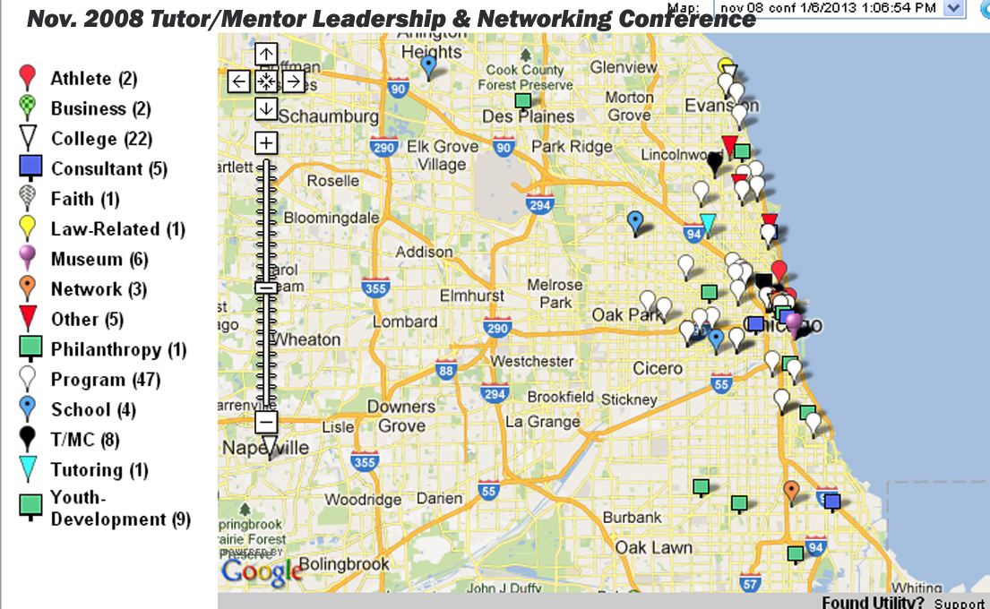
In addition, each city should have someone creating maps showing who is connecting on a regular basis to help needed youth serving programs grow in that city. The map at the right shows participation in one of the Chicago conferences. You can see several maps like that on this page

If this were happening it would indicate that groups of people are meeting within a city, and within neighborhoods of each city, and that they were connecting with people in other similar cities, with a common goal of helping economically disadvantaged kids more successfully through school, which has a economic benefit to the business sector and the entire urban region.

So far I don't see this happening.

Thus, if you're reading this. Share it with people in your own community and network who might also be focusing on filling high poverty areas of their city with a range of mentor-rich programs that reach more k-12 kids, last longer, and result in more being in jobs when they are in their mid 20's than what is the reality today, in 2018.

Friday, June 22, 2018

Maps for Planning - Use Multiple Sources

Since 2008 articles on this blog have shown my uses of maps to help fill high poverty areas with youth serving organizations that include volunteer based tutor and/or mentor components. I started using maps for this purpose in 1993.

In many of the articles posted since 2011 I've shown map platforms hosted by other organizations in Chicago and in other cities.  Some contain different information, or present the information in different formats, than what I've done. 

I encourage people to learn to use these multiple platforms in their own map-stories and planning strategies. Here's an example.  The image below contains three maps showing the West side of Chicago and the Austin neighborhood.


The  infographic on the left, with a map showing the Austin neighborhood, and its location in Chicago, can be found on the Strengthening Chicago Youth web site. 

If you open the link above you will find a page listing all 77 Chicago area community areas, with an infographic like these for each area.  Shown are Austin and North Lawndale. Click on the graphic to get an enlarged version.

Open the Projects & Resources page of the SCY site and you'll see that the infographics are part of a set of actions intended to bring people together and try to develop strategies that reduce violence in Chicago.  I attend the quarterly meetings and get their monthly newsletter.

The other two maps shown above are from my collection. This map is from a pdf presentation showing the number of high poverty youth, age 6-17, in each community area on Chicago's West side. Austin and North Lawndale are at the far left.

This map was created using the Interactive Chicago Tutor/Mentor Program Locator, so it includes green stars indicating the location of non-school, volunteer-based tutor/mentor programs. On the interactive map you can zoom into an area as small as a few blocks and click on the green star to go directly to that organization's web site.*

The third map is also from the Program Locator, but I've added on a photo from an August 2017 Chicago Tribune article, reporting on a shooting that took place on the West side of Chicago. I put that map in an article on this blog. 

For this map story I used the asset map section of  the Program Locator, which enables me to show faith groups, banks, hospitals, universities and drug stores in the map area. These are people who need to be strategically involved in helping youth programs and anti-violence solutions grow. 

I share my blog articles in a monthly email newsletter which I send to people at SCYChicago and many other groups, with the goal that they will borrow some of my ideas to help draw attention to the same issues that they focus on.  I also show links to SCY and many other Chicago organizations in my newsletters and the Tutor/Mentor web library.

The goal is shown by this planning graphic:


If someone is collecting information showing existing service providers as well as assets in an area, then anyone can use that information to invite people to connect in face-to-face and/or on-line gatherings.

If we can encourage growing numbers of people to use maps in bringing people together and drawing attention and resources to solutions needed to reduce violence and poverty by helping more kids go safely through school and into adult lives and jobs, we can make Chicago and other cities a better place for everyone to live and raise their families.

While I've posted stories on this blog since 2008 I have also posted related stories on the Tutor/Mentor blog since 2005.  Spend time browsing through the archives. You'll find  many ideas that you can apply to change the future.

Let me know if you'd like to know more about these resources.  I'm on Twitter @tutormentorteam

* Due to a lack of funds and talent the Tutor/Mentor Program Locator has not been upgraded since 2011 and program data has not been updated since 2013.  

Monday, July 24, 2017

Mapping Collaboration - Who's Here? Who's Not.

On this blog I show many examples of how maps can be used to show areas where people need extra help, based on indicators like poverty, segregation, wealth inequalities, violence, poorly performing schools, etc. I also demonstrate how data on existing youth programs can be collected and plotted on maps, in an on-going effort to help programs get the talent, dollars and ideas each needs to constantly improve and become the best they can be.

In the map below I show participation in the 2017 Connected Learning on-line community, which you can find on Google+, Twitter, Facebook and other platforms.

view map

If you look at the on-line spaces where #clmooc participants are connecting you'll see a wide range of interaction around ideas and around "making things" like music, postcards, coloring books, etc.  

I'm interested in this because I've been trying to connect people who are involved in helping youth in high poverty areas get comprehensive support systems that help them from first grade all the way to first jobs, over a 20+ year period of support.  

While I've attended Chicago conferences hosted by big foundations, universities and/or businesses, with as many as 500 or more people in the room, I don't feel that these really are interactive, where people in attendance are connecting deeply with speakers and other participants the way people in the #clmooc are doing. 

I've found very few building participation maps as part of their on-going strategies.

Thus, I share the map and the idea in stories on this blog, and on the Tutor/Mentor blog.  I can't make this type of engagement happen through my own limited efforts. However, by shining the spotlight on the #clmooc group and sharing this attention on social media, I can try to inspire and influence others to help make this happen.

Nov. 1998 conference map
I hosted Tutor/Mentor Leadership and Networking Conferences in Chicago from May 1994 to May 2015 and created some maps to show participation.  I've also created concept maps, to show the range of talent and networks I was trying to attract to the conferences, and to help me help tutor/mentor programs grow throughout the region. 

You can see from viewing my maps that too few people from business, philanthropy, media, politics, universities and faith groups were attending the conferences I was hosting.  You can also see, from viewing the #clmooc participation maps from the past three years, that too few people from Chicago or other urban areas are participating in their efforts. 

You can change that by visiting the #clmooc site, joining the group, and adding your name to the map.

While participation ( or non-participation) in the Tutor/Mentor Conferences could be the topic of many discussions, my goal with this article is to encourage others to think about mapping participation in events they host (on-line and face-2-face) to show "who needs to be involved and interacting with each other" and "who is already involved"  

Duplicate the #clmooc.  Look at the image shown in this Tweet. Imagine many people from throughout the Chicago region, and the world, interacting and sharing ideas about who needs to be involved in on-going efforts intended to build and sustain needed youth and family service and jobs programs in every high poverty neighborhood of Chicago or other parts of the country, or the world.

Interested in helping? This could be an on-going project hosted by a college group, or even a high school service learning course.  Tweet me @tutormentorteam or post a comment to this article if you're interested in exploring this idea.

Monday, May 8, 2017

Building a "Fellowship" on the Web.

Last week I posted this article, with a TED talk presented by Steve Whitla, based in the UK.  Today Steve sent me a Tweet, pointing me to a thoughtful article he'd written, in response to my article. He focused on the three challenges I'd offered in my article, and expanded on them from his own perspective.

I  hope you'll take time to read it.

1)  Challenges of Making Maps - Steve recognizes a truth that I've understood for many years.  In the past I've had people question the value of the maps I've created, saying people in poor areas don't have access to the technology to view the maps. I said, "I know.  I'm trying to reach the people who don't live in poor areas who have the resources to make technology and access to my maps available to people in poor neighborhoods, and who will help me collect the data, build the maps, and train people to use them."  In Steve's article these would be the "Gentry" who supported map-making in the middle ages.

2) The Challenge of Motivating Growing Numbers of People to look at the maps.  I love the reference to Bilbo, from The Hobbit and Lord of the Rings. I've read the series several times.  My graphic above draws from another fantasy series, the Wheel of Time books by Robert Jordan. In both books a small group of people band together to save the world.  In both books the 'hero' was a reluctant 'hero'.  I never sought the role I'm in. It grew on me over many years.   In Steve's article, he focuses on the 5% of people in an organization who might already be interested in an idea.  My efforts have focused on the same 5%, or even 1%, of people in the world who might be interested in the work I'm doing. That's like looking for a needle in the universe!  Yet, that's how I connected with Steve.

I created this concept map to show the different skills and networks I'm trying to bring into my fellowship.  I first used the Wheel of Time graphic in 2011, in this article.

3) The Role of Network Builder, Facilitator and Teacher.  In Steve's article he writes "If we're all looking a the same map, then we have a much more meaningful conversation."  That's what I think, too, but it takes us back to Challenge 1 and Challenge 2.

I've used this pyramid graphic often since the mid 1990s, such as in this article.  I've created a library of concept maps, that support the GIS maps. Steve's blog is full of visualizations.  If more people spend time trying to understand these, when we get together we are closer to a common frame of reference.

In my case, I feel that we all want kids to go safely through school and enter jobs and careers as contributing members of society. However, if someone is not doing the work at the bottom of the pyramid, of creating a map-based information system, it's hard to have a 'meaningful conversation' about actions each of us needs to take to make that support system available in all places where kids need extra help.

If people are not motivated to spend time looking at these articles, and our maps, our meetings lack the common understanding and frame of reference needed. Back to Challenge 2.

Final Challenge - Remaining Neutral - Steve added this since I did not mention it in my original article.  I think that if the data on the maps is accurate, anyone can use the map to develop strategies that support a common vision.  In articles on this blog I point to many data platforms, not just the interactive Tutor/Mentor Program Locator and maps the Tutor/Mentor Connection has created. Keeping the maps updated and accurate goes back to Challenge 1, which is finding the talent and resources to do this.

Another Challenge - Overcoming "Not Invented Here".  Over the 24 years that I've been doing this work, too many have started their own "fellowships", drawing support from political, business and civic leaders. Too few, like almost none, have reached out to say "What can I learn from your experiences? Or, "How can I help you?"   Here's one of several articles that focus on this challenge.

One more. It seems to me that Steve is writing about challenges within organizations, where there are many different power bases and hidden agendas. I'm writing about the challenge of mobilizing people from many different organizations and sectors of society - the village of people who need to take roles in raising kids and helping them move to productive adult lives.  They also have power bases and hidden agendas. They don't have the structure, and pay check, provided by corporations, which offer some motivation for people to work together.

That makes this even more difficult.


I can't express how pleased I was that Steve took time to read my original article and reflect on it on his blog. I've encouraged others to do the same, and created this concept map as a way to connect those people and their articles with each other.  I added a link to Steve's blog today.   In some ways, the people I point to are "companions" who I've been able to attract and connect in my own on-going efforts to have a positive impact on the world I live in.

I invite other readers to join us.

Tuesday, June 28, 2016

Chicago's Public Housing Changes Not Good for All


Today I read this report on the Better Government Association web site, titled "CHA's Transformation Reshaped a City".  It shows while the displacement of public housing residents led to gentrification in some neighborhoods, which had a positive impact on CHA residents who were able to obtain vouchers and live in these areas, most of the benefit went to those moving in, and less went to the poor people who most often moved into other neighborhoods which already held concentrations of poverty.

In 2010 I included the map of Cabrini-Green (shown above) in this blog article, under the title, "Cabrini-Green gone. Are you sure?"

The BGA article includes a statement that 3200 families now live in Chicago's Near North area.  If families average 3 children per family, that would mean there are at least 9,000 low-income kids hidden in this area and I'm not aware of a lot of non-school tutor/mentor programs still there to help them.  Maybe they don't need as much help since affluent families tend to support schools with better trained teachers and more learning opportunities. That benefits poor kids, too.

In January I created a new map showing locations of the youth serving organizations in my database.  If you set my map next to the map in the BGA article, you can begin to determine what level of non-school, volunteer-based tutoring, mentoring and learning programs are available in areas where former CHA residents have been moving.

This is an analysis that should include business, political, government, religious, university, CPS, media and residents, with neighborhood groups focusing attention on each of the high poverty community areas.  It's something that should be funded by the major foundations, or by the city, or the CHA.  

The result should be the growth of more and better services to youth and families in the high poverty areas where former CHA residents live, as well as the development of needed programs in the areas where poor people are living mixed in with people of more affluent backgrounds.

Friday, April 22, 2016

Using Maps To Support Community Collaborations

All of the articles on this and the Tutor/Mentor blog aim to support the growth of non-school programs that connect urban youth with workplace volunteers.

I encourage you to spend time browsing past articles. See how concept maps are used to show strategy, and emphasize the need for long-term, on-going, flexible funding of youth serving programs.  See how GIS maps focus attention and resources on all high poverty areas of the Chicago region, not just a few high profile places.

I've been building a database of Chicago non-school tutor, mentor and learning programs since 1993 and use maps to show where these programs are located.  Below is an example from a map platform, showing how you can zoom into the map and look at a specific part of the neighborhood.


While I've been hosting an interactive Chicago Program Locator that can be used to create map views, I've also been pointing to platforms hosted by others. Below I'll point to the Community Commons platform and compare it to the Program Locator.

Faith groups in entire Chicago region.  


These two map views show faith groups who could be leading strategies that engage the resources of a faith group in support of tutor/mentor and learning programs in different high poverty neighborhoods.  This PDF outlines a strategy I've been sharing with faith leaders since the late 1990s.


Faith groups on Chicago's West Side

This shows how you can zoom into maps on interactive platforms, to get a closer view.  The Program Locator includes features that show zip code, community area and legislative districts.  The Community Commons platform has a feature for adding legislative district boundaries.


Others who could be helping - Program Locator feature

These two map views show the West side of Chicago. One shows poverty overlays. Both include green stars indicating locations of tutor/mentor programs in my database. Put the mouse over an icon and get the name of the organization. Double click and go to their web site.

The map on the left also adds information showing businesses, colleges and hospitals in the area, who should be serving as anchor organizations and leaders in on-going efforts to help the neighborhoods have a full range of world-class quality tutor/mentor programs.

On both of these maps you can see additional information that has been added by pasting the map image into Power Point, then adding additional information, such as additional locations of tutor/mentor programs, or data showing the number of high poverty youth living in each community area.


Birth to Work Tutor/Mentor Programs needed in every poverty neighborhood


This concept map is part of a series that I've summarized on this article.  It shows that at each stage of life young people need a full range of supports in order to move more successfully, and safely, to the next stage, GIS maps should show if such supports are available....and in every high poverty zip code.

This concept map is a model. Each node should point to a directory of web sites, like this, showing organizations that provide that service in one, or many, neighborhoods.  If that information were plotted on poverty maps, leaders could begin to better understand what supports exist, and which are missing. Leaders could begin to lead year-round marketing campaigns intended to draw visibility, volunteers and dollars to programs in each map area.

With the help of researchers and information collectors, and funders, such information could be made available, and kept updated on an on-going basis.  In this article you can see how I've been reaching out to universities to encourage adoption of this strategy. 


Here's one PDF essay focusing on information collection. 


Getting the information, organizing it and making it available is just one part of a 4 part strategy that needs to be embraced by many leaders in every city.  The concept map below illustrates these four strategies.


See this concept map described in this PDF essay.  1) Better information, 2) seen by more people, 3) understood by more people, 4) leads to more consistent support of organizations serving youth and families in high poverty areas, so each can grow to be great at what they do to help people climb out of poverty and into the American Dream.


Accountability Maps needed


Just mapping indicators showing places of need, mapping places where service is available is not enough.  We also need to create maps showing who is coming together to find ways to solve these problems, and/or who is taking actions that make resources available in different neighborhoods. The map shown here shows participation in a past Tutor/Mentor Leadership and Networking Conference. You can clearly see that business, media, government, and philanthropy are not represented.  Maybe they are meeting elsewhere. We won't know that unless organizers create participation maps like this.   Read this article about mapping events and this article about mapping philanthropy to learn more about this part of the strategy.

I don't find many other web sites where leaders are outlining their strategies, using maps and visualizations, the way I have been doing for nearly 20 years.  If you know of such places, please share the link and make an introduction.  If you see the value of the ideas I'm sharing then adopt them, and lead them, or offer your time, talent and dollars to help me keep this available to Chicago and other cities.


Today Congresswoman Robin Kelly hosted a press conference, announcing an #Urban Progress initiative.  Here's one of many tweets from that event, which includes photos of the high profile people who spoke.
I hope some of those leaders will view this and other articles I've written and duplicate what I've been doing for the past 20 years, to achieve a problem that still persist because too few have a deep commitment and a day-to-day map-based strategy, to draw people from the entire village together, and to mobilize needed resources for each high poverty neighborhood of Chicago and other big cities throughout the country.

Thursday, March 31, 2016

Why I Attend Chicago Hack Night events

I've been attending Chicago Hack Night events for at least 2 years and I'm writing this article to help celebrate their 200th weekly gathering.  This image is from this week's event, where the Heartland Alliance presented information. You can see me in the middle, sitting by the wall. That's my usual spot. Helps me see better.

So why do I attend?

First, I'm not a technologist. I've been using technology as a tool to work smarter, think better, share ideas and network with others since the early 1980s.  I attend Hack Night meetings because I'm inspired by the ideas shared by speakers. I'm inspired by the talent and the work being done by people who are attending. I'm also  hoping to share from my own knowledge and experiences, while finding volunteers to help with my own work.

Here's a few highlights from my journey through technology and innovation, starting in 1980, when I was one of the first people at the Montgomery Ward Corporate Office in Chicago to have an Apple Lisa on their desk.  Ron Mantegna and Ken Novak, peers in the Retail Advertising department, were the catalysts who suggested that using the computer to create ad diagrams and update them would be more time efficient that doing them by hand, since the company changed ad plans so frequently.  At first, pepole laughed at me sitting at the computer, and called it a toy. By 1990 the entire multi million dollar ad planning and development process at Montgomery Ward was computerized based on the work we started in the early 1980s.

I tell this story because it has repeated over and over for the past 30 years. Others with better knowledge of how computers and the Internet work have prodded me to adopt new ideas and have supplied the tech talent to help me implement those ideas.  In the early 1980s it was Ken Novak who introduced me to Excel and helped me create a forecasting system that was used in the advertising planning process and generated millions of dollars of benefit. Later it was Ken who introduced new versions of technology, and this idea called "email".

As I applied these tools for my retail advertising job, I also applied them in my role as the volunteer leader of the tutoring program at Montgomery Ward.  While we spent millions on mass communications to draw people to 400 stores around the country, I spent time and talent to create mass communications (starting with duplicating machines) that told our 200-300 volunteers what to expect each week at the tutoring sessions.

In 1997 my first web site was created by the brother of one of our volunteers. Then, in 1998, Matt Mead, another one of our volunteers, said "I understand you're trying to build a web site. I can do that for you."

When Matt and I started talking I said "We'll need people with different talents to help us."  So, he created this graphic as the home page for the www.tutormentorconnection.org site that he built for me, using a technology called 'revista' which enabled me to edit text on the site. In 2005 this site was rebuilt using dot.net.nuke, by a team from IUPUI in Indianapolis. 

I've used this hub and spoke design over and over since then to communicate how I was trying to connect others to myself, and each other, in a constantly growing community of people and ideas focused on helping inner-city kids have the extra support they each need to move through school and into jobs.

In 1999, Steve Roussos, who was then a PhD student at the university of Kansas, used power point to create this visualization to describe the work I was doing. He called it a "Tutor/Mentor Learning Network", and drafted this paper to describe it to donors. I've built hundreds of power point presentations since then, inspired by Steve's work, including this PDF.  Steve was also the creator of the www.tutormentorexchange.net web site in 1998, which now is the home site for the Tutor/Mentor Institute, LLC. In 2000-2001, he also created an on-line documentation system called OHATS (Organizational History and Tracking System), modeled after work being done from the University of Kansas.


While I started collecting information about Chicago tutor/mentor programs in 1993, I did not have an idea of how to display that information until the librarian at the United Way/Crusade of Mercy showed me a geography magazine, and one of my volunteers at IBM introduced me to GIS mapping, and to the Metro Chicago Information Center in 1993.

I started mapping the database of programs in 1994 and published the first Chicago Tutor/Mentor Programs Directory in 1995, with contact information and address for more than 120 different youth serving organizations, along with dozens of more organizations who were working in some way to improve the life-outcomes for kids in poverty.

When I started the T/MC web site in 1998 this list of other organizations became the core of a web library that now points to more than 2000 other web sites, including Chicago Hack Night and similar data networking groups.  If you look at the link to the web library, you'll see it's outlined  using a concept map (CMAP tools), which was introduced to me by a former Peace Corps worker in 2005. I've created a whole library of concept maps since then.

In 2004 an intern from IIT and India recognized my goal of sharing this information on the Internet, and created a searchable program locator that duplicated what was in the printed Directory. This enabled users to search by zip code, type of program and age group served, to produce a map showing that program, and others in the same zip code.

In 2007 another volunteer from India, added an interactive map feature to the program locator, enabling us to zoom into neighborhoods to not only find organizations based on age group, type of program and time of day, but to also see indicators showing where the programs are most needed, and what assets were in that area who could be collaborating to help sustain existing programs or build new programs.

Now (when this is working properly) users can create their own neighborhood map view, to help bring others together to help support existing program or build new ones to fill voids.  This PDF describes how to make your own map using this program locator, or other data maps that now are available on the internet. Browse this blog, and the Tutor/Mentor blog, and you'll find many examples of this type of map-story.


In 2009 Valdis Krebs, one of the world's foremost experts on Social Network Analysis, spoke at the Tutor/Mentor Conference that I hosted in Chicago, then donated software that interns could  use to create maps showing participation in Tutor/Mentor Conferences.  This blog shows maps created in 2010. This article shows how I'm still trying to find interns and volunteers to create maps and visualizations that show how networks grow as a result of the work I and other innovators do.

When I attend Chicago Hack Night and similar gatherings of tech and data visualization people, I'm trying to connect with talented people who will help me continue to build tools and visualizations that bring people and ideas together and focus actions on places where time, talent and dollars will be needed for many, many years. I'm also sharing ideas from my own experiences and library, that others can apply in their own work.

The Chicago Hack Night has a tradition of letting everyone introduce themselves at the beginning of each week's gathering. As I do this, I am posting my intro on Twitter, as I did this week.

Last September I saw a Tweet with a network analysis map like this. I followed it and introduced myself to Marc Smith, who then pointed me to information that I could use to learn about NodeXL, and how I could ask him to create similar maps for me.  I created this tutorial so others could learn from my own journey.   

If every participant of a networking event, or conference, hosted by someone in Chicago or another city, were to post a tweet with #chihacknight , etc. maps using NODEXL could show who was participating and how they are connected to each other. Such maps can demonstrate the impact event organizers are having, while also helping participants expand their own networks and find talent and sponsors who will  help them with the work they are doing.

I really appreciate Chicago Hack Night and it's organizers and sponsors for creating a space where I can be inspired by the work of others, where I can share ideas that any of the participants might apply in their own work, and where I might find people who will volunteer time, talent and dollars to help me keep doing what I've been trying to do for the past 20 years.

I encourage anyone who has read this far to go to this site and see the many ways Chicago Hack Night is supporting technology innovation in Chicago.

Thus, I'm not a data scientist, or coder, and I depend on the talent of other people to create and maintain the technology platforms that share my ideas and bring people together to help youth in high poverty areas of Chicago. The examples posted on this blog are just a few showing how others have helped me in the past, and can help me again in the future.

They also may serve as inspiration for a project someone in Chicago, or elsewhere in the world, will develop and apply in the future.

While I'm not able to stay each week and contribute on the many projects in process, I'm available to connect between sessions to offer suggestions and/or point people to some of the resources and ideas I share.  Just Tweet me @tutormentorteam or introduce yourself in the comment section below.

Tuesday, March 29, 2016

Mapping Network Growth in Youth Development Field

I created this concept map in the mid 2000s to show a commitment of "helping all kids born or living in poverty in Chicago be starting jobs/careers by age 25" that needs to be shared by many.  A version of this on a web site would demonstrate that commitment.

This map is really an entry point to layers and layers of addition information, representing available knowledge as well as needed strategies that draw people together and generate a flow of ideas, talent and operating dollars to all of the people who are involved in this work in the same neighborhood and/or city.


The map shown above map is an outline of the web library I've been building since 1998, which was really started in the mid 1970s as a paper-based library.

Open nodes on the map and you eventually will get to a list of organizations which you can open to dig even deeper into the information that's available. It's like going to a university. The information available is much more than can be learned and absorbed in a day, or even over many years.  Yet, the more people dig into the information, the broader the range of ideas and strategies they will have to solve problems of poverty, inequality, social justice and workforce development.


Last September I connected with Marc Smith, one of the leaders of a network analysis project called NodeXL.  I wrote this blog article as a tutorial for those interested in learning more about what this is, and why it is important. I wrote another article in February, following the National Mentoring Conference.

Today, I listened to Marc talk to a group of students at Indiana University, via this YouTube video. I hope you'll take the time to listen and to read my blog articles.

In the concept map above and my web library, I point to more than 2000 other web sites. More than 200 of those are youth serving organizations in Chicago.  Others are research organizations, funders, or people who share ideas about collaboration, process improvement, knowledge management, etc. Many of the sites I point to have their own resource sections, thus pointing to even more web sites.  

By hosting this information on the Internet via blogs and web sites, I create the opportunity that on any given day someone from one of the organizations I point to can be digging into the information on my web sites and starting a conversation with someone else.

The problem is, we don't know if this is happening, and how often.  We don't know who is looking at the information, or connecting to us or each other, so we also don't know who still needs to be engaged.

Marc talks about how the #hashtags we use on social media enable us to track topics that people talk about.  He shows how the handle we use, like @tutormentorteam, can be captured using a network analysis tool like Node XL, to create a map showing who was involved in a conversation on a specific set of days, how they were connected to others, if the were, and what type of connectivity is taking place.  

I hosted Tutor/Mentor Leadership and Networking Conferences every six months from May 1994 to May 2015, and one of the goals was to help build relationships between participants, and to connect participants to myself and the library of information and ideas I host. Another was to create an on-line community where more people can connect, and where everyone has a chance to talk and express their own ideas.   Visit this page and you can see what organizations were part of each conference.

So far, I don't see many in the social service field, or in the narrower tutor/mentor field, trying to use maps to show participation in events they host, or in on-line conversations.  I also don't see any who are trying to show impact, by showing network maps of individual youth and/or volunteers who participate in their programs. I've written a variety of articles focused on network building, network analysis and networking that illustrate my ideas, and why understanding who you are connecting to is a critical first step in building the type of network that is needed to build and sustain a mentor-rich system of supports that will help more youth move safely through school and into jobs and careers.


Last week I posted an article, with this concept map, which shows the four part strategy I've developed over the past 20 years, and the work that needs to be done to enhance each step. I posted another article on Monday,  on the Tutor/Mentor blog.  I hope you'll read them, and share them with people in your own network.

I'm just one person with few skills and little funding, but with a broad vision. There's room for many to share this work, but we need to be connected, and we need to be using tools that show how we're connected and that enable others to join in.

By sharing this and other articles I create the possibility that one or more readers will forward this to others, who forward it to even more. One of those people will be the benefactor who endows the work I"m doing and not only provides funding for the next few years, but provides funding that moves this into one or more universities where it grows for the next 50 years.

Using tools like NodeXL we should be able to map this process.