Tuesday, December 18, 2018

Child Care Availability Map

My Twitter feed today led to this post by @EveryChildMattersinIowa, who had just started following me. I clicked into their map, and it led me to this page, which contains child care availability data for every state, including Illinois, which I show in this graphic.

This is an interactive map, so you can zoom into different parts of Illinois and every state.  The way the Iowa group used it in a Tweet is exactly how I hope others will use maps, from the ones I make, to the ones I point to in blog articles on this site.

If you're doing this, post your link in the comments below.

Monday, December 17, 2018

Field Foundation Data Maps - Great Resource. Who Else Using It?

I was pleased to find this map on my LinkedIN feed today, which is from the Field Foundation of Illinois web site.  Visit the site and open this PDF and you will find a series of data maps, showing areas of Chicago where extra investment is needed, based on a variety of indicators.

If you have looked at articles on this blog, or this section of the Tutor/Mentor Institute, LLC blog, I've been using maps for more than 20 years to focus attention and resources to areas shown on the maps as needing extra help.

See map here
Among the maps in the Field Foundation pdf is one showing a lack of arts programs in high poverty areas.  What's not included is a map like mine at the right, showing the availability of non-school tutor and/or mentor programs in these areas.

I hope that I'll be able to connect with foundation leaders and that they will look at the many articles I've posted showing ways the maps can be used.  If they point to these, or write similar articles on their own web site, perhaps more leaders would be using the maps, and thus, more resources would be flowing into these areas.


One other resource I'd like to point to is this PDF that shows the number of high poverty youth, age 6-17, in each Chicago community area.  The map at the left shows the far North East part of Chicago, which includes Rogers Park, Uptown and West Rogers Park.  Based on the number of kids in these areas, investment in tutor/mentor programs is also needed here.

I've not been operating as a 501-c-3 non profit since 2011, so I'm not eligible for a Field Foundation grant, yet I have not found investors or a source of income to help me maintain and update my mapping platform.  A contribution to my FUND ME page would help.  A partnership with a foundation, university or business would help even more.

Wednesday, December 12, 2018

Network Analysis Tool for Twitter - Twitonomy

I've posted articles showing network analysis tools in the past. Thus, today I was excited to see the Tweet which is shown below.

I signed up for a free account and browsed around to see what's available. It's pretty easy to use. Blow is a screen shot of people who mentioned @tutormentorteam (me) between May and December 2018.


If you've read any of my past articles my interest in these tools is the potential to provide on-going support to community-building efforts, or bringing people together to solve complex problems, such as making well-organized, long-term, volunteer based tutor, mentor and learning programs available in every high poverty neighborhood of Chicago, and keeping them there for a decade or longer.

Without these analysis tools we could fill a football stadium with fans and still not know if we have the right mix of talent, experiences, political leadership, resource providers, program experts, etc present to work on solving our problem.

Unless we repeat the analysis on an on-going basis we don't know if our efforts are keeping these people in the conversation, and expanding the range of people involved.

I don't have the  time, talent, dollars or manpower to do this analysis myself in all the ways it should be done, which is why I keep inviting others, from Chicago, or any where in the world, who is interested in this, to reach out and introduce yourself.

Sunday, December 9, 2018

Digital Divide in Chicago - 2018 WBEZ article


This screen shot shows interactive map included in WBEZ article titled "Clear Signs Of The Digital Divide Between Chicago’s North And South Sides"

The article reports that "more than half the households in Englewood and nearly half the households in West Englewood (51 percent), Riverdale (49 percent), Auburn Gresham, and South Shore (both 46 percent), lacked internet access at home".

This is a disadvantage for youth and adults.

I show these maps and articles with the goal that readers will be concerned and will share the articles with others, who will also be concerned, and that this will result in people from different sectors giving time, talent and dollars to help reduce this problem.

Browse other articles on this blog, and the Tutor/Mentor blog, and share with your network, as the graphic below suggests.

This work is not something that can be done in a day, or even a year or a decade. But it is work that needs to be done.  If you'd like help digging through the information I'm sharing, or in making sense of some of the graphics, I'm available.

12-12-18 update - Visit this site and see 2018 data and maps showing digital access in census tracts across the USA.

12-19-18 update - World Economic Forum - report - Our Shared Digital Future: Building an Inclusive, Trustworthy and Sustainable Digital Society, 2022 goals. click here

1-16-19 update - World Economic Forum  report - Global Risks Report 2019

2-18-2019 update - Nearly one-in-five teens can’t always finish their homework because of the digital divide - 10/2018 Pew Research Center report - click here

2-25-2019 update - Digital Distress: What is it and who does it affect? Part 1. 2019 article focusing on "those on the wrong side of the divide (who) are being left behind, prompting the creation of strategies to ensure everybody can reap the benefits of this new age. click here

3-30-2020 update - Broadband is now our lifeline, but 20 million still lack access. click here

3-31-2020  update - Worst Connected Cities - 2018 from National Digital Inclusion Alliance -  click here

4-13-2020 update - Stop the Cap-Promoting Better Broadband, Fighting Data Caps and Usage-Based Billing - read articles at this link.

4-21-2020 update - Analysis of Digital Divide in California, including map and policy recommendations - click here

4/25/2020 update - One in five Chicago students lacks broadband. Here’s where they live - Chalkbeat Chicago story - click here

5-6-2020 update - Digital prosperity: How broadband can deliver health and equity to all communities - click here

1-24-2021 update - Mapping and Mitigating the Urban Digital Divide This article describes a grant to the Center for Data and Computing at the University of Chicago to create new maps that build better understanding and help mitigate the Digital Divide.  

3-18-2021 update - visit the "saving the world" set of articles on Paul Signorelli's blog and find many articles related to digital access, digital justice, and digital divide. Below are links to two articles.
- Promoting Universal Broadband Access With Lev Gonick (Part 1 of 2- (click here);
- Promoting Universal Broadband Access With Beth Holland (Part 1 of 3) -  (click here)

3-18-2022 update - This Robert Wood Johnson Foundation Tweet shows that "neighborhoods experiencing deep poverty are the least connected to broadband. The Tweet also points to a resource page on the RWJF website. 

6-6-2022 update -  Interactive map shows level of broadband connectivity in rural zip codes throughout the USA. This is a project of RURAL LISC. click here

11-22-2022 update - HBR article "How to Close the Digital Divide in the U.S."  - click here

If you appreciate what I'm sharing, please visit my FUND ME page and send a contribution.

Tuesday, December 4, 2018

Population Density of Largest US Cities

Population Density map
My Twitter feed brought to my attention this map showing population density in the largest US cities.  You can find the article describing contents of the map here, and the interactive map here.

I created the Tutor/Mentor Connection in Chicago in 1993 to help volunteer-based tutor/mentor programs grow in high poverty areas. As the Internet became a tool for me to gather and share ideas, I've sought out people in other big cities, because the challenges of concentrated poverty, segregation, inequality and population density are similar.

That means that some day I should be able to produce a map, with icons on each blue circle, indicating one, or more, people from that city is following me on Twitter, Facebook and Linkedin, reading my blogs, and interacting around the same challenges and questions I ask every day.

In the map below I show people who attended Tutor/Mentor Leadership and Networking Conferences that I held in Chicago every six months from May 1994 to May 2015. If you compare it to the population density map, you could see that I was connecting with people from some of these cities.

May 1994-May 2014 conference participation map - click here
However, those connections did not turn into on-line connections and, for the most part, on-going connections.  They also did not include business leaders, funders and/or policy makers, which is one reason I no longer host the conferences and struggle to keep the T/MC alive in Chicago. 

I'm still trying, but I think it will take finding others from different cities to help with this effort. 

In addition, each city should have someone creating maps showing who is connecting on a regular basis to help needed youth serving programs grow in that city. The map at the right shows participation in one of the Chicago conferences. You can see several maps like that on this page

If this were happening it would indicate that groups of people are meeting within a city, and within neighborhoods of each city, and that they were connecting with people in other similar cities, with a common goal of helping economically disadvantaged kids more successfully through school, which has a economic benefit to the business sector and the entire urban region.

So far I don't see this happening.

Thus, if you're reading this. Share it with people in your own community and network who might also be focusing on filling high poverty areas of their city with a range of mentor-rich programs that reach more k-12 kids, last longer, and result in more being in jobs when they are in their mid 20's than what is the reality today, in 2018.

Friday, November 16, 2018

Maps that should be part of learning in US schools

In this Vox.com article the author shares sixteen maps that most American's probably don't spend much time thinking or talking about.  I created this montage from the maps in the article.


Wednesday, October 17, 2018

Opportunity Index article in Chicago Tribune

Below is a Tweet that points to article in today's Chicago Tribune, describing the different opportunities available to youth in different parts of Chicago.


In the concept map shown below I point to several different data platforms that you can use to understand where people need extra help.

Click here to open cMap. Then click on box under each node to open links.
The number of data maps has grown tremendously over the past 10 years. However, the number of people using these as tools to guide needed resource, jobs, health, education and youth support programs into each of these areas has not yet grown to the same extent.

Tuesday, October 9, 2018

World Wide Inequality Index - Interactive Map

Inequality Index
I created the Tutor/Mentor Connection in 1993 with the goal of collecting and sharing information showing work being done in some parts of the world that could be borrowed and duplicate in other places.  Instead of constant reinvention, we need constant learning and innovation.

With that in mind, here's a web site/data map showing a World Wide Inequality Index, which is an annual "global ranking of governments based on what they are doing to tackle the gap between rich and poor".

Reclaim American Dream
Here's another example. This is from the Reclaim the American Dream web site. On a map showing US states you can find information showing legislative work being done in some states that can be inspiration and models for similar work to be done in other states.

Click here to see map
I've been adding links to sites like this to various sections of the Tutor/Mentor web library, and to the concept map shown at the right, as well as posting stories that point to some of them. (see links on right side of this blog)

I learned about the Inequality Index from an article on the From Poverty to Power blog, which is one of the blogs I point to in the web library.

I don't have any money for advertising (never had much) so use my blogs and social media to try to draw attention to the information I'm putting in my library. As others share this in their own networks, my goal is that more people will learn to use these platforms to learn what's working in some places that might also work where they are located, if they can find resources to implement the ideas.

Thus, getting people involved from every sector is really important if we want to try to reduce some of the complex problems facing us in Chicago, the US, and around the world.

You can help by following this blog, or the Tutor/Mentor blog, and sharing posts on social media sites.

If you value the work I'm doing, and the web library I host, please visit my FUND ME page and send a contribution. 


Wednesday, October 3, 2018

Mapping Opportunity - Casey Community Opportunity Map

Community Opportunity map view
On Monday I posted an article showing a map of Chicago's West Side neighborhoods, using an Opportunity Atlas which was featured last week in a New York Times article, and has been mentioned often on social media since then.

Today I found a different Community Opportunity Map, created and hosted by the Casey Family Programs.

Opportunity Atlas map view
Both of these platforms offer a load of information.  I am particularly impressed with the Casey map, in how easy it is to draw boundaries around an area and receive a table of data showing different indicators for that area.  I drew the entire West side just to compare one map with the other, and with the map I host that shows non-school youth tutor and/or mentor programs in the same area.

Chicago Tutor / Mentor Programs
Neither of the two opportunity maps has layers of information showing youth and family services and other assets in these areas, which all need consistent attention and an on-going flow of talent, ideas and operating dollars to be effective.

Thus, users will need to do what I do, which is combine map views from different platforms in order to tell a story that starts out showing where people need help, then moves to an analysis of what help is already available, and then a conversation of how to help existing services grow and stay available, while also filling voids where more services are needed.

If this is a process you're applying through your planning and community support efforts, please share a link to a web site where you describe and show your work.

Like the information I'm sharing? Go to this FUND ME page and send a contribution to help me keep doing this.

Monday, October 1, 2018

Where You Live Makes a Difference

Below is a Tweet from today showing maps created using the Opportunity Atlas which is a resource of Opportunity Insights. If you view the Tweet you'll see links to a New York Times article in which the map is described in detail.

Below is a map view, showing Chicago's West side, which I created using the Opportunity Atlas.

I've added a link to this site in the Tutor/Mentor web library and to a concept map which I use to show links to data indicator platforms like this.

What's great about this Opportunity Atlas platform is that it enables you to zoom into the neighborhood level. Thus, you can focus on pretty small sections of Chicago or other places to understand where people have the greatest need for greater youth and family support systems.

I've been using data maps to focus attention on places where people need help and to draw resources to non-school tutor/mentor programs operating in these areas. Or to help create new programs where too few exist.

I maintain a list of Chicago tutor and mentor programs which I show on the map at the right.  If you were to compare this, to other data maps, you'd see that this is where programs are needed.  Now you can click on the icon for each program, then go to their web site, and try learn what they do, who they serve, and how you can get involved, or help them constantly improve the impact of their work.

Visit the Tutor/Mentor blog articles here, here and here, where you can see a couple of recent articles I wrote using maps of Chicago neighborhoods.


Here's an article on this blog, where I used the interactive Tutor/Mentor Program Locator to create a map view of Chicago's West side.  The Program Locator was built in 2008 and has layers of information that include assets (business, faith groups, hospitals, universities, political leaders) who should be working to fill neighborhoods with hope and opportunity, because they share space in those areas. 

Unfortunately, the Program Locator is not working and I don't have the funds or tech skills to fix it. And I don't see many (any) who are using data maps the way I have been, to try to mobilize resources to build and sustain needed youth and family services in all of the areas where the data maps indicate there is a need.

That's why I keep asking people to help me, and to make contributions to my FundMe page.

Thursday, September 13, 2018

Chronic School Absences - Interactive map

The map at the left is a screen shot of this page, which host an interactive data map that shows chronic school absence rages for areas as small as a single school.

This article provides a great tutorial on how to use this resource.

I zoomed into Chicago and could have created an even closer view of any part of Chicago. However, this resource covers the entire country.

Friday, September 7, 2018

Building Networks of Support - Role of Faith Communities

The goal of the articles on this blog and the Tutor/Mentor Blog is to influence what other people do to build and sustain mentor-rich non-school programs where volunteer tutors and mentors help kids move through school and into jobs, over many years of support.

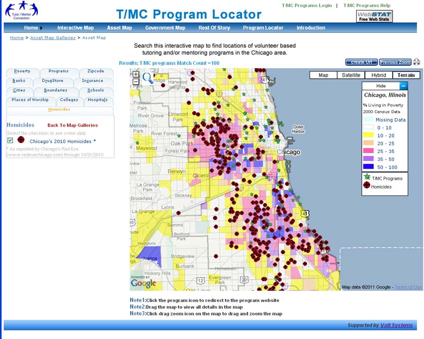
In this graphic you can see a small map of Chicago inserted at the bottom, with  high poverty areas highlighted. Comprehensive, mentor-rich programs are needed in every one of these areas.

I focus on roles business, hospitals, universities and faith groups can take to make great programs available in more places and in this article I'm introducing a new resource that shows faith groups in different zip codes of Chicago.


This map was created using the interactive map on the ARDA (Association of Religious Data Archives) web site.  This map view is showing the area around the 60640 zip code in Chicago.

The ARDA Research Hub includes this data map and a huge library of additional research.


Here's a second map, showing the area around the 60651 zip code, which is the Austin community area of Chicago.  There are literally hundreds of faith based groups on this map. On the graphic I'm pointing to a button you can click to get more information about the area highlighted.  At the top of the graphic I'm pointing to where you enter a zip code (any from the entire US) to find data showing faith groups in that zip code.  Spend time getting to know the site. It looks like a great resource.

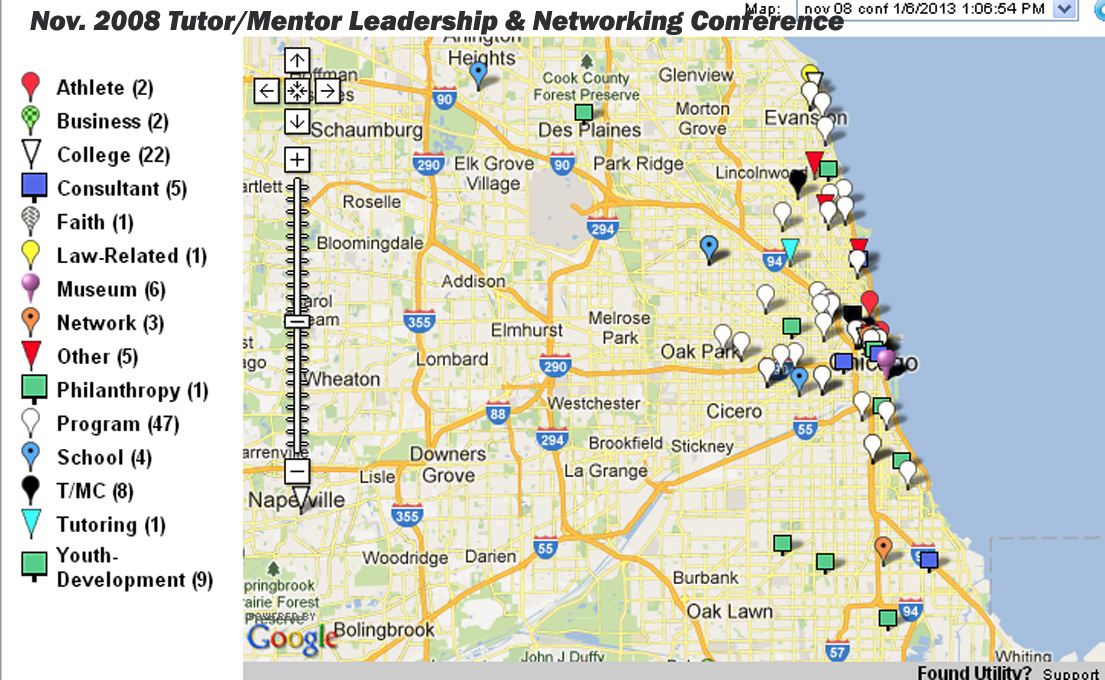
Below is another map, created using the map of Chicago tutor/mentor programs that I host.  In this map I'm also showing the Austin area, along with Humboldt Park and West Garfield Park.


On this map I am showing the number of high poverty kids, age 6-17, in each of these community areas. The green icons on the map are non-school tutor and/or mentor programs in my database.

Now, if you compare my map to the map showing faith groups, you'll see that there are dozens of places where kids and volunteers could be meeting as part of organized, on-going, tutor/mentor programs.

Below are two more maps showing the Austin area. On these the blue boxes are locations of churches where mentoring programs were operating around 2011 and 12.  These never made it into my database and I can't find evidence (web sites) showing that programs are operating in these areas.


My goal is that leaders in the faith community, in hospitals, colleges and/or businesses, or even politics, use my maps and other information on my web sites, as part of a process that identifies existing programs and then draws regular, on-going attention to them, helping each attract volunteers, ideas and dollars, so youth in each program have the best possible help moving through school and into adult lives.  

Below is a presentation that shows a role faith leaders could be taking:

I've shared this since 1999 but still don't know if anyone is actually applying these ideas. However, as long as the daily news keeps reminding me of the need for support systems that help guide kids to positive life choices and adult lives where they can raise their own kids free of poverty, I'll keep sharing these ideas and resources.

If you look at the Tags on the right side of this blog you can find other articles that I've written on this topic.

If you want to help me do this, please visit this page and use the PayPal to send me a contribution.

Tuesday, September 4, 2018

Citizens Police Data Project - Use As Resource

Below is the home page image from the Chicago Police Data Project, created by the Invisible Institute to collect and publish information about police misconduct in Chicago.

Visit this page and view the video that shows how this information can be used.

Over the past few weeks I've posted a few stories on the Tutor/Mentor blog showing other data platforms, such as Healthy Chicago 2.0 and DuPage Impact.

Click here, here, here and here to see three recent articles.

The common theme of all of these is that poverty concentrations on the West and South parts of Chicago show many indicators that people need extra help from public and private services.

I've posted more than 150 stories since 2005 on the Tutor/Mentor blog where I point to violence in Chicago in an effort to motivate more people to help mentor-rich, non-school youth programs grow in these areas.

I can't do this alone. I invite others to use my stories as a template, and these platforms that I point to, and create your own map stories. If enough of us do this daily or weekly perhaps we'll be able to influence what power brokers do in Chicago to help fill these map-areas with a wide range of needed supports for youth and families.

Saturday, August 11, 2018

Use this map and list to find volunteer based tutor and mentor programs in Chicago

Since 1993 the Tutor/Mentor Connection has been maintaining a list of Chicago area non-school tutoring and/or mentoring organizations and sharing this information in an effort to help existing programs attract a more consistent flow of needed resources, while also helping leaders identify places where more programs are needed.  In 2011 the Tutor/Mentor Institute, LLC was created to continue this service.

You can find contact information for nearly 200 Chicago area youth serving programs by browsing the Chicago Program Links list. You can also use the map, shown below, to determine what groups operate in different parts of Chicago...or near where you live, work, or along the route you travel as you do to and from work every day.  The program links list is also organized by sections of the city and suburbs, for the same purpose.


This map can also be seen here.

If  you click on an icon you can find the organization's name and their web site. Copy and paste the web address into your browser and you can learn more about the program, depending on how well the web site communicates the program purpose, history and design. Below is a JPG showing what the map looks like when open opened.


Some of the locations on this map are headquarters sites of organizations that offer community based mentoring (mentors meet with kids at different places), or are organizations with many different sites where they offer services. Big Brothers/Big Sisters of Metropolitan Chicago and Working in the Schools (WITS) are two who fit these descriptions. You'd need to go to their web sites to see their lists showing locations where they are active.
enlarge the map

This information can also be a starting point for others to get to know these organizations better, to help each of them attract needed resources, and to help share ideas across different programs so all will improve. You can enlarge the map then click on the icons to learn about programs in different areas. 

This map replaces an interactive Chicago Tutor/Mentor Program Locator developed by the Tutor/Mentor Connection between 2004 and 2009. Since 2013 I've not had funds or technology support to  update the site and in August 2018 the link to Google maps stopped working. 

In this section and this section of the Tutor/Mentor Institute, LLC Planning Wiki you can read the history, goals and current status, for building a map-based tutor/mentor program database.  Such a platform can be applied in any city to support the growth of needed services in all high poverty areas, thus volunteers, partners and financial support can come from any place to help this work become a reality.


I depend on contributions to maintain this list of programs, the Tutor/Mentor Connection web library, my blogs, etc.

Please make a contribution so I can keep this information freely available to all.  Visit this page to find an address and a PayPal button.

Saturday, August 4, 2018

Tutor/Mentor Program Locator Not Working. Use This.

I'm sad to report that as of yesterday the interactive search page, and interactive map pages of the Chicago Tutor/Mentor Program Locator, is no longer connecting to Google maps, and thus not working.

If you browse back through articles written on this blog since 2008, or on the Tutor/Mentor blog, you'll see many examples of how I've used the Program Locator to create map stories, and how I've tried to teach others to use this.

The Program Locator not working is part of a larger on-going problem that has grown since 2011. I don't have a source of funding or technology/coding support to update the sites and/or fix problems like this.   I keep looking for new partners and/or investors, in Chicago or in any other major city in the world, who might want to take part ownership of the work I've been doing, to apply the ideas to their own community.  If you know such people, please point them to this blog and to my profile on LinkedIn.

In the meantime you can still view locations of Chicago non-school,  youth serving organizations on a map, and browse my list of more than 200 Chicago area programs, by visiting this page.

You can also visit this concept map and find several sites that you can search for contact information about tutor/mentor programs in Chicago and other US cities.

I started using maps in 1993 and have always been dependent on volunteers who could had the skills to use GIS mapping technology and/or who could put our maps on interactive web sites. I've never had the funding needed to do all that I was trying to do, nor to consistently do any of this work. However, I keep sharing the vision for the Program Locator on several wiki pages.

Vision for use of Geographic Maps - click here
Program Locator Database - overview
Vision for a future program locator - click here

Friday, July 20, 2018

Elections coming - Vote for People Using Maps in their Leadership

Il 4th Congressional District
The Tutor/Mentor Connection started using maps in 1994 to help leaders understand where non-school, volunteer-based tutor, mentor and learning programs were most needed, and where existing programs were located.

This blog was created in 2008 to share maps that we were able to created between then and 2011.

 I've encouraged politicians to use maps since we launched this strategy.  Sadly, I've never seen this happen consistently.

Yesterday I had another opportunity, when I had a brief discussion with a leading candidate for the Illinois 4th Congressional District election in November.  Above is a map of the district. Below is one of many presentations I've created showing uses of maps:


See more articles and ideas for using maps on this page of Tutor/Mentor Institute, LLC web site. 

Browse past articles on this blog and the Tutor/Mentor blog to see ways maps can be embedded into stories.

Help me keep the Tutor/Mentor Institute, LLC resources and stories like this on line. Make contribution using PayPal form on this page

Interested in helping me rebuild and update this resource? Introduce yourself with comment or connect with me on Twitter @tutormentorteam or on Linkedin.

Monday, July 16, 2018

GEOFRED blog and map - Health Disparities

The Federal Reserve Banks have a wealth of resources on their web sites. This map is from the GEOFRED site of the Federal Reserve Bank of St. Louis. Read the blog article and follow the links.

This introduction is provided:

GeoFRED maps can help us understand a lot of things, including trends in regional socioeconomic data, which could ultimately provide insights for policy recommendations. In this post, we look at two important indicators of health throughout the United States: premature deaths and preventable hospital admissions. High levels of premature deaths indicate issues with public health.


I've been posting links to mapping and data platforms on this blog since 2011. Original articles, posted between 2008 and 2011, show map stories created using ESRI GIS software and an interactive Chicago Tutor/Mentor Program Locator (created in 2008).

My goal is to provide tools, and examples, that encourage many others to create map stories that show indicators of need in different places and draw attention and resources to organizations working in those areas to help kids and families.

In this article I've been aggregating links to additional articles that include data maps.

If you're creating maps stories using some of the platforms I point to please share links to your blogs and tell of the successes (or challenges) you are having.

Thursday, July 5, 2018

World Migration Map Combines GIS and Social Network Analysis

I'm on Twitter @tutormentorteam and my feed constantly introduces me to new ideas.  At the left is a world map showing migration patterns, to new countries and from home countries. It was created using a combination of Geographic Information Systems (GIS) maps, and Social Network Analysis (SNA) tools.

This article shows how the map was created, tells why it was created and points to a live tool that anyone can use to better understand one of the most important issues facing the US and the world as we move further into this century.

If you operate a volunteer-based tutor and/or mentor program and include a computer center at your facility, you and your volunteers could be reading these articles and then teaching young people to use the tools. In a few years, they could be creating these stories and in a few more years they might be leading companies or leading the nation, using these technologies as decision support tools.

Friday, June 29, 2018

Policy Map - Looks like great resource

Social Needs Index map
I use Twitter daily because it constantly feeds me new ideas and resources. For instance, yesterday I saw a post about a PolicyMap Social Index map. Today I looked up the site and found a wealth of resources.

The map at the left is from a blog article titled, "Social Needs Index", posted on June 25, 2018.

In the resources section is a "Mapchats blog" with a collection of useful articles that show "insights into GIS, Data and Mapping".

The only negative to this site is that it's not free, except to read the articles. The subscription prices will be out of reach for many....but not all.

If you're using data and maps to make a case for investment in specific geographic locations the site is worth adding to your own resource library. I'm adding it to this section in the Tutor/Mentor web library.

Friday, June 22, 2018

Maps for Planning - Use Multiple Sources

Since 2008 articles on this blog have shown my uses of maps to help fill high poverty areas with youth serving organizations that include volunteer based tutor and/or mentor components. I started using maps for this purpose in 1993.

In many of the articles posted since 2011 I've shown map platforms hosted by other organizations in Chicago and in other cities.  Some contain different information, or present the information in different formats, than what I've done. 

I encourage people to learn to use these multiple platforms in their own map-stories and planning strategies. Here's an example.  The image below contains three maps showing the West side of Chicago and the Austin neighborhood.


The  infographic on the left, with a map showing the Austin neighborhood, and its location in Chicago, can be found on the Strengthening Chicago Youth web site. 

If you open the link above you will find a page listing all 77 Chicago area community areas, with an infographic like these for each area.  Shown are Austin and North Lawndale. Click on the graphic to get an enlarged version.

Open the Projects & Resources page of the SCY site and you'll see that the infographics are part of a set of actions intended to bring people together and try to develop strategies that reduce violence in Chicago.  I attend the quarterly meetings and get their monthly newsletter.

The other two maps shown above are from my collection. This map is from a pdf presentation showing the number of high poverty youth, age 6-17, in each community area on Chicago's West side. Austin and North Lawndale are at the far left.

This map was created using the Interactive Chicago Tutor/Mentor Program Locator, so it includes green stars indicating the location of non-school, volunteer-based tutor/mentor programs. On the interactive map you can zoom into an area as small as a few blocks and click on the green star to go directly to that organization's web site.*

The third map is also from the Program Locator, but I've added on a photo from an August 2017 Chicago Tribune article, reporting on a shooting that took place on the West side of Chicago. I put that map in an article on this blog. 

For this map story I used the asset map section of  the Program Locator, which enables me to show faith groups, banks, hospitals, universities and drug stores in the map area. These are people who need to be strategically involved in helping youth programs and anti-violence solutions grow. 

I share my blog articles in a monthly email newsletter which I send to people at SCYChicago and many other groups, with the goal that they will borrow some of my ideas to help draw attention to the same issues that they focus on.  I also show links to SCY and many other Chicago organizations in my newsletters and the Tutor/Mentor web library.

The goal is shown by this planning graphic:


If someone is collecting information showing existing service providers as well as assets in an area, then anyone can use that information to invite people to connect in face-to-face and/or on-line gatherings.

If we can encourage growing numbers of people to use maps in bringing people together and drawing attention and resources to solutions needed to reduce violence and poverty by helping more kids go safely through school and into adult lives and jobs, we can make Chicago and other cities a better place for everyone to live and raise their families.

While I've posted stories on this blog since 2008 I have also posted related stories on the Tutor/Mentor blog since 2005.  Spend time browsing through the archives. You'll find  many ideas that you can apply to change the future.

Let me know if you'd like to know more about these resources.  I'm on Twitter @tutormentorteam

* Due to a lack of funds and talent the Tutor/Mentor Program Locator has not been upgraded since 2011 and program data has not been updated since 2013.  

Thursday, June 7, 2018

Poems as Maps - take a look

If you've taken a look at any of the articles on this blog posted since 2008 you'll quickly see a commitment to using maps to show spaces where people need extra help.  While I embed GIS maps in stories, and point to story-maps created by others, the map is always the focal point.

Thus, I was curious when the following two Tweets crossed my feed today.  Take a look.


I vised the "Poems as Maps" web site and read this introduction.  I also visited the #writeout web site, to learn about this summer 2018 activity.

Both feature words to describe spaces. I'm intrigued. I'm inspired to spend some time reading more.  I hope you'll do the same.


Sunday, May 27, 2018

Teaching Nineteenth-Century Slave Narratives using Digital Story Maps

Image from The Slave Trail site
I follow a #WorldGEOchat Twitter group that meets every Tuesday evening and am constantly finding new ideas for teaching and for engaging people with social issues that have roots in the past, but are cause for great concern in the present and the future.

Last week I saw a mention of using ESRI story maps to teach the history of the nineteenth-century US slave trade.  I clicked the link and started reading an article titled "Teaching Nineteenth-Century Slave Narratives: Engaging Student Scholars in the Production of Digital Story Maps" written by Amy Lewis, Assistant Professor of Humanities and Liberal Arts, St. Norbert College.

The article is an important read because it encourages student study of the American slave trade, which I feel is and important journey for many to take. It also shows how the students used ESRI story maps to plot escape routes and show movement of individual slaves while in captivity. The author says "the digital story maps engage their interest in ways that few other assignments can match and that they create an awareness of how digital media impacts the ongoing conversation about nineteenth-century slavery that continues to unfold in the United States."

I wanted to share this article, but it did not have usable images so I did a Google search for "slave trade ESRI story maps" then looked at the images.  The one I used in this article is from a site titled "The Slave Trail" which is an extensive resource.

This link opens the ESRI story map on that site.

Thus, by opening one link, reading the article, then doing a search for more information, I'm expanding my own learning. By writing this article, I'm hoping to spark the curiosity of others.  I go one step further. I put links to some of these articles in the Tutor/Mentor web library, to help people find some of the articles I've found valuable.

view examples of maps in stories
It looks like many colleges are using story maps and teaching digital literacy. If you're an educator, or someone interested in history, or in reversing the centuries of injustice caused by slavery, these resources will be useful to you.

However, I'm hoping that some of the students and faculty who learn to use GIS mapping to tell stories will look at what I've been trying to do for 25 years to use stories and maps to support the growth of volunteer-based tutor, mentor and learning programs in areas of high poverty, frequent violence, poorly performing schools and many other indicators that can be viewed on a map.

I don't just want to build a deeper, more empathetic understanding. I want to influence more people to take the YOU role in this graphic. Become someone who helps mobilize time, talent and dollars from people YOU know, to support the growth and continued operations of mentor-rich programs in more places.

I maintain a list of nearly 200 organizations in the Chicago region that offer various forms of tutoring and/or mentoring and plot locations on maps to help build an understanding of where programs are located and where more are needed...and to help parents, volunteers and donors connect with individual programs.

This could be duplicated in other cities, with students from high schools and/or colleges building and maintaining the list of programs, and duplicating work I've been doing to use maps to draw attention to the data resources.

If this interests you, introduce yourself in the comment sections, or connect with me on Twitter @tutormentorteam or on Facebook, or LinkedIN