Saturday, December 23, 2017

Be a story-map-maker. Draw needed resources to neighborhoods.

This map shows the Austin neighborhood on the West side of Chicago. It also shows the Eisenhower Expressway that draws commuters through the West side as they travel to and through work.

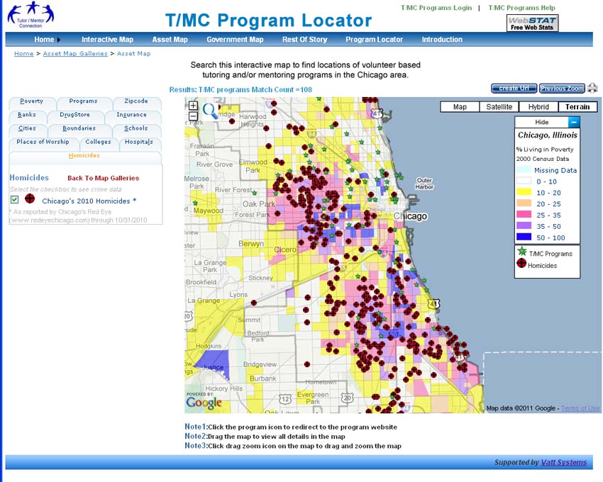
I've used this and similar maps in several stories on this blog in past years. Please look at them and use them as examples for ways you and others can use maps in stories that draw attention, volunteers, dollars, ideas and other needed resources to youth serving organizations in every poverty neighborhood in the Chicago area,  the USA, and the world.

Here's another article, showing ways to make your own maps to influence public policy and willpower.

This blog was started in 2008. There are nearly 10 years of articles showing ways to use maps and visualizations in stories, which also point you to many other resources that help you understand poverty, inequality and racism in America.

The purpose of my map stories is to help well-organized, volunteer-based, tutor, mentor and learning programs grow in all high poverty neighborhoods of the Chicago region. Ideally, such programs connect with youth in elementary and middle school, then stay connected as they help youth move through high school and into adult lives.

With social media, such programs can be a hub connecting youth, volunteers, ideas and opportunities for a lifetime.

I know of very few programs who actually do this. One reason is that the system that funds non profit  youth serving organizations is inconsistent and short-term in who it funds, and how long it funds, as well as what it funds.  Another might be that there is no university or apprentice program training leaders to come into this field, drawing upon the multi-year experience of current and past program leaders, such as myself. 

While I provide these map stories, I host a library of articles and web sites that you can use to expand your understanding of problems and solutions. For instance:

List of Chicago youth programs - visit this link and see the way I share links to Chicago youth programs. You can use this list to find programs. You can also use it to learn ideas from well organized programs that you can apply to help other programs.  Or you can use this to frame a vision for new programs that need to be created in areas where no programs now exist.

Learn  more about challenges of funding these programs - click this link and read articles I've been collecting for the past 20 years.  Unless we find better ways to fund programs, making talent, technology and operating resources consistently available to EVERY program, little will change in the availability of programs or the number of kids being helped through school and into adult lives.

Browse sections of Tutor/Mentor Institute, LLC web site and use it as an on-going resource to support your own efforts. 
* Use this "getting started" page to help you navigate the site. 
* Visit this page to view the library of "strategy presentations" that I've created since the mid 1990s.

If you value this information and these resources, click here and use the PayPal button to provide financial support to help me keep it available to you and others.

Monday, December 18, 2017

School Segregation in the US. Long history. Intentional.

In several articles on this blog I include maps that show segregation in the US school system.  In the video below, Soledad O’Brien discusses with Nikole Hannah-Jones, an investigative reporter for New York Times Magazine, and a MacArthur Genius Award Winner, why she says the segregation in American schools is intentional and why it’s hurting the country’s future.


 Read articles on Tutor/Mentor blog and this blog that focus on ways to get more people involved in learning about issues like this, and in using their time, talent, dollars, influence and votes to create needed systems of support for kids living in high poverty and segregated America.

Friday, December 15, 2017

MapCorps - engages youth in data collection

MapCorps
This is a map on the MapCorps web site t hat shows neighborhoods of Chicago where they are collecting data. Browse the site to see other maps and learn how they are engaging and employing students in this process.

Visit this YouthCounts site to see how MapCorps partners to help collect data about homeless youth in Chicago.


Arts Vibrancy in US Counties

Arts Vibrancy map
Here's another example of how maps can be used. This link points to an interactive map that shows how strong an arts community is in different counties throughout the USA.

Visit the site to learn more about the map and the data/research behind it. 

Thursday, December 14, 2017

Racial Segregation in Metro Areas - Brookings report

Map from Brookings.edu report
This is one of four sets of maps included in this article describing continuing racial segregation in 24 large metro areas of the United States.  Take a look.

Read other articles that focus on race and segregation that I've posted on this blog.

Monday, December 11, 2017

Racial Imbalance in U.S. Public Schools - Interactive map

See this map here
I've posted several articles over the past few years that point to the Brookings.edu site and their use of data maps to show poverty and race issues in the U.S.

This link points to an article and interactive map showing the racial imbalance in U.S. public schools. 

You can zoom into the map and look at the school and neighborhood demographics for every public school (traditional and charter) in the U.S. 

Monday, December 4, 2017

Cook Country GIS Portal - Cook Central

Last week at Chicago Hack Night we were introduced to a new GIS portal, called Cook Central, which was launched on December 1, 2017.  View the video below to see some features, then browse the site and get to know it better.

Saturday, December 2, 2017

Mapping Decline: St. Louis and the American City

This map is from a web site that tells the story of racial segregation in St. Louis as a result of deliberate policies enacted from the 1900 through the 1970s.  Click on the interactive maps to understand the impact of different policies and to see changes by decade.

In this blog I've included maps of Milwaukee, St. Louis, Cincinnati, Chicago and other cities to show that racism led to concentrated poverty and inequality that is present in every city. Maps can be used to not only show where the problem is, and why it occurred, but also to support leadership efforts that help put programs in place that help overcome these challenges.

Sunday, November 19, 2017

Calling on Tech Volunteer for Long-Term Involvement

Nice article in today's Chicago Tribune under headline of "When hackathons won't cut it: Non-Profits cut longer term partnerships with tech experts."

Chicago tech leaders Derek Elder, co-founder of ChiHackNight and Adam Heckman, of Microsoft were quoted in the story.

Heckman said “It’s not just about building a solution; it’s about helping them with their processes and looking at it holistically,” 

Elder said "My experience has been proven out time and time again: You can’t do anything meaningful in a weekend. With a lack of sustainability, a lot of projects will start up and die off. Our resolution was to do it every week and make it easy to attend.

How true. My web sites have all been built by volunteers. This was the home page of the Tutor/Mentor Connection site in 1998, built by Matt Mead and his company.  Matt was a volunteer in the tutor/mentor program I led and he said "I hear you are trying to build a web site."

The current Tutor/Mentor Connection web site was rebuilt by the tech department at IUPUI in 2005 and hosted there till 2011. Now it's hosted on a volunteer in Indiana on a different server, still connected to IUPUI.


Here's another example. I've been  using maps since 1994 to focus attention and resources on tutor/mentor programs in all poverty neighborhoods of Chicago. From 2001 to 2008 a volunteer from Madison, Wisconsin was my map maker. He built the first map gallery.

I've always been dependent on volunteers to help produce these maps, and one reason I've struggled is that I could never find a volunteer who could produce a marketing plan with a realistic cost estimate for what we were trying to do, thus when a wealthy tech guru once showed interest and asked "what will this cost" my feeble response was "I don't know."

The T/MC Organizational History and Tracking System (OHATS) was launched by a volunteer in 2000 and rebuilt by another team of volunteers in 2007.  However, I can't access the data or add to it since 2013 since I've not had the tech support needed. I've not had anyone summarize the information since 2002 due to lack of volunteer or paid talent.

These are just a few of my web sites. All need help to update, improve, add content and attract visitors.

If you want to take the time,  you could visit this wiki and look at the "projects stated since 1993" and see how each requires on-going tech support which I've never been able to find on a consistent basis from volunteers or support with donor dollars.

I've used this graphic for 20 years to show that youth in tutor/mentor programs should be supported by volunteers and leaders from every industry, university, faith group and hospital, as part of their own workforce development and social justice commitments. 

If this were happening, volunteers from the tech industry might be more likely to make longer-term commitments to a non profit or social enterprise, or might be part of a "relay race" of volunteers, with one volunteer passing on the project to others who follow him/her.

Without this consistent support it's difficult to build strong, constantly improving organizations, and thus it's almost impossible to solve complex social and environmental problems, or help kids born or living in poverty move from first grade to first job over 20 years of consistent support.

Sunday, November 12, 2017

Who else doing map stories like this?

Through my participation in the weekly ChiHackNight meetings that take place at Chicago's Merchandise Mart every Tuesday evening I've met a lot of people doing interesting things with technology.  One is Steven Vance who heads the ChicagoCityscape site which focuses on making Chicago neighborhood property, construction and development data accessible to everyone.

Steve posted a series of Tweets today, using maps to focus on four Chicago schools.
here's another
here's another
and here's the fourth
This interests me because I've been using maps of Chicago neighborhoods since 1994 to focus attention on places where non-school tutor/mentor programs are most needed, based on poverty, poorly performing schools, etc.. My goal is to draw support to any non-school tutor and/or mentor programs that may be in the neighborhoods I point to, or to inspire local leaders, business, philanthropy, etc.  to create new programs where more are needed.

Below is one of the map stories the Tutor/Mentor Connection created in the 1990s.


Browse articles on this blog written between 2008 and 2011 and you'll find many more stories like this, created when we had funds to hire a part time GIS specialist.  Browse stories on the Tutor/Mentor blog, written since 2008, and you'll see maps made using an interactive program locator created in 2008-09.  

Steve focuses on a different issue than I do, and uses more updated mapping technologies, and demonstrates how maps can be used to focus on neighborhoods and draw attention to information people can use to better understand problems and opportunities in Chicago. I encourage you to browse his web site to see the many map views he has created.

I've not had help updating my maps, or telling map stories, since 2011, so I write articles like this with the goal of locating others already doing map stories, so I can point to their examples, encourage more people to use maps in planning support for social sector organizations, and so I can attract others to help me with the type of stories I focus on.

Interested?  Let's connect. I'm on Twitter at @tutormentorteamhttp://www.twitter.com/tutormentorteam

12-18-2018 update - Here's a MapStrategies blog that Steve Vance hosts.

Wednesday, November 1, 2017

Mapping Philanthropy - Where's the Analysis?

BMA Funders Map
The map at the right is from the Black Male Achievement web site and shows grant making focused on men and boys of color, and Black men and boys in specific.  It's a great resource and I hope more donors and recipients find ways to show this type of information.

I wrote about this in 2016  and have written other articles on this blog and the Tutor/Mentor blog, focused on philanthropy and funding of non-school tutor, mentor and learning organizations that serve youth in high poverty areas.

The screen shot that I posted above shows the level of information available on this site. In this case the number of grant makers and name and number of Illinois organizations who received grants in 2015.

Since I focus on organizations who provide long-term, muti-year support, reaching kids when they might be in elementary or middle school, then staying connected through high school, it's important that funding be repeated to these organizations on an on-going basis, focusing on building strong organizations, not on specific projects or outcomes.

I also focus on high poverty areas where this long-term support is most needed and I use map overlays to show where poverty is concentrated.

Thus, I'd like to find stories showing how people are studying the BMA data, to show if funding is reaching enough of the programs who are doing work in this sector, and continuing from year-to-year.  That might require that more people plot funding on sites with demographic overlays.  I don't think I see this on the Foundation Center maps.

For instance, in 2015, 78 grants totaling $2.9 million were made in Illinois, to nine (9) Chicago area organizations. 63 of these grants went to Chicago Jesuit Academy (49) and Cristo Rey Jesuit High School (14), totaling $2.165 million.  If you look at my list of Chicago tutor/mentor programs you'll find many in high poverty areas serving minority youth. 

This should prompt stories saying "We need more comprehensive funding data!" and/or "We need funding to reach more programs."   I don't know if those stories are being written.

Distressed Communities index
I've written some stories focusing on distressed communities, with maps showing where they are most concentrated. Large numbers of minority youth live in many of these areas, so the foundation giving maps should show a broader distribution of grants than what I see for 2015. 

This broader distribution needs to be happening every year if we want good programs to be continuously operating in more of the places where they are needed.

Who's writing about this?

If you are doing this type of analysis, using BMA Funders data, or some other philanthropy-tracking resource, please share links to your stories so people reading this article can expand their understanding by reading what you are also writing. 


Thursday, October 26, 2017

Mapping Opioid/Overdose crisis and service providers

Brookings Institute map
Yesterday I posted an article asking that someone map locations of the Digital Divide and showed a concept map outlining problems schools are facing.

 Today I found this article, with a title of "A Nation in Overdose Peril:  Pinpointing the Most Impacted Communities and the local gaps in care".

 The article shows where this crisis is most severe, where it is growing and also talks about lack of prevention and treatment non-profits in many of the areas that have the greatest need. If I had ever had a research institute to help me do the work I've been doing to identify where youth tutor/mentor programs are most needed, and where existing programs exist, my stories might have looked very much like this one.

Thus, I posted a comment on Facebook with the goal that some folks working with public health issues might be interested in what I've been doing for the past 23 years.

I decided to post that comment here, with more detail. 

Based on this article I have two comments/requests. First, have you produced a concept map/visualization showing the different treatments and prevention services that are available in some communities but not in others?

This link points to the cMap below,  showing supports kids in poverty need to move from first grade to a job. http://tinyurl.com/TMI-K-CareerMentoring


My map starts at the left, pointing to pre-school, then moves from elementary school, to middle school, high school, college/vocational school, then jobs and careers. That's a 20-30 year journey for every youth. Those living in high poverty have less support, thus non-school volunteer-based tutoring, mentoring and learning programs are a valuable resource.

Middle School
At each age level I show a range of supports that all kids need, but which are missing in many areas of high poverty.

I feel that a similar map could show a time line of first exposure to potential drug abuse and the causes of addiction, to a later stage where a person is heavily addicted and needed specialized treatments. At the right end of the time like could be the post addition recovery stages, showing supports still needed.

At each stage having the appropriate supports and treatment could make a huge difference.

The information the Brookings Institute is collecting to produce this article could be organized into a web library sorted by the categories on the concept map, making these resources available to every community in the country/world.

The second question asked if the Brookings Institute has plotted its data about service providers on a map, as an overlay to the maps showing distribution of the problem? I have been plotting locations of non-school tutor/mentor programs on maps since 1994. The map at the right is created using a Chicago Tutor/Mentor Program Locator pilot which was built in 2008.

The maps force leaders to think of all the places where help is needed. Without mapping resource providers you could fill a stadium with people doing this work and still not be reaching most places where help is needed.

With this information people concerned with the problem could begin a marketing campaign intended to help existing providers continue to provide services while helping others build new service distribution points, borrowing from what is working in other places. If someone is doing this please share the links.

Using the information you collect in a campaign intended to draw resources to the areas where extra help is needed is the 4-part strategy the Tutor/Mentor Connection developed in 1994 and has been using since then (since 2011 as part of Tutor/Mentor Institute, LLC).  Just showing where the program is located, and talking about some causes is only part of what needs to be happening.

If some is interested in talking more about what I've just suggested,I'll post this on my blog and look forward to connecting.

Update: 10-27-17- Here's a link to a Jan 2016 New York Times story with maps showing drug overdose deaths each year since 1999.

Update: 10-12-18 - Here's useful article in USNews about the challenges of solving the opioid epidemic.

Update: 10-25-18- America's 150 Year Opioid Epidemic - NY Times article  click here

Wednesday, October 25, 2017

Mapping Digital Learning Access - invitation

Earlier this week I watched a one hour documentary showing the Digital Divide in America, and identifying three key challenges that must be overcome.

I created this concept map to visualize that discussion and add some other issues that were not included in the video.

I'm looking for information that can make this cMap more useful.

First, if you know of articles that provide more information related to hardware, connectivity, or teacher training, I'd like to add links to such articles in the three nodes on the map that focus on those issues.   If you know of anyone writing about the challenges of keeping this stuff updated as kids go through school - 12  years - I'd like to point to such articles.

Second, I am looking for maps that show every school in the US, and provide some sort of indicator that shows what level of digital access that school offers.  Ideally such maps would have overlays showing poverty demographics and legislative districts, such as I've tried to provide in the Chicago Tutor/Mentor Program Locator platform.

A few weeks ago I pointed to the OpenStreet Map Project, in which people from around the world can help upgrade the quality of information for places throughout the world.  It seems to me that a group of students and/or volunteers could create a base map, and that schools from around the country could add their own information with pre-set icons that would show levels of readiness (yellow, red, blue, green, etc?) based on the information in the Digital Divide video.

Maybe someone is already doing all of this?  If so, just share a link and I can point to it.

This information needs to be available on a school by school level or in districts with multiple schools crossing income and wealth divides, the need of poor schools might be overlooked.  Including legislative overlays would build in direct accountability to the people who represent those districts.

We can't help kids get through school and into jobs and adult lives free of poverty if we can't give them a more equal playing field.

11-10-17 update - Here's an article titled "From good intentions to real outcomes: Equity by design in Learning Technologies", which relates to this topic.  It has been set up on Hypothes.is so readers can annotate and share ideas in the margins.

5-28-18 update - Here's an article about a 2018 Google Report revealing the state of CS education in the US

7-16-2018 update - Article titled "The Last Mile" talks about broadband access in rural areas of US.

9-11-2018 update - The Stark Geography of America's Digital Divide, article by Bryan Alexander, summarizes this Pew Research Center Report on the Digital Divide.

11-23-2018 update - Equity, Access and the Distributed Web - relevant blog article from #clmooc network.

4-24-2020 update - map showing broadband accessibility in Chicago census tracks - click here

Thursday, October 19, 2017

Unique Geography Teaching & Learning Resource

I've been following a Twitter chat using the hashtag #worldgeochat and this week I saw this graphic introducing a web site titled The Human Imprint.

I took a look at the site and found it to be a treasure of information and ideas.  It was created by a geography teacher and one section is an Illustrated Textbook for teaching geography and spatial-based history, current events, environmental topics and more.

However, another section is a web library, organized in nine categories, with topics such as population and migration, urbanization, industry and economic geography, political configurations, etc.  In each section are sub-sections, which you can find using the drop-down menu. 

I've been building a web library for more than 20 years and I have two categories with links to geography and mapping resources.  The graphic at the right can be found in this presentation, describing the information library I've been building and showing my goal of finding others who are experts in specific topics. It looks like The Human Imprint is providing some of this expertise.

I encourage you to book mark the site as I did, and visit regularly.

Monday, October 16, 2017

Updating CPS Tiers Map - How It Was Done

Many well-intentioned civic tech volunteers are creating apps and web sites, but seldom do the work to update them regularly.  Thus, it was great to find a set of Tweets and web links posted by Derek Elder, of ChiHackNight, showing how he updated a map platform showing Chicago Public School Tiers. You can read Derek's article here.

The CPS School Tiers map can be found here.

The same tier info is also used on the CPS School Locator.

I think the information Derek is sharing could be applied by civic tech volunteers in other cities and working on other projects.

I'd love to find some volunteers who would help update, and/or rebuild, the Tutor/Mentor Program Locator, which was built for me by a team from India in 2008. I've not been able to update the site since 2010 and have not been able to update the tutor/mentor program information on the site since 2013.

The Program Locator is part of a project started in 1993, intended to identify all non-school, volunteer-based tutor and mentor programs in the Chicago region and share that information in on-going public awareness activities intended to draw resources and ideas to existing programs,  help parents, volunteers and donors find programs, and help people see where more programs are needed.

Initially the list of programs was published in a printed directory that was mailed to libraries, businesses, foundations, and existing programs each year and shared at a May and November Tutor/Mentor Leadership and Networking Conference.

In 1998 we began putting the list of programs on line, pointing to program web sites, which we felt would have much more updated information than what we could provide in a directory. It could also be found by more people.

In 2004 we launched a ProgramLocator search portal, which you can see at the right, which enabled people to search for programs by age group, type of program and zip code or community area. The results would show on a Google map.  A special feature made it easier for Tutor/Mentor Connection staff to update program data, and allowed programs to enter and  update their own data.

Unfortunately, this feature has not worked since 2013 and even in the late 2000s we had too few dollars to train programs to use this effectively.

This is one of many graphics created over the past 20 years to emphasize our intent of connecting donors and volunteers directly to individual tutor/mentor programs, using the Program Locator, and eliminating us or anyone else as the gate-keeper or middle-man.

Our goal was to create PDF essays, like this Shoppers Guide, to educate programs and resource providers, so they could make informed decisions on which programs to support.  In some cases, there are almost no choices in some zip codes, so you need to help which ever programs are there become great at what they do. That take time and perseverance.

This page contains articles that show ways to use the Program Locator.

I've not found many using maps this way, to draw needed support to organizations who are already doing needed work in different parts of a city.  Yet, I believe what I'm piloting can, and should, be applied in cities throughout the world.

Read more stories about my use of maps, on this blog, and on the Tutor/Mentor blog. See history of my use of maps, and current status, on this wiki page.

So, as I look at what Derek and others are doing with GIS technology, I hope to find people with similar talent, or some dollars, who will help me upgrade what I've been doing for almost 24 years.


Wednesday, October 11, 2017

Help More CPS Youth Move To&Through College - See the Data


I attended an event in Chicago yesterday hosted by the To&Through Project of the University of Chicago's Urban Education Institute. The Project's mission is:

The To&Through Project’s mission is to close the gap between the 76% of CPS freshmen who aspire to attend college and the actual results of only 18% obtaining a 4-year college degree within 10 years, with research, data, and resources designed to give every student who aspires to earn a college degree the opportunity and support to do so.

The Project web site has a data portal that anyone can use to understand how each CPS high school performs, with a multi-year history and with comparisons to other schools, CPS in total, and national results. The site also has reports produced by experts in Chicago and beyond that provide additional ideas that can be used to build a stronger support system for Chicago youth.

This is a rich resource. You'll need to spend time on site to learn what's there.

One of the features of the site is a collection of stories, submitted by anyone in the community, showing how they are using To&Through data to help CPS students through school and through college.

I attended this event in September 2016 and posted this story on the Tutor/Mentor blog.   In that story I encouraged Project leaders to review the ways I'm using maps and showing how others use maps, via articles on this blog. 

Birth to Work Support

I included this graphic in that story, emphasizing the need for support that starts as early as first grade and points to jobs as the result of post high school college and/or vocational school programs, along with an expanded network of mentors who help open doors to those jobs.

In the breakout group that I attended yesterday I asked if any of the data was plotted on GIS maps. The best answer I received was that you could find such maps on CPS web site, and perhaps on other sites, such as that of WBEZ radio. 

data platforms
This blog is full of articles showing uses of maps. The concept map at the left shows many data portals that are models that can be reviewed.

On other concept maps, like the one below, I show how maps should be used in planning and community building efforts that focus on specific neighborhoods, such as the area surrounding each CPS school. 

Use maps in planning

I'd like to see stories on the To&Through site that show how people in different map-areas are using some of the ideas I'm sharing and are coming together to help students be more successful in moving through school and into jobs and careers.

One goal expressed by the To&Through Project director at this year's event was data that show income and earnings of CPS alumni, as a result of having obtained a college degree. That would align with my own goals and perhaps build greater support for the broader system of supports needed by youth in many school neighborhoods.

Last year's article did not result in an invitation to connect and share ideas with any of the organizations working toward the To&Through Project goals. Hopefully, this year's article will lead to some conversations.

Thursday, October 5, 2017

KUMU adds GEO layer to Community-Based Concept Maps

Map from Kumu blog
I was delighted to scroll my LinkedIn feed today and see a post announcing that Kumu.io is introducing Geographic Mapping Underlays.  Here's the blog article that introduces this feature. 

I've been interested in mapping event participation for about a dozen years. In this article on the Tutor/Mentor blog I describe my interest. In this page on the Tutor/Mentor Conference site I show conference participation maps.

In this 2014 article I talk about systems mapping and introduce Kumu and a few other companies I'd connected with. I also bemoan my lack of resources to apply their technology, or my ability to influence others in Chicago to apply these tools.

The map at the right shows participation in one of the MOOCs I've taken part in since 2013. I first saw this type of mapping in an Education Technology and Learning MOOC (#ETMOOC) which was I joined in Jan 2013. As I participated in later MOOCs, such as Deeper Learning (DLMOOC), then Connected Learning (CLMOOC), I shared a link to the ETMOOC and encouraged adoption. I was pleased to see this happen.

In this Twitter chat the #clmooc group is talking about using maps to understand "who's here and who's not".

Now if only the foundations and event organizers in Chicago would take the same steps.

The Kumu GIS Mapping Underlay looks like a really sophisticated, but simple, way to map participation. I'll be following their progress and user groups to see (and share) how this is used by people throughout the world.

If you're trying to bring people with different talents and representing different networks in order to solve a problem, you might use maps like the one at the left to show what talents or networks you seek.  Using tools like KUMU is developing you might find a way to map participation in your meetings and events and do the analysis needed to know if you are getting the range of participation you need, and where you might still have some missing pieces.

If you're using these tools, for this purpose, I look forward to hearing from you.  If you'd like me to sit in on your brainstorming and share my ideas, I'm available.


Sunday, October 1, 2017

Learn about Open Street Mapping

The video below is from last week's ChiHackNight session. Steve Vance describes Open Street Mapping and efforts to create better maps for areas of the world, like Puerto Rico, where there are not enough good maps to support disaster recovery efforts.


Here are some relevant links:

Open Street Map site - click here

Humanitarian Open Street Map team - click here

Many areas prone to disaster have not yet been mapped. View the video, visit the web sites and find ways you can help.


Wednesday, September 27, 2017

Distressed Communities in US

Distressed Communities Index map and data show a fragmented economy with nearly 52.3 Americans living in economically distressed communities.  Read the report-click here. View the map-click here.

Note: the link I'm pointing to is to an updated 2021 map. 

In articles on this blog and the Tutor/Mentor blog I show how people can zoom into maps like this to focus on specific areas. 

Below is an example. I've zoomed into the Springfield, Illinois area.


If you run your mouse over the map data tables pop up showing a "distress score". For instance, the rust colored area of Springfield has a 91.5 distress score with a 26% poverty rate and 25% adults not working rate. 

People from throughout the Springfield area should be creating stories using map-views like this with a "what are we going to do about it?" set of questions.  Only when enough people are concerned will anything happen.

Tuesday, September 19, 2017

Mapping Indiana After School Programs

There's a lot to like about the map/directory on the Indiana Afterschool Network web site. They not only are collecting location information, but through surveys and data analysis are providing an overview of that information.  Take some time to browse the site.

The 2018 Indiana Summit on Out-of-School-Learning will be held in Indianapolis on Monday, April 9, 2018. Out-of-state programs might find this useful.


Monday, September 18, 2017

Mapping Terrorist Attacks Around World

This is another ESRI story map, showing terrorist attacks around the world in 2018.

Teams of students, volunteers and researchers in US cities could create similar maps to show neighborhood violence and the availability (or lack) of  youth jobs, tutoring and mentoring support services.

Mapping Segregation in Washington, DC

This image is from an ESRI story-map, showing the growth of racial segregation in Washington, DC.

Take a look at this, and other articles on this blog, where I've shared maps focusing on race, poverty and segregation.

Monday, September 11, 2017

Pain and suffering throughout the world - how do we respond?

I have been watching the daily news briefs following hurricanes in Texas, Florida and Mexico, along with daily shootings that take lives of young people in Chicago and other cities.  Yesterday I did a search to see if anyone had been mapping locations of natural disasters throughout the world.  I found the map below, showing events in 2014, on this United Nations Disaster Prevention resource page.

This map only shows natural disasters. If wars, terrorism and other man-made disasters were plotted on the map, or added as an overlay, we'd see a lot more pain in some parts of the world, but not much more than what's on the map now, in other parts of the world. If poverty overlays were added, we'd see that much of the man-made and natural disasters hit people hardest in high poverty area. These are areas where people have the fewest resources to rebuild their own lives and communities.

With so many bad things happening, how can anyone find a meaningful way to respond?  I encourage you to visit this article, which I posted over the weekend on the Tutor/Mentor blog. It includes the graphic shown below.


Look at the slanted white line in the middle of this figure-8 graphic.  This represents information, such as the UN Disaster Prevention site, or the Tutor/Mentor web library, which people can use to learn more about any of these problems, learn what some people are doing in different places to solve the problem, and find places where they might get involved with time, talent and dollars.  It also represents the role of intermediaries, who help people connect with this information and  help them  understand how to apply it.

I first used this ENOUGH list in 2007 after seeing a newspaper headline following a shooting in Chicago, where a talking head said "Enough is Enough".  This is a list of steps anyone can follow to become involved.

A couple of months ago I updated it in a video that you can find here.  The first step is educate yourself, and the second is educate your network. Use the information made available by myself an others to know more about some of these problems and to find ways to use your time, talent and dollars to become part of the solution.

Related article: "I'm up to my neck in alligators. How do I drain the swamp"  click here

I've never claimed to have the solution to any of these problems. I only offer a learning path that might lead to solutions if more people begin to use it.  Want to connect with me? Visit this page to see social media pages where you can find me.

Update 7-4- 2018 - network analysis showing migration patterns around the world. click here

Update 2-20-2019 - Migration Policy Institute site is an in-depth resource for information about this crisis. Click here

Update 3-4-2018 - "The 10 shocking humanitarian crises you probably haven't heard of" - plenty of pain throughout the world. click here

Update 3-13/2019 - Visit this #investinhumanity page on Twitter and be reminded of the many places in the world where there is daily pain and suffering.

Update 12-11/2021 - Global Conflicts in 2021 - click here

Monday, August 21, 2017

Analysis of Philadelphia using maps

Here's an article in the NextCity.org site showing changes over the past five years in different Philadelphia neighborhoods.

Getting people to look at this, talk about it and act in ways that help struggling neighborhoods grow while continuing the success of other neighborhoods is a challenge for people throughout the city, not just city leaders.

I don't think this set of maps includes an overlay showing youth serving organizations and/or other needed services like I've tried to provide with the Tutor/Mentor Program Locator.  All it would take would be a dedicated group of people, including funders, to make that happen.

Monday, August 14, 2017

Violence on doorstep of Church in Austin neighborhood

While social media rages against the violence in Virginia, my Monday Chicago Tribune reminded me of another act of violence that took place yesterday in Chicago, when two men were gunned down right in front of the Friendship Baptist Church in Chicago.

I have written often on this and the Tutor/Mentor blog about violence in the Austin neighborhood, using maps to encourage businesses, universities, faith groups and others to work collectively to build a first-grade to careers support system that provide hope and opportunity and competes against gangs and their influence

The daily newspapers provide just one more reminder of problems that won't go away unless many more people give time, talent, dollars and votes over many years to address the root-causes of these problems.

That's true for racism, fanaticism, fascism and other problems we face in America and the world.

Friday, August 11, 2017

Atlas of Sustainable Development Goals - World Bank

Image from World Bank web site
This graphic is found on a web site that hosts an Atlas of Sustainable Development goals. Here's the description on the web site:

 "The Atlas is built around World Development Indicators 2017 - the World Bank's compilation of statistics from over 200 economies about global development and the quality of people's lives.  For each of the 17 Sustainable Development Goals, selected indicators have been identified and visualized to analyze trends and challenges, and to stimulate discussion on measurement issues. You can browse the Atlas online, or download it as a PDF." 

 There is a load of data here, and will take many hours to review and get to know the information. What I'm interested in seeing is how people use the data to tell on-going stories that build the public will needed to invest in future solutions so that over time the Sustainable Development Goals are achieved, in every country, including the USA.

 If you're seeing some good stories using this data I invite you to share links using the comment section of this blog.

Tuesday, August 8, 2017

Role of Facilitators - See Blog Talk Radio Interview

In the 4-part strategy that I've shared often on this blog, step  3 focuses on facilitation, or helping other people find, understand and apply the information on my web sites.

I use my articles to help people understand ideas and information they can use to help build and sustain volunteer-based tutor, mentor and learning programs that reach kids in high poverty neighborhoods of Chicago and other cities.

I point to work interns have done in past years to help people understand ideas I share on this blog and the Tutor/Mentor Institute, LLC library.

On Monday, August 7, 2017,  Valerie Leonard, a Chicago community organizer, who I have come to know over the past 15 years, interviewed me for her Blog Talk Radio show.  You can see the interview below.


By hosting this show, and inviting me to be a guest, Valerie is modeling a facilitation role that needs to be duplicated by people in many groups to draw people to articles and ideas that I and other people share and help them build their own understanding and use of the ideas.


This graphic illustrates what I'm saying. There are many different groups who could be taking a deeper, more strategic, and on-going role to help improve the quality of life for people in different parts of Chicago or in other parts of the US and the world.

You don't need to have a deep understanding of any of the stuff I post or write about. You can invite a group of people into a room, project the image or article on a screen, the ask people to share what they are understanding.

You don't even need to be in the same room, at the same time. Connect on the Internet.

This past month the Connected Learning #clmooc group has been encouraging people to "make" visualizations that express their ideas. Take a look at their web site and see the activities they have been doing and the way they share and connect with each other on several social media platforms.

The #clmooc organizers are educators from different parts of the world who meet on-line to plan each year's activities.

Go ahead and get started. Invite some people to come together. Pick any of the articles I've posted over the past 10 years or that you find in the Tutor/Mentor Institute, LLC library.

If you're taking this role, send me a link and I'll join in when I can, and share  your videos and Tweets as I receive them.  It's another example of what I mean when I say "It takes a village to raise a child."

One role in the village is information net-worker, facilitator, trainer, etc.

If you want to make a contribution to help me do this work, visit this page and use the PayPal button.