Thursday, September 19, 2019

Factors that affect learning - interactive map

In a Twitter chat today I learned about a new map by Brookings.edu and the @hamiltonproject. I show it below. Visit this article to read about the map and learn how to use it.

Open map - click here
You can zoom into the map and enlarge it to focus on different places around the USA.  I zoomed into the Chicago region and created the map view shown below:

Open map - click here

Each dot on this map is an individual school.  So I zoomed in even more to focus on one school, which I chose at random.

Open map - click here
The blue circle focuses on Daley Elementary School, where student chronic attendance is 18.2%, which you can see if you put your icon on the red dot. 

The red circle focuses on the wider area around this school, where most students live.  I've been trying to coach schools, businesses, faith groups, hospitals and others to fill the red circle with a wide range of volunteer-based tutor, mentor and learning organizations so kids come to school more prepared to learn and leave with networks that help them into jobs.

I've been trying for 20 years with limited success. I keep trying. 

Below is another map, created in 2017 from the Chicago Tutor/Mentor Program Locator, which my organization created in 2008 (it's not been updated since 2013).

View Program Locator - click here
On this map I show layers of information, that includes existing non-school tutor/mentor programs in the area, as well as assets who could be helping programs and schools help kids, such as faith groups, businesses, hospitals and universities.  The map shows who is in the same geography, thus who has a reason to help.

Most of the map platforms that show data, don't do what the Program Locator was intended to do. And, I've not had the resources or partnership to keep updating the Program Locator, or to keep adding to its features.

Chicago programs
In 2016 I created a new map platform, which is kept updated. See it here.  Unfortunately  this does not have the layers of information, or search features of the program locator. You can zoom in and put your mouse over a green icon to learn who that program is.

It's not enough to just point to where kids need help. We need to  help build a support system of people and organizations who devote time, talent, dollars and votes over many years to help kids grow up.

If you'd like to know more, connect with me on Twitter, Facebook or Linkedin.  If you'd like to make a contribution (not tax deductable) to help me, click here.
Friday, September 13, 2019

Understanding Racial Diversity in USA

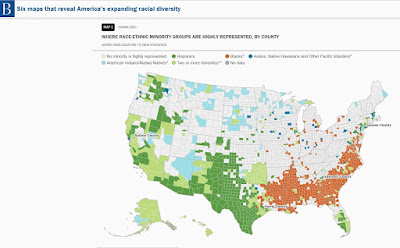
Below is one of six maps shown in a Brookings.edu article titled "Six Maps that Reveal America's Expanding Racial Diversity".

Run your pointer over the maps and you'll get data for every county showing the percent of each racial group in that county.

In theory you would expect a greater percent of minority elected officials, at the local, state and federal level, in those areas showing high concentrations of African American and Latino populations. 

Take some time to read the full article.