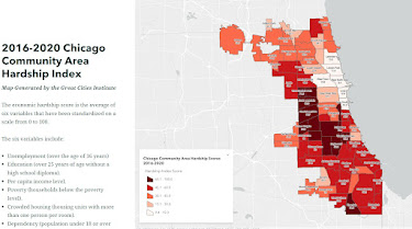
This blog has been using maps since 2008 to highlight areas of high poverty where youth, families and schools need extra help. Prior to 2011 the maps shown were created using our own GIS tools. Since then blog articles have continued to show maps using a Program Locator developed in 2008 (but inactive since 2018) and platforms created by others.
The goal is that people from every industry and profession, as well as from colleges, faith groups and health care institutions, will spend time looking at these maps, then will create their own blog articles, calling more people to look at the information, then do something with their time, talent, dollars and votes to change conditions in one or more of the areas with high needs.
That's not yet happening in nearly enough places.
See more uses of maps in stories on the Tutor/Mentor blog, which was started in 2005.

