Monday, September 1, 2014
US Schools Highly Segregated
This Metro Trends Blog article shows that "Despite our country’s growing diversity, our public schools provide little contact between white students and students of color. Metro Trends has mapped data about the racial composition of US public schools to shed light on today’s patterns at the county level. These maps show that America’s public schools are highly segregated by race and income, with the declining share of white students typically concentrated in schools with other white students and the growing share of Latino students concentrated into low-income public schools with other students of color." Read the article.
Wednesday, August 13, 2014
Changes in race and poverty in US since 1980

Browse the articles on this site to see how map stories can be created using map platforms like this. Such stories can be used to build public awareness and mobilize leaders and resources to fill high poverty areas with a wide range of youth and family supports.
Browse sections of the Tutor/Mentor Institute blog and you'll see more examples of maps and graphics. Use these as examples that can be duplicated by volunteers, leaders, media in Chicago and other cities.
Monday, July 14, 2014
Forbes map shows where wealthiest US families are located

Today I was encouraged to take a look at an interactive map on the Forbes.com web site showing locations of 180 billionaire families. See the map here.
Imagine how much more we could do to help young people in high poverty areas is just one of these familes in each part of the country adopted the Tutor/Mentor Connection strategy and commitment, shown on this animation, and this concept map.
Monday, May 26, 2014
Create Map Stories following Negative News
Throughout this blog and the Tutor/Mentor Blog I show how maps can be created to focus attention and resources on places in Chicago where bad things are happening to good people.
 Maps can be created using the Tutor/Mentor Program Locator, or by using other map resources, such as this homicide map hosted by the Chicago SunTimes.
 If you browse this blog you'll see other mapping platforms that can be used to create images for blogs and social media articles. These are tools that youth and adult volunteers could use in creating map stories that leverage the attention created by traditional media coverage of negative news.

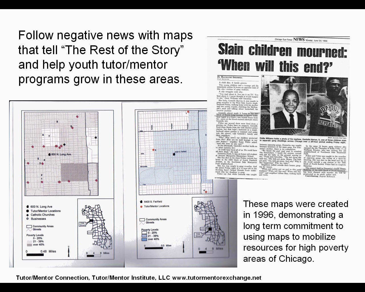
Such stories, if repeated over and over, could begin to motivate adults in different parts of the Chicago region (or in other cities) to provide the on-going flow of resources that are needed to create mentor-rich programs and learning opportunities for K-12 youth in neighborhoods where lack of opportunity contributes to lack of hope, which contributes to many of the negatives that are reported too often in the media.
See this album for map stories from the 1990s and this Map Gallery for stories from between 2008 and 2011.
If you're already creating map stories for the purpose of drawing resources to neighborhoods, point to this list of Chicago tutoring and/or mentoring programs as you call on leaders to provide resources so your stories are helping existing programs grow.
Share your stories with me on Twitter @tutormentorteam or on Facebook in this group.
Friday, May 2, 2014
How is the Chicago Tutor/Mentor Program Locator Supposed to Work?

If you want to know how this should work, visit the Chicago Public Schools "School Locator" page. It may take you a while to figure out how this works, but on the left side is a label that says "political overlays". Click on any of these and you'll see political district outlines on the map.
Now on the Tutor/Mentor Program locator, you'd be able to use a drop down menu to zoom into a specific district or geographic areas. I don't see this on the CPS locator, but I really like the way the technology works.
Of course, having a great map-directory is only useful if many people are using the maps to tell stories that draw needed resources into school neighborhoods so families and schools have more help encouraging youth to become active learners who take a greater responsibility for their own learning, and their own futures.
If you are creating map stories using this information please post a link to this article so others can learn from how you are using the maps.
Wednesday, April 2, 2014
Using Multiple Data Sources
In the articles on this blog I've shown maps I've created using a desk top GIS mapping system, as well as the interactive Chicago Tutor/Mentor Program Locator. However, this is just one of many resources that need to be used to build a better understanding of the comprehensive problems caused by where you live or where you were born. I feel there needs to be a generation of activists who create map stories, drawing upon all of these resources.
As I find new map portals I add them to the web library that I've been building since 1998. Then I write a blog article here, or on the Tutor/Mentor Blog, to draw attention to the resource.
 The map at the left is from the 2014 Annie E. Casey Foundation report titled "Race for Results: Building a Path to Opportunity for All Children" Visit the web site and view the report, as well as a recording of a panel discussion held to announce the release of the report and discuss its findings.
This second map is from a Civil Rights Project report titled "New York State’s Extreme School Segregation: Inequality, Inaction and a Damaged Future"
 This third image is from the County Health Rankings and Roadmaps web site, showing health disparities in Illinois counties.
Browse this blog and you'll find links to many other map resources. Visit this section of the web library for more examples of mapping and visualization.
Each of these web sites is a tremendous resource, but they only tell part of a story. If we're to build public will to solve the problems indicated in these reports, in all of the places shown on the map, we need a massive increase in the number of people telling map stories on a daily basis, connecting maps and data from many sources into stories that motivate more people to give time, talent, dollars and votes to solve the problems these reports show to be embedded in many parts of the country.
As I find new map portals I add them to the web library that I've been building since 1998. Then I write a blog article here, or on the Tutor/Mentor Blog, to draw attention to the resource.

This second map is from a Civil Rights Project report titled "New York State’s Extreme School Segregation: Inequality, Inaction and a Damaged Future"

Browse this blog and you'll find links to many other map resources. Visit this section of the web library for more examples of mapping and visualization.

Each of these web sites is a tremendous resource, but they only tell part of a story. If we're to build public will to solve the problems indicated in these reports, in all of the places shown on the map, we need a massive increase in the number of people telling map stories on a daily basis, connecting maps and data from many sources into stories that motivate more people to give time, talent, dollars and votes to solve the problems these reports show to be embedded in many parts of the country.
Subscribe to:
Posts (Atom)