Last week I watched a webinar where the term Social Determinants of Education was used in context of the non-school data schools could be collecting to better understand school performance and propose solutions. I wrote about it here and included links to the video and website, along with other resources.
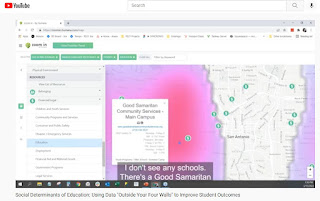
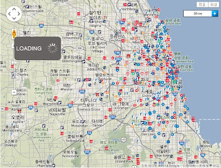
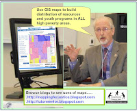
Below is a screenshot from the demonstration shown in the video. This shows how non-school youth development programs are plotted on a map along with indicators such as poverty.
In my article I showed how the Tutor/Mentor Connection (1993-present) had started building a list of Chicago non-school, volunteer-based tutor/mentor programs in 1993 and began using GIS maps to show where programs were needed and where more were located as part of that strategy.
Read this article to see growth of our mapping strategy since 1993. Visit this page to see current status.
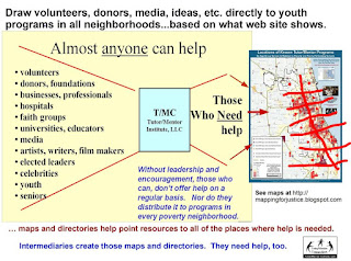
What I did not emphasize enough was that while we pointed to youth serving organizations and indicators of need, we also pointed to businesses, faith groups, colleges, hospitals, banks, etc. who shared geography and could be directly involved in helping fill a neighborhood with a wide range of K-12 tutor and/or mentor programs.
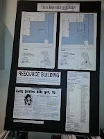
Click on this image and enlarge it, then look at the list posted on the right. This is how we were sharing information in the 1990s, prior to the Internet.
It's part of a "Rest of the Story" strategy that we developed to draw additional attention and resources to neighborhoods featured in negative news stories, such as kids getting killed in Chicago.
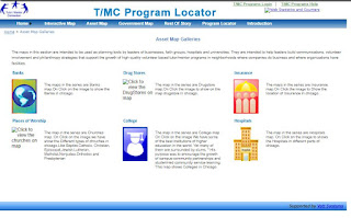
When we launched the interactive Chicago tutor/mentor program locator in 2008 we built a page of asset maps. You can see this in the graphic below. This is only available as an archive now (click here).
When this was working you could click on any of the categories and open a new page.
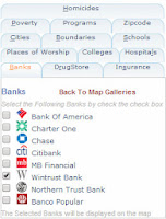
For instance, of you opened the "banks" page you'd find a list of
Chicago banks. You could build a view showing only one, or several banks. You could also add information from the other categories. Then you could zoom into a zip code, or Congressional district, or any small area on the map, and see indicators of need, existing programs, which you could sort by age-group served and type of program, and assets.
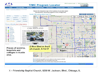
Below is a map view created using the assets map section:
This shows how I was able to zoom into a section of the city and build a map view, then add an image from a May 2017 newspaper story about "two men shot in front of a church".
You can find many map-stories on this blog, and the
tutor/mentor blog, showing similar map views.
While this service is no longer available, it remains as a model for people building new dashboards. Until that happens, I've shown some ways to use other dashboards.
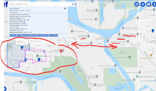
The map view below is shown in this article. I used the Chicago Public Schools Locator platform and zoomed into an area on the far South Side of Chicago with extensive poverty, but too few non-school youth support programs. I highlighted on the map businesses nearby who could be helping.
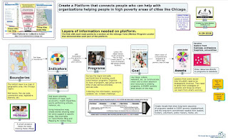
For those who have the funds (perhaps from ESSER) to build new dashboards I created
this concept map to show layers of information that could be included. See it in
this article.
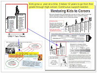
What my maps and articles focus on is funding and sustainability. It takes 12 years for a youth to move from 1st grade to high school graduation and several more years to move into a job. While a few non-school organizations may succeed in attracting consistent funding, most don't have that type of ability. They struggle.
If someone can create an interactive dashboard, and someone else can build a list of non-school youth serving organizations, sorted by type of program and age group served, others can integrate this into the dashboard and lead efforts to draw 'people who can help' through the dashboard and into different parts of the city, and the websites of organizations in those areas.
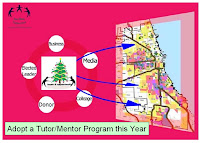
In the graphic above I've drawn a grid over the map of Chicago illustrating the potential for volunteer groups, businesses, faith groups, etc. to adopt specific parts of the city, collecting and maintaining program data for that section of the city and leading on-going communications and outreach efforts intended to draw support to youth programs in that area. The could also be supporting the operations of programs in that area and/or making specific types of learning more available, such as computer science education.
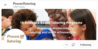
Ultimately, every high poverty area should have someone taking this role. That takes me to another innovative project. This is the Twitter page of
Proven Tutoring. It's a project of the Johns Hopkins University Center for Research and Reform in Education.
Visit the
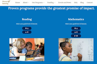
website, read the blogs, and view
the list of reading and mathematics tutoring programs that they point to.
This is an example of what universities could be doing to collect and share information about non-school tutor, mentor and learning programs in neighborhoods surrounding each university. I've been reaching out to universities since the late 1990s to enlist one, or more, to take this role in support of the Tutor/Mentor Connection's strategies. Here's
one example.
Proven Tutoring is partially funded by the Walton Family Foundation. Just last week I saw this Tweet, showing a $281 million gift from
@MackenzieScott to fund the Boys & Girls Clubs of America.
Imagine the potential for a major donor to fund the one or more universities adopting the Tutor/Mentor Connection strategy and goals and hiring a team like that at
@RS21 to build a data platform that has all of the Social Determinants of Education features that they described in their webinar and
in this blog article, along with layers of information showing youth serving organizations, and assets, which was collected and updated by students.
Imagine the even greater potential if students in business, arts, sports and media departments were leading on-going campaigns to draw policy-makers, volunteers, donors, youth, educators and others to the platform and on to websites of youth organizations, who they then would support with time, talent and dollars.
That's the goal.
If you're still reading, thank you. Please share this with your network and with people who can take up this call to action.