 |
| See map here |
Hopefully this leads people of all backgrounds to dig deeper into the history of slavery and continued oppression of Black and Brown people that continues today.
One part of this history is 'redlining' where maps were drawn using red lines to show neighborhoods where banks and insurance companies would not invest. Those were poor neighborhoods with concentrations of Black and Brown people.
The map I'm showing here is from an article on the Bloomberg City Lab website, titled "Louisville Confronts Its Redlining Past and Present". Visit this page to see the full presentation.
 |
| Oakland, San Francisco - redlining |
The ESRI story maps make great presentation platforms for this information. Scroll down the map and new images and text appear. It makes it easier to understand the stories being told.
Below is a map showing the Chicago region. It's from a Mapping Inequality project of the Digital Scholarship Lab at the University of Richmond.
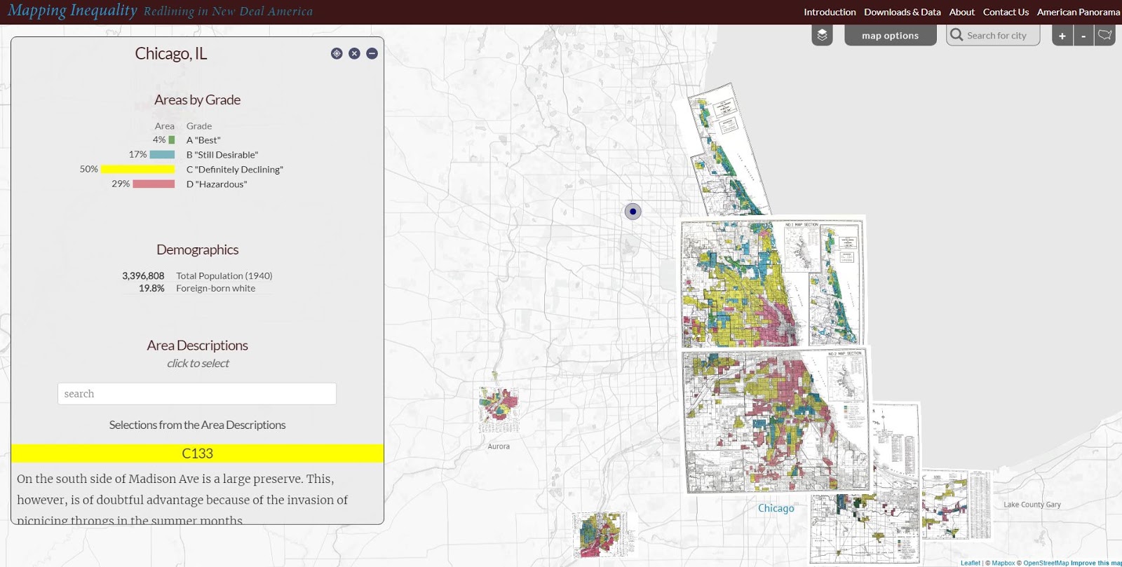 |
| Redlining in the Chicago region - see map |
Visit the American Panorama section on the DSL site and find story maps focusing on other issues in American history.
I found these maps on my @tutormentorteam Twitter feed then did a Google search for "Esri story maps - redlining" and "redlining maps". There are many other resources to learn from.
Return to this article often and read updates where I've added links to new, related, articles.
11/30/16 update: Here's a New York Times story about immigration, that uses maps and animation to tell the story in a visual way.
12/20/16 update: Here's another ESRI storymap, this time telling the story of the Dakota Access Pipeline (DAPL).
1/11/17 update: Story map showing 10 most segregated cities in the US.
6/28/17 update: See how Crain's Chicago Business uses this Wealth Divides map in it's own analysis. click here
2/28/18 update: How Cities are Divided By Income, Mapped - CITYLAB story. click here
View the ESRI Mapping Incomes story-map - click here
4/8/2018 update: Mapping Inequality: Redlining in New Deal America - this collection of Home Owners Loan Corporation (HOLA) maps from the 1920s and 1930s serve as "as critical evidence in countless urban studies in the fields of history, sociology, economics, and law. Indeed, more than a half-century of research has shown housing to be for the twentieth century what slavery was to the antebellum period, namely the broad foundation of both American prosperity and racial inequality."
4/17/2018 update: Public Housing Plays Huge Role in Racial Segregation and Inequality-- but not in the way most people think. Article in Business Insider - click here
4/20/2018 update: US News & World Report article - Segregation's Legacy - click here
4/24/2018 update: Segregation incarnated in brick and mortar. See maps in this April 2018 article on The Hechinger Report.
5/3/2018 update: "Segregation Map: America is More Diverse than Ever, but still Segregated" - Washington Post article - click here
5/10/2018 update: "To Succeed Older Cities Must Overcome Their Stark Color Lines." Brookings edu article - click here
5/16/2018 update: Metropolitan Planning Council site offers plan for addressing costs of segregation in the Chicago region. "Title: Our Equitable Future: A Roadmap for the Chicago Region". click here
5/29/2018 update: Connecticut has more concentrated poverty (and wealth) than most metros. see 2015 article. These are findings from a DataHaven study
6/1/2018 update: The End of the American Dream? Inequality and Segregation in US Cities. Alessandra Fogli, senior economist and assistant director in the research department at the Federal Reserve Bank of Minneapolis leads a discussion about segregation and inequality across U.S. cities and their consequences on educational outcomes of future generations. see video
12/11/2018 update: 2018 County Health Map - Key Findings - click here This report is a resource that can be used by leaders from across the USA.
2/20/2019 update: American segregation, mapped at day and night. This site includes animated maps that show segregation patterns while at work, and while at home. Unique way to view this. click here
2/25/2020 update: Where Democrats and Republicans live in your city. This article includes maps that show political separation in cities across the USA, as well as racial segregation. click here
9/21/2020 update: Redlining and neighborhood health - click here
9/23/2020 update: from Brookings.edu: Six maps that reveal America's expanding racial diversity. - click here
2/19/2021 update - The Case for Reparations - Story by Ta-Nehisi Coates. Review history of slavery, Jim Crow, separate but not equal, housing discrimination, etc. in America.
2/24/2021 update - How Black cartographers put racism on the map of America This article shows how maps have been used in the past to fight racism and inequality.
3/5/2021 update - Race & Policing in America - storymap - click here
3/5/2021 update -
- Exploring impacts of structural racism in Chicago - click here
- Lessons from the Harvard/Brown Opportunity Atlas - click here- Exploring impacts of structural racism in Chicago - click here
- Fatal Force - report on police shootings in USA - Washington Post - click here
3-6-2021 update - Mapping Project Explores Links Between Historic Redlining And Future Climate Vulnerability - click here
3-17-2021 update - NY Times article shows patterns of segregation dividing Democrats and Republicans - using maps of many cities - click here
4-2-2021 update - Redlining and Neighborhood Health - National Community Reinvestment Coalition article. click here
9-21-2021 update - New research puts a different light on how we've traditionally understood "Redlining. Read Redlining Didn’t Happen Quite the Way We Thought It Did" - click here
11-10-21 update - "Before redlining and beyond: How data driven neighborhood classification masks spatial racism". click here
3-9-2022 update - "Redlining means 45 million Americans are breathing dirtier air, 50 years after it ended". Washington Post article. click here
4-29-2022 update - "Mapping Chicago's Racial Segregation" part 1 of 6 series in South Side Weekly - click here
5-14-2022 update - "How a Minneapolis public history project is building political will to redress racial housing disparities" - Brookings.edu article highlights role of the University of Minnesota Libraries in this research. click here
5-17-2022 - School Segregation dashboard by The Century Foundation shows how segregated the schools within every metro area in the US are, including breakdowns by different types of segregation. click here
6-1-2022 - Segregation and School Funding - How Housing Discrimination Reproduces Unequal Opportunity. New research from Albert Shanker Institute click here
2-15-2023 - 2020 WBEZ article "Where Banks Don't Lend (in Chicago) click here
2-24-2023 - Follow these Tweets from David Schonholzer to see how segregation has changed (or not) in urban areas over the past 30 years. click here
This article does a great job of showing the data in the segregation dashboard.
6-21-2023 - "School segregation thrives in America’s most liberal cities" - American Inequality article with maps. click here
12-12-2023 - Upgraded version of "Mapping Inequality," the award-winning, foremost digital resource on New Deal redlining, posted here
5-31-2024 - NCRC (National Community Reinvestment Corporation ) article titled "Decades of Disinvestment: Historic Redlining and Mortgage Lending Since 1981" - https://ncrc.org/decades-of-disinvestment/ This report introduces a new HMDA Longitudinal Dataset (HLD).
No comments:
Post a Comment