Showing posts sorted by relevance for query census. Sort by date Show all posts

Thursday, November 30, 2023

Explore STEM Visualizations for Stakeholder Conversations

Today I explored a robust data visualization site created by Argonne Labs in partnership with Northwestern University’s Digital Youth Network. The project is described on this page.   


Click on any of the green circles and you'll open data tables for nine communities on Chicago’s south side, cataloguing STEM assets from Kindergarten to career.  

2026 update - the links on the Argonne page no longer open, possibly due to restrictions by the Trump administration.  However, you can still view the interactive map, using the link below.

The nine focus communities are shown in the map on the home page.  Open this link and you'll find an interactive version.  Below are some map views that I created in just a few minutes.


Click on the "layers" tab and you will see a menu of choices for what you want to show on your map.  For instance.

This view shows community organizations in the area who offer various forms of STEM learning opportunities.  The orange circles show census data for each census tract in the nine community areas.


In the map view above I've clicked on an icon for the Chicago Youth Programs site at 5350 S. Prairie Ave.  You can see program information in the text box to the left of the map.  This is an organization I've know for many years and is also included in my list of Chicago area volunteer-based tutor, mentor and learning programs.

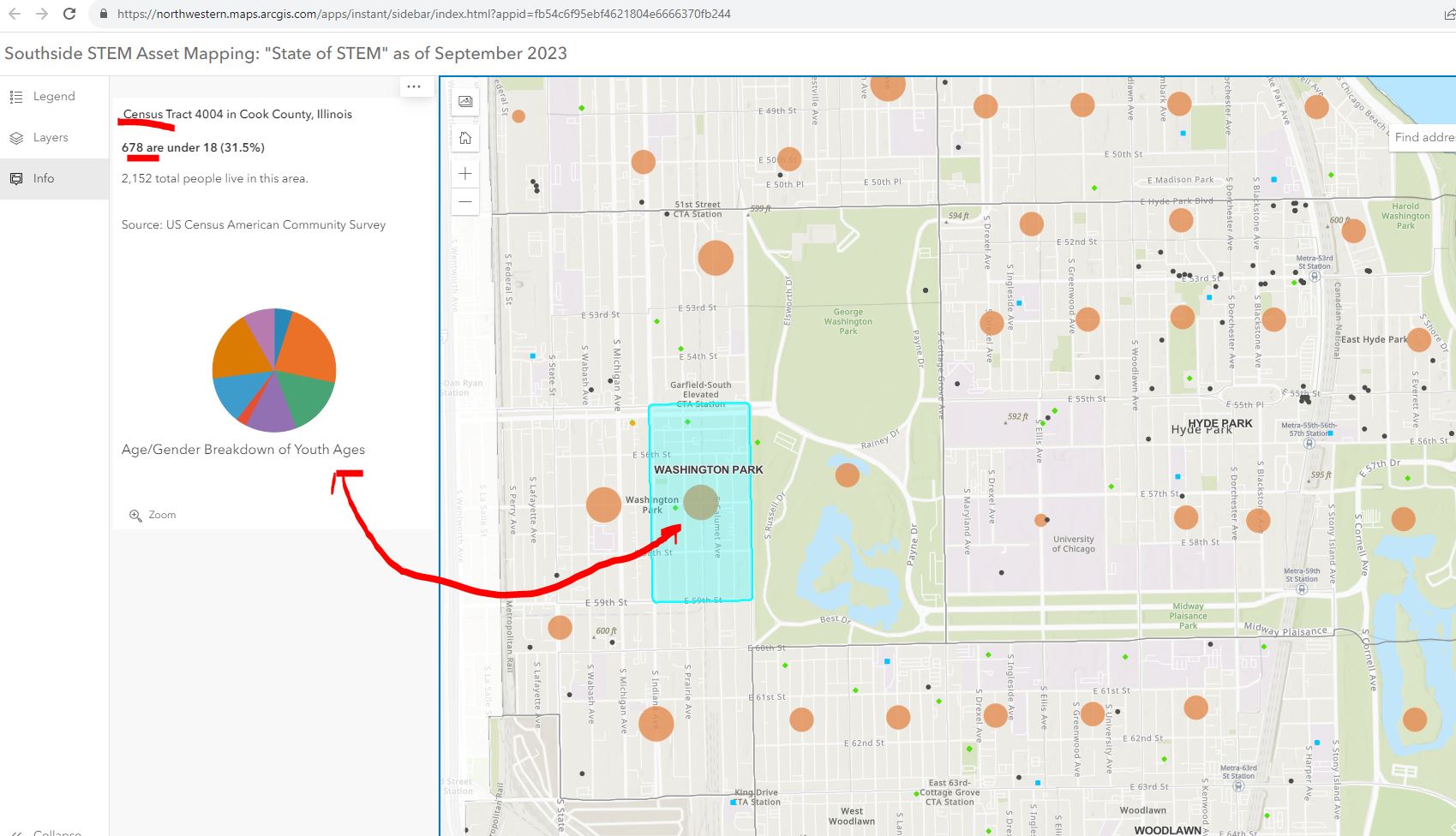
Below is a map view where I've clicked on the orange circle for the census tract with the Chicago Youth Programs location.  I asked for information showing the number of youth under age 18 in the area. The map shows 678 kids out of a population of 2152 in that census tract.


The next map view shows businesses, or potential employers, in the nine community areas.  Put your curser over any black dot and find information showing who that business is. Zoom in to see what businesses are in different census tracts. 


There is a lot to explore.  Here's an article about the platform, posted in the Block Club Chicago publication.

My question is, "How will it be used to make STEM learning and career opportunities available to youth through out the area?"  

I've met in the past two years with the people who created this platform and encouraged them to dig into the history of the Tutor/Mentor Connection and the tools and strategies we piloted from 1993 to 2011 to help volunteer-based tutor/mentor programs grow in the Chicago region.  This Mapping for Justice blog is a textbook for anyone who wants to use it that way. Just read some of the "strategy" articles. 

I started building a list of Chicago tutor/mentor programs in 1993 and at the same time began learning ways to use GIS mapping to show where the programs were located and where more were needed. We published our first Directory in May 1994 at the same time as we hosted our first networking conference.  We used the directory to launch citywide volunteer recruitment campaigns in August 1995.


In 2004 an intern from India built the first on-line Tutor/Mentor Program Locator, which was a searchable database shown below.  We had organized our annual survey in 1994 to learn who offers volunteer-based tutor/mentor programs, where they were located, what age group they served, and what type of tutoring and/or mentoring did they offer, as well as what time of day did they offer services.


The search fields on the Program Locator enabled people to search for specific programs based on the categories of our survey.  This worked like most search engines. If you had an idea of what you were looking for, and where, the platform helped you narrow your search and find tutor/mentor program information in that area.

In 2008 a team from India built a new version of the Program Locator. The home page is shown below. This works differently from Google. It starts with a map of a specific area, then shows layers of information, including our data on Chicago tutor, mentor programs.


At the left you can see layers of information that can be displayed on the map.  These layers included our data about Chicago tutor/mentor programs, but also included poverty data, poorly performing schools, and assets (businesses, faith groups, colleges, hospitals) etc.

Thus, you could create a map showing the entire city.


Or you could zoom in and create a map view showing a portion of the city.  

You could add text to the map to focus on specific organizations in various community areas.


You could follow news stories with map stories. On your map you could not only show existing tutor/mentor programs, but you could add layers showing businesses, hospitals, faith groups, universities who share the same geography and who should be innovative and strategic in helping mentor-rich non-school programs grow in the area. For each part of the city the mix of programs and assets is different.


The Program Locator is now only available as an archive.  However, you can see some of the features in this PDF essay.

How to Use Chicago Tutor/Me... by Daniel F. Bassill

One of the challenges of the STEM project is building public awareness and drawing people to the platform, then teaching them to create stories on a regular basis that draw even more people to the platform and motivate them to take actions that help kids in the area have access to mentor-rich STEM learning programs that provide on-going support as kids move from 1st grade through high school, college/tech school and into jobs and careers.

Since my organization did not have advertising dollars we developed a "Rest of the Story" strategy that followed media stories with maps that showed the neighborhood and pointed to tutor/mentor programs in the area (if any) and described the need for more programs.  Below is a mid 1990s example.


The STEM project leaders could duplicate this and other strategies that I've piloted over the past 30 years.  They are all on-line and available to anyone motivated to look.  They might even add some features and functionality to their platform based on what I have done, or tried to do. 

The Tutor/Mentor Blog is an even broader text book than the Mapping For Justice blog.  Think of the sections below as chapters, or courses in a learning curriculum.  

Public awareness - click here

Using maps - click here

Media strategies - click here

Follow up to violence - click here

Mentor role in larger strategy - click here

Tutor/Mentor Institute, LLC website - click here

The challenge: Too much information.  

View this graphic in this article.  The ideas I share and websites I point to are a vast information ecosystem. It's like a university library or the library of different religious groups.  It can't be learned in a day. It needs to be part of on-going learning.


For that to happen major donors, perhaps MacKenzie Scott, need to provide money to fund programs within high schools and college that provide advance degrees for people who spend 10-20 years learning and applying these ideas.


Thanks for reading. Please share these ideas with leaders in Chicago and other cities.  Maybe you know one of these donors, or are one yourself.

Connect with me on social media platforms and share your own strategies and maps. Help build the network. Help the STEM network grow and reach more people. 

Finally, consider a year-end contribution to help me continue this work in 2024. Visit this page to use the PayPal.  

Thursday, June 8, 2017

U.S. Census Bureau - Learn to Use Its Data

This is a screen shot from a page on the ChicagoReporter.org web site, which makes U.S. Census Bureau data easily available.

This was just one of many resources that I learned about during last night's Chicago City Data User Group (#CCDUG) meeting at the Microsoft headquarters in Chicago.

Other resources were shared by participants in the MeetUP, using the #CCDUG  hashtag. Browse this thread and you can find more links.

I posted to Twitter my own long-term vision of sharing map-based data with this type of sophistication.

A couple of other links that were shared are:

The Space Informatics Lab (SIL) at the University of Cincinnati - click here

Census Explorer - click here

Census Business Builder - Regional Analysis Version - click here

Census Business Builder - Small Business Addition - click here

Below is a pdf created in 2009 to show how to use the Tutor/Mentor Program Locator to create map stories. The program locator is now out of date and needs updating. Imagine what I could do if I had the talent and resources to apply some of the mapping tools shown above to the work I've been trying to do since 1993.


If you can imagine this, and you understand the need and opportunity, and you have either the talent or the dollars, why don't you reach out and offer your help?  This can apply to any city in the world, so you can be located in any city and work with me via Skype or other on-line tools.  Let's connect.

Monday, February 8, 2021

Census Map Shows Home Town of Superbowl Players

 I've pointed to the US Census Bureau in past articles to show how their maps can be used to create map-stories. I was reminded of this capacity when a friend emailed me this map showing home towns of players in the 2021 Super Bowl.


You can find this map here

Are you using the Census Bureau platform to create map stories that draw attention to the needs of youth and families in high poverty areas of the USA?  Share links to your stories in the comments.


Thursday, August 27, 2015

2010 Census data on interactive map

This just came across my Twitter feed. Open the link and you'll find a map of the USA, with the 2010 census data plotted, and color coded for different racial groups. It clearly shows how big cities around the country have the greatest concentrations of minorities, and the greatest challenges of race and inequality issues.

Wednesday, March 25, 2026

Have you visited the ESRI GIS site?

I was able to obtain donated ESRI GIS software each year from 1995 to 2011.  Many of the maps that I show on this blog from 2008-2011 and earlier were created using that donation. 

ESRI maintains a huge on-line library of resources.  In this blog article ESRI introduces the most recent U.S. Census American Community Survey (ACS) which is available in the ArcGIS Living Atlas.


The direct link to the ACS Atlas Collection is here

I started using ESRI software in 1995 (When I say "I", I really mean volunteers and part-time staff made the maps under my direction.) Below is an example of how I shared these at every Tutor/Mentor Leadership and Networking Conference.


Below is a visual essay showing how I've been using maps and why.  Click here to open.


Is someone in your community creating maps like these and sharing them in their blog articles, newsletters and social media?  If yes, send me the link.

Thanks for reading.  Please connect with me on LinkedIn, BlueSky, Facebook, Instagram, Mastodon and/or Twitter.  Find links on this page

I depend on a small group of supporters for contributions that help me cover expenses.  If you'd like to help, click here.

Thursday, August 22, 2013

Demographic map shows race distribution in US

I've been using maps to draw attention and resources to all high poverty neighborhoods in Chicago so that every neighborhood could have great youth programs operating in non school hours, not just a few great programs in a few neighborhoods. I also maintain a Tutor/Mentor Institute blog which integrates maps and map ideas in its articles. I add new articles each week, such as one today where I'm pointing to a web map of racial distribution in the US, based on the 2010 Census.

This map, and others like it, illustrate that most big cities have high concentrations of minorities, and of minorities living in high poverty. Thus, connecting people from different cities in on-line forums where we talk about the problem and innovate new ways to overcome challenges, would make sense. Talent and dollars from many places could be supporting innovations like uses of mapping, that can be applied in many other places. This is new thinking when most philanthropic support focuses close to home or where a company is located.

Maintaining a map resource requires talent, tech support and operating dollars. As we connect more people who do this work with each other, such as in this web library, my hope is that we find ways to attract these resources to all of us, and that we find ways to partner where we use scarce resources more efficiently.

Sunday, December 9, 2018

Digital Divide in Chicago - 2018 WBEZ article


This screen shot shows interactive map included in WBEZ article titled "Clear Signs Of The Digital Divide Between Chicago’s North And South Sides"

The article reports that "more than half the households in Englewood and nearly half the households in West Englewood (51 percent), Riverdale (49 percent), Auburn Gresham, and South Shore (both 46 percent), lacked internet access at home".

This is a disadvantage for youth and adults.

I show these maps and articles with the goal that readers will be concerned and will share the articles with others, who will also be concerned, and that this will result in people from different sectors giving time, talent and dollars to help reduce this problem.

Browse other articles on this blog, and the Tutor/Mentor blog, and share with your network, as the graphic below suggests.

This work is not something that can be done in a day, or even a year or a decade. But it is work that needs to be done.  If you'd like help digging through the information I'm sharing, or in making sense of some of the graphics, I'm available.

12-12-18 update - Visit this site and see 2018 data and maps showing digital access in census tracts across the USA.

12-19-18 update - World Economic Forum - report - Our Shared Digital Future: Building an Inclusive, Trustworthy and Sustainable Digital Society, 2022 goals. click here

1-16-19 update - World Economic Forum  report - Global Risks Report 2019

2-18-2019 update - Nearly one-in-five teens can’t always finish their homework because of the digital divide - 10/2018 Pew Research Center report - click here

2-25-2019 update - Digital Distress: What is it and who does it affect? Part 1. 2019 article focusing on "those on the wrong side of the divide (who) are being left behind, prompting the creation of strategies to ensure everybody can reap the benefits of this new age. click here

3-30-2020 update - Broadband is now our lifeline, but 20 million still lack access. click here

3-31-2020  update - Worst Connected Cities - 2018 from National Digital Inclusion Alliance -  click here

4-13-2020 update - Stop the Cap-Promoting Better Broadband, Fighting Data Caps and Usage-Based Billing - read articles at this link.

4-21-2020 update - Analysis of Digital Divide in California, including map and policy recommendations - click here

4/25/2020 update - One in five Chicago students lacks broadband. Here’s where they live - Chalkbeat Chicago story - click here

5-6-2020 update - Digital prosperity: How broadband can deliver health and equity to all communities - click here

1-24-2021 update - Mapping and Mitigating the Urban Digital Divide This article describes a grant to the Center for Data and Computing at the University of Chicago to create new maps that build better understanding and help mitigate the Digital Divide.  

3-18-2021 update - visit the "saving the world" set of articles on Paul Signorelli's blog and find many articles related to digital access, digital justice, and digital divide. Below are links to two articles.
- Promoting Universal Broadband Access With Lev Gonick (Part 1 of 2- (click here);
- Promoting Universal Broadband Access With Beth Holland (Part 1 of 3) -  (click here)

3-18-2022 update - This Robert Wood Johnson Foundation Tweet shows that "neighborhoods experiencing deep poverty are the least connected to broadband. The Tweet also points to a resource page on the RWJF website. 

6-6-2022 update -  Interactive map shows level of broadband connectivity in rural zip codes throughout the USA. This is a project of RURAL LISC. click here

11-22-2022 update - HBR article "How to Close the Digital Divide in the U.S."  - click here

If you appreciate what I'm sharing, please visit my FUND ME page and send a contribution.

Wednesday, August 5, 2015

Use Community Commons Portal to create map stories

If you browse through past articles on this blog you'll see examples of how the Interactive Tutor/Mentor Program Locator has been used to create maps of community areas of Chicago where indicators such as poverty, poor schools, violence, etc show a need for more youth and family supports, such as organized volunteer-based tutor/mentor programs.

Due to a lack of talent and resources since 2010, features of the Program Locator that allow you to zoom into zip code, community area and political district boundaries are not working. In addition demographics still represent the 2000 census and the tutor/mentor programs shown on the map no longer represent close to 100% of those organizations operating in the Chicago region.

Thus, in many of my articles I point to other mapping and data platforms. One that I encourage you to browse and learn to use is the Community Commons portal. Visit this page and you can enter Chicago, Detroit or any other city, and see an interactive map showing poverty levels for that city. These maps also include info on political districts.

Using this information many users can create map stories, like this one, that they share in blogs, web sites, presentations, etc. which are intended to build attention, and participation, in efforts that fill the map areas with programs that reduce the levels of poverty over a period of many years.

Saturday, August 10, 2024

Governor Tim Walz - a 'GIS Nerd' - ESRI Blog

There are many reasons to like the selection of Governor Tim Walz of Minnesota as the Vice President candidate of the Democratic Party.  One that's close to my heart is shown in this ESRI 2024 blog article, titled "Why Governor Tim Walz is a 'GIS Nerd' and What that Means for the US".


I encourage you to read the ESRI article, then go to the Minnesota Executive Map Portfolio and view each collection.  Open the collection under "Minnesota Children, Youth and Families" and you'll see the page I show below.


Click on any of the maps and it opens to an interactive map where you can enlarge and look closely at any part of the state.  The example I show below is from the "Children in Poverty" map. I've zoomed into the Minneapolis - St. Paul area.


The more you enlarge the map, or zoom into a specific area, the greater the level of detail you'll see.  Notice that if you click on the map a pop up will show the number of children under age 18 that live below the poverty line and what percent of children this represents for that census tract.

I've added a link to the ESRI article and the Minnesota Executive Map Portfolio in this section of the Tutor/Mentor library.  

In my April 2024 article I shared this page from a 1997 Tutor/Mentor newsletter and asked "What if Leaders had used maps like this?" 

Maybe they are.  I can't tell from the maps I'm viewing on the Minnesota site.   The maps are great, as far as they go.  

What I don't see (maybe it is someplace else) is a set of maps answering the questions of "How many tutor/mentor programs are needed?"  and "What programs already exist?", sorted by type of program, age group served and location".  

Nor do I see a section of blogs where writers have created images like I show above, and embedded them in articles, like I'm doing here.  As a teacher, maybe Governor Walz was teaching youth to create map stories.  Does anyone have a link to a collection of blogs that show this? 

Browse past articles on this blog, and the Tutor/Mentor blog and you can see how I've been trying to use maps.  If you're familiar with the Minnesota maps, of similar collections from other states, do you see information showing maps being used for the same purposes that I've been trying to use them?  

Below is an example.   This is a page from a PDF essay that I first created in 2011, then updated in 2018.


It shows community areas of Chicago, and the number of high poverty youth, age 6-17, in that area. It also shows what percent this represents.  The green stars on the map are known volunteer-based tutor/mentor programs in this area.  The platform I used to create this was the Chicago Tutor/Mentor Program Locator, launched in 2004 and updated in 2008, which was also interactive.  


As you can see from this image, you could sort my maps for programs in specific zip codes, and that provide different forms of volunteer-based tutoring and/or mentoring services to different age groups.

If you look at the Minnesota map above, it shows this information in a much better format.  It just does not include information about service providers.  Thus, it cannot be used by the Governor or any other group to draw attention, volunteers and donors to the providers, or to determine where more programs are needed.

I wish I'd connected with Governor Walz in the late 2000s when I first launched the Program Locator and in the 2015-17 period when i ran out of money to keep it active.  Now it's an archive, which you can read about on this page

This is the type of image I'd like to find on the website of political and business leaders in every state.  It's me, in the mid 1990s, with a Chicago Tribune article on the screen behind me saying "City Kids at Risk". 

Kids in every city and state have been at risk for more than 30 years but I've not found any leader who has the same history as I have, trying to create an information base people could use, then trying to build on-going visibility so more people use the information to help programs grow that help kids in high poverty areas move through school and into jobs and adult lives free of poverty.

It sounds like Governor Tim Walz may have been doing much of this.  Too bad we've never met.

Until now.  I know he's busy with the election, but if you know him, share this article and my blogs. Hopefully we'll connect after he's elected Vice President of the United States and  he can champion this strategy in every city and state. 

Connect with me on Twitter, Instagram, Facebook, LinkedIn, Mastodon and other platforms. See links here

Please send a contribution to help me keep sharing these stories. Visit this page. 


Friday, March 12, 2010

High School Students Need Mentoring Too

Last week, I showed a new map that features "failing" elementary schools in the Chicago area.

Of course, "failing" elementary students eventually graduate to high school. If they are still living with challenges related to poverty and struggling schools, they might still be lagging behind academically, unprepared to find jobs, and "at risk."

Some high school students however (like several who attend Cabrini Connections tutor/mentor program every week), have sought out an extra edge from an experienced mentor, and will be going on to college next year. (Congrats, Brittany D.!)

Unfortunately, many others will be looking to the streets or to you and me as they enter adulthood.


Click on this map above to expand it and see newly-released "failing school" data from 2009, poverty data from the last census, and the known locations of currently-operating Tutor/Mentor Programs in Chicagoland (data that the T/MC hosts and offers to the public for free on its website).

The focus is on high schools in this map - specifically, high schools that aren't "making adequate yearly progress" according to state and federal testing standards. The map above also shows known locations of tutor/mentor programs that are equipped to help high school kids who want an extra edge to compete for a better life for themselves, their families, and our communities.

Like last week, I ask you to expand the map and explore patterns between poverty and high schools. Where is the high poverty? Where, in relation, are clusters of poorly performing schools? How many (or few) programs are available in the neighborhoods where these conditions exist?

Keep in mind that you aren't looking for a one-to-one relationship of schools to programs here. Each high school has hundreds if not thousands of students. Each mentor program, in contrast, likely serves only a fraction of that total.

You can support individual not-for-profit programs on this map by volunteering, or by making a small donation that allows others to volunteer. (Use the online searchable program locator to find a program near your home, job, or commuter line... to find a good fit for your time and your routine.)

You can also take a few minutes and let business leaders, faith leaders, and political leaders in your network know about these maps and the strategies at Tutor/Mentor Exchange. Together, community leaders and Tutor/Mentor Connection can collaborate on building new programs, while helping existing programs thrive.

To learn more about volunteering, collaborating, or making a donation to this cause, please take a look at the Tutor/Mentor Exchange website.

Tuesday, August 5, 2008

Failing Schools, Povery,... and Race?

I'm in the middle of an ongoing discussion with Jim Cory and some of the other map makers on the Tutor/Mentor Connection GIS team about a sort of conundrum that affects us as map-makers, educators, and Tutor/Mentor program advocates. We need your help.

A few days ago, Dan Bassill came to me and asked if I could take the data I collected from Interactive Illinois Report Card's database, pertaining to "failing schools" (schools on the IIRC's "Academic Warning" and "Early Watch" lists), and display them against a backdrop of poverty. I've done this sort of thing before, but this time he wanted to see them categorized by grade-level ("High School," "Elementary," etc.)

I think the resulting map clearly shows that clusters of "failing" schools are more likely found in impoverished areas, than in communities where poverty is low. Likewise, there are an awful lot of "succeeding" schools where poverty is low.

(I should take a second here to point out that I am certainly no authority on the math behind "failing schools." In fact, I've asked several people - including teaching and administrators - how this works, and how schools are chosen for these warning lists... and no one seems to know for certain. So again, I'm no guru here by any measure. I only know what I've been told by some folks who work in the schools, and by what I've learned from the IIRC website. If anyone knows FOR CERTAIN how schools are determined to be "failing," I would love any feedback. This would help me make better maps for sure.


But then I had a brainstorm and decided to play a little bit here, using some of the other data I have. For these "succeeding" schools, I looked at their "% of Students Exceeding Expectations" data (which is apparently one of those variables used to determine "failing" schools). Learning that schools need to be above 40% for this particular variable, it makes sense to assume that schools that are currently not "failing" but are below 40% "Students Exceeding Expectations" are surely on the path to warning lists and state sanctions.

In other words, instead of saying "look at all these succeeding schools," I think the map now shows that the "succeeding" ones in the impoverished neighborhoods... the ones not meeting expectations... maybe they just haven't been tagged "failing" yet, and maybe they're on course to get that tag soon.

So I'm already playing with assumptions, but here's where it gets real hairy... Dan came to me next and asked to see the "failing" school data against a backdrop of neighborhoods' racial makeup.

This is easy enough. I just took the 2000 Census' population numbers and calculated percentages within tracts. I also created a flag in the data that tells me which racial group constitutes a tract's "majority." (I have these new data for all of IL, IN, WI by the way, if anyone needs them.)

Looking at the resulting map, it's pretty hard to miss all that segregation... "hypersegregation" in fact... isn't it?

Having read Douglas Massey's book "American Apartheid: Segregation and the Making of the Underclass," which lays out in great statistical detail how segregation and poverty are unmistakeably tied to frustration, rebellion, and failure... and having seen with my own eyes (through the work I've done in a high school which is located in that chunk of navy blue on the West side, and here at Cabrini Connections and Tutor/Mentor Connection) how smart the kids really are and how well they respond academically to tutoring and mentoring...

Surely, everyone knows this all to be true, right?

Not so fast, warned Jim. "When I look at the race distribution maps," he noted, "I think that we need to be careful about the message we convey. Are schools poor because the majority of students are minorities?"

I hadn't thought from that angle. But damn it, I bet that is the conclusion people will draw, isn't it?

Of course that's not what I want to convey... or what I know to be true. (I'm extremely appreciative for the different perspective Jim was able to provide here, and would ask all of you to drop me a line whenever you have advice or concerns. This can and should be a very open discussion as the project grows.)

Any rate, Jim sent me something else to consider, an empirical study on "High Poverty-High Performance (HP-HP) Schools" by the research division of the Illinois State Board of Education back in 2001. Therein, researchers compared "High Poverty-High Performance" (HP-HP) schools to "High Poverty-Low Performance" (HP-LP) schools (the latter of which surely apply to many of the "failing schools" where African Americans and Hispanics are concentrated). The report searches for answers as to why some schools in these areas are actually "succeeding" (HP-HP).

Of course they determine that there are many factors, none of which (including race of course) are singularly responsible for poor overall school performance. School size, teacher salary, student mobility, teacher education... all of these were cited as quantitative variables that can be looked at. (In fact, I have some of this data, and could make maps that show these variables.)

But the report also cites qualitative factors such as "time and energy spent by teachers," "teacher outreach to parents," and "student sense of responsibility." How do you measure student and teacher motivation? I can't map that! Can I?

As Jim asks, "What other kinds of influences affect success? Can we map them? I think if we look deeper at the problem we will find complexity, but also compelling reasons for people to mentor."

And this is precisely the question we're stuck on here at Tutor/Mentor Connections.

I'm open for suggestion.

Thursday, December 19, 2013

New Maps showing Racial Distribution in Chicago

Note: The links in this article no longer work.  Visit this CNN site for a 2021 version of this map.

This is a map showing racial demographics in Chicago, based on the 2013 census data. It's one of a collection of maps that can be found in this Wired.com article.

This map is called a Racial Dot Map, and "provides an accessible visualization of geographic distribution, population density, and racial diversity of the American people in every neighborhood in the entire country." This link provides an overview of the process and purpose of creating the map.

This link points to an article showing the racial dot map used to show Virginia cities.  

Use this map, along with maps showing locations of poorly performing schools, incidents of violence, health disparities, etc. and you can form an understanding of what neighborhoods and/or racial groups live in more troubled environments than others.

Use maps that show locations of non-school tutoring and/or mentoring programs and you can begin to build an understanding of which neighborhoods have programs and which don't. Further review and understanding would be needed to determine which of the existing programs are of higher quality or serve more youth than other programs, but using this information leaders should be able to form strategies that help existing programs get the resources to operate and constantly improve, while helping new programs form in areas of need.

This is the type of work Tutor/Mentor Connection has been trying to do since 1993, but with far too few dollars and talent. It's work that now is being attempted by the Tutor/Mentor Institute, LLC, but with the same lack of resources.

Tuesday, May 19, 2026

Mapping Philanthropy in USA

Below is a view of an interactive map that can be found on the Smart Charity website.  This shows the amount of philanthropic grants received, per person, in 2021 for each county in the USA. 


Below is another view from the same dashboard.  This one shows counties with high poverty but lowest philanthropic support per person.  You can click on the map, or the table at the right, to find data for each county.


I introduced the Smart Charity website in this January 2026 article on the Tutor/Mentor blog. It's part of a Project 990 program at the University of Indiana and one of a growing number of sites that I'm seeing that are using IRS 990 data to create interactive maps like this. 

Below is an image from another story on the Tutor/Mentor blog. 


This is the first page of a visual essay where I show the number of youth, age 6-17, who are below the poverty level, in each Chicago community area.  An example is shown below.  The yellow boxes show numbers from 2011 and the blue boxes show the same information, but for 2018.


If you use the Smart Charity dashboard you can zoom in to Illinois then put your curser over Cook County. You'll see that philanthropy gave $534.43 per person.  That's for 5.177 million people.  With the growing abilities of AI I'm hoping that future dashboards will zoom to the zip code, census tract, and/or community area level, giving a much better understanding of philanthropic support in big urban areas.

If you're finding dashboards like this please share the links in the comments, or connect with me on LinkedIn, Twitter, Instagram, Facebook and/or BlueSky to share the links.

I hope you value this information and that some will visit this page and make a contribution to help me pay the bills.  Thank you.


Tuesday, August 9, 2016

Rural and Urban America Not As Different as One Might Think - Maybe

I encourage you to look at the map on this Brookings.edu article, titled "Political rhetoric exaggerates economic divisions between rural and urban America".

The map, and the article, show that "Nearly 54 percent of people living in areas classified by the Census Bureau as rural also live in a county that is part of one of the nation’s 383 metropolitan areas."

Thus, it's the other 46% who are not closely connected to any city.

This is significant because the web library I've been building since 1993 focuses on urban issues and urban poverty and inequality.  In many articles I've suggested that the largest urban areas, where school age student population is greater than 100,000 students, have  unique problems caused by the number of students and the size of the bureaucracy that are different that rural areas, where lack of density and distance between students and potential support offer barrier to place based support services like non-school tutor/mentor programs.


Thus, I've encouraged others to duplicate the Tutor/Mentor Connection, using all the same ideas and practices, but with a library that identifies uniquely rural challenges, as well as organizations that are innovating solutions to those challenges.

If you're building such a library, let's connect.


UPDATE: 8/10/2016

Recently two resources that map poverty in the Appalachian region have  come to my attention. Here's the links:

1) Community Commons web site story, Mapping Poverty in the Appalachian Region

2) Appalachian region data overview from the 2010-14 American Community Survey Chartbook

Note: Jan. 2, 2018 update
The 100 year capitalist experiment that keeps Appalachia poor, sick and stuck on coal. - article

Wednesday, October 16, 2019

Link between poverty, segregation and education performance

In my Twitter feed today was a post that pointed me to this article, titled: An analysis of achievement gaps in every school in America shows that poverty is the biggest hurdle.  The article draws upon data that is available in this Stanford Opportunity Explorer map.

Below I'm showing three map views that I created by zooming in on the map.

The blue shades show "students' scores, in grade levels, relative to the national average (grades 3-8, 2009-2016)". This is explained in the table in the lower right corner of the page.  Click on the "more info" link and a panel opens on the left side of the page with a set of questions and answers.

National View of Opportunity Explorer
Then I zoomed in to look at the Chicago area where I've focused on helping volunteer-based, non-school tutor/mentor programs grow since forming the Tutor/Mentor Connection in 1993.  At this level of detail  you can see individual schools, which are color coded to show how they perform vs the national average.

View of Chicago region - Central/South

Then I zoomed in more to focus on the central part of the city.  For reference, look at this map which we created more than 10 years ago, showing the Illinois 7th Congressional District. You can see how this district stretches from Chicago's lakefront to the far West suburbs and that there are areas of high poverty in the middle and South part of the district (note: this is 2000 census data). 

7th Illinois Congressional District
Now look at the third map that I created using the Opportunity Explorer.  I'm focusing on the same area as the 7th Congressional District. You can see the difference between more affluent areas (green) and greater poverty areas (blue).

This map covers much of the 7th Congressional District
Now look at the map below, showing the 7th Congressional District, which was created using the Chicago Tutor/Mentor Program Locator, which a team from India built for the Tutor/Mentor Connection in 2008 using money we'd received from an anonymous donor. (This team first introduced themselves to me in 2007 by rebuilding our Organizational History and Tracking System (OHATS) page - on a pro-bono basis!)

7th District view using Program Locator - click here

The Opportunity Explore is a great resource.  However, I wish it had overlays showing Congressional or State legislative districts, so voters could build an understanding of the segregation, poverty and school performance within their district and hold elected leaders accountable for generating the resources and mobilizing the leadership needed to improve the lives of those living in poverty.  

Unfortunately the Tutor/Mentor Connection was not able to attract new funding after 2008 due to the financial crisis, which also affected the volunteers from India who were helping us. In 2011 this led to the strategy being discontinued at the non profit I founded in 1993, which led me to form the Tutor/Mentor Institute, LLC (also 2011) to try to keep this resource updated and available.  

It is available. It's not updated. However if you explore it's features, it's loaded.  For instance, in the upper right I've pointed to an "enlargement" button which expands the map to your full screen. That enables you to look closer at the information on the map, including the green stars, representing non-school tutor and/or mentor programs in the map area.  

Data platforms - click here
The Tutor/Mentor Program Locator is not the only resource people can use. It is one of the few that overlays non-school tutor/mentor programs and is intended to support leaders working to fill neighborhoods with a wide range of k-12 youth programs.

I point to a wide range of data platforms in this concept map. I'll add the Stanford Opportunity Explorer today.  These can be used to understand issues and create map-stories that share your understanding with other people, mobilizing the talent, dollars and votes needed to change conditions shown on the maps.  

View more stories on this blog showing uses of maps, and view stories on the Tutor/Mentor blog, also using maps. Imagine such stories appearing on thousands of web sites and blogs, created by students, volunteers, policy makers, elected leaders, etc.

I'm looking for partners at universities, businesses think tanks and/or other non-profits who will spend time learning what I've been trying to do and then invest and adopt, updating the Program Locator, and rebuilding strategies that I'm no longer able to lead as well as needed, due to lack of support.  

If I can get the attention and investment from just one of the growing number of billionaires in the world, this entire strategy could be relaunched, using their name and influence. Share this article, and perhaps you can help me reach these people. 

This link points to social media platforms where we can connect.


Monday, June 9, 2008

Mapping the May Tutor/Mentor Leadership and Networking Conference

A couple times each year, Cabrini Connections and Tutor/Mentor Connection organize a local conference of folks who are involved or interested in tutoring and mentoring. With the goal of sharing resources and information, people come from all over the region and throughout the country. The most recent of these "Tutor/Mentor Leadership and Networking Conferences" occured at the end of last month, between May 29 and May 30.

I took the attendee data that was collected at the conference and created a few maps to show where programs are working in relationship to eachother. Hopefully, the maps can be used as a sort of visual directory for people and companies who are interested in finding eachother and working together. (Incidentally, if you are interested in a searchable listing of all known tutoring and mentoring programs, please check out Tutor/Mentor Connection's Program Locator.)

The primary map shows that the conference attracted tutor/mentor programs throughout the city. It also takes this local "attendee data" and plots program locations against poverty data collected by the Census Bureau in 2000. This of course helps to show where, in relation to poverty, these local organizations are working with kids:


Many of the programs who attended work to support non profits throughout the region (such as BigBrothers/Big Sisters of Metropolitan Chicago). Several are tightly clustered in downtown offices, so I zoomed to this level in a second map. (by the way, Cabrini Connections and Tutor/Mentor Connection are located at point #7):

Attendees did not come only from the city of Chicago however. Programs from all over Northeastern Illinois participated...

... as well as from all over the country:

Overall, the conference was a great success, and I'm hoping these maps help coordinate future efforts of organizations who attended. Perhaps they even can help attract and help new programs who would like to share information and resources in tutoring and mentoring.