Wednesday, December 18, 2024

Help me help others


Throughout the year I share examples of how maps can be used to draw attention and resources to youth serving tutor, mentor and learning programs in high poverty areas of Chicago.  

I point to articles on this blog, and the Tutor/Mentor blog, which I started in 2005.

I point to the library and list of Chicago tutor/mentor programs that I host at http://www.tutormentorexchange.net

I don't charge a fee for using the resources I share. I encourage others to duplicate them and apply the ideas to helping kids in every city and state.  

While I operated the Tutor/Mentor Connection under a 501-c-3 nonprofit status from 1993 to 2011, I've supported it through the Tutor/Mentor Institute, LLC since 2011.  I've used my own savings and I depend on contributions from a small group of supporters to help keep these on-line.  

Please visit this page and make a contribution if you're able to help me. 

Thank you. 

Wednesday, October 30, 2024

After the election the work continues

11-6-2024 update - the election was not the result I and millions of others wanted. Yet, what I wrote last week is still true.

The US election next week will be a tipping point. Which way do we go as a democracy?  I voted for Kamala Harris and hope she wins.  But I realize that is just a step in the work we need to be doing to solve the complex problems facing the US and the world.

I've used this blog since 2008 to share uses of GIS maps to show where people need extra help, and to show where help is being delivered.  In one set of links in the Tutor/Mentor library I point to many websites showing uses of GIS maps.

I've posted several articles over the past 20 years showing why I've built a library and how I hope people will use it.  

Below is what I wrote on the Tutor/Mentor blog in November 2022.

Below is a post I saw on Twitter, showing a "Social Change Ecosystem Framework" developed by Deepa Iyer, of the SolidarityIs and Building Movement Project.  

Here's an article by Deepa Iyer that describes a use of this Social Change Map.  I love the "hub and spoke" design she uses and how this shows the range of people and networks who need to be part of any problem-solving ecosystem.  

I've used similar visualizations for more than 20 years.

You can see these in hundreds of articles on this blog.  I've posted several dozen articles since 2005 that I've tagged "complex problems".  And many more tagged "network building".  Plus a few more tagged "ecosystem". 

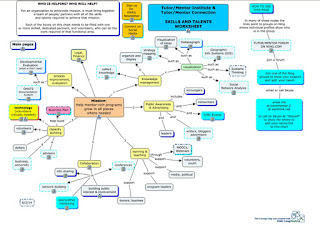
Below is a concept map created more than 10 years ago that shows the range of talents and networks that need to be involved in solving any complex problem.

All of these emphasize that no single person can solve the many complex problems we face locally and globally.  If you scroll through the articles tagged complex problems you'll find many visualizations showing complexity. 

I found another on my LinkedIn feed this week.

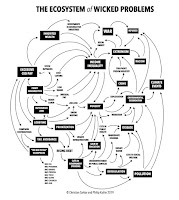
This graphic by Christian Sarkar can be viewed in an article titled "The Ecosystem of Wicked Problems".  

One of the features of this graphic is that it shows relationships and how the problems are inter-related to each other.  

What would have made it better (in my opinion) would have been links from each node, to web libraries with information about each problem.

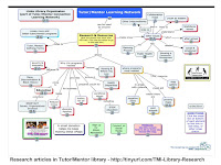
For instance, here's my concept map showing the research section of the Tutor/Mentor Library.  At the bottom of each node is a link to a specific collection of websites.

Linking to libraries like this would expand the information anyone has to understand a problem, to connect with others who are also trying to solve the problem, and to find work being done in some places to solve the problem that might stimulate innovation and/or duplication in many other places.

The challenge, of course, is building and maintaining such libraries, and attracting people to use the information.  And, finding consistent funding to pay for the work.  I was never able to do that. 

I hypothesize that every link I point to from my library represents an ecosystem of many people working for that organization and an even greater number who that organization and its employees connect with.  

Looking at the graphics by Christian Sarkar and Deepa Iyer, imagine people from each of these nodes connecting with each other in on-going learning, innovation, resource development and problem solving.

Who are all of those people? Who are all of the organizations working in each category? 

Someone who's been doing some deep thinking about part of this is Greg Bloom, Founder of Open Referral. He was the speaker at the November 15, 2022 ChiHackNight event.  

I encourage you to view the short video on the home page of the Open Referral website to understand the important work they are doing and the problems they are addressing. 


Greg's group has been bringing people together since 2012 to talk about the challenges of building and maintaining information directories and to "create a common set of data standards, that define and structure information, so that it can be readily transferred between systems".  Read through the FAQ questions and answers on the Open Referral website to understand this better. 

View Greg's Nov 15 presentation to ChiHackNight.  click here

That means many distributed directories could be connected in larger directories, making more information available to more people.

The Tutor/Mentor Connection, which I and a few others created in 1993 and launched in 1994, has been collecting information about Chicago area volunteer-based tutor/mentor programs for 30 years, along with building a library that represents the ecosystem of research, resources, funding, businesses and everyone else who needs to be involved in helping kids in poverty move more safely from birth-to-work.

We published our first printed directory of Chicago tutor and mentor programs, and the ecosystem of those who support them, in 1994 and updated it annually through 2003. After that all of our information was put on-line. 

We had others ask us to share the data, but who never offered to help pay the costs of collecting and maintaining it.  I never did this for fear of the larger organization eliminating the need for our work, and then at some point in the future, ceasing operation, so none of the data we had been collecting would remain available. 

Furthermore, if our data was owned by a national organization, the people who managed it would not have local passion, or local purpose, to use the data regularly to help existing programs constantly improve, nor to help new programs form where data analysis showed more were needed. 

That was why we were collecting the information in the first place!

Thus, I proposed there be a decentralized collection of data that was shared in a system similar to what Greg has been working on. Back in the 1990s the technology, or motivation, to do this was not available.

Thus, I fully understand the challenges Greg describes. For the past 10 years I've been a one-person army trying to maintain the library, share it, and get people to talk to myself, and each other.  If you read though this blog you can find hundreds of articles that relate to this.

Bringing people together.

When we were planning the Tutor/Mentor Connection in 1993 and talking about building a directory our PR partner from Public Communications, Inc. in Chicago, said "You've got to host a conference!".  

Using the contact information from organizations we learned about through our survey and our networking, we hosted a first Tutor/Mentor Leadership and Networking Conference in May 1994 and hosted one every six months after that until May 2015, at which time I had to stop due to lack of money.

In this article you can see a map showing participation over 20 years.  Here's a presentation showing how universities hosted these conferences and how I reached out to them for many years.  Between 1996 and 2002 attendance ranged from over 150 to over 300. Our mailing list grew from 400 to 14,000. This represented quite a large ecosystem, yet, it was not attracting business, philanthropy, government or university participants.   Thus, there were always too few of "the right people" to fully build the Tutor/Mentor Connection to what I hoped it would accomplish.

Since forming the Tutor/Mentor Institute, LLC in 2011 the range of people I've been reaching dramatically declined and conference participation dropped to around 100 per event. 

So let me sum up.

1) the world is dealing with complex problems and some people are creating great visualizations showing this complexity;

2) some people recognize the difficulty of collecting and sharing social service information and are trying to innovate new solutions;

3) knowing "who" should be included in a directory, or in an "invitation list" is part of the problem in a big city like Chicago;  getting them to come to "your event" or into "your conversation" is a huge challenge if you're not well-connected, or have a reputation that draws people to you.  Getting into "their conversations" and "being heard" is just as difficult.

4) I find very few people creating visualizations of who should be connected, or who they are bringing together via their events.

5) even if you have a list of "who" unless you do some sort of network analysis of event participation and/or social media conversations, you don't really know how well your network is connecting.

I'm sure readers might list more problems. I'd love to hear from you.

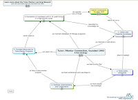
This has already been a long article, but if you've made it this far I encourage you to go one article further.  Review the 4-part strategy described in this concept map.

The "information collection" described in this article is just STEP 1. Getting people to look at the information (step 2) and helping them understand it (step 3) and use it (step 4) also need to be funded and supported as part of any problem-solving process.

---- end 2022 article ----

Last week I posted another "after the election" article on the Tutor/Mentor blog. Click here to read it.  Having libraries like mine can help people innovate solutions to problems based on how others may already be trying to solve them, and can help find others to help with the work.  

Electing Kamala Harris and Tim Walz blunts the regressive policies being promoted by the ultra conservatives but does not fix the problems that we face. Those who are funding Trump will still be trying to change the face of America in 2025 and beyond.  

It will take an ecosystem of people to build and sustain an America that creates hope and opportunity for everyone and dims the passions of the fanatics. I hope the next administration helps such systems grow and that my resources will be useful. 

Thanks for reading. I hope you'll share this.  I'll be 78 on December 19th and I keep looking for people/institutions who will take ownership of my archives, the library and this vision of supporting problem solving with extensive libraries like mine.

I'm on Twitter, LinkedIn, BlueSky, Instagram, Facebook and Mastodon. (see links here).  Let's connect.

If you appreciate these articles please visit my FundT/MI page and send a small contribution. 


Saturday, August 10, 2024

Governor Tim Walz - a 'GIS Nerd' - ESRI Blog

There are many reasons to like the selection of Governor Tim Walz of Minnesota as the Vice President candidate of the Democratic Party.  One that's close to my heart is shown in this ESRI 2024 blog article, titled "Why Governor Tim Walz is a 'GIS Nerd' and What that Means for the US".


I encourage you to read the ESRI article, then go to the Minnesota Executive Map Portfolio and view each collection.  Open the collection under "Minnesota Children, Youth and Families" and you'll see the page I show below.


Click on any of the maps and it opens to an interactive map where you can enlarge and look closely at any part of the state.  The example I show below is from the "Children in Poverty" map. I've zoomed into the Minneapolis - St. Paul area.


The more you enlarge the map, or zoom into a specific area, the greater the level of detail you'll see.  Notice that if you click on the map a pop up will show the number of children under age 18 that live below the poverty line and what percent of children this represents for that census tract.

I've added a link to the ESRI article and the Minnesota Executive Map Portfolio in this section of the Tutor/Mentor library.  

In my April 2024 article I shared this page from a 1997 Tutor/Mentor newsletter and asked "What if Leaders had used maps like this?" 

Maybe they are.  I can't tell from the maps I'm viewing on the Minnesota site.   The maps are great, as far as they go.  

What I don't see (maybe it is someplace else) is a set of maps answering the questions of "How many tutor/mentor programs are needed?"  and "What programs already exist?", sorted by type of program, age group served and location".  

Nor do I see a section of blogs where writers have created images like I show above, and embedded them in articles, like I'm doing here.  As a teacher, maybe Governor Walz was teaching youth to create map stories.  Does anyone have a link to a collection of blogs that show this? 

Browse past articles on this blog, and the Tutor/Mentor blog and you can see how I've been trying to use maps.  If you're familiar with the Minnesota maps, of similar collections from other states, do you see information showing maps being used for the same purposes that I've been trying to use them?  

Below is an example.   This is a page from a PDF essay that I first created in 2011, then updated in 2018.


It shows community areas of Chicago, and the number of high poverty youth, age 6-17, in that area. It also shows what percent this represents.  The green stars on the map are known volunteer-based tutor/mentor programs in this area.  The platform I used to create this was the Chicago Tutor/Mentor Program Locator, launched in 2004 and updated in 2008, which was also interactive.  


As you can see from this image, you could sort my maps for programs in specific zip codes, and that provide different forms of volunteer-based tutoring and/or mentoring services to different age groups.

If you look at the Minnesota map above, it shows this information in a much better format.  It just does not include information about service providers.  Thus, it cannot be used by the Governor or any other group to draw attention, volunteers and donors to the providers, or to determine where more programs are needed.

I wish I'd connected with Governor Walz in the late 2000s when I first launched the Program Locator and in the 2015-17 period when i ran out of money to keep it active.  Now it's an archive, which you can read about on this page

This is the type of image I'd like to find on the website of political and business leaders in every state.  It's me, in the mid 1990s, with a Chicago Tribune article on the screen behind me saying "City Kids at Risk". 

Kids in every city and state have been at risk for more than 30 years but I've not found any leader who has the same history as I have, trying to create an information base people could use, then trying to build on-going visibility so more people use the information to help programs grow that help kids in high poverty areas move through school and into jobs and adult lives free of poverty.

It sounds like Governor Tim Walz may have been doing much of this.  Too bad we've never met.

Until now.  I know he's busy with the election, but if you know him, share this article and my blogs. Hopefully we'll connect after he's elected Vice President of the United States and  he can champion this strategy in every city and state. 

Connect with me on Twitter, Instagram, Facebook, LinkedIn, Mastodon and other platforms. See links here

Please send a contribution to help me keep sharing these stories. Visit this page. 


Sunday, April 21, 2024

What If Leaders Had Used Maps This Way?

Below is a page from the 1997 NEWSLINK, the printed newsletter of the Cabrini Connections, Tutor/Mentor Connection, which I formed in late 1992.  

The headline is "No General Would Go to Battle Without a Map".  It's aimed at corporate CEOs.


In the top map inset is a 1997quote from Chicago's Mayor Richard Daley.  It says, "I look forward to a time when businesses, churches and leaders throughout this city will each stake out an area in a particular community and pledge to take an active responsibility for the education and well-being of all the young people in that area."

The bottom map shows hospitals in Chicago.  The heading next to it says, "Channel marketing:  Encourage "look-alike" groups (health, law, arts, science) to expand outreach programs in neighborhoods where they operate, with afterschool programs serving as distribution centers for these efforts"

In the text it says "Healthcare groups with "prevention" programs aimed at changing behaviors before they come to the health care provider as problems could partner with existing programs. Staff and volunteers could be role models to help youth hear healthcare "prevention" messages, modify behavior, and sustain changes until they become a habit. At the same time health groups are a source of mentors, job shadowing, careers, professional resources and even safe place for youth and adults to meet."

In the inset the text says:

WHAT IF?
While everyone can't be a one-on-one mentor, different groups have special skills that could help tutor/mentor programs be more effective.

While the map shows how hospitals could adopt neighborhoods, what if the alumni groups of Chicago's business schools (Northwestern, Chicago, DePaul, Loyola) made it their mission to have teams of business/marketing experts at each afterschool program in the city to help ALL programs build effective long-term business plans.

WHAT IF THAT PROMISE WERE MADE?


I've been encouraging businesses to adopt strategies like this for more than 25 years.  You can read the full NEWSLINK issue at this link

Visit this page and view visual essays that I've created since the 1990s to share similar ideas and strategies. 

While we mailed our print newsletters to nearly 7,000 people by 1997, too few people have ever seen the ideas I've been sharing.  

That means they are "NEW" to everyone who has not seen them.  Which means anyone can begin to add these ideas to their own leadership and maybe ten years from now the WHAT IF will be LOOK AT WHAT WE DID!

If these ideas have value to you, please visit this page and make a small contribution to help me pay the bills and keep this resource available to you and the world.

Monday, April 15, 2024

Maps and Map-Stories from past 30 years


This is a story that appeared in the Chicago SunTimes in November 1994. It talks about my leaving my corporate advertising job to lead a volunteer-based tutor/mentor program in Chicago.

The two photos show me with a 7th grade student, who is now a college graduate with two kids in college. We're still connected on Facebook.

The second is a map of Chicago, with high poverty areas highlighted, and known volunteer-based tutor/mentor programs shown.

While we launched the site-based Cabrini Connections program in January 1993, we spent all of 1993 planning a second program, aimed at building greater attention and a better flow of volunteers and dollars to EVERY volunteer-based tutor/mentor program in Chicago, including our own. 

We named that Tutor/Mentor Connection and launched our first survey to learn about existing programs in January 1994.  

Why maps?

In late 1992 as I was forming the new program I told a librarian at the United Way/Crusade of Mercy about our intent to learn about every tutor/mentor program in Chicago. She asked, "How will you share that information?"

I told her I had not yet figured that out and she went into the library and came back with a magazine that describe Geographic Information Systems (GIS) and how that could be used to plot locations of programs on a map of Chicago.  

I was immediately sold on the ideas and have spent the last 30 years trying to do that.

The first challenge was learning about GIS technology and building the capacity to create maps. That was solved in 1993 when Metro Chicago Information Systems offered to produce maps for us (for a fee).  They produced maps for us through 1995. We launched our own capacity in 1996 (see below). 

How were maps used?  

One strategy was to publish our list of programs in a directory, which we began to do in May 1994.  We updated that annually and continued publishing it until 2002.  Then we moved the data to an online Program Locator, which was used until 2018 when the site went off line.  View 1995 Directory.

A second strategy was to create map-stories following negative news in the Chicago SunTimes or Chicago Tribune.  Below is one example.

Our aim was to show where something "bad" happened, and was given significant attention in local media. Our goal was to tell "The Rest of the Story", showing the level of poverty and number of poorly performing schools in that area, which were contributing factors to what happened.  

We added locations of tutor/mentor programs in the area, if there were any.  Then we also added layers showing assets, such as churches, business, colleges and/or hospitals, who shared the geography, thus should be strategically involved in helping tutor/mentor programs grow, and helping those programs constantly improve what they were doing to help kids through school and into jobs and careers.

At the same time we created maps like these, showing businesses, faith groups, universities, etc. who had locations in many parts of the Chicago area, thus could be supporting volunteer-based tutor/mentor programs in many places, not just a few favored, high-profile, programs.

The goal has been to have good and constantly improving programs in EVERY high poverty area, not just in a few places.

Over the past few months I've been creating archives in my Google drive folder and now you can look at all of the maps and map stories we've created, as well as the media stories our strategies generated.

Map stories created since 1993 - open this link


From 2008 to early 2011 we were able to hire a part time GIS expert to create maps using donated ESRI ArcView GIS software. View his collection.


The collections below show maps used in blog articles, visual presentations, social media, etc.  Many of these maps were NOT created by the Tutor/Mentor Connection or Tutor/Mentor Institute, LLC.  Some were created using the interactive map-based program locator that was created in 2008 - open this link


As we found ways to create maps and map-stories we created an on-going event strategy that generated media stories.  Below is a folder that shows several hundred articles.


Finding talent to do the annual survey, create and maintain a database, and then create our maps was always a challenge. Drawing attention to the maps was an equally large challenge.  That's why I began to reach out to universities in 1993 to try to form partnerships that would lead to students, faculty and alumni duplicating the work my small organization was piloting.

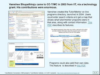
Last Friday I posted an article on the Tutor/Mentor Blog, featuring a PDF presentation showing my "30-year history of reaching out to universities".  Below are three pages from that presentation

Students from Northern Illinois University set up a GIS map-making capacity at our Cabrini Connections office in 1995.  One student worked for us part time in 1996 and 1997 to create maps for us, then continued as a volunteer.


Vamshee Bhupathiraju, a graduate student at IIT, came to Cabrini Connections, Tutor/Mentor Connection in 2003 through a technology grant.  He created the on-line program locator, which was launched in 2004.  This was the source of data used in the interactive Chicago Program Locator built in 2008 by a team from India. 


Students from Indiana University created a map in 2016, showing participation in every Tutor/Mentor Leadership and Networking Conference from May 1994 to May 2014.


These were significant contributions.  These are just 3 pages out of 50 that I share in this presentation. They show what's possible. I hope you'll take a look. 

I'm sharing my archives because I believe other people could do what I've been trying to do, and do it better.  And because I'm now 77 and need others to continue this work.

My maps show that non-school, volunteer-based, tutor, mentor and learning programs are needed in many parts of the Chicago region, but in many cities around the country (and probably the world). 

Too few people ever saw the maps I'm sharing because I never had millions of dollars for advertising and was not a Taylor Swift type of celebrity who could draw people to complex ideas on a regular basis. 


Universities have the talent, and responsibility, to do this work.  However, unless major donors step forward to provide on-going, decades-long, funding, none will do this for as long as I have and none will ever be able to publish an archive like I've shared here, showing 30 years of maps and map stories.

Ten or fifteen years from now archives like mine could be available on university websites in many cities.  It only takes "two or three people on a campus to launch a Tutor/Mentor Connection", and a major donor!

I'll be sharing more of my archives in coming weeks, primarily in articles on the Tutor/Mentor blog.  My goal is that a few people will be motivated to dig deeply into this information. I'm sure there's a book that could be written, showing strategies leaders can use to help end poverty by helping more kids through school and into jobs and careers.


Thanks for reading this. Please share it.

I'm on Twitter (x), Facebook, LinkedIn, Instagram and other platforms. You can find links on this page.

If you are able to make a small contribution to help me keep doing this work, visit this page.  


Tuesday, April 2, 2024

University of Michigan Poverty Solutions Data Maps

I've followed the University of Michigan Poverty Solutions account on Twitter (X) for a few years and have a viewed some of their live presentations. Below are screenshots from two resources I found on their site today.

Michigan  Poverty and Well-Being Map - open link


Multidimensional Index of Deep Disadvantage - open link


Both maps are interactive, meaning you can zoom in to small sections of the country, or the state. And you can click on an area and get data showing the level of poverty and/or disadvantage in that area. I encourage you to spend time learning to use these in your own advocacy.

I've added links to the University of Michigan Poverty Solutions site in this section of the Tutor/Mentor library. Take time to get to know these resources. Share them with your community. 

As I prepared to write this post I scrolled through this blog, looking at articles I had tagged "datamaps".

I encourage you to do the same.  You'll see many other interactive data platforms and maps. 

In many articles you'll see how I've used maps to call attention to areas where kids and families need extra help. Here's one example


There are a lot of resources mapping poverty but I don't find enough people using the maps the way I have been since 1994, to draw volunteers, donors and business investment into these areas and keep it there for many years.   

That's the only solution I know of.  It comes down to building and sustaining public attention and public will.  

I took this photo many years ago, as a reminder of what I needed to do daily, and what others also need to be doing.


I'm on many social media platforms. See links on this page. I hope you'll connect and post links to map-stories you are creating.

I also hope you'll visit my "Support Tutor/Mentor Institute, LLC" page and make a contribution to help me continue to maintain this library and share it daily with the rest of the world. 


Wednesday, February 14, 2024

Persistent Poverty in America

My Twitter feed brought a new report to my attention this week. It's titled "Persistently poor, left-behind and chronically disconnected" and was written by Kenan Fikri who I've been following for a while.  (I'll use Persistent Poverty to refer to this report in the rest of this article.)

The map below was what caught my attention.  It shows areas of concentrated poverty in six Ohio cities.

For the past 30 years I've used maps to focus attention on areas of concentrated poverty in Chicago. In this set of MappingforJustice blog articles, I show other cities with the same challenges.  In the 1990s a book titled American Apartheid: Segregation and the Making of the Underclass written by Douglas S. Massey,  addressed this same issue.

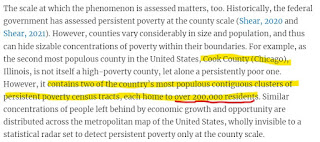
Below are a few passages from the Persistent Poverty article that I highlighted. (click to enlarge). Go to the report to read this in context.


The abstract shows a focus on social networks and social capital and says "these problems tend not to resolve themselves naturally".    The second shows that hidden in affluent Cook County are several clusters of persistent poverty census tracts.  Two with over 200,000 residents."

This is not a new problem. This 1994 Chicago Tribune front page pointed to some of the same high poverty areas as are shown in the Persistent Poverty report. 

I formed the Tutor/Mentor Connection in Chicago in 1993 (and Tutor/Mentor Institute, LLC in 2011)  to try to help volunteer-based tutor, mentor and learning programs grow in these areas as a strategy for expanding the networks of adults from beyond poverty areas who were helping kids through school.  I point volunteers and donors to these programs, through lists that I host on this page

In the Persistent Poverty report, one strategy was to expand networks of support and bridging social capital. 


This paragraph highlights the difference between "bonding" social capital which consists of strong ties between family, neighborhoods and/or church groups.  These are present in many high poverty communities.  What's not present are large doses of "bridging" social capital, which connect youth and families to people and opportunities and solutions beyond the place where they live.  

I've been writing about social capital on the Tutor/Mentor blog for many years. Add these articles to your research. 

The graphic below was created in the 1990s to show the design of the tutor/mentor program I led. It's a strategy designed to expand "bridging" social capital for K-12 youth and families in every high poverty area of Chicago and other cities with areas of concentrated poverty. 

The hub on this graphic represents a youth, a family, a school or a neighborhood. It shows a volunteer-based tutor/mentor program as a place that draws workplace volunteers from many different backgrounds to serve as one-on-one and group tutors/mentors to youth living in high poverty places of Chicago.  The timeline in the middle of the hub emphasizes the 20-plus years it takes to help each youth through school and into jobs where they can earn enough to raise their own kids free from poverty's challenges.  

The strategy I've emphasized has been to enlist leaders from every industry to use their own media, visibility and resources to draw volunteers and donors to tutor/mentor programs in all parts of a city, not just to one, or two, high profile programs. 

These two PDFs show this goal - Total Quality Mentoring  click here
Role of Leaders - click here

I've focused on cities because the geographic size makes it difficult for workplace volunteers to meet with kids during the school day, or right after school, because of the distance between work and program locations.  The after work and weekend hours are times when that volunteers is more able to stop at a neighborhood program and make an on-going commitment.

However, there are not enough long-term programs and there is inconsistent funding to build and sustain such programs.  Here's one of many articles where I focus on funding.  No solution will come without addressing the flow of dollars to these places!
However, as the map from the Persistent Poverty report shows, the problem of long-term poverty is not limited to cities and urban areas.


These two paragraphs emphasize the different history of places across the US and the lack of simple solutions.


Below is another graphic from my collection.  


It emphasizes the role each person can take to be part of a solution. If you've read this far, that means YOU!

Read the report. Here's the link again.

Update: I asked if there is an interactive map showing the Persistent Poverty data. There is. Follow the link in this post from Twitter (x): Using the interactive map you can zoom into the Chicago area, or any other place with high concentrations of poverty.  Look at it. Create your own map stories.

Then, share it with people in your network, so they read it and begin to think about roles they might take in helping more people become involved in efforts that make mentor-rich programs available in all of the high poverty areas shown on these maps.

3-7-2024 update - Here's another article using the EIG dashboards to understand t his data:  https://cityobservatory.org/a-yawning-chasm-patterns-of-neighborhood-distress-in-us-metros/

Then visit this section of the Tutor/Mentor library and read additional reports about poverty, race and inequality in America, that I've been collecting for more than 20 years. 


In last Sunday's Super Bowl a group spent millions of dollars to purchase ads talking about Jesus.   I wish someone were spending the same money talking about the research I've been pointing to and mobilizing people to be volunteers, leaders and donors supporting youth tutor, mentor and learning programs in all high poverty areas of big cities across the country. 

And building a similar research library showing the different challenges of rural areas, reservations, and other places where solutions may be different than for big cities. Then, drawing readers and planners to that resource so they develop solutions.

And that they do it consistently for the next two decades.

What do you think?  Connect with me on social media. (see links here)

Help me pay the bills. Make a contribution to Fund the Tutor/Mentor Institute, LLC. click here