Monday, February 25, 2008
Tech Update: Some Progress Over The Past Week
After a bit of a struggle, the program now lets users plot multiple custom addresses to a map. Each point can have a custom symbol, and there is a tool that allows the user to track and delete points that have been geocoded and added. (It turns out that adding and deleting individual geocoded points is a little tricky to do programmatically, but after hitting my head against the wall a few times over the week, several posts on the ESRI developer board, and a bit of good luck, the system now works.) I've also added functionality that allows users to turn labels on or off for each layer included, and at this point, I'm adding the rest of the layers. I may have to create a few shapefiles myself, as some of the data here seems a little dated (CPS schools, for instance). After these layers are in place, I want polish up the zoom functionality. Still hoping to have something usable by the time I begin student teaching in late March.
Saturday, February 16, 2008
Tech Update: Rolling Up My Sleeves
Ok... this week has been full-on trouble shooting and learning how to make the code behind the software's engine do what I need it to do. I have programmed with Visual Basic in the past, so I'm comfortable with the VBA editor that comes with ArcGIS. On the other hand, the object model for ArcGIS is humongous! I've had success in the past using the object model, but it's always an adventure, and my success is owed entirely to the many support/help resources I've found. The fact is that many people have published their code online, so I haven't had to invent many wheels so far.
I'd like to take a second and share my sources, in case anyone out there is interested in coding ArcObjects but just starting out. And of course, any of you veterans who know of more/better sources, please send em my way.
First, I should mention that I do use my trusty copy of Getting To Know ArcObjects by Robert Burke a lot. But not nearly as much as online sources such as ArcObjects Online and The ESRI Developer Network, each of which offer a lot of documentation and code samples. But the ESRI User Forums is the goldmine. Usually my first stop - highly recommended and helpful.
So, what have I accomplished so far (with the help of these resources)? For starters, I have learned how to zoom to the boundary of a polygon, such as a neighborhood or a the boundary of zip code. The volunteers here might want to make a map of the Albany Park neighborhood. They can do this now with the click of a mouse, thanks to code which came largely from the Burke book.
I have also learned how to programatically geocode a custom address (although I have had problems refreshing the geocoded point to appear on the layout once it is added to its attribute table. Still unsolved but I'm not out of ideas.)
In fact, refreshing the map layout is more complicated - in general - than I had anticipated. A guy in India on the ESRI boards helped me troubleshoot my code when I was having a hard time accessing and refreshing the legend. (Thanks, Vijay!) Maybe this technique will shine light on why my geocoded point won't refresh. I'll get that fixed this coming week.
What else did I build this past week? There is now a way for the user to customize the title, add news text, and add credits/sources to the map. Again, this was a little more difficult than I suspected it would be, since the text objects' property dialogs do not let you give them unique IDs/Names... and you need to refer to the objects by name when accessing them programatically. No idea why you can't simply rename them in their property boxes. Turns out, I had to create a custom routine to name the components, one at a time, at the moment I created them. Strange, but it worked. (Drop me a line if anyone needs any of this code.) Moreover, I had to add code to add carriage returns to user text (news stories), in order to ensure the textbox object stays at the proper width in the layout. (If that makes sense.)
I have also learned how to access layers in the Table of Contents (toc), and how to toggle them on and off. Again, refreshing the toc is separate from refreshing the map... and then refreshing the legend - all of which have to occur when a layer is toggled on or off. But now that I can do all of this, adding the layers Dan needs (hospitals, schools, teacher/mentor program locations, etc.), and attaching them to the interface will be tedious but straight-forward.
Lastly, I should mention that a guy who lurks on our yahoo group TutorMentor_GIS_Project works for the city of Chicago, and contacted me with a donation of code that allows me to export map layouts to .pdf ... thanks!
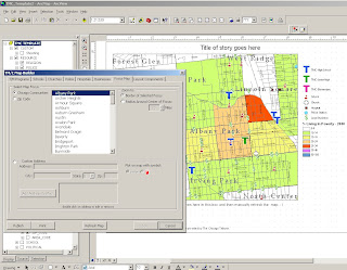
That should get us up to date for the week. Here's a quick look at the interface in its current state:
See you next week.
Thoughts and prayers to everyone who lost their home in this week's fire at Cabrini Green. Heartbreaking story.
I'd like to take a second and share my sources, in case anyone out there is interested in coding ArcObjects but just starting out. And of course, any of you veterans who know of more/better sources, please send em my way.
First, I should mention that I do use my trusty copy of Getting To Know ArcObjects by Robert Burke a lot. But not nearly as much as online sources such as ArcObjects Online and The ESRI Developer Network, each of which offer a lot of documentation and code samples. But the ESRI User Forums is the goldmine. Usually my first stop - highly recommended and helpful.
So, what have I accomplished so far (with the help of these resources)? For starters, I have learned how to zoom to the boundary of a polygon, such as a neighborhood or a the boundary of zip code. The volunteers here might want to make a map of the Albany Park neighborhood. They can do this now with the click of a mouse, thanks to code which came largely from the Burke book.
I have also learned how to programatically geocode a custom address (although I have had problems refreshing the geocoded point to appear on the layout once it is added to its attribute table. Still unsolved but I'm not out of ideas.)
In fact, refreshing the map layout is more complicated - in general - than I had anticipated. A guy in India on the ESRI boards helped me troubleshoot my code when I was having a hard time accessing and refreshing the legend. (Thanks, Vijay!) Maybe this technique will shine light on why my geocoded point won't refresh. I'll get that fixed this coming week.
What else did I build this past week? There is now a way for the user to customize the title, add news text, and add credits/sources to the map. Again, this was a little more difficult than I suspected it would be, since the text objects' property dialogs do not let you give them unique IDs/Names... and you need to refer to the objects by name when accessing them programatically. No idea why you can't simply rename them in their property boxes. Turns out, I had to create a custom routine to name the components, one at a time, at the moment I created them. Strange, but it worked. (Drop me a line if anyone needs any of this code.) Moreover, I had to add code to add carriage returns to user text (news stories), in order to ensure the textbox object stays at the proper width in the layout. (If that makes sense.)
I have also learned how to access layers in the Table of Contents (toc), and how to toggle them on and off. Again, refreshing the toc is separate from refreshing the map... and then refreshing the legend - all of which have to occur when a layer is toggled on or off. But now that I can do all of this, adding the layers Dan needs (hospitals, schools, teacher/mentor program locations, etc.), and attaching them to the interface will be tedious but straight-forward.
Lastly, I should mention that a guy who lurks on our yahoo group TutorMentor_GIS_Project works for the city of Chicago, and contacted me with a donation of code that allows me to export map layouts to .pdf ... thanks!
That should get us up to date for the week. Here's a quick look at the interface in its current state:

See you next week.
Thoughts and prayers to everyone who lost their home in this week's fire at Cabrini Green. Heartbreaking story.
Saturday, February 9, 2008
Cabrini Connections artists present their work in a gallery this weekend!
Oh while I have you today.... If you're on the Near North Side this weekend, and want to check out some of the amazing artwork the kids here at Cabrini Connections made, the pieces will be displayed until the end of this weekend at Pallette and Chisel on 1012 N. Dearborn (Don't think about buying any of it though - it all sold already!) Some news on the event here. And here.
I think you'll be amazed. Some of what I've seen is stunning.
And if you can't make it but want to see a few pieces online (and read a few artist bios), there is some of that at the Cabrini Connections website.
Also, a few of the kids (mentioned in an earlier post) spent years working on a documentary called Cabrini Green:Times of Change, detailing the gentrification of their Cabrini neighborhood. The film was premiered yesterday, and will be for sale beginning next week. Buy a copy to support these fine artists, and to learn a little more about the history of Cabrini Green. ($20 each, which includes mailing/$10 if you pick up copies at Cabrini Connections). Just email tutormentor2@earthlink.net.
I'm heading over to the gallery right now to give everything one last look.
Catch ya later.
First Mapping Project
Excited to report that my first mapping project is in motion and my first deadline – mid-March – is fast approaching! Basically, my goal is to program a custom interface with which Dan, other volunteers, or perhaps even students can create maps – using ArcGIS – quickly and on the fly. ArcGIS (the mapping software) is pretty complicated and takes some training to use. The problem is that Cabrini Connections works largely through the efforts of volunteers and part-timers and there simply isn’t the budget to have a technician like myself here full time. No one else knows how to use the software very well, so I want to give them a simple and standard Windows tool that will help them be map-makers when I’m not here. This has to be "as done as possible" before I begin student teaching late March.
Why does Cabrini Connections need maps again? One of the big goals here is to raise community awareness about issues of social justice. But a larger goal is motivating people to join together to work for solutions. Everybody wants to see an end to poverty and crime and human suffering, right? Everybody wants safer neighborhoods, no? (Well I guess this is an assumption, but I’m betting the vast majority of people would do something if they could.) Cabrini Connections gives ordinary people an opportunity to do something. Like most tutor/mentor programs, Cabrini Connections pair students with volunteers like you and me… to provide mentorship for kids who are being “left behind” by underfunded schools and underinformed community, government, and business leaders.
So this thing about raising awareness in folks who might be willing to work for a solution... this is one situation where maps can come into play.
Let’s take an example: Here’s an article from this week’s Chicago Tribune: 2 teens shot while waiting for bus on South Side. Ok, so what do we learn from reading this? That Englewood is a dangerous place where kids get shot on the way to school. People read the story and probably think, “That's too bad. Poor kids.” And then they turn the page.
While this particular article has no maps, occasionally you’ll see a simple map attached to an article like this – one that shows the location of the shooting but not much else. Again, all we’ve actually “learned” is that someone was shot on the South Side. (Which we’ve been trained to expect of course, because after all, all we ever hear about the South Side is that “it’s dangerous.”)
But what if a map like this was included:

(I know I know... I just got started and I have a lot of design work to do... so cut me some slack guys! :) Any rate, you get the idea.
Perhaps someone now might take a second to think: “Whoa – look at that poverty around that shooting.” And maybe “Are those churches and businesses and schools in the area providing any after-school help for the kids in Englewood?” Better yet, “Who are those existing Tutor/Mentor Programs I see on this map? Do they know each other? Are they working together? Can I get involved?”
Maybe someone in the neighborhood will now take a leadership role after seeing a map like this. Maybe a community leader can stand up and ask “What do we have to do to get more people interested in the wellbeing of our neighborhood?”
Instead of simply saying “That's too bad another kid died” now maybe folks, combining the story from the trib with the map made here are saying “Why is there so much violence and poverty here, and what can I do to help address this?!”
So that’s where I am at – racing the clock to get this interface built before I leave to student teach… a custom tool that will make ArcGIS easier to use for everyone here in their efforts to help people identify problems... and then find solutions to the problems.
Subscribe to:
Posts (Atom)