Friday, December 20, 2019

What factors affect learning at your school? Interactive map


click here to view map
My Twitter feed drew my attention to the interactive maps on the Hamilton Project website, which is a part of Brookings.edu

While there are many different reports on the site the map I'm pointing to focuses on a report that focuses on the factors that affect learning at individual schools.

If you browse through this blog or sections of the Tutor/Mentor blog you'll see that I create stories by zooming into sections of map platforms like this, then creating a screen shot that I convert to a jpg that can be put in the story.

Below is a closeup of the Chicago region.  You can drill down even closer to look at individual schools.


Below you can see how I share maps from these stories on Twitter and how I'm trying to motivate youth from schools across Chicago and the world to create their own map-stories, focusing on issues in their own community.

This is something that youth as early is middle school could be doing for various class projects, or for service learning. If practiced all the way through high school and college, I suspect we'd develop a generation of spatial thinkers who use maps to draw needed programs and resources into more places where such help is needed.

Thank you to everyone who has read and shared stories from my blogs over the past year.  I wish you all a  happy, healthy and hope filled holiday.

Tuesday, October 22, 2019

What If This Market Analysis Tool Were Used to Support Growth of Youth Programs

Below is a screen shot from a Business Market Analysis Case Study posted by ESRI this week.  I encourage you to open the link and see how Walgreens uses this tool to determine where to place new stores.

Open link and view this market analysis tool
UPDATE:  10-24-2019 - here's a different example of using GIS mapping to support fund raising efforts. Read both articles then the rest of this blog article.

Imagine having this tool available to social sector intermediaries like the Tutor/Mentor Connection.  In early 1993 when a volunteer from IBM was introducing me to Geographic Information Systems I saw interactive uses of mapping as planning tools and understood their potential to visually communicate.

Between then and 2009, with the help of volunteers and a few donors, I was able to mimic some of those tools in the types of maps and map platforms we created to help support the growth of volunteer-based tutor/mentor programs in Chicago, but was never able to get the full suite of tools, nor the executive commitment to use these in efforts to engage corporate resources in helping tutor/mentor programs grow in areas served by different companies.

See map in this story

At the left is one of the map stories we created in the 1990s. This has all of the elements of the ESRI tool, except it is not automated. We show specific parts of Chicago, tell a story of a shooting, talk about the poverty that is a root cause of much of the violence, and talk about assets in the area (businesses, faith groups, colleges, hospitals) who could be helping tutor/mentor programs grow in that area.

Imagine having that story told with a GIS tool like the one ESRI is showing. Imagine the story being told by a corporate CEO or Mayor of a big city!   I can imagine it. I've not been able to make it happen!

Browse through this set of articles, written since 2008, to show how Tutor/Mentor Connection (now Tutor/Mentor Institute, LLC) has been attempting to use maps.
view map & list of programs here

The one unique feature of the T/MC work is that we've been collecting information about non-school, volunteer-based tutor, mentor and learning programs in the Chicago region since 1993, and our efforts aim to draw volunteers, donors and ideas directly to each program, to help each constantly improve.

T/MC goes beyond technical assistance and showing "how" to recruit and/or raise money. T/MC has helped build public attention and recruit and raise money for these programs since 1994. 

And T/MC uses maps to try to ensure a distribution of k-12 programs in every high poverty neighborhood of the Chicago region.

If you know of others using maps this way, please share it in the comments section.


Since 2011 the Tutor/Mentor Connection has been led by the Tutor/Mentor Institute, LLC (which is a one person - Dan Bassill (me) - operation based in the Chicago region). Here's a 2019 article showing what I've been trying to do and showing help needed to re-build my capacity to do this work.

These maps could be any major city in the world, not just Chicago. That means a  university, business and/or civic organization from any place in the world could spend time learning what the Tutor/Mentor Connection/Institute, LLC  has been building then offer to adopt, and rebuild, the strategy to apply in their own city and to share with other cities.

Any company could be using ESRI tools as part of this ROLE OF LEADERS  commitment, to support the growth of youth serving organizations in areas where they do business, and/or where customers and employees live.

Connect with me on Twitter, Facebook and/or Linkedin.  Let's explore this possibility. 

In the short term, please make a contribution to help me continue to fund this work.

Wednesday, October 16, 2019

Link between poverty, segregation and education performance

In my Twitter feed today was a post that pointed me to this article, titled: An analysis of achievement gaps in every school in America shows that poverty is the biggest hurdle.  The article draws upon data that is available in this Stanford Opportunity Explorer map.

Below I'm showing three map views that I created by zooming in on the map.

The blue shades show "students' scores, in grade levels, relative to the national average (grades 3-8, 2009-2016)". This is explained in the table in the lower right corner of the page.  Click on the "more info" link and a panel opens on the left side of the page with a set of questions and answers.

National View of Opportunity Explorer
Then I zoomed in to look at the Chicago area where I've focused on helping volunteer-based, non-school tutor/mentor programs grow since forming the Tutor/Mentor Connection in 1993.  At this level of detail  you can see individual schools, which are color coded to show how they perform vs the national average.

View of Chicago region - Central/South

Then I zoomed in more to focus on the central part of the city.  For reference, look at this map which we created more than 10 years ago, showing the Illinois 7th Congressional District. You can see how this district stretches from Chicago's lakefront to the far West suburbs and that there are areas of high poverty in the middle and South part of the district (note: this is 2000 census data). 

7th Illinois Congressional District
Now look at the third map that I created using the Opportunity Explorer.  I'm focusing on the same area as the 7th Congressional District. You can see the difference between more affluent areas (green) and greater poverty areas (blue).

This map covers much of the 7th Congressional District
Now look at the map below, showing the 7th Congressional District, which was created using the Chicago Tutor/Mentor Program Locator, which a team from India built for the Tutor/Mentor Connection in 2008 using money we'd received from an anonymous donor. (This team first introduced themselves to me in 2007 by rebuilding our Organizational History and Tracking System (OHATS) page - on a pro-bono basis!)

7th District view using Program Locator - click here

The Opportunity Explore is a great resource.  However, I wish it had overlays showing Congressional or State legislative districts, so voters could build an understanding of the segregation, poverty and school performance within their district and hold elected leaders accountable for generating the resources and mobilizing the leadership needed to improve the lives of those living in poverty.  

Unfortunately the Tutor/Mentor Connection was not able to attract new funding after 2008 due to the financial crisis, which also affected the volunteers from India who were helping us. In 2011 this led to the strategy being discontinued at the non profit I founded in 1993, which led me to form the Tutor/Mentor Institute, LLC (also 2011) to try to keep this resource updated and available.  

It is available. It's not updated. However if you explore it's features, it's loaded.  For instance, in the upper right I've pointed to an "enlargement" button which expands the map to your full screen. That enables you to look closer at the information on the map, including the green stars, representing non-school tutor and/or mentor programs in the map area.  

Data platforms - click here
The Tutor/Mentor Program Locator is not the only resource people can use. It is one of the few that overlays non-school tutor/mentor programs and is intended to support leaders working to fill neighborhoods with a wide range of k-12 youth programs.

I point to a wide range of data platforms in this concept map. I'll add the Stanford Opportunity Explorer today.  These can be used to understand issues and create map-stories that share your understanding with other people, mobilizing the talent, dollars and votes needed to change conditions shown on the maps.  

View more stories on this blog showing uses of maps, and view stories on the Tutor/Mentor blog, also using maps. Imagine such stories appearing on thousands of web sites and blogs, created by students, volunteers, policy makers, elected leaders, etc.

I'm looking for partners at universities, businesses think tanks and/or other non-profits who will spend time learning what I've been trying to do and then invest and adopt, updating the Program Locator, and rebuilding strategies that I'm no longer able to lead as well as needed, due to lack of support.  

If I can get the attention and investment from just one of the growing number of billionaires in the world, this entire strategy could be relaunched, using their name and influence. Share this article, and perhaps you can help me reach these people. 

This link points to social media platforms where we can connect.


Thursday, September 19, 2019

Factors that affect learning - interactive map

In a Twitter chat today I learned about a new map by Brookings.edu and the @hamiltonproject. I show it below. Visit this article to read about the map and learn how to use it.

Open map - click here
You can zoom into the map and enlarge it to focus on different places around the USA.  I zoomed into the Chicago region and created the map view shown below:

Open map - click here

Each dot on this map is an individual school.  So I zoomed in even more to focus on one school, which I chose at random.

Open map - click here
The blue circle focuses on Daley Elementary School, where student chronic attendance is 18.2%, which you can see if you put your icon on the red dot. 

The red circle focuses on the wider area around this school, where most students live.  I've been trying to coach schools, businesses, faith groups, hospitals and others to fill the red circle with a wide range of volunteer-based tutor, mentor and learning organizations so kids come to school more prepared to learn and leave with networks that help them into jobs.

I've been trying for 20 years with limited success. I keep trying. 

Below is another map, created in 2017 from the Chicago Tutor/Mentor Program Locator, which my organization created in 2008 (it's not been updated since 2013).

View Program Locator - click here
On this map I show layers of information, that includes existing non-school tutor/mentor programs in the area, as well as assets who could be helping programs and schools help kids, such as faith groups, businesses, hospitals and universities.  The map shows who is in the same geography, thus who has a reason to help.

Most of the map platforms that show data, don't do what the Program Locator was intended to do. And, I've not had the resources or partnership to keep updating the Program Locator, or to keep adding to its features.

Chicago programs
In 2016 I created a new map platform, which is kept updated. See it here.  Unfortunately  this does not have the layers of information, or search features of the program locator. You can zoom in and put your mouse over a green icon to learn who that program is.

It's not enough to just point to where kids need help. We need to  help build a support system of people and organizations who devote time, talent, dollars and votes over many years to help kids grow up.

If you'd like to know more, connect with me on Twitter, Facebook or Linkedin.  If you'd like to make a contribution (not tax deductable) to help me, click here.

Friday, September 13, 2019

Understanding Racial Diversity in USA

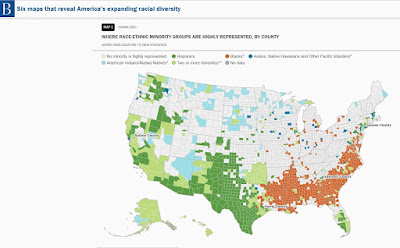
Below is one of six maps shown in a Brookings.edu article titled "Six Maps that Reveal America's Expanding Racial Diversity".

Run your pointer over the maps and you'll get data for every county showing the percent of each racial group in that county.

In theory you would expect a greater percent of minority elected officials, at the local, state and federal level, in those areas showing high concentrations of African American and Latino populations. 

Take some time to read the full article. 

Wednesday, July 24, 2019

A Bridge Too Far? My Vision Since 1993.

This is one of many maps you'll find on this blog and on the Tutor/Mentor Blog which zoom into a Chicago neighborhood and tell a story of "why" kids and families need more help, "what" help is already in that area, if any, in the form of organized volunteer based tutor and/or mentor programs; and "what assets" and leaders share the geography and could be doing much more to help change the conditions and improve the lives of people who live there.


click to enlarge
I created the Tutor/Mentor Connection (T/MC) in 1993 and Tutor/Mentor Institute, LLC (T/MI) in 2011 to support the growth of well-organized youth tutor/mentor programs in all high poverty areas of Chicago. This graphic shows four strategies that I've followed since they were developed in 1993.

While we accomplished much and built a huge resource library, we've never had consistent funding or significant leadership support from Chicago business, political, philanthropic or other sectors. Thus, what we wanted to accomplish is far less than what has been needed.

Data collection and GIS mapping have been at the heart of T/MC work since 1993. This graphic shows what the T/MC has been trying to do and what has not ever been accomplished.

Annual cycle of Tutor/Mentor Connection mapping. Click to enlarge 
We've built a list of youth tutor/mentor programs, organized bi-annual conferences to bring leaders together, organized events to draw volunteers and donors to programs, generated considerable attention from local media, built a social media presence and more.  It's been too little to change the overall range of poverty in Chicago, but has had a positive affect on many individual lives.

I created this Wiki Page to show what we were trying to accomplish. Feel free to read it and offer your help.

When we started building a mapping capacity, and on-line program locator, the goal was that we could do more to support the fund raising capacity of programs in different parts of the city.  There were three goals that never have been reached.

click here to view
1) There is a growing mountain of data showing levels of poverty and inequality in Chicago and the world.  In the concept map shown at the left I point so some of these data platforms.  The Tutor/Mentor Program Locator (since 2022 only available as an archive) used some of that data and like other platforms enabled people to zoom into small areas to look for the availability of tutor/mentor programs in small areas.

My vision was that we could create a form that would be accepted by grant makers, to show the need for tutor/mentor programs serving different age levels in different zip codes and/or community areas.  Right now every program has to build their own case statement showing why it is important for their program to receive funding. Some have greater talent to do this than others. It's a redundant process. Thus, creating a form where you'd only need to enter a zipcode or community area, plus the age group you serve, and the type of program you offer, should generate a report showing that you are needed in that area.

7-29-2022 update - below is a video created by a company called RS21 who is building data mapping dashboards and using the data in an analysis process that determines where services are needed and where to put them. View the video at this link.  View other articles showing RS21 use of data - click here.


I point to the RS21 video because this is the type of analysis that was envisioned in 1993 when we began to plan the Tutor/Mentor Connection and it's use of maps.  We never reached the capacity to do this in all the ways imagined.

If we had fully developed this capacity, it would have lowered the cost to individual programs and give grant makers a consistent way to help them decide where to provide funding and who to support in each area. 


click here to view

We got partially there in 2004 when we launched this on-line searchable program locator form (since 2022 only available as an archive).  However, the maps that this produced did not show demographic information or indicators such as poorly performing schools or violence.  The Interactive Program Locator that was built in 2008 provided this information. However, there was no "easy to use" narrative generated in a "form" that could be printed that someone could pull from the site and use in a grant proposal.

The financial melt down starting in 2008 led to this work being discontinued in 2009 and to updates being discontinued by 2013.

So this is one bridge that we never were able to cross.

2)  Motivating programs to provide data for the Tutor/Mentor Program Locator and keep it updated has always been a challenge. One way we partially overcame that was to have our annual survey included in the grant guidelines of the Chicago Bar Foundation's Lawyer's Lend A Hand Program. About 40 out of our list of nearly 200 programs submitted applications each year from 1995-20003 which I could use to update the list. However, that was too few and too time consuming for my small staff. Thus as we built the interactive portal in 2004 we developed an on-line form that programs could use to add themselves or update their data (not working since 2013).  However, this still did not provide "motivation".

click to enlarge

My answer is shown in this PDF. The graphic at the right is part of it. As on-line fund raising portals grew since the mid 2000s I felt that we might create a portal that would work with the Program Locator maps, to encourage donors to support programs in different parts of Chicago and give media a resource to use in developing stories following incidents of violence, reports on schools, reports on gangs, etc. 

On one level, we could draw from the list we were maintaining to give donors info to create the platform. However, on another level we felt that as programs began to generate donations, and learned to use the site to build their own campaigns, we'd create greater motivation to keep their data updated.  We could even organize events at different time in each year to draw volunteers and donors to the platform.

This is another bridge that has not been crossed. This has never gotten further than me putting the idea into this PPT and sharing it on my planning wiki.

click to enlarge
Media stories continue to remind us that some people in Chicago and other cities live with fewer resources and fewer opportunities than do other people.  Thus, there's still a need for organizations that provide a bridge, connecting youth and families to resources and connecting people who don't live in poverty with people who do.

3) The final bridge - As we developed the Tutor/Mentor Connection in the 1990s we felt we could generate income to support our continued operations and innovation by making it available to other cities and offering our expertise to help them use it. When I formed the Tutor/Mentor Institute, LLC that continued to be the goal.  However, that has not happened.   Now my goal is to find people who will take time to understand what I've been trying to do and will want to take ownership and carry it into the future.   One idea that might offer promise is to make the code for the Program Locator and any new platforms freely available on GitHub, so it could be more easily applied in other cities, and to other causes.  That might attract more developers to help build in the features I've not been able to construct, and to keep updating it as technology and needs change.  Having parallel portals in every major city of the US and the world would certainly contribute to greater visibility and greater traffic, and thus a bigger flow of donations through the portal and the maps to individual tutor/mentor programs in different places.

That's always been the goal.  So far it's still a bridge to far to cross.

Does any of this interest you?  I'm on Twitter, Linkedin and Facebook. Let's connect.


Monday, July 1, 2019

Collective Mapping - Resources

I've followed the From Poverty to Power blog for a few years because of the informative articles. The image below is from an article on Collective Mapping, posted today.

#PowerShifts Resources: Collective Mapping - click here

If you browse through past articles on this blog you'll find many examples of how I've attempted to use maps to show where volunteer based tutor and mentoring programs are most needed, where existing programs are located, and ways people can help those programs grow.

I've depended on volunteers and inconsistent donations to create the maps and map platform you see on this site.  My goal for the past few years and going forward is to find people who will use my history as a template for building new versions of my mapping and apply them in cities across the world.

At the same time, I've been creating a web library showing ways people are using #maps and showing platforms and technology that can be used. This cMap is one way I share that information.

Open this cMap and visit the mapping platforms that I point to.
I use maps in articles on this blog, and the Tutor/Mentor blog, to draw attention to areas with high poverty, or high violence, where long-term youth tutor/mentor programs are most needed. If you read these, please share.  However, another way to read these is to use them as templates for your own articles, focusing on  your own cities, if you're not from Chicago.

To  have an impact, thousands of people need to be telling stories using maps, not just myself or a few people. 

You can connect with me on one of these social media sites

If you want to make a small contribution to support my work, click here.


Monday, April 29, 2019

Population Density for US Cities

My Twitter feed showed me this article today.  It includes interactive maps showing the population density in 200 US cities. 


As I find sites like this on Twitter I'm always hoping there is a person, or group of people, in each of these cities doing exactly what I've been doing since 1993 to build an information base, with maps, that people can use to understand where kids and families need more help, where existing youth tutor and/or mentor programs are located, and ways to help each program get the talent and dollars on an on-going basis that enables each to be great at helping kids through school and into adult lives.

Sadly, I'm not finding such people.

I'm @tutormentorteam on Twitter.  If you know people doing what I'm describing, which includes maintaining this blog, the Tutor/Mentor blog, and the Tutor/Mentor Institute, LLC web sites, please introduce us.

If you're a benefactor, please support us.

Tuesday, April 16, 2019

Mapping Poverty and Inequality in the UK - new maps

I saw this Tweet last week and saved it to do a deeper review when I was back home from my hospital stay. 


Here's the link that the Twitter post points to.  I've been looking for someone mapping poverty and inequality in England, similar to how others have been doing this in the USA.  Here's an article I posted in 2011, following riots in London. Since then, I've  not found anyone creating maps like those I'm pointing to above.

 Of course, my goal reaches beyond just creating the poverty maps. I want people to create overlays showing where existing youth tutor/mentor and learning programs are located, and where more are needed.

Then, I want to influence the growth of teams of business, non-profit, education and community members who help existing programs grow, and share ideas, that help every program be great.

I've written about this in past articles on this blog, and on articles at TutorMentor.Blogspot.com since 2005.  I hope you'll take a look.

I show the need for planning and action teams, working at the program, neighborhood, city, state and national level. I'd like my ideas to be part of these teams and I'd like to be personally in the conversation, via Twitter, Facebook, LinkedIN, or any other format you choose.


Wednesday, March 27, 2019

Youth in Poverty - Chicago Region

If you browse through articles posted on this blog since 2008 you'll see a consistent focus on helping k-12 youth living in high poverty areas.  Between 1994 and 2011 the Tutor/Mentor Connection was able to build it's own data maps, including an interactive Chicago Tutor/Mentor Program Locator, to show where non-school youth programs are needed, where existing programs are located, and what assets are available to help programs grow in different places.

I've not had the money or volunteer talent to update the Program Locator and create map views using ArcGIS software since 2011 , so I point to data platforms hosted by others, which can be used as base-level maps* for stories that intend to mobilize attention and resources to support youth tutor/mentor programs in throughout the Chicago region.

One of those  is the Community Commons site. Below is a map view that I created today to show youth in poverty in the Chicago region.

create your own map - click here
Of many features that I like on the Community Commons site is the way they share stories of maps that have been created. And they organize these by channels, or focus areas. This link points to stories related to education issues.

The Tutor/Mentor Connection started building a resource library in 1993 and that has continued under Tutor/Mentor Institute, LLC since 2011.  Below is a concept  map showing various data platforms that can also be used to create map stories. Links to these platforms is just a small part of the Tutor/Mentor web library.  Open the map, then open the links under each node to find a direct link to each resource.

As you look at them, see if they have a section of stories, similar to the Community Commons site. It would be great if every one of these sites where doing that.
View this map at this link
Creating data platforms is only a first step in solving problems. Motivating growing numbers of people to visit and use the data, then create stories that draw more attention to places, along with resources to solve problems, is the real work that needs to be done.

*What do I mean by "base level maps"?  None of the platforms I point to has been building a database of non-school tutor/mentor and learning programs, with sort features for age group served and type of program, they way Tutor/Mentor Connection started doing in 1994.  Visit this page and see how the T/MC list of programs can be searched, by these sub-categories.

Thus, to support the growth of these programs in Chicago or any other city, someone needs to be doing the on-going research to identify existing programs.  While the Program Locator is not  updated, I continue to update the list of Chicago programs and show them on a map, which you can see in this article.  Unfortunately, this is not as robust as the original Program Locator.

So what can you do?

Anyone can be the YOU shown on this graphic, who creates map stories and shares them via social media, blogs, church sermons, newspaper stories, and one-on-one conversations with these goals in mind.

Anyone can browse the stories on this blog, and on the Tutor/Mentor Blog and then share those, in your own words, videos and graphics, with people you know.

Anyone can help find a partner/investor/university who would help rebuild the Tutor/Mentor Connection and it's mapping capacity, and apply it to cities across the world.

I'm on Twitter, LinkedIn and Facebook. If you're one who responds, just connect with me on one of these platforms.

Do you like what you read? Visit this page and make a contribution to help me continue to do this work. 


Wednesday, March 13, 2019

Chicago Health Atlas - updated

In 2014 I wrote this article about the Chicago Health Atlas. Last night at the weekly ChiHackNight event, the updated version was shown.

Below are some screenshots I've created, with links to a couple of articles where I've used these.

This is map showing hospitals in the North Lawndale area of Chicago - from this article


This map shows youth serving organizations in the North Lawndale area - from this article


Here's another screenshot that I just created today, showing the Auburn Gresham neighborhood.


I've been creating map stories, using mapping resources that I've had available, and those created by others, for more than 25 years. My goal is to teach others to do the same.

Here's one from many years ago.


This was created in the 1990s, before I had access to the Internet, and well before I had the ability to create map views with layers of information.  However, you can see poverty areas highlighted, indicating a need for youth tutor/mentor programs, among other supports. You can see an Excel list, of programs in the area, based on the Tutor/Mentor Connection survey, and you can see a list of assets (business, faith groups, university, hospital) who could be helping build mentor-rich programs (visualized by the chart). 

For this map area to be filled with such programs, someone needs to be creating an on-going invitation that reaches out to all the assets on the map, the political leaders, media, and community members, including leaders of existing tutor/mentor programs, to bring them together in an on-going conversation that builds a better understanding of need, and leads to the growth of more, constantly improving youth programs in the area. 

This concept map visualizes that process.

Map-based planning - view here
If some, like Chicago Health Atlas, are building and maintaining platforms like this, with a list of resources in each community area, then it will be easier for others to use this list in an invitation process, getting people together on an on-going basis, and innovating solutions that build public will, and a distribution of needed resources, to all parts of the map-area shown.

Here's a second concept map, visualizing planning needed.

Planning needed to influence resource providers - click here

I hope those who are creating data maps will devote space on their web sites to coach others to use their platform for creating map stories that bring people together to solve problems shown by the maps. One group that does that pretty well is the Community Commons site.  It's one of many that I point to on this data map.

There's a lot of information in my blog articles and on my web site and web library. Use it for on-going learning. Make it a resource for college programs that help grow future leaders.

If you appreciate what I'm sharing, I could use your help to pay the bills. Click here to contribute to my FUND TMI page.


Saturday, March 2, 2019

How to Increase Focus on Black Issues, when Share of US population is less than 14%

Here's a Tweet from BrookingsMetro that I saw this week:

This points to a Brookings article titled The Rise of Black-Majority Cities

Within the article is this statement: "The black share of the U.S. population rose only slightly since 1970. From 11.1 percent in 1970 to 12.6 percent in 2010." 

The map shows a heavy concentration of African Americans in the South East and along the East Coast from New York City South to Florida and in many large cities spread across the country.

I'm in Chicago, and started leading a tutor/mentor program serving African American kids living in the Cabrini Green public housing area in 1975. In 1993 I created the Tutor/Mentor Connection (T/MC) to help mentor-rich non-school programs, like the one I was leading, grow in all high poverty areas of Chicago, which were mostly African American and Hispanic neighborhoods.

I've been using maps since 1994 to show high poverty areas, in an effort to build public attention and motivate more people to provide time, talent and dollars to help youth tutor/mentor programs grow in all of these areas.

I use tags to help sort the articles in my blog, so if you click the #poverty tag, you can find a series of articles with various maps that show the demographics of Chicago the concentrations of poverty in the USA. 

Over the past 30 years the population of Black kids in the city has been decreasing.  It's still a huge number, but the Hispanic population is almost the same, and many African Americans who lived in the city are now living in the Chicago suburbs, or have moved out of state.

The work I've been doing since early 1990s is building a web library with information anyone can use to better understand issues, know more possible solutions, and then use these ideas in efforts to build and sustain youth tutor/mentor and learning programs that reach more k-12 kids in high poverty areas with support systems that help them move through school and into adult lives free of poverty.  In the concept map below I point to sections of the Tutor/Mentor Connection web library, with links to articles about poverty, race issues, inequality, Black History, etc.

In looking at the Brookings article and map I have some questions.

a) How do we attract and maintain attention and support for those kids still living in high poverty neighborhoods of Chicago as the population changes?

b) How do we attract and maintain attention on social justice, inequality and other issues that focus on the lives of people whose ancestors came to America as slaves many years ago, when most parts of the country don't have a significant population of people with this background....and when the overall percent of African Americans in the total US population is  under 14%

Do solutions need to come from cities rather than from national initiatives? Do solutions need to be regional, focusing on parts of the country with high concentrations of African Americans?

Would it be helpful to show similar maps with Hispanic and immigrant populations, showing what percent live in poverty, and where they live? Are there shared experiences that are similar, and that could create political bonds that focus on solutions at the national level?

I really don't know.

Tuesday, February 26, 2019

The Politics of Englewood

This is a  map of the greater Englewood area of Chicago, taken from a Southsideweekly.com article titled Without Representation: How Englewood got mapped into pieces.

I drew the line down the middle to show how the Englewood and West Englewood community areas are dividied.

I've posted a number of articles featuring Englewood, on the tutor/mentor blog.

Here's one from 2009, under  headline of:

Chicago Kids Victims of Neighborhood Violence


I encourage you to read the feature article of Sunday's Chicago Tribune, titled Innocence in Peril, which shows the tragic impact of violence and drugs on kids living in the Englewood neighborhood of Chicago.

 Then I encourage you to use the interactive tutor/mentor program locator to zoom in on the Englewood neighborhood (zip code 60621) and learn about existing volunteer-based tutoring /mentoring programs, or other youth organizations that provide some form of tutoring for kids in these areas.

This is map of Englewood from Tutor/Mentor Program Locator

 When you look at this, don't think of tutoring or mentoring as a simplistic strategy that cannot overcome the complex, deeply rooted poverty, segregation and racism in Chicago. Think of this as a strategy that connects adults, businesses, faith groups and other resources beyond poverty, in long-term personal connections which transform the volunteers and what they are willing to do to help kids and families.

 If we don't increase the number of people beyond poverty, who get involved with as much commitment as they would to help their own kids, we'll never have the dollars and political will-power to change the systems of support for kids living in poverty.

 As you use the interactive map, you can create overlays showing faith groups, businesses, universities in the area who could be helping tutor/mentor programs grow. You can also look at the highways that bring working people from the suburbs, through these neighborhoods every day. Look at the faith groups on the suburban end of these highways, and think of them as partners who could be educating their members to use this information, and their resources, to help tutor/mentor programs grow in poverty neighborhoods.

Visit the Tutor/Mentor Institute to learn more about strategies that readers of this Tribune story might learn so that they are more of the solution, than a drive by reader.
-----------------------------------------

In November 2015 I wrote another article, titled "Using Maps in Long Term Planning" and showed how an area where two shootings took place had multiple layers of political representation. 

The ChicagoSouthsideweekly.com article shows how this dilutes accountability, and may be contributing to the lack of progress on some of these issues.

I've been using maps to tell stories and draw resources to high poverty neighborhoods since 1994. Browse through sections of this blog, and the Tutor/Mentor blog, to see many of these.

If you value this work, I could use some help, with contributions, to keep on doing it. Click here if interested.

Sunday, February 17, 2019

Vision for a Resilient Chicago

view map here
The map at the left shows areas of Chicago where people were living in economic hardship in 2014. The red is the areas of high impact, while the darker blue shows areas of medium impact.

This map is part of an ambitions new plan, titled Resilient Chicago, to create a Chicago "where residents, neighborhoods, institutions, corporations, and government agencies are successfully connected to each other in the pursuit of economic opportunity, safety, equity, and sustainability."

I encourage you to take time to go through all sections of the web site and download the full report.

I was not part of the planning process, which started in late 2016, and don't know if any of the ideas on the Tutor/Mentor blog, Tutor/Mentor Institute, LLC site, or this blog, were viewed by any who were part of the planning process.

However, I've been sharing maps pointing to these neighborhoods for more than 20 years, focusing on efforts that bring people together to build and sustain mentor-rich non-school programs in each of these areas, as part of a larger strategy of getting more people involved in trying to address the many problems related to poverty, segregation, income inequality, etc.

The devil is in the details. How does the city get from "here", the launch of this plan in 2019, to "there", a time in the future when most of the goals of the plan have been met?


Follow this link and view some of the articles where I've used the "here to there" concept. Maybe there will be some ideas that leaders can apply to help Chicago make this plan a success.

If you are part of this process and would like to bring me and the Tutor/Mentor Connection/Institute, LLC experience into the process, I'd be happy to connect. I'm on Twitter @tutormentorteam. I'm on LinkedIn and Facebook, too.

If you value this information, a contribution can help me keep it available. Click here

Friday, February 8, 2019

Uses of Maps in Conservation Efforts - Discussion

For  25 years I've been trying to build support for the mapping efforts of Tutor/Mentor Connection, which focus on identifying areas of high poverty, then mobilizing people and resources to  build and sustain solutions in these areas, such as volunteer-based tutor/mentor programs.

During this time one obstacle I've faced is that most people don't use maps this way, or focus more on other geo-based issues, such as conservation.  Below is a Tweet that came across my feed. I encourage you to read the article.

The argument in this article is "We already have enough maps. Why create more?"  I can appreciate that.

While I've been trying to map poverty and locations of tutor/mentor programs in Chicago since 1994, few have come forward to say  "Let me help you".  Instead, new platforms with a similar focus have been created.  Furthermore, I find too few efforts where people are using the data-maps in stories intended to influence public policy, volunteer involvement, business and philanthropic support, etc. for work that needs to be done within any specific map area.

I have been aggregating links to data and mapping platforms for many years and created the concept map shown below to share some of these.  Look at articles on this blog and the Tutor/Mentor blog to see ways I've used maps in stories for many years.


I don't think we'll ever reach a point where there is just one data-map that everyone uses. That's just not the way people work. Thus, my recommendation to the conservation people is that someone create similar concept maps and web libraries, so at least people who focus on conservation (or other issues) could find these and learn to build stories from multiple platforms of information.

If you like my articles and concept maps, click on the "help me" button and send a contribution.

Tuesday, January 29, 2019

Take a look at 2019 #ProsperityNowScorecard

On my Twitter feed today I saw this Tweet. 
I took a few minutes to dig into the ProsperityNow site. It's loaded with information.  Below are three pages I looked at:

This is a data resource for the entire USA. You can look at it from the state level, or from the city level. Zoom in and create a focus on specific places.


Below is an example of the type of data that is available for specific locations, in this case, Chicago.  I'm not sure if this data gets more detailed, showing pockets of wealth and poverty within big cities like Chicago. That would be useful.

The next image show ProsperityNow networks across the country, and identifies leaders in each city.  Since the hastag #ProsperityNowScorecard was used, I hope in future weeks that I'll be able to see how people from within specific places are connecting with each other, and how people from different places are connecting and sharing ideas.


If you've read past articles on this blog, or the Tutor/Mentor blog,  you will see my long term commitment to help build and sustain non-school youth tutor/mentor programs which connect k-12 kids to people who live beyond poverty areas and can open doors to opportunities.  Thus, my goals and those of ProsperityNow align.

Let's find ways to connect and get more people involved.