Showing posts sorted by date for query census. Sort by relevance Show all posts

Tuesday, May 19, 2026

Mapping Philanthropy in USA

Below is a view of an interactive map that can be found on the Smart Charity website.  This shows the amount of philanthropic grants received, per person, in 2021 for each county in the USA. 


Below is another view from the same dashboard.  This one shows counties with high poverty but lowest philanthropic support per person.  You can click on the map, or the table at the right, to find data for each county.


I introduced the Smart Charity website in this January 2026 article on the Tutor/Mentor blog. It's part of a Project 990 program at the University of Indiana and one of a growing number of sites that I'm seeing that are using IRS 990 data to create interactive maps like this. 

Below is an image from another story on the Tutor/Mentor blog. 


This is the first page of a visual essay where I show the number of youth, age 6-17, who are below the poverty level, in each Chicago community area.  An example is shown below.  The yellow boxes show numbers from 2011 and the blue boxes show the same information, but for 2018.


If you use the Smart Charity dashboard you can zoom in to Illinois then put your curser over Cook County. You'll see that philanthropy gave $534.43 per person.  That's for 5.177 million people.  With the growing abilities of AI I'm hoping that future dashboards will zoom to the zip code, census tract, and/or community area level, giving a much better understanding of philanthropic support in big urban areas.

If you're finding dashboards like this please share the links in the comments, or connect with me on LinkedIn, Twitter, Instagram, Facebook and/or BlueSky to share the links.

I hope you value this information and that some will visit this page and make a contribution to help me pay the bills.  Thank you.


Wednesday, March 25, 2026

Have you visited the ESRI GIS site?

I was able to obtain donated ESRI GIS software each year from 1995 to 2011.  Many of the maps that I show on this blog from 2008-2011 and earlier were created using that donation. 

ESRI maintains a huge on-line library of resources.  In this blog article ESRI introduces the most recent U.S. Census American Community Survey (ACS) which is available in the ArcGIS Living Atlas.


The direct link to the ACS Atlas Collection is here

I started using ESRI software in 1995 (When I say "I", I really mean volunteers and part-time staff made the maps under my direction.) Below is an example of how I shared these at every Tutor/Mentor Leadership and Networking Conference.


Below is a visual essay showing how I've been using maps and why.  Click here to open.


Is someone in your community creating maps like these and sharing them in their blog articles, newsletters and social media?  If yes, send me the link.

Thanks for reading.  Please connect with me on LinkedIn, BlueSky, Facebook, Instagram, Mastodon and/or Twitter.  Find links on this page

I depend on a small group of supporters for contributions that help me cover expenses.  If you'd like to help, click here.

Saturday, August 10, 2024

Governor Tim Walz - a 'GIS Nerd' - ESRI Blog

There are many reasons to like the selection of Governor Tim Walz of Minnesota as the Vice President candidate of the Democratic Party.  One that's close to my heart is shown in this ESRI 2024 blog article, titled "Why Governor Tim Walz is a 'GIS Nerd' and What that Means for the US".


I encourage you to read the ESRI article, then go to the Minnesota Executive Map Portfolio and view each collection.  Open the collection under "Minnesota Children, Youth and Families" and you'll see the page I show below.


Click on any of the maps and it opens to an interactive map where you can enlarge and look closely at any part of the state.  The example I show below is from the "Children in Poverty" map. I've zoomed into the Minneapolis - St. Paul area.


The more you enlarge the map, or zoom into a specific area, the greater the level of detail you'll see.  Notice that if you click on the map a pop up will show the number of children under age 18 that live below the poverty line and what percent of children this represents for that census tract.

I've added a link to the ESRI article and the Minnesota Executive Map Portfolio in this section of the Tutor/Mentor library.  

In my April 2024 article I shared this page from a 1997 Tutor/Mentor newsletter and asked "What if Leaders had used maps like this?" 

Maybe they are.  I can't tell from the maps I'm viewing on the Minnesota site.   The maps are great, as far as they go.  

What I don't see (maybe it is someplace else) is a set of maps answering the questions of "How many tutor/mentor programs are needed?"  and "What programs already exist?", sorted by type of program, age group served and location".  

Nor do I see a section of blogs where writers have created images like I show above, and embedded them in articles, like I'm doing here.  As a teacher, maybe Governor Walz was teaching youth to create map stories.  Does anyone have a link to a collection of blogs that show this? 

Browse past articles on this blog, and the Tutor/Mentor blog and you can see how I've been trying to use maps.  If you're familiar with the Minnesota maps, of similar collections from other states, do you see information showing maps being used for the same purposes that I've been trying to use them?  

Below is an example.   This is a page from a PDF essay that I first created in 2011, then updated in 2018.


It shows community areas of Chicago, and the number of high poverty youth, age 6-17, in that area. It also shows what percent this represents.  The green stars on the map are known volunteer-based tutor/mentor programs in this area.  The platform I used to create this was the Chicago Tutor/Mentor Program Locator, launched in 2004 and updated in 2008, which was also interactive.  


As you can see from this image, you could sort my maps for programs in specific zip codes, and that provide different forms of volunteer-based tutoring and/or mentoring services to different age groups.

If you look at the Minnesota map above, it shows this information in a much better format.  It just does not include information about service providers.  Thus, it cannot be used by the Governor or any other group to draw attention, volunteers and donors to the providers, or to determine where more programs are needed.

I wish I'd connected with Governor Walz in the late 2000s when I first launched the Program Locator and in the 2015-17 period when i ran out of money to keep it active.  Now it's an archive, which you can read about on this page

This is the type of image I'd like to find on the website of political and business leaders in every state.  It's me, in the mid 1990s, with a Chicago Tribune article on the screen behind me saying "City Kids at Risk". 

Kids in every city and state have been at risk for more than 30 years but I've not found any leader who has the same history as I have, trying to create an information base people could use, then trying to build on-going visibility so more people use the information to help programs grow that help kids in high poverty areas move through school and into jobs and adult lives free of poverty.

It sounds like Governor Tim Walz may have been doing much of this.  Too bad we've never met.

Until now.  I know he's busy with the election, but if you know him, share this article and my blogs. Hopefully we'll connect after he's elected Vice President of the United States and  he can champion this strategy in every city and state. 

Connect with me on Twitter, Instagram, Facebook, LinkedIn, Mastodon and other platforms. See links here

Please send a contribution to help me keep sharing these stories. Visit this page. 


Wednesday, February 14, 2024

Persistent Poverty in America

My Twitter feed brought a new report to my attention this week. It's titled "Persistently poor, left-behind and chronically disconnected" and was written by Kenan Fikri who I've been following for a while.  (I'll use Persistent Poverty to refer to this report in the rest of this article.)

The map below was what caught my attention.  It shows areas of concentrated poverty in six Ohio cities.

For the past 30 years I've used maps to focus attention on areas of concentrated poverty in Chicago. In this set of MappingforJustice blog articles, I show other cities with the same challenges.  In the 1990s a book titled American Apartheid: Segregation and the Making of the Underclass written by Douglas S. Massey,  addressed this same issue.

Below are a few passages from the Persistent Poverty article that I highlighted. (click to enlarge). Go to the report to read this in context.


The abstract shows a focus on social networks and social capital and says "these problems tend not to resolve themselves naturally".    The second shows that hidden in affluent Cook County are several clusters of persistent poverty census tracts.  Two with over 200,000 residents."

This is not a new problem. This 1994 Chicago Tribune front page pointed to some of the same high poverty areas as are shown in the Persistent Poverty report. 

I formed the Tutor/Mentor Connection in Chicago in 1993 (and Tutor/Mentor Institute, LLC in 2011)  to try to help volunteer-based tutor, mentor and learning programs grow in these areas as a strategy for expanding the networks of adults from beyond poverty areas who were helping kids through school.  I point volunteers and donors to these programs, through lists that I host on this page

In the Persistent Poverty report, one strategy was to expand networks of support and bridging social capital. 


This paragraph highlights the difference between "bonding" social capital which consists of strong ties between family, neighborhoods and/or church groups.  These are present in many high poverty communities.  What's not present are large doses of "bridging" social capital, which connect youth and families to people and opportunities and solutions beyond the place where they live.  

I've been writing about social capital on the Tutor/Mentor blog for many years. Add these articles to your research. 

The graphic below was created in the 1990s to show the design of the tutor/mentor program I led. It's a strategy designed to expand "bridging" social capital for K-12 youth and families in every high poverty area of Chicago and other cities with areas of concentrated poverty. 

The hub on this graphic represents a youth, a family, a school or a neighborhood. It shows a volunteer-based tutor/mentor program as a place that draws workplace volunteers from many different backgrounds to serve as one-on-one and group tutors/mentors to youth living in high poverty places of Chicago.  The timeline in the middle of the hub emphasizes the 20-plus years it takes to help each youth through school and into jobs where they can earn enough to raise their own kids free from poverty's challenges.  

The strategy I've emphasized has been to enlist leaders from every industry to use their own media, visibility and resources to draw volunteers and donors to tutor/mentor programs in all parts of a city, not just to one, or two, high profile programs. 

These two PDFs show this goal - Total Quality Mentoring  click here

Role of Leaders - click here

I've focused on cities because the geographic size makes it difficult for workplace volunteers to meet with kids during the school day, or right after school, because of the distance between work and program locations.  The after work and weekend hours are times when that volunteers is more able to stop at a neighborhood program and make an on-going commitment.

However, there are not enough long-term programs and there is inconsistent funding to build and sustain such programs.  Here's one of many articles where I focus on funding.  No solution will come without addressing the flow of dollars to these places!

However, as the map from the Persistent Poverty report shows, the problem of long-term poverty is not limited to cities and urban areas.


These two paragraphs emphasize the different history of places across the US and the lack of simple solutions.


Below is another graphic from my collection.  


It emphasizes the role each person can take to be part of a solution. If you've read this far, that means YOU!

Read the report. Here's the link again.

Update: I asked if there is an interactive map showing the Persistent Poverty data. There is. Follow the link in this post from Twitter (x): Using the interactive map you can zoom into the Chicago area, or any other place with high concentrations of poverty.  Look at it. Create your own map stories.

Then, share it with people in your network, so they read it and begin to think about roles they might take in helping more people become involved in efforts that make mentor-rich programs available in all of the high poverty areas shown on these maps.

3-7-2024 update - Here's another article using the EIG dashboards to understand t his data:  https://cityobservatory.org/a-yawning-chasm-patterns-of-neighborhood-distress-in-us-metros/

Then visit this section of the Tutor/Mentor library and read additional reports about poverty, race and inequality in America, that I've been collecting for more than 20 years. 


In last Sunday's Super Bowl a group spent millions of dollars to purchase ads talking about Jesus.   I wish someone were spending the same money talking about the research I've been pointing to and mobilizing people to be volunteers, leaders and donors supporting youth tutor, mentor and learning programs in all high poverty areas of big cities across the country. 

And building a similar research library showing the different challenges of rural areas, reservations, and other places where solutions may be different than for big cities. Then, drawing readers and planners to that resource so they develop solutions.

And that they do it consistently for the next two decades.

What do you think?  Connect with me on social media. (see links here)

Help me pay the bills. Make a contribution to Fund the Tutor/Mentor Institute, LLC. click here

Thursday, November 30, 2023

Explore STEM Visualizations for Stakeholder Conversations

Today I explored a robust data visualization site created by Argonne Labs in partnership with Northwestern University’s Digital Youth Network. The project is described on this page.   


Click on any of the green circles and you'll open data tables for nine communities on Chicago’s south side, cataloguing STEM assets from Kindergarten to career.  

2026 update - the links on the Argonne page no longer open, possibly due to restrictions by the Trump administration.  However, you can still view the interactive map, using the link below.

The nine focus communities are shown in the map on the home page.  Open this link and you'll find an interactive version.  Below are some map views that I created in just a few minutes.


Click on the "layers" tab and you will see a menu of choices for what you want to show on your map.  For instance.

This view shows community organizations in the area who offer various forms of STEM learning opportunities.  The orange circles show census data for each census tract in the nine community areas.


In the map view above I've clicked on an icon for the Chicago Youth Programs site at 5350 S. Prairie Ave.  You can see program information in the text box to the left of the map.  This is an organization I've know for many years and is also included in my list of Chicago area volunteer-based tutor, mentor and learning programs.

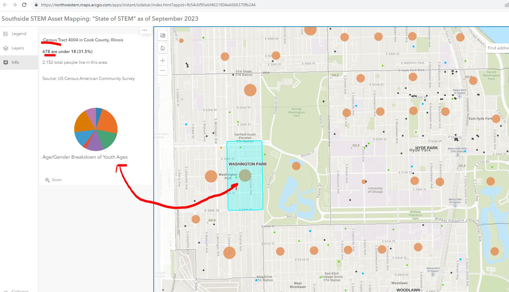
Below is a map view where I've clicked on the orange circle for the census tract with the Chicago Youth Programs location.  I asked for information showing the number of youth under age 18 in the area. The map shows 678 kids out of a population of 2152 in that census tract.


The next map view shows businesses, or potential employers, in the nine community areas.  Put your curser over any black dot and find information showing who that business is. Zoom in to see what businesses are in different census tracts. 


There is a lot to explore.  Here's an article about the platform, posted in the Block Club Chicago publication.

My question is, "How will it be used to make STEM learning and career opportunities available to youth through out the area?"  

I've met in the past two years with the people who created this platform and encouraged them to dig into the history of the Tutor/Mentor Connection and the tools and strategies we piloted from 1993 to 2011 to help volunteer-based tutor/mentor programs grow in the Chicago region.  This Mapping for Justice blog is a textbook for anyone who wants to use it that way. Just read some of the "strategy" articles. 

I started building a list of Chicago tutor/mentor programs in 1993 and at the same time began learning ways to use GIS mapping to show where the programs were located and where more were needed. We published our first Directory in May 1994 at the same time as we hosted our first networking conference.  We used the directory to launch citywide volunteer recruitment campaigns in August 1995.


In 2004 an intern from India built the first on-line Tutor/Mentor Program Locator, which was a searchable database shown below.  We had organized our annual survey in 1994 to learn who offers volunteer-based tutor/mentor programs, where they were located, what age group they served, and what type of tutoring and/or mentoring did they offer, as well as what time of day did they offer services.


The search fields on the Program Locator enabled people to search for specific programs based on the categories of our survey.  This worked like most search engines. If you had an idea of what you were looking for, and where, the platform helped you narrow your search and find tutor/mentor program information in that area.

In 2008 a team from India built a new version of the Program Locator. The home page is shown below. This works differently from Google. It starts with a map of a specific area, then shows layers of information, including our data on Chicago tutor, mentor programs.


At the left you can see layers of information that can be displayed on the map.  These layers included our data about Chicago tutor/mentor programs, but also included poverty data, poorly performing schools, and assets (businesses, faith groups, colleges, hospitals) etc.

Thus, you could create a map showing the entire city.


Or you could zoom in and create a map view showing a portion of the city.  

You could add text to the map to focus on specific organizations in various community areas.


You could follow news stories with map stories. On your map you could not only show existing tutor/mentor programs, but you could add layers showing businesses, hospitals, faith groups, universities who share the same geography and who should be innovative and strategic in helping mentor-rich non-school programs grow in the area. For each part of the city the mix of programs and assets is different.


The Program Locator is now only available as an archive.  However, you can see some of the features in this PDF essay.

How to Use Chicago Tutor/Me... by Daniel F. Bassill

One of the challenges of the STEM project is building public awareness and drawing people to the platform, then teaching them to create stories on a regular basis that draw even more people to the platform and motivate them to take actions that help kids in the area have access to mentor-rich STEM learning programs that provide on-going support as kids move from 1st grade through high school, college/tech school and into jobs and careers.

Since my organization did not have advertising dollars we developed a "Rest of the Story" strategy that followed media stories with maps that showed the neighborhood and pointed to tutor/mentor programs in the area (if any) and described the need for more programs.  Below is a mid 1990s example.


The STEM project leaders could duplicate this and other strategies that I've piloted over the past 30 years.  They are all on-line and available to anyone motivated to look.  They might even add some features and functionality to their platform based on what I have done, or tried to do. 

The Tutor/Mentor Blog is an even broader text book than the Mapping For Justice blog.  Think of the sections below as chapters, or courses in a learning curriculum.  

Public awareness - click here

Using maps - click here

Media strategies - click here

Follow up to violence - click here

Mentor role in larger strategy - click here

Tutor/Mentor Institute, LLC website - click here

The challenge: Too much information.  

View this graphic in this article.  The ideas I share and websites I point to are a vast information ecosystem. It's like a university library or the library of different religious groups.  It can't be learned in a day. It needs to be part of on-going learning.


For that to happen major donors, perhaps MacKenzie Scott, need to provide money to fund programs within high schools and college that provide advance degrees for people who spend 10-20 years learning and applying these ideas.


Thanks for reading. Please share these ideas with leaders in Chicago and other cities.  Maybe you know one of these donors, or are one yourself.

Connect with me on social media platforms and share your own strategies and maps. Help build the network. Help the STEM network grow and reach more people. 

Finally, consider a year-end contribution to help me continue this work in 2024. Visit this page to use the PayPal.  

Sunday, August 15, 2021

Population growth in US cities

 Below is a screen shot that I created from an article in the Washington  Post, titled "Where America's developed areas are growing".

I'm showing the Sycamore-DeKalb, Illinois cities.  I spent 5th grade through high school in Sycamore, graduating from HS in 1964. I left for college in the fall of 1964 and while my family lived there until 1992, I later made my home in the Chicago region.  Thus, I've watched this population growth with interest over the past 30 years.

I used this example to demonstrate the interactive feature of the Washington Post article. Type in any zip code in the bar at the top of the map and you'll get a map showing that location, with the purple shading showing population growth in that area between 2001 and 2019.

This is just one platform that I point to in this blog, demonstrating ways to visualize data and share it via newspaper and Internet articles.

I've used this blog since 2008 and the Tutor/Mentor blog, since 2006, to share map-stories with the goal of drawing attention to the information, then using the information to develop strategies that draw resources into the areas where the maps show help is needed. 

I've been collecting links to data platforms for many years and while I point to some from articles on this blog, I created this concept map, to point to many more. And while many major media are creating some fantastic map stories, I don't find many bloggers talking about using their data maps for specific purposes, the way I've been doing.

Thus, I'm pleased to point to a new site being  hosted by Adam Hecktman, who has been part of the ChiHackNight group for many years, in his role with Microsoft.  Look at the Tweet below and visit Adam's new site. I'm please that this MappingforJustice blog is the first on the site. I hope there will be many more in the coming months.

The Washington Post article enables you to look at population growth in every part of the country.  People in every city need to be looking at the maps and asking "what does this mean for us?" and "What can we do to fix any problems this shows?" and finally, "Who wants to help?"

Since most of us don't have dedicated advertising budgets to reach out and gather people to work together to solve specific problems, using our blogs and social media to share our ideas is one of the few resources we can use.

 Creating libraries, or hubs, is one way to shine the light on the work many are doing. 

8-20-2021 update - Here's 8-20-2021 WBEZ story titled,  "Takeaways From 2020 Census Data For Chicago And Illinois In 6 Graphics".  White population in Illinois declined while POC grew. 

Monday, April 26, 2021

Chicago a divided city - WBEZ maps

Today the US Census announced that Illinois will lose one Congressional seat as a result of declining population in Illinois and growth in a few other states.  As I  thought about this I saw an article on the WBEZ website, showing maps created by the Center for Neighborhood and Community Improvement at the University of Illinois at Chicago.


 Whereas in 1970 there were large middle class neighborhoods in the North, SW and South sides of Chicago, not the city seems starkly divided between wealth and very low income.  

While the low income area grew dramatically this does not mean the population of poor people grew. African American population within Chicago has been declining for decades. This 2019 UIC Great Cities Institute report states that "Since a peak measured in 1980, Chicago’s Black population has declined steadily from 1,187,905 in 1980 to 797,253 in 2017, a decrease of 390,652 or 32.9%."  

This 2018 article provides more information about the migration of Blacks out of Chicago, to the suburbs, other cities in Illinois, and out of state, perhaps to some of those states gaining Congressional seats. It includes a quote saying, "Experts from the Urban Institute predict that by 2030, Chicago’s African-American population will shrink to 665,000 from a post-war high of roughly 1.2 million."  

That leaves behind those who are very poor and those who are very affluent.  


Monday, March 1, 2021

Map resource for redistricting in 2021

 Every 10  years state political district maps are re drawn, based on the new Census information. Across the country Democratic and Republican party leaders try to "gerrymander" the maps to favor one party or another.

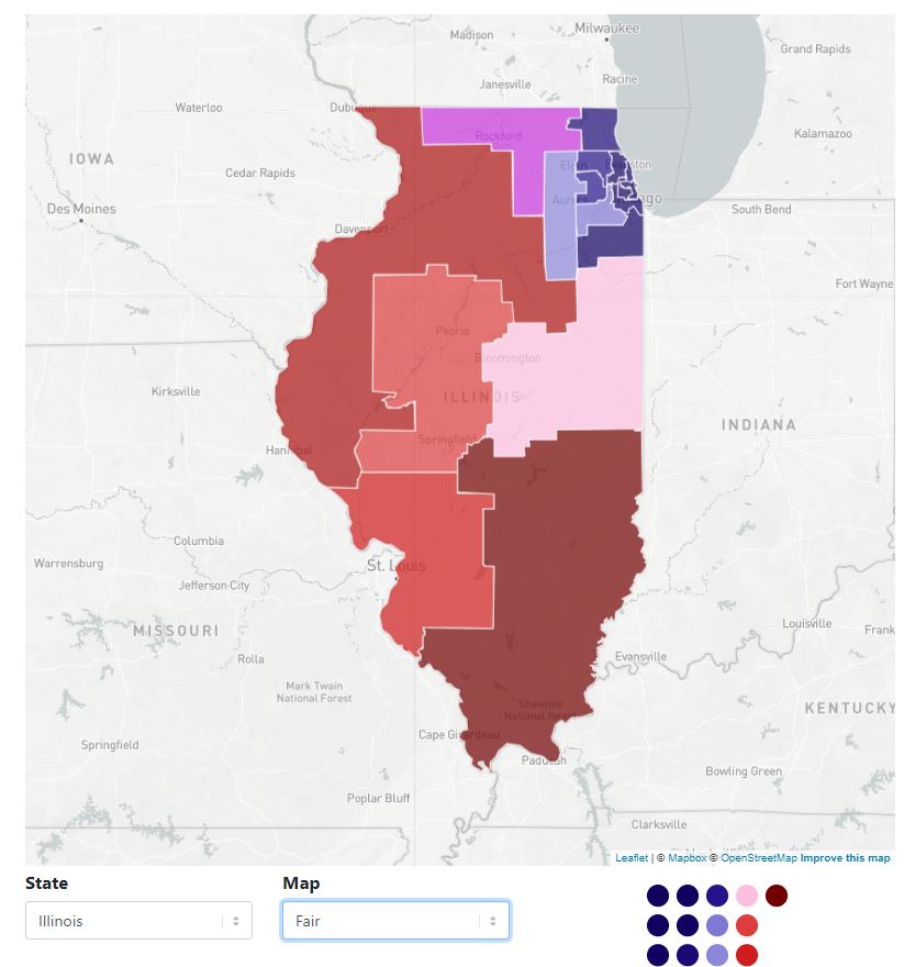
This platform provides maps for every state, showing maps favoring one party or the other, plus an recommended "fair map". 

Use the search bar under the map to find your state, then to see the three versions of the map. Which will your state choose? 

Monday, February 8, 2021

Census Map Shows Home Town of Superbowl Players

 I've pointed to the US Census Bureau in past articles to show how their maps can be used to create map-stories. I was reminded of this capacity when a friend emailed me this map showing home towns of players in the 2021 Super Bowl.


You can find this map here

Are you using the Census Bureau platform to create map stories that draw attention to the needs of youth and families in high poverty areas of the USA?  Share links to your stories in the comments.


Wednesday, October 16, 2019

Link between poverty, segregation and education performance

In my Twitter feed today was a post that pointed me to this article, titled: An analysis of achievement gaps in every school in America shows that poverty is the biggest hurdle.  The article draws upon data that is available in this Stanford Opportunity Explorer map.

Below I'm showing three map views that I created by zooming in on the map.

The blue shades show "students' scores, in grade levels, relative to the national average (grades 3-8, 2009-2016)". This is explained in the table in the lower right corner of the page.  Click on the "more info" link and a panel opens on the left side of the page with a set of questions and answers.

National View of Opportunity Explorer
Then I zoomed in to look at the Chicago area where I've focused on helping volunteer-based, non-school tutor/mentor programs grow since forming the Tutor/Mentor Connection in 1993.  At this level of detail  you can see individual schools, which are color coded to show how they perform vs the national average.

View of Chicago region - Central/South

Then I zoomed in more to focus on the central part of the city.  For reference, look at this map which we created more than 10 years ago, showing the Illinois 7th Congressional District. You can see how this district stretches from Chicago's lakefront to the far West suburbs and that there are areas of high poverty in the middle and South part of the district (note: this is 2000 census data). 

7th Illinois Congressional District
Now look at the third map that I created using the Opportunity Explorer.  I'm focusing on the same area as the 7th Congressional District. You can see the difference between more affluent areas (green) and greater poverty areas (blue).

This map covers much of the 7th Congressional District
Now look at the map below, showing the 7th Congressional District, which was created using the Chicago Tutor/Mentor Program Locator, which a team from India built for the Tutor/Mentor Connection in 2008 using money we'd received from an anonymous donor. (This team first introduced themselves to me in 2007 by rebuilding our Organizational History and Tracking System (OHATS) page - on a pro-bono basis!)

7th District view using Program Locator - click here

The Opportunity Explore is a great resource.  However, I wish it had overlays showing Congressional or State legislative districts, so voters could build an understanding of the segregation, poverty and school performance within their district and hold elected leaders accountable for generating the resources and mobilizing the leadership needed to improve the lives of those living in poverty.  

Unfortunately the Tutor/Mentor Connection was not able to attract new funding after 2008 due to the financial crisis, which also affected the volunteers from India who were helping us. In 2011 this led to the strategy being discontinued at the non profit I founded in 1993, which led me to form the Tutor/Mentor Institute, LLC (also 2011) to try to keep this resource updated and available.  

It is available. It's not updated. However if you explore it's features, it's loaded.  For instance, in the upper right I've pointed to an "enlargement" button which expands the map to your full screen. That enables you to look closer at the information on the map, including the green stars, representing non-school tutor and/or mentor programs in the map area.  

Data platforms - click here
The Tutor/Mentor Program Locator is not the only resource people can use. It is one of the few that overlays non-school tutor/mentor programs and is intended to support leaders working to fill neighborhoods with a wide range of k-12 youth programs.

I point to a wide range of data platforms in this concept map. I'll add the Stanford Opportunity Explorer today.  These can be used to understand issues and create map-stories that share your understanding with other people, mobilizing the talent, dollars and votes needed to change conditions shown on the maps.  

View more stories on this blog showing uses of maps, and view stories on the Tutor/Mentor blog, also using maps. Imagine such stories appearing on thousands of web sites and blogs, created by students, volunteers, policy makers, elected leaders, etc.

I'm looking for partners at universities, businesses think tanks and/or other non-profits who will spend time learning what I've been trying to do and then invest and adopt, updating the Program Locator, and rebuilding strategies that I'm no longer able to lead as well as needed, due to lack of support.  

If I can get the attention and investment from just one of the growing number of billionaires in the world, this entire strategy could be relaunched, using their name and influence. Share this article, and perhaps you can help me reach these people. 

This link points to social media platforms where we can connect.


Sunday, December 9, 2018

Digital Divide in Chicago - 2018 WBEZ article


This screen shot shows interactive map included in WBEZ article titled "Clear Signs Of The Digital Divide Between Chicago’s North And South Sides"

The article reports that "more than half the households in Englewood and nearly half the households in West Englewood (51 percent), Riverdale (49 percent), Auburn Gresham, and South Shore (both 46 percent), lacked internet access at home".

This is a disadvantage for youth and adults.

I show these maps and articles with the goal that readers will be concerned and will share the articles with others, who will also be concerned, and that this will result in people from different sectors giving time, talent and dollars to help reduce this problem.

Browse other articles on this blog, and the Tutor/Mentor blog, and share with your network, as the graphic below suggests.

This work is not something that can be done in a day, or even a year or a decade. But it is work that needs to be done.  If you'd like help digging through the information I'm sharing, or in making sense of some of the graphics, I'm available.

12-12-18 update - Visit this site and see 2018 data and maps showing digital access in census tracts across the USA.

12-19-18 update - World Economic Forum - report - Our Shared Digital Future: Building an Inclusive, Trustworthy and Sustainable Digital Society, 2022 goals. click here

1-16-19 update - World Economic Forum  report - Global Risks Report 2019

2-18-2019 update - Nearly one-in-five teens can’t always finish their homework because of the digital divide - 10/2018 Pew Research Center report - click here

2-25-2019 update - Digital Distress: What is it and who does it affect? Part 1. 2019 article focusing on "those on the wrong side of the divide (who) are being left behind, prompting the creation of strategies to ensure everybody can reap the benefits of this new age. click here

3-30-2020 update - Broadband is now our lifeline, but 20 million still lack access. click here

3-31-2020  update - Worst Connected Cities - 2018 from National Digital Inclusion Alliance -  click here

4-13-2020 update - Stop the Cap-Promoting Better Broadband, Fighting Data Caps and Usage-Based Billing - read articles at this link.

4-21-2020 update - Analysis of Digital Divide in California, including map and policy recommendations - click here

4/25/2020 update - One in five Chicago students lacks broadband. Here’s where they live - Chalkbeat Chicago story - click here

5-6-2020 update - Digital prosperity: How broadband can deliver health and equity to all communities - click here

1-24-2021 update - Mapping and Mitigating the Urban Digital Divide This article describes a grant to the Center for Data and Computing at the University of Chicago to create new maps that build better understanding and help mitigate the Digital Divide.  

3-18-2021 update - visit the "saving the world" set of articles on Paul Signorelli's blog and find many articles related to digital access, digital justice, and digital divide. Below are links to two articles.
- Promoting Universal Broadband Access With Lev Gonick (Part 1 of 2- (click here);
- Promoting Universal Broadband Access With Beth Holland (Part 1 of 3) -  (click here)

3-18-2022 update - This Robert Wood Johnson Foundation Tweet shows that "neighborhoods experiencing deep poverty are the least connected to broadband. The Tweet also points to a resource page on the RWJF website. 

6-6-2022 update -  Interactive map shows level of broadband connectivity in rural zip codes throughout the USA. This is a project of RURAL LISC. click here

11-22-2022 update - HBR article "How to Close the Digital Divide in the U.S."  - click here

If you appreciate what I'm sharing, please visit my FUND ME page and send a contribution.